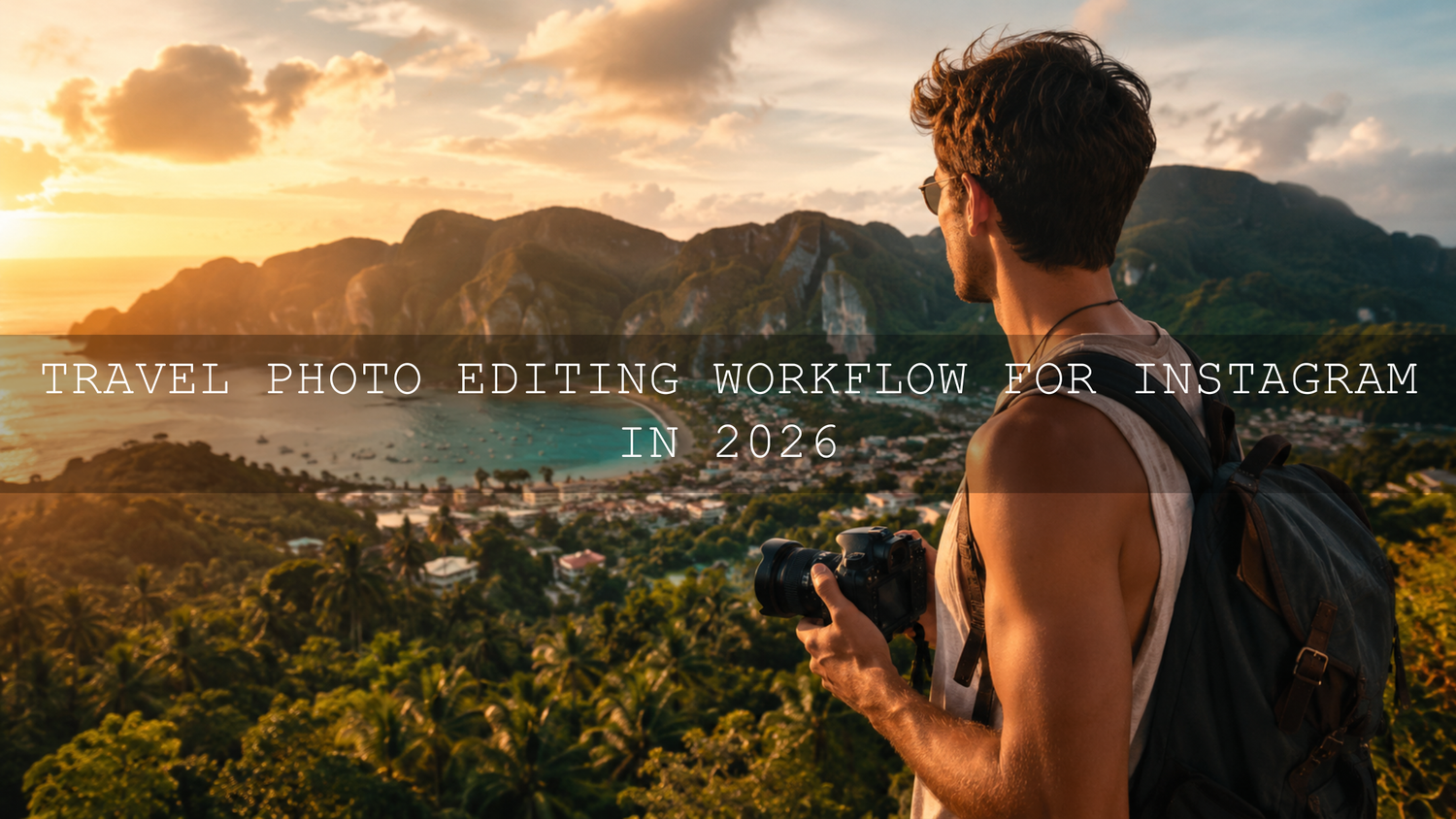
Travel Photo Editing Workflow for Instagram in 2026
A strong travel photo editing workflow can turn a full memory card into polished Instagram travel photos without wasting hours on random edits. Whether you are editing in Lightroom Mobile, Lightroom Classic, Photoshop Camera Raw, or a mix of mobile and desktop tools, the goal is simple: keep the feeling of the place, improve the light and color, and create a consistent visual story your audience instantly recognizes.
Here’s why this matters: travel photography is rarely shot in perfect conditions. One day you are capturing harsh midday streets, the next you are editing foggy mountains, golden beaches, night markets, hotel interiors, and portraits in mixed light. A repeatable workflow helps every image feel intentional instead of accidental.
For faster editing, start with a travel-focused preset pack such as the AI-Optimized Cinematic Travel Landscape Wanderlust Lightroom Presets, then browse the AI-Optimized Lightroom Presets for Mobile and Desktop collection to build a consistent editing toolkit. Try these presets today — Buy 3, Get 9 FREE when you add 12 presets to your cart.
Start Before Editing: Shoot With the Final Look in Mind
The best Instagram edits begin before you open Lightroom. If you want cinematic travel photos, bright vacation edits, moody city shots, or warm golden-hour memories, you need to capture enough detail for the edit to work.
- Shoot RAW when possible: RAW files give you more flexibility for recovering highlights, lifting shadows, and correcting white balance.
- Protect the highlights: Bright skies, white buildings, beaches, and reflective water can clip quickly. Slightly underexposing is often safer than losing sky detail.
- Capture variety: Shoot wide landscapes, medium storytelling frames, close-up textures, and vertical portraits for Instagram carousels.
- Keep your lens clean: Dust, fingerprints, and sea spray can soften your photo before editing even begins.
- Take a reference shot: A simple natural-looking frame helps you remember the true colors of the location when you start grading.
I’ve tested travel presets on mixed sets with beach scenes, street portraits, cloudy mountain photos, and warm city lights. The presets worked best when the original photo had clean exposure, protected highlights, and a clear subject.
Import, Organize, and Cull Your Travel Photos
Before color grading, clean up your library. A common mistake is editing every photo from a trip. That leads to burnout and inconsistent results. Instead, narrow your gallery first.
- Import by trip or location: Use folders such as “2026 Bali,” “Tokyo Street,” or “Patagonia Hiking.”
- Remove obvious rejects: Delete blurry, duplicated, badly framed, or accidental shots.
- Pick the strongest story images: Look for emotion, movement, light, color, and a clear subject.
- Build Instagram sets: Choose 5–10 images that work together as a carousel or grid sequence.
- Mark hero images: These are the strongest photos for covers, Pinterest pins, blog headers, and Instagram feed posts.
If you want a deeper editing system, this 2026 travel preset workflow guide is a helpful next read for building a faster Lightroom process from start to finish.
Presets vs Manual Editing: What Works Best?
Presets and manual editing are not enemies. The best workflow uses both. A Lightroom preset gives you the creative direction quickly, while manual adjustments help each image fit the real lighting and subject.
Use presets for speed and consistency
Presets are ideal when you want a repeatable style across Instagram travel photos. They help control contrast, tone curve, color mood, shadows, highlights, and overall atmosphere in seconds. For example, a cinematic travel preset can make a mountain sunrise feel more dramatic, while a warm film preset can make a café street scene feel softer and more nostalgic.
Use manual editing for precision
Manual tweaks are important for exposure, white balance, skin tones, skies, and scene-specific problems. A preset may look perfect on a golden-hour beach image but too strong on a shaded market portrait. That does not mean the preset is wrong. It simply needs refinement.
For more help choosing between looks, read this guide on comparing Lightroom presets for your perfect photo style.
Step-by-Step Lightroom Travel Editing Workflow
1. Correct white balance first
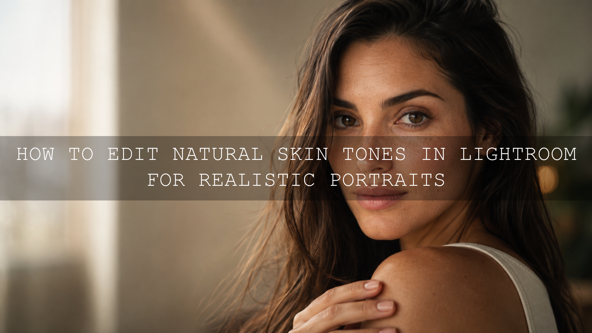
White balance controls the emotional temperature of your photo. A warm setting can make sunsets, deserts, and tropical scenes feel inviting. A cooler setting can make mountains, fog, and city night shots feel cinematic. Before touching color grading, adjust temperature and tint until skin, whites, and neutral surfaces look believable.
2. Fix exposure and contrast
Adjust exposure so the main subject is clear. Then refine highlights, shadows, whites, and blacks. For travel photography, avoid crushing shadows too much unless the image is intentionally moody. Viewers should still see important details in architecture, clothing, landscapes, and faces.
3. Apply your preset
Now apply your travel Lightroom preset. Try a style that matches the story of the image. For soft landscapes and adventure shots, the Cinematic Travel Landscape Wanderlust Presets are a strong fit. For bold city scenes and dramatic sunsets, the AI-Optimized Moody Red Cinematic Travel Lightroom Presets can add deeper emotion and stronger atmosphere.
4. Refine the HSL panel
The HSL panel is where travel edits become cleaner. Reduce orange saturation if skin looks too strong. Lower yellow saturation if sand or buildings look too harsh. Shift greens slightly if forests look too neon. Darken blue luminance if the sky needs more depth. Small HSL changes can make a preset look custom instead of copied.
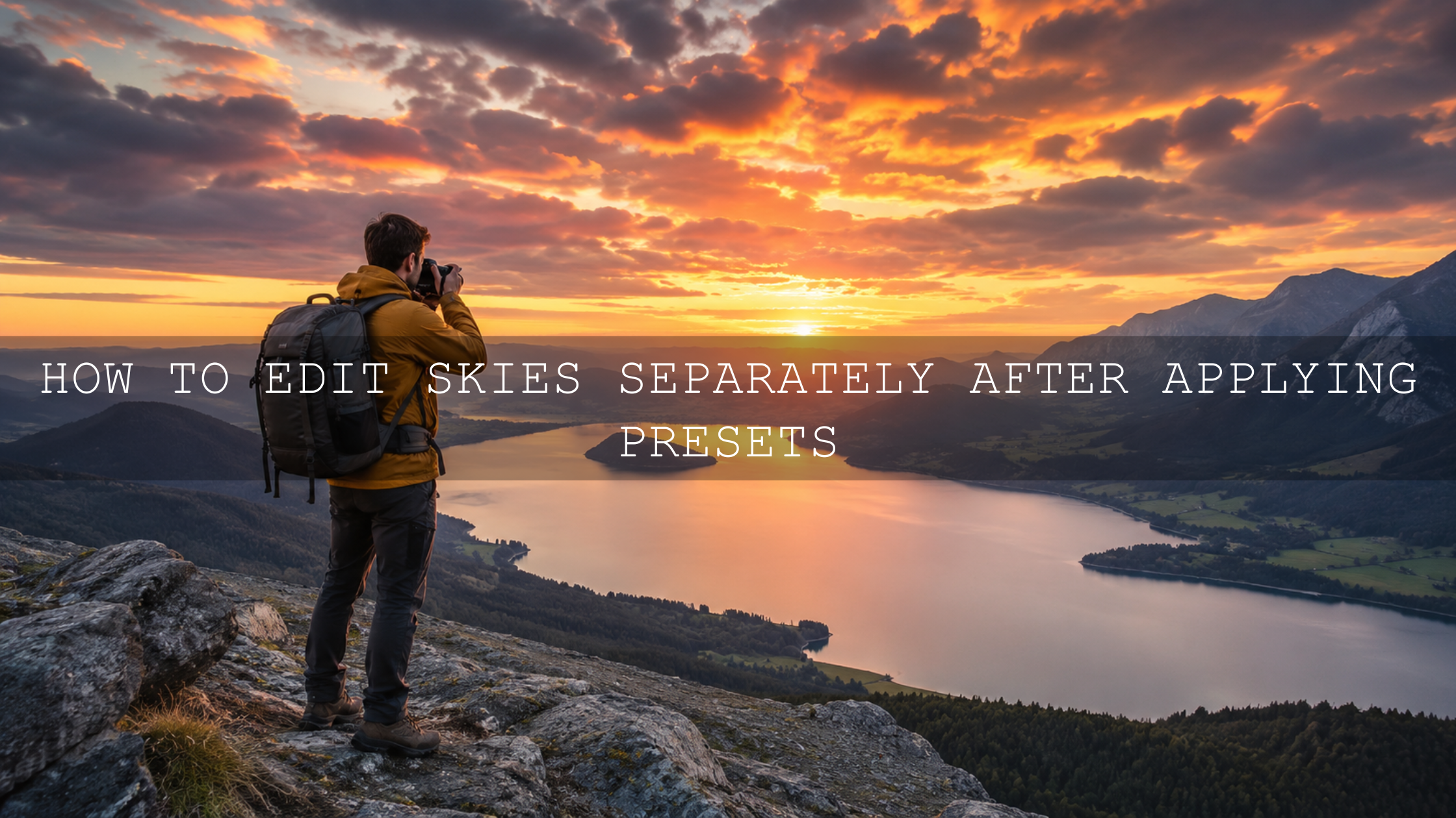
5. Use masks for local control
Masks are essential for modern Lightroom editing. Use them to brighten faces, darken skies, add depth to mountains, or separate the subject from the background. Adobe explains these tools in detail in Adobe’s guide to masking in Lightroom Classic.
6. Clean distractions carefully
Remove small distractions such as dust spots, litter, signs, or unwanted objects only when they pull attention away from the story. For bigger removals, use a light hand so the photo still feels real. Adobe’s Lightroom Remove tool guide is useful if you want to clean travel photos directly inside Lightroom.
7. Finish with sharpening and noise reduction
Travel photos often include low-light streets, indoor cafés, early morning hikes, and night scenes. Use noise reduction gently. Too much can make textures look plastic. Add sharpening mainly to edges and important details, not smooth skies or skin.
Color Grading for Instagram Travel Photos
Color grading is where your Instagram style becomes recognizable. But it should support the location, not overpower it. A tropical beach can handle brighter blues and clean highlights. A mountain scene may look better with softer contrast and cooler shadows. A Tokyo night street might need neon color separation and deeper blacks.
Use color theory as a guide. Warm highlights with cool shadows create a cinematic feeling. Analogous colors feel calm and cohesive. Complementary colors create stronger contrast and attention. For planning palettes, Adobe Color’s color wheel tool is helpful for exploring harmonious color combinations before you build a consistent Instagram feed.
For richer cinematic edits, you may also like this guide on editing travel photos for a cinematic feel in 2026.
Export Settings for Instagram Travel Photos
After editing, export correctly so Instagram does not ruin your work with unnecessary compression or color shifts. For most feed posts, a vertical 4:5 crop is the strongest choice because it takes up more space on the mobile screen.
- Vertical feed post: 1080 x 1350 pixels
- Square feed post: 1080 x 1080 pixels
- Horizontal post: 1080 pixels wide
- File format: JPEG
- Color space: sRGB for web and social sharing
- Quality: High quality, but avoid exporting unnecessarily huge files
For color consistency, Adobe notes that Lightroom Classic allows you to choose a profile or color space when exporting, including sRGB for online sharing. You can review the details in Adobe’s Lightroom Classic color management guide.
Create a Consistent Instagram Feed From Travel Presets
A beautiful travel feed is not made from one perfect photo. It is built from a consistent system. Your colors, contrast, crop style, subject distance, and mood should feel connected across multiple posts.
- Choose 2–3 preset styles: For example, one for landscapes, one for street photos, and one for portraits.
- Keep skin tones natural: Strong color grades should not make people look orange, red, gray, or overly saturated.
- Repeat visual patterns: Use similar crops, warm tones, shadow depth, or highlight softness across your grid.
- Edit in batches: Apply the same base look to a group, then adjust each image individually.
- Use carousels intentionally: Start with the strongest hero image, then add details, people, food, architecture, and atmosphere.
For more feed-building ideas, read how to create a consistent Instagram feed with travel presets.
Pro Tips for Better Before-and-After Travel Edits
- Do not overuse saturation: Increase vibrance first, then adjust individual colors in HSL. This protects skin and prevents neon skies or grass.
- Check the edit at small size: Instagram viewers see your image on a phone. Zoom out and make sure the subject still stands out.
- Use masks before heavy global edits: A sky may need drama, but the face in the same image may need softness.
- Save your own preset versions: Once you tweak a preset for your camera and style, save it as your custom travel base.
- Compare before and after: If the edit looks impressive but no longer feels like the place, reduce the intensity.
If a preset looks different from one travel image to another, do not panic. Lighting, camera profiles, white balance, and exposure all change the result. This guide on why Lightroom presets look different on every photo explains how to fix common preset problems without starting over.
Related Reading
- Build a faster travel preset workflow in Lightroom
- Edit travel photos for a cinematic look in 2026
- Explore top Lightroom presets for travel photography
- Create a consistent Instagram feed with travel presets
- Fix Lightroom presets that look different on every photo
Best Presets for This Workflow
If you want one flexible toolkit for travel, lifestyle, landscapes, portraits, and Instagram content, the 1000+ Master Lightroom Presets Bundle is a strong all-around option. If your travel style is more colorful and cinematic, try the Orange & Teal Cinematic Travel Moody Lightroom Presets. You can also browse the full Lightroom Presets for Mobile and Desktop collection to find looks for beach trips, city breaks, mountain adventures, weddings, portraits, and lifestyle content.
Before installing new presets, check the Lightroom preset installation guide so your XMP and DNG files are added correctly on desktop and mobile.
FAQ
What is the best travel photo editing workflow for Instagram?
The best workflow is to shoot clean files, import and cull your images, correct exposure and white balance, apply a travel Lightroom preset, refine HSL and masks, then export in Instagram-friendly dimensions such as 1080 x 1350 pixels for vertical feed posts.
Should I use presets or edit travel photos manually?
Use both. Presets give you speed and consistent style, while manual editing helps correct exposure, white balance, skin tones, skies, and small scene-specific problems.
What Lightroom preset style is best for travel photography?
Cinematic, warm film, orange and teal, moody landscape, golden hour, and clean natural presets work well for travel photography. The best choice depends on the location, lighting, and mood you want for your Instagram feed.
How do I keep Instagram travel photos consistent?
Use a small group of related presets, edit in batches, keep skin tones natural, repeat similar crops, and adjust each image with small exposure, white balance, and HSL refinements.
Why do my Lightroom presets look different on each travel photo?
Presets react to the original photo. Different light, exposure, camera profiles, white balance, and colors will change the result. Adjust exposure, white balance, HSL, and masks after applying the preset.
Great travel edits should feel polished, emotional, and still true to the place you photographed. Start with a clean workflow, use presets as your creative base, and make small manual refinements so each image feels custom. For a faster editing setup, explore the AI-Optimized Cinematic Travel Landscape Wanderlust Lightroom Presets, the 1000+ Master Lightroom Presets Bundle, and the AI-Optimized Lightroom Presets collection. Buy 3, Get 9 FREE and build a travel editing toolkit you can use across every trip.
Written by Asanka — creator of AAAPresets (10,000+ customers).
Leave a comment
This site is protected by hCaptcha and the hCaptcha Privacy Policy and Terms of Service apply.