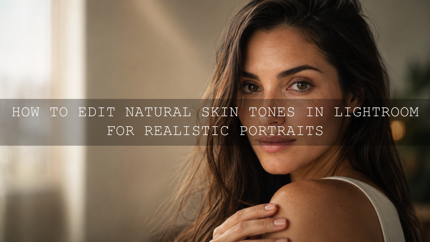
How to Edit Natural Skin Tones in Lightroom for Realistic Portraits
Natural skin tones in Lightroom are one of the biggest signs of a clean, professional portrait edit. In 2026, photographers are not just trying to make portraits look sharp; they are trying to make people look real, warm, alive, and believable. A good portrait editing workflow should protect natural skin texture, fix color casts, balance exposure, and create a polished look without turning the face orange, gray, too red, or overly smooth.
Here’s why this matters: skin is not one flat color. It includes soft reds, oranges, yellows, shadows, undertones, highlights, and tiny texture changes. If you push a preset too hard or correct color globally without checking the face, the whole portrait can quickly look artificial.
For a faster starting point, try the 1000+ Master Lightroom Presets Bundle and browse the Portrait Photography Lightroom Presets collection. Apply a preset first, then fine-tune white balance, exposure, masks, and Color Mixer settings for each person. Try these presets today — Buy 3, Get 9 FREE.
Understanding Real Skin Color Before You Edit
Before touching sliders, look at the portrait carefully. Ask yourself: what kind of light was used? Was it golden hour, cloudy daylight, indoor tungsten, flash, neon, mixed window light, or shade? Natural skin tones in Lightroom depend heavily on the original lighting, so your edit should respect the scene instead of forcing every portrait into the same color style.
I have tested portrait presets on outdoor lifestyle photos, wedding portraits, and indoor window-light sessions. The best results usually came from correcting the technical base first, then using the preset as a creative layer instead of a one-click final result.
Real skin often contains:
- Orange and yellow tones for warmth and natural glow.
- Red tones around cheeks, lips, ears, hands, and areas with more blood flow.
- Cooler tones in shadows, especially under the chin, eyes, and jawline.
- Texture and pores that should be refined carefully, not erased.
If your portrait has mixed lighting, this guide on balancing warm indoor glow with cool window light can help you understand why one side of the face may look warm while the other side looks blue or green.
Step 1: Start With White Balance for Clean Lightroom Skin Tones
White balance is the foundation of realistic portrait editing. If white balance is wrong, every later adjustment becomes harder. A beautiful preset can still look bad if the skin starts too yellow, too green, too blue, or too magenta.
Use the Temperature and Tint sliders slowly. Temperature controls the blue-to-yellow balance, while Tint helps correct green or magenta casts. For portraits, small changes are usually better than dramatic moves.
Practical white balance workflow
- Look for a neutral reference. Use a gray card, white shirt, gray wall, or another neutral object if available.
- Use the eyedropper carefully. Click a neutral area, then judge the result with your eyes.
- Check the face, not only the background. A wall may look neutral while the skin still looks green or orange.
- Adjust Tint in small steps. Indoor lights often add green or yellow casts that need gentle correction.
- Compare before and after. The goal is believable skin, not perfectly neutral everything.
Adobe’s official Lightroom photo editing controls are useful for understanding how exposure, color, and detail adjustments work together inside Lightroom.
Step 2: Fix Exposure Before Color Grading
Many skin tone problems are actually exposure problems. If the face is underexposed, the skin may look muddy, gray, or overly saturated. If the highlights are too bright, the skin may lose detail and look flat.
Start with global exposure, then refine highlights and shadows. For portrait editing, the face should usually feel clear and dimensional without looking washed out. Keep the eyes bright enough to connect with the viewer, but avoid lifting shadows so much that the image loses depth.
Exposure settings to check
- Exposure: Set the overall brightness so the face feels naturally lit.
- Highlights: Reduce only enough to recover skin detail on the forehead, nose, cheeks, or shoulders.
- Shadows: Lift gently if the face is too dark, but avoid a flat HDR look.
- Whites and Blacks: Set a clean tonal range without clipping important skin detail.
- Contrast: Use moderate contrast so skin keeps softness and shape.
For group portraits, uneven lighting can make some faces brighter than others. The workflow in this family portrait editing guide is helpful when you need to balance multiple faces in one image.
Step 3: Use the Color Mixer for Realistic Skin Tone Control
The Color Mixer, also known as HSL in some workflows, is where natural skin tones in Lightroom become more refined. Most skin tones live mainly in the red, orange, and yellow channels. The secret is to adjust these channels gently.
Let’s break it down:
- Hue: Changes the direction of the color. Use it to move red skin slightly toward orange or yellow skin slightly toward a healthier warmth.
- Saturation: Controls color intensity. Reduce saturation slightly if skin looks too red, orange, or painted.
- Luminance: Controls brightness inside that color range. Raising orange luminance slightly can create a soft glow, but too much can flatten the face.
A simple portrait edit may only need tiny adjustments:
- Red Hue slightly toward orange if cheeks look too red.
- Orange Saturation slightly lower if the face looks too warm.
- Orange Luminance slightly higher if the skin needs softness and glow.
- Yellow Saturation lower if indoor light makes skin look too yellow.
For deeper color harmony, Adobe’s Adobe Color harmony tool is useful for understanding how warm skin tones interact with background colors, clothing, shadows, and overall mood.
Presets vs Manual Editing: Which Is Better for Skin Tones?
Presets and manual editing both matter, but they serve different roles. A preset gives you speed, consistency, and a creative direction. Manual editing gives you precision. The best workflow is not presets versus manual editing; it is presets plus manual refinement.
Use presets to build the style. Use manual adjustments to protect the person.
For example, a warm cinematic preset may look beautiful on a golden-hour portrait, but on an indoor portrait it might push skin too yellow. A moody preset may create strong atmosphere, but it may also darken the face too much. That does not mean the preset is bad. It simply means every portrait needs small adjustments after the preset is applied.
If you are building your first editing routine, read this guide on creating a clean editing routine with AAAPresets. It explains why base corrections should come before heavy styling.
Step 4: Use Lightroom Masks to Protect the Face
Global edits affect the entire image, but portraits often need local control. That is where masks become powerful. You can brighten only the face, soften only harsh shadows, reduce redness only on cheeks, or add detail only to eyes and hair.
Adobe’s guide to masking in Lightroom explains how masks help you target specific areas instead of changing the whole photo.
Best masks for portrait skin tone editing
- Subject mask: Brighten or warm the person without changing the background.
- Face skin mask: Make small exposure, texture, or color changes only on skin.
- Radial gradient: Add soft attention to the face and upper body.
- Brush mask: Fix small color patches, under-eye shadows, or uneven cheek tones.
- Background mask: Reduce distracting colors that make skin look wrong by comparison.
Pro tip: avoid reducing Texture and Clarity too much on skin. A small negative Texture adjustment can soften harsh detail, but too much makes the skin look waxy. Keep pores, fine lines, and natural texture visible enough for the portrait to feel real.
Step 5: Retouch Skin Without Losing Texture
Retouching should remove distractions, not identity. Temporary blemishes, stray hairs, dust, and small distractions can be corrected, but natural skin texture should stay. A portrait becomes more powerful when the person still looks like themselves.
Use the healing tools lightly. Zoom in to check your work, then zoom out again to judge the full portrait. Many editors make the mistake of retouching at 200% zoom for too long. The edit may look perfect close up, but unnatural when viewed normally.
Natural retouching checklist
- Remove temporary blemishes, dust, and small distractions.
- Keep permanent features, natural lines, and real texture unless the client requests otherwise.
- Do not blur the whole face.
- Sharpen eyes, lashes, brows, lips, and hair more than skin.
- Use before-and-after checks often to avoid over-editing.
For portraits with deeper skin tones, use products like AI-Optimized Dark Skin Cinematic Lightroom Presets as a creative starting point, then fine-tune exposure and orange/red channels carefully so the skin keeps richness, depth, and natural highlight detail.
Step 6: Add a Subtle Color Grade Without Damaging Skin
Color grading gives a portrait mood. It can make an image feel cinematic, romantic, luxury, vintage, soft, warm, or dramatic. But skin tone should stay believable. If your shadows become too teal, your highlights too orange, or your midtones too pink, the portrait can lose realism.
For a luxury portrait style, AI-Optimized Luxury Golden Tones Lightroom Presets can create a warm polished base for fashion, lifestyle, and wedding portraits. The key is to keep the skin warm but not oversaturated.
Use color grading with this simple rule:
- Highlights: Add gentle warmth for glow.
- Midtones: Protect natural skin color.
- Shadows: Add mood carefully, especially with blue, green, or teal tones.
- Balance: Shift the grade only enough to support the portrait, not overpower it.
If you also edit video, this guide on keeping skin tones natural in color grading workflows gives useful ideas that also apply to Lightroom portrait editing.
Step 7: Sharpen and Export for a Professional Finish
Final sharpening should bring attention to the important details, not exaggerate skin texture. In portraits, sharpen eyes, hair, brows, clothing detail, and jewelry more than cheeks or forehead. If the skin starts looking rough after sharpening, reduce the amount or increase masking.
Noise reduction should also be gentle. Too much noise reduction removes texture and makes the face look soft in an artificial way. Use only enough to clean low-light grain while keeping the portrait natural.
For web export, sRGB is usually the safest color profile because it displays more consistently across browsers and devices. For printing, ask your lab which color profile they prefer before exporting.
Common Skin Tone Editing Mistakes to Avoid
- Using presets without adjustment: Presets are a strong starting point, but every face and lighting setup is different.
- Over-saturating orange tones: This makes skin look fake, sunburned, or too heavy.
- Ignoring green casts: Fluorescent lights, grass reflections, and mixed lighting can make skin look unhealthy.
- Over-smoothing skin: Real skin has texture. Keep it visible.
- Editing only at close zoom: Always check the full portrait before finishing.
- Making shadows too cool: A cool cinematic grade can be beautiful, but too much blue or green in shadows can damage skin realism.
Simple Natural Skin Tone Workflow for Lightroom
- Import and choose the strongest portrait images.
- Correct white balance before applying a heavy style.
- Balance exposure, highlights, shadows, whites, and blacks.
- Apply a portrait-friendly preset as a creative base.
- Use Color Mixer to refine reds, oranges, and yellows.
- Use masks to brighten faces and fix uneven tones locally.
- Retouch only distractions while keeping real skin texture.
- Add subtle color grading for mood.
- Sharpen selectively and export for web or print.
If you edit weddings, portraits, family sessions, or lifestyle content regularly, the AI-Optimized 100+ Cinematic Wedding Lightroom Presets Bundle is a strong match for soft, romantic edits with clean skin tone control. You can also browse the Lightroom Presets for Mobile & Desktop collection to find more looks for portrait, wedding, street, travel, and lifestyle photos. Add 12 presets to cart and pay for only 3 with Buy 3, Get 9 FREE.
Related Reading
- How to balance warm indoor light and cool window light
- Complete editing guide for family portraits
- How to build your first Lightroom editing routine
- How to fix green and magenta color casts
FAQ
How do I get natural skin tones in Lightroom?
Start with correct white balance, balance exposure, then use the Color Mixer to gently refine reds, oranges, and yellows. After that, use masks to fix the face locally instead of changing the whole photo.
Should I edit skin tones before or after applying presets?
Do basic white balance and exposure first, then apply your preset. After the preset, fine-tune skin tones with Color Mixer, masks, and small saturation adjustments.
Why does skin look orange after using a preset?
The preset may be adding too much warmth, saturation, or orange luminance for that specific lighting. Lower Orange Saturation slightly, check Temperature, and reduce warm color grading if needed.
How can I retouch skin without making it look fake?
Remove only temporary distractions, keep natural texture, avoid heavy blur, and use small local adjustments. Skin should look cleaner, not plastic.
Which Lightroom tools are best for portrait skin tone editing?
White Balance, Exposure, Color Mixer, Masking, Healing, Texture, Clarity, and Detail are the most important tools for realistic portrait edits.
Written by Asanka — creator of AAAPresets (10,000+ customers).
Leave a comment
This site is protected by hCaptcha and the hCaptcha Privacy Policy and Terms of Service apply.