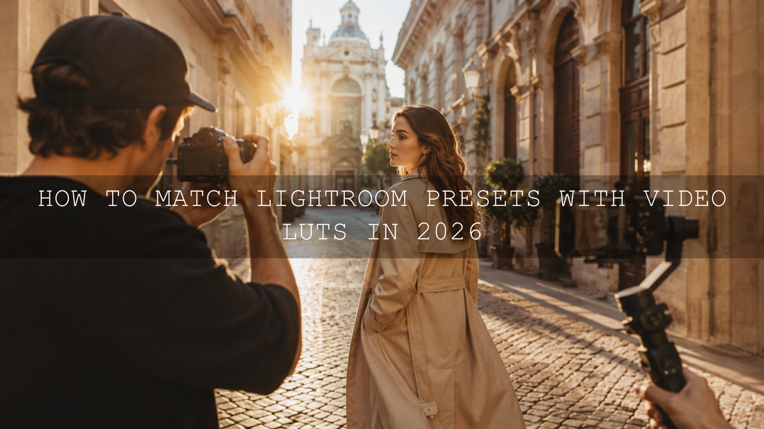
How to Match Lightroom Presets with Video LUTs in 2026
Learning how to match Lightroom presets with Video LUTs is one of the most effective ways to create consistent color across photographs, reels, YouTube videos, wedding films, travel content, and branded campaigns. When your still images feel warm and cinematic but your footage looks cold or overly digital, the visual disconnect can make an otherwise professional project feel unfinished.
Color matching does not mean forcing every photo and video frame to look identical. It means creating a shared visual language through similar white balance, contrast, saturation, skin tones, highlight color, shadow color, and overall mood.
This matters more than ever in 2026 because creators rarely publish in only one format. A single shoot may produce website photographs, Instagram carousels, vertical reels, YouTube footage, thumbnails, and client previews. Matching your photo and video color grading helps every part of that campaign feel connected.
For a flexible starting point, explore the 1000+ Master Lightroom Presets Bundle for photography and the 700+ Cinematic Video LUTs Bundle for footage. You can also browse the Lightroom presets for mobile and desktop collection to build a smaller toolkit around your preferred style. Try these presets and LUTs today — Buy 3, Get 9 FREE.
Why Photo and Video Color Harmony Matters
Your audience may not understand tone curves, color spaces, or vectorscopes, but they can immediately sense when two visuals do not belong together. A carefully edited portrait followed by a video clip with green skin, clipped highlights, or completely different contrast breaks the emotional flow.
Here’s why this matters: color is part of your identity. Warm highlights can make a wedding story feel romantic. Muted greens and soft blacks can give travel content a nostalgic mood. Cooler shadows and controlled saturation can create a polished commercial look.
When the same color decisions appear in both stills and motion, viewers begin to associate that palette with your work. This consistency is especially valuable for:
- Wedding photographers delivering photographs, slideshows, and highlight films
- Travel creators publishing images, reels, and long-form videos
- Commercial teams producing product photographs and advertisements
- Social media managers building recognizable brand feeds
- Filmmakers who also create posters, thumbnails, and promotional stills
I have tested matching workflows on portrait, travel, and wedding-style files, and the most reliable results never came from applying the strongest preset or LUT. The better approach was to create a clean correction first, apply the creative look second, and then refine the two versions side by side.
Lightroom Presets vs Video LUTs: What Is the Difference?
A Lightroom preset and a Video LUT may produce similar-looking results, but they work differently. Understanding this difference will prevent many common color-matching problems.
How Lightroom presets work
A Lightroom preset stores a group of editable instructions. Depending on the preset, these instructions may adjust exposure, white balance, contrast, highlights, shadows, tone curves, the Color Mixer, color grading, calibration, sharpening, grain, masks, and other controls.
Because the adjustments remain editable, you can change individual settings after applying the preset. You can reduce orange saturation, lift exposure, soften contrast, or remove a mask without rebuilding the complete look.
How Video LUTs work
A LUT, or Look-Up Table, remaps input color values to different output values. A creative .cube LUT can shift contrast, saturation, hues, and tonal relationships across a video image. It is a fast way to create a consistent starting point, but it does not contain every Lightroom adjustment as a separate editable control.
A LUT also cannot intelligently correct an incorrectly exposed clip or understand which part of the frame is a face. The condition of the footage entering the LUT strongly affects the result. For a deeper explanation, read what LUTs are and how they work in a video workflow.
Why a preset cannot simply be opened in Premiere
Lightroom presets usually use formats such as XMP or DNG-based settings, while video applications commonly use .cube LUT files. They are not interchangeable. The article about using Lightroom presets in Premiere Pro and other Adobe applications explains why a compatible LUT or manually recreated grade is required.
Presets vs Manual Editing for Cross-Media Color Matching
Presets and LUTs are valuable because they provide speed and a repeatable creative direction. Manual editing gives you greater control over the differences between individual files.
- Presets and LUTs are best for consistency: They help you establish a recognizable palette across large projects.
- Manual correction is best for accuracy: Exposure, white balance, skin tone, and mixed lighting often require clip-specific adjustments.
- A combined workflow is usually strongest: Correct the image first, apply the look, and then refine the final result manually.
Think of a preset or LUT as the creative foundation rather than the finished grade. A one-click result can be useful for previews, but professional consistency usually comes from the small adjustments made after that first click.
Step-by-Step Workflow to Match Lightroom Presets with Video LUTs
Let’s break it down into a repeatable workflow that can be used for weddings, travel videos, commercial campaigns, interviews, portraits, and social content.
1. Choose one reference scene
Select a photograph and a video clip captured in similar lighting. Ideally, they should contain the same person, location, wardrobe, or important colors. Matching a sunset photograph to an indoor fluorescent clip will make the process unnecessarily difficult.
For the closest comparison, export a high-quality still frame from your footage and import that frame into Lightroom. This allows you to apply the photo preset directly to an image created from the video clip.
Pro tip: Choose a reference that includes skin, a neutral object, deep shadows, and bright highlights. One balanced frame will reveal more about the look than a frame containing only a sky or dark background.
2. Correct exposure and white balance before styling
Start with a neutral base. Adjust the photograph and footage so that both have believable brightness and white balance before applying creative color.
In Lightroom, review exposure, temperature, tint, highlights, shadows, whites, and blacks. In Premiere, use Lumetri Color to make similar corrections. Adobe’s guide to basic color correction in Premiere explains the controls available for balancing light and color.
For Log or flat footage, apply the correct camera transform or color-management setting before adding a creative LUT. A creative LUT should not be expected to perform technical normalization unless it was specifically designed for that camera profile.
Pro tip: Correct unwanted green or magenta tint before adjusting warmth. A clip can have the right temperature and still look wrong because its tint is unbalanced.
3. Apply the Lightroom preset to the reference frame
Apply the selected Lightroom preset and evaluate the complete image. Do not focus only on whether the result looks attractive. Identify exactly what the preset is doing.
- Are the highlights warm, neutral, or cool?
- Are the blacks lifted or crushed?
- Are greens muted, yellowed, or shifted toward blue?
- Are orange skin tones bright or subdued?
- Is the overall saturation strong or restrained?
- Does the image use a soft matte curve or a deep contrast curve?
Use Adobe’s Lightroom Color Mixer guide to understand how Hue, Saturation, and Luminance adjustments affect individual color ranges.
4. Find the closest Video LUT
Apply a LUT with a similar emotional direction rather than relying only on its name. Two products described as “cinematic” may handle shadows, greens, and skin tones very differently.
For example, when matching a warm travel preset, look for a LUT that produces golden highlights, slightly muted greens, controlled blue saturation, and moderate contrast. For a dramatic urban preset, you may need cooler shadows, deeper blacks, and more restrained skin saturation.
The 120+ Cinematic Blockbuster Movie Look LUTs Pack provides a broad range of cinematic directions, while the larger 700+ bundle is useful when you need several possible matches for different photography styles.
Premiere users can follow this step-by-step guide to using LUTs in Premiere Pro. Adobe also provides an official guide for adding Look-Up Tables with Lumetri Color.
5. Lower the LUT intensity
Applying a creative LUT at maximum strength can produce excessive contrast, unnatural skin, oversaturated colors, or clipped highlights. Start with a reduced intensity and increase it only when the footage can support the stronger treatment.
There is no universal percentage that works for every clip. A softly exposed 10-bit Log file may tolerate a stronger grade than a compressed 8-bit clip from a phone or older camera.
Pro tip: Temporarily reduce the image or program monitor size when judging the grade. An overly strong look often becomes more obvious when you stop inspecting individual pixels and view the frame as a complete composition.
6. Match contrast and the tone curve
Contrast is often the reason a photo and video still feel different even when their colors appear close. Study the Lightroom Tone Curve and compare the black point, midtone contrast, highlight roll-off, and overall curve shape.
If the preset raises the black point for a faded film effect, lift the darkest video values gently. If it creates a strong S-curve, deepen the lower midtones and brighten the upper midtones without crushing important detail.
Adobe’s guide to image tone and color in Lightroom Classic explains how the Tone Curve changes tonal values throughout an image.
Do not attempt to copy numerical Lightroom curve points directly into your video software. The source files, color spaces, gamma, and available dynamic range may be different. Match the visual behavior rather than the numbers.
7. Recreate the important HSL shifts
The Color Mixer is often responsible for the distinctive personality of a Lightroom preset. Compare the major color groups and recreate only the changes that matter to the scene.
For a natural outdoor look, you might need to:
- Move yellow-green foliage toward a slightly warmer olive tone
- Reduce green saturation to prevent a digital appearance
- Lower blue luminance for a deeper sky
- Protect orange luminance so faces remain bright
- Reduce purple or magenta contamination in shadows
Avoid changing colors that are not meaningfully present in the footage. Unnecessary adjustments can introduce noise, banding, or strange color separation.
8. Use video scopes instead of trusting your eyes alone
Your eyes adapt quickly to color casts. Room lighting, monitor brightness, and extended editing sessions can also change your perception. Scopes give you an objective reference.
Use the waveform to compare brightness distribution, the RGB Parade to detect channel imbalance, and the vectorscope to evaluate saturation and skin-tone direction. Adobe’s official guide to displaying and reading Lumetri Scopes covers the available waveform, parade, histogram, and vectorscope views.
For more practical examples, see the guide to using waveform, vectorscope, and RGB Parade in Premiere Pro.
9. Protect skin tones with secondary correction
A photo preset may include local masks that protect a subject, brighten a face, or reduce background saturation. A standard LUT cannot reproduce those masks. This is one of the main reasons a converted look may affect video skin differently.
After applying the LUT, isolate the skin with HSL Secondary controls or another selective tool. Refine the key carefully, soften its edges, and make small adjustments to hue, saturation, luminance, temperature, or tint.
I tested this approach on a warm portrait look where the background needed golden tones but the uncorrected LUT pushed the subject’s face too far toward orange. Reducing global LUT strength weakened the entire look. Isolating the skin instead preserved the warm environment while restoring natural facial color.
The guide to correcting natural skin tones in Premiere Pro provides a more detailed workflow.
10. Compare the final photo and video in context
Place the photograph and video frame side by side on the same calibrated display. Compare them at the size your audience will actually see rather than relying only on a magnified editing view.
Check the following areas:
- Overall temperature and tint
- Black level and shadow color
- Highlight brightness and highlight color
- Skin tone direction and luminance
- Green, blue, and orange saturation
- Perceived contrast and mood
The goal is visual cohesion, not mathematical duplication. Natural differences are expected because a RAW photograph and compressed video frame contain different amounts of information.
A Practical Before-and-After Example
Imagine a travel creator photographing and filming a subject walking through an old city during late afternoon. The original RAW photo contains neutral color, open shadows, and a pale blue sky. The video was captured in a flat profile and initially looks less saturated.
After applying a warm cinematic Lightroom preset, the photograph gains golden highlights, soft contrast, muted greens, and slightly cooler shadows. To match the video, the creator first normalizes the flat footage, corrects white balance, and applies a warm cinematic LUT at reduced intensity.
The first result is close, but the video skin appears too orange and its shadows are too dark. The creator lowers shadow contrast, isolates the skin, reduces orange saturation slightly, and adds a subtle cool tone to the deepest shadows. The final photo and video are not exact copies, but they clearly belong to the same story.
How to Create a Reusable Custom LUT
When you repeatedly use the same color treatment, creating a reusable LUT can save time. Rebuild the most important parts of your Lightroom look inside a video-grading application, test the grade on several clips, and export it as a .cube file.
Do not include shot-specific exposure or white-balance corrections in a general creative LUT. Those corrections should remain adjustable for each clip. The exported LUT should mainly contain the repeatable creative characteristics of your style, such as contrast shape, color separation, muted greens, warm highlights, or cooler shadows.
The guide to creating custom LUTs in Premiere Pro explains how to turn a finished grade into a reusable look.
Common Color-Matching Mistakes to Avoid
- Applying a creative LUT before correcting the footage: Incorrect exposure and white balance become harder to control after a strong look is added.
- Using the wrong technical transform: A LUT designed for standard footage may behave unpredictably on unconverted Log footage.
- Matching slider numbers instead of the image: Lightroom and video software process files differently, so identical values do not guarantee identical results.
- Ignoring skin tones: A beautiful background grade cannot compensate for green, red, or excessively orange faces.
- Using maximum LUT intensity by default: Strong LUTs can clip channels and remove subtle color variation.
- Judging only one frame: A look that works in one shot may fail when lighting or camera angle changes.
- Forgetting export differences: Always review the rendered video and exported photographs on more than one display.
Related Reading
- Can Lightroom presets be used in Premiere Pro?
- How to use LUTs in Premiere Pro
- How to fix exposure and white balance in Premiere Pro
- How to use LUTs for color matching between cameras
Frequently Asked Questions
Can I use a Lightroom preset directly as a Video LUT?
No. Lightroom presets and Video LUTs use different formats and processing methods. You must recreate the important color adjustments in video software, use a matching .cube LUT, or build and export a custom LUT from a video grade.
Should I apply color correction before or after a LUT?
Perform technical correction first. Normalize Log footage, balance exposure, correct white balance, and remove unwanted color casts before applying a creative LUT. Make final skin-tone and shot-matching adjustments afterward.
Why does the same LUT look different on every video clip?
A LUT reacts to the color, exposure, camera profile, bit depth, lighting, and white balance already present in each clip. Correcting clips to a consistent neutral base helps the LUT behave more predictably.
How strong should a creative LUT be?
Use the lowest intensity that clearly communicates the intended mood. Begin below full strength, check highlights and skin tones, and increase the intensity only when the footage retains natural detail and color separation.
Can Lightroom masks be included in a LUT?
No. Standard LUTs transform color values globally and cannot store Lightroom subject, sky, background, or brush masks. Recreate selective adjustments separately in your video editor.
Build a Consistent Photo and Video Editing Toolkit
The best color-matching workflow combines a repeatable creative starting point with careful manual correction. Begin with a suitable preset, find a LUT with the same color direction, normalize both files, and refine contrast, HSL shifts, and skin tones until the complete project feels unified.
Explore the 1000+ Master Lightroom Presets Bundle to develop your photography style and pair it with the 700+ Cinematic Video LUTs Bundle for consistent motion content. You can also browse the cinematic LUT collection for Premiere Pro, DaVinci Resolve, and Final Cut Pro to find a look suited to your camera and project. Try these presets and LUTs today — Buy 3, Get 9 FREE.
Written by Asanka — creator of AAAPresets (10,000+ customers).
Leave a comment
This site is protected by hCaptcha and the hCaptcha Privacy Policy and Terms of Service apply.