Highlight and shadow color separation for a cinematic look
If you’ve ever watched a film and felt the frame glow in the highlights while the shadows felt deep, cool, and cinematic, you’ve already experienced highlight and shadow color separation. This technique sits at the heart of modern cinematic color grading in 2025, whether you’re working in DaVinci Resolve, Premiere Pro’s Lumetri Color panel, or grading stills with Lightroom and Photoshop. Instead of treating the entire image with one uniform color, you deliberately give your highlights one color personality and your shadows another, turning flat footage into a rich, immersive visual experience.
Think of it like painting with two harmonized palettes: one for the bright parts of your story and one for the darker areas. Done well, this subtle color separation guides the viewer’s eye, shapes emotion, and gives your work that “premium streaming platform” look—even if you shot on a modest camera.
What exactly is highlight and shadow color separation?
At its core, highlight and shadow color separation means assigning different color biases to different tonal ranges of your image. Highlights lean one way, shadows lean another, and midtones connect the two.
Imagine a night street scene after rain. The pools of light under streetlamps glow in warm amber tones, while the alleys and distant buildings sink into cool blue shadows. In real life, your eyes and brain already expect this contrast. Color separation in grading mimics—and often gently amplifies—this natural behavior, so your footage feels more “real” and more cinematic at the same time.
- Highlights: The brightest parts of the image—faces, practical lights, bright skies, white shirts, reflections.
- Shadows: The darkest areas—corners of the room, tree lines, the gaps between buildings, under furniture.
- Midtones: Everything in between—most skin tones, mid-bright backgrounds, clothing, foliage.
With highlight and shadow color separation, you’re not randomly adding color. You’re making a conscious storytelling decision: “My highlights will feel warm and inviting; my shadows will feel cool and mysterious,” or “My highlights will be neutral and clinical; my shadows will be slightly green and unsettling.”
Why highlight and shadow color separation is essential for a cinematic look
In 2025, audiences are used to polished visuals from Netflix, Disney+, and high-end YouTube creators. Simply “fixing” white balance is no longer enough. Effective color separation helps your footage stand out in a crowded feed.
- Creates immersive depth: Our brains interpret color contrast as depth cues. Warm highlights against cooler shadows create a subtle 3D feel that makes your frame feel bigger than the screen.
- Drives emotional tone: Warm highlights (golds, yellows, soft oranges) often feel safe, nostalgic, or romantic. Cool shadows (blues, teals, deep purples) can feel mysterious, tense, or introspective. You’re literally “color-writing” the emotional subtext.
- Builds a recognizable visual identity: Repeating the same highlight–shadow combinations across projects gives your work a signature. Viewers start to recognize your look in a scroll of thumbnails.
- Guides the viewer’s attention: Brighter, slightly warmer areas pull the eye. Cooler, darker zones recede. This helps you shape the hierarchy inside the frame without shouting, “Look here!”
- Solves real-world problems: Smart color separation can hide noise in shadows, revive dull footage, or blend shots from different cameras into a cohesive look.
When I tested a warm-highlight / cool-shadow grade on a low-light wedding reception, the dance floor suddenly felt intimate and magical instead of noisy and muddy. Later, when I pushed teal into the shadows of a drone sunset shot and kept the highlights golden, the entire landscape felt epic and cinematic, even though the original footage was relatively flat.
If you want to experiment with highlight and shadow color separation without building every look from scratch, you can always start from cinematic LUTs and presets. For example, you might mark options like 700+ Cinematic Video LUTs or build an all-purpose toolkit from 1000+ Master Lightroom Presets, then explore more options under Video LUTs Collection. With the Buy 3, Get 9 FREE offer, adding 12 items to your cart gives you a huge playground of looks you can refine to match your own highlight/shadow style.
The core toolkit: software for cinematic color separation
No matter which NLE or photo editor you use, the concepts are the same: isolate tonal ranges, adjust color balance, and refine until the image feels natural and intentional. Here’s how key tools help.
DaVinci Resolve: node-based control for highlights and shadows
DaVinci Resolve is still the gold standard for color work, with a dedicated Color page, powerful primary wheels, custom curves, and flexible masking. Blackmagic’s DaVinci Resolve color overview dives into HDR grading, wide-gamut workflows, and advanced color management that are perfect for nuanced separation.
- Use the Lift, Gamma, Gain or Shadows, Midtones, Highlights wheels to bias color in each tonal range.
- Add separate nodes for technical transforms (like camera-to-Rec.709) and creative looks (your highlight/shadow choices).
- Combine qualifiers and power windows to protect skin tones while you push shadows and highlights further.
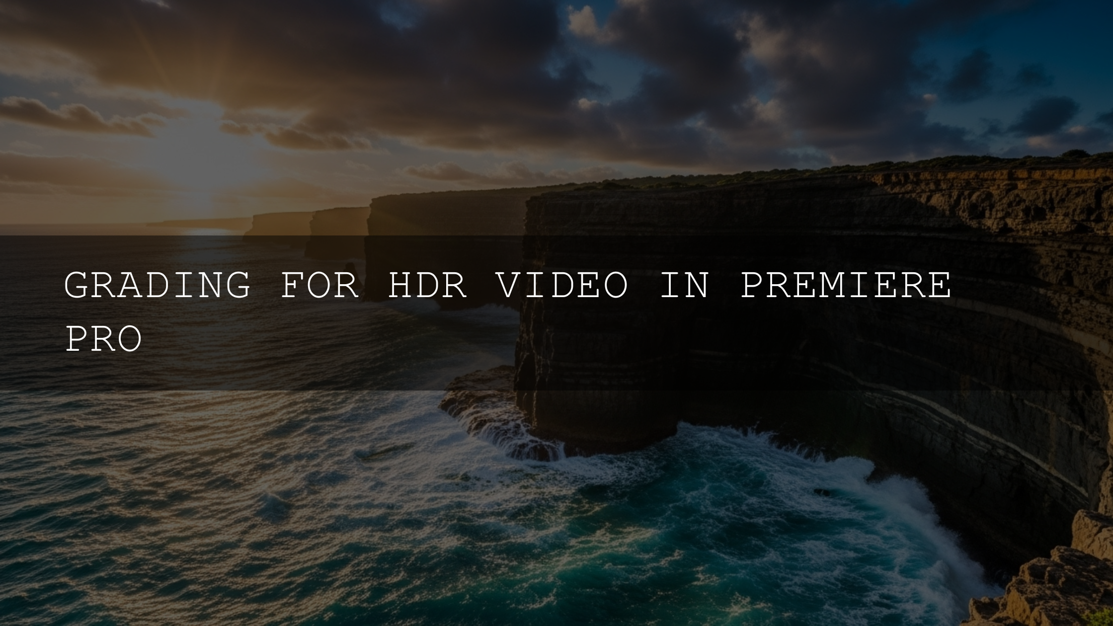
Premiere Pro and the Lumetri Color panel
If you edit in Premiere Pro, the Lumetri Color panel is your main control center. Adobe’s guides to the Lumetri Color panel for color grading and the Lumetri scopes for monitoring color show how to balance exposure, control color temperature, and read scopes accurately.
- In Color Wheels & Match, use the Shadows and Highlights wheels to introduce cool and warm tones separately.
- Use Curves > Hue vs Luma and Hue vs Hue to tweak specific colors in either bright or dark areas.
- Rely on Lumetri scopes (Waveform, Vectorscope, Parade) to keep your changes grounded in measurable reality, not just your monitor.
Lightroom, Camera Raw, and Photoshop for still images
For stills, Lightroom and Adobe Camera Raw give you split-toning-style control through tools like Color Grading, where you can separately tint shadows, midtones, and highlights. Photoshop adds extra precision with adjustment layers like Curves, Color Balance, and Selective Color.
For complex photo pipelines (especially when mixing CGI, different cameras, and HDR sources), some photographers and colorists take things further with color-managed workflows such as ACES, which is documented on the Academy’s official ACES page.
A practical, step-by-step workflow for highlight and shadow color separation
Let’s turn theory into a repeatable color grading workflow you can apply to your next project, regardless of software.
Step 1: Set a clean foundation (exposure and white balance)
Before you do anything creative, neutralize your image. Correct exposure, white balance, and contrast so you’re starting from a balanced frame. In Premiere Pro, this often means basic adjustments in the Lumetri Basic Correction section; in Resolve, you’ll use the primary wheels and curves.
- Ensure skin tones sit at believable brightness levels (watch your waveform around 55–75 IRE for typical midtones).
- Fix any obvious color casts so your creative tints don’t have to fight bad source color.
Step 2: Use scopes to understand your image
Scopes are your objective truth. Vectorscopes show how saturated and where your hues lean; waveforms show luminance; RGB parade reveals color imbalances.
- Check that your shadows aren’t crushed (unless you want that look).
- Make sure highlights retain enough detail to accept a color shift without clipping.
- Look at where skin tones fall on the vectorscope line—keep them close to the skin-tone line even after separation.
Step 3: Choose your color story
Now decide what your highlight–shadow relationship should be. Ask:
- Is this scene warm and nostalgic, or cool and tense?
- Do I want the environment to feel inviting, distant, or surreal?
- Should skin tones feel neutral, golden, or slightly stylized?
Typical pairings include:
- Warm highlights / cool shadows: Cinematic, versatile, works for travel, narrative, commercials.
- Cool highlights / warm shadows: Unsettling, stylized, often used in horror or sci-fi.
- Monochrome with tints: Subtle warm highlights and cool shadows inside a mostly desaturated look.
Step 4: Push highlight and shadow color separation
With your tonal ranges set, begin adding color separation:
- Highlights: Slightly nudge tint towards yellow, amber, or soft orange. Avoid oversaturating; subtlety goes a long way.
- Shadows: Gently push towards blue, teal, or a muted green. Watch that blacks stay rich and not washed-out cyan.
- Midtones: Keep them relatively neutral—or give them a gentle bias that bridges the two extremes.
When I graded a handheld city B-roll for vertical content, I pushed highlights slightly towards warm peach while cooling shadows just enough to make the streets feel cinematic but still believable. Tested side-by-side, the ungraded clip looked flat; with separation, the subject finally “popped” off the background.
Step 5: Protect skin tones and important details
Faces are where viewers connect emotionally, so they can’t look radioactive or sickly.
- Use secondary keys or masks to isolate skin tones and keep them closer to neutral or a gentle warmth.
- If your shadows push teal, consider pulling some of that teal back out of faces.
- Check hair, white clothing, and important brand colors so they remain accurate enough for the story or client.
Step 6: Refine and compare
Toggle nodes or adjustment layers on and off to compare your color-separated grade to the neutral base.
- Ask: “Did I enhance the mood, or did I just add color for the sake of it?”
- Reduce saturation or intensity if you feel the grade drawing more attention to itself than to the story.
- Check the grade on multiple devices and in different viewing conditions when possible.
Inspiring highlight/shadow palettes you can steal
If you’re stuck, here are some tried-and-true combos for highlight and shadow color separation.
- Classic teal & orange: Warm oranges and golds in highlights, deep teals in shadows. Great for travel films, vlogs, and narrative work.
- Moody blue & golden hour: Deep blues in shadows, soft golden highlights. Perfect for romantic scenes, coastal sunsets, and intimate documentaries.
- Vibrant green & magenta: Greens in shadows or backgrounds, magentas in highlights or accents. Ideal for stylized music videos and futuristic cyberpunk looks.
- Earthy brown & sky blue: Warm browns in highlights, clean blues in shadows. Works beautifully for outdoor adventures and nature stories.
- Subtle neutral tinting: Slightly warm highlights and slightly cool shadows inside an otherwise neutral grade. Great for corporate, lifestyle, and social content where you want polish without obvious stylization.
Presets and LUTs vs manual color separation
A common question is whether you should rely on LUTs/presets or build everything manually. The real power comes from combining both.
When presets and LUTs shine
- Speed: Drop a LUT or preset on footage to instantly get a starting point with baked-in separation.
- Consistency: Using the same preset family across a project ensures your highlight and shadow treatment stays coherent.
- Inspiration: Sometimes seeing how a LUT handles highlights and shadows gives you ideas for your own custom tweaks.
When manual grading is essential
- Matching different cameras: LUTs can help, but dialing in shadows and highlights by hand usually gives the cleanest match.
- Solving tricky lighting: Mixed color temperatures, flickering neon, or strange skin tones usually require careful manual work.
- Refining your style: Your signature look comes from the specific way you balance separation, not from a single LUT.
In practice, most filmmakers work in layers: technical transforms, then LUT/preset, then manual adjustments to highlights, shadows, and skin tones. You could, for example, use a cinematic pack like 700+ Cinematic Video LUTs as your creative base, then fine-tune the highlight and shadow color separation so it matches your project perfectly.
Real-world scenarios where highlight and shadow separation shines
1. Wedding receptions in low light
Wedding receptions often suffer from mixed lighting—DJ LEDs, tungsten bulbs, maybe some daylight bleeding in. A warm highlight / cool shadow split can make the couple and guests feel warmly lit while the background falls into a soft, cinematic coolness, hiding chaos and noise.
For deeper ideas on wedding and event grading, you might reference content like From Flat Footage to a Filmmaker-Quality Color Grading Workflow when planning your color pipeline.
2. Drone sunsets and golden hour landscapes
Drone footage at sunset is perfect for dramatic separation. Keep the sunlit clouds and horizon in warm oranges and golds while gently cooling the land or sea below. This adds scale and depth, and it also makes the sky feel more luminous by contrast.
3. Urban B-roll, TikToks, and Reels
Short-form content benefits a lot from bold but controlled color. You might push neon signs and highlights toward magenta or amber, while the concrete and deep shadows lean teal or indigo. Combined with snappy transitions and rhythmic cuts, strong highlight/shadow separation can instantly make your edits scroll-stopping.
When you’re building a full motion color toolkit for social content, you might plan to explore bundles like 300+ Music Video Color Grading LUTs and then pair them with more general cinematic packs via Video LUTs Collection to keep your style cohesive across platforms.
Keeping your workflow consistent across projects
The last piece of the puzzle is consistency. A beautiful look on one shot is great; a cohesive look across an entire project is what makes you feel like a real colorist.
- Save presets for your highlight and shadow settings: Whether it’s a LUT in Premiere Pro or a node tree in Resolve, save your favorite combos.
- Use color management: Consider standardized workflows (like Rec.709 or ACES) so your separation behaves predictably across cameras and displays.
- Create reference stills: Export a few favorite graded frames as reference and match new shots to those.
- Study your own work: Ask what you consistently gravitate towards—warm highlights? Cyan shadows? Subtle desaturation? That’s your style trying to speak.
If you’re building a long-term library of looks, you might eventually want a simple learning hub or FAQ, which is where resources like How to Install Presets and other support pages become useful for your audience and clients.
Related reading ideas from your blog ecosystem
When you expand your color knowledge, it helps to connect highlight/shadow separation with broader topics in your blog ecosystem, such as:
- Color Grading LOG Footage: From Flat to Cinematic
- Matching Sony and Canon Color for a Seamless Edit
- From Flat Footage to a Filmmaker-Quality Color Grading Workflow
- Premiere Pro vs DaVinci Resolve for Color Grading in 2025
Together, these topics give readers a full roadmap: shoot smart, manage color correctly, then use highlight and shadow color separation to give every project a unique, cinematic voice.
Bringing it all together
Highlight and shadow color separation is not just a stylistic trend—it’s a language. In 2025, powerful tools and color-managed workflows make it easier than ever to speak that language clearly. When you combine a clean technical base, deliberate color choices, and a little restraint, your work starts to feel like it belongs on the big screen, even if it’s being watched on a phone.
If you’re ready to experiment with these ideas on your own footage, this is a perfect moment to build a small “cinematic lab” of tools: mark bundles like 700+ Cinematic Video LUTs, all-rounders such as 1000+ Master Lightroom Presets, and broader packs inside Lightroom Presets Collection or Video LUTs Collection. With the Buy 3, Get 9 FREE offer, you can assemble a full highlight-and-shadow testing kit in a single order and start developing a signature look shot by shot.
How do I keep highlight and shadow separation consistent across a whole project?
Work from a structured node or adjustment-layer stack, use color management, and save your favorite grades as presets or LUTs. Then apply those saved setups across your timeline, making only small scene-specific tweaks to exposure and skin tones.
Is highlight and shadow color separation only for cinematic films?
No. While it’s popular in narrative and commercial work, subtle separation also improves vlogs, tutorials, corporate videos, and social content. The key is adjusting intensity: keep it soft for professional work and push it more for stylized, creative projects.
Can I get good results using only Premiere Pro’s Lumetri Color?
Yes. You can achieve excellent highlight and shadow color separation using the Color Wheels, Curves, and HSL Secondary tools in Lumetri. Combine them with Lumetri scopes to stay in control of exposure and saturation while you fine-tune your look.
How do I avoid ruining skin tones when separating highlights and shadows?
Use secondary selections or masks to isolate skin tones, then keep them closer to neutral or gently warm. If your shadows lean teal or blue, pull that cast out of faces while letting it live in the background and clothing.
Should I apply LUTs before or after doing highlight and shadow adjustments?
Most workflows apply technical transforms first, then creative LUTs or presets, and finally fine-tuning highlight/shadow separation and skin tones. This order keeps your main creative look intact while giving you control to adapt it to each shot.
Written by Asanka — creator of AAAPresets (10,000+ customers).

Leave a comment
This site is protected by hCaptcha and the hCaptcha Privacy Policy and Terms of Service apply.