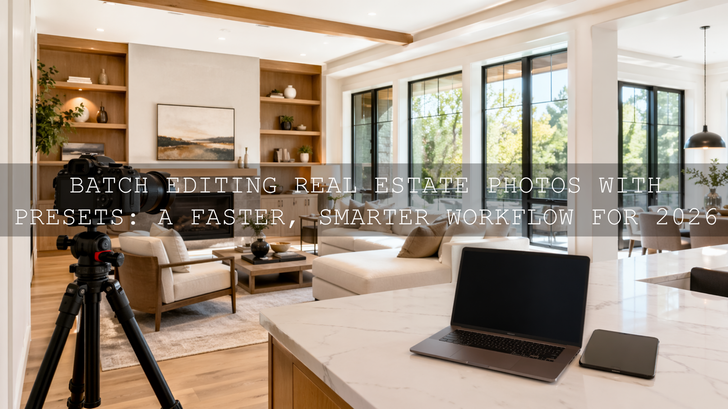
Batch Editing Real Estate Photos with Presets: A Faster, Smarter Workflow for 2026
Batch editing real estate photos with presets is one of the easiest ways to speed up delivery, stay consistent, and make listings look polished without spending hours on every single frame. If you work with real estate photography presets, batch editing in Lightroom, or interior design photo editing, the goal is simple: build a repeatable workflow that keeps rooms bright, colors believable, and the whole property presentation cohesive from first image to last.
That matters more than ever in 2026. Buyers, agents, Airbnb hosts, and interior designers all expect clean, professional visuals that feel inviting right away. A great preset does not replace your judgment. It gives you a strong starting point, so you can move faster and still keep control over exposure, white balance, perspective, and mood.
If you want a fast starting point for interiors, architectural details, and listing photos, try the AI-Optimized Interior Design & Real Estate Lightroom Presets and browse the full Lightroom Presets for Lightroom Mobile & Desktop collection. If you are building out a bigger toolkit, the Bundles collection is also worth exploring, especially when you want more variety across photo and video projects. And yes, you can keep it cost-effective with Buy 3, Get 9 FREE.
Why Batch Editing Matters So Much in Real Estate
Real estate shoots rarely happen in one perfect lighting condition. You may move from a sunlit exterior to a warm kitchen, then into a darker hallway, a reflective bathroom, and a bedroom with mixed window and lamp light. Editing every image from scratch can work on a tiny job, but once the gallery grows, it becomes slow, inconsistent, and mentally exhausting.
Batch editing solves that by letting you apply a strong base look to a group of similar images, then refine only what needs individual attention. That is the real advantage. You are not removing creativity. You are removing repeated manual work.
- It saves serious time. One clean preset applied across a room set can cut your editing time dramatically.
- It improves consistency. White walls, wood tones, and daylight balance stay more unified from image to image.
- It helps listings feel trustworthy. A gallery with a consistent tone feels more professional and better organized.
- It makes scaling easier. You can take on more shoots without editing becoming the bottleneck.
If you want a deeper look at why this matters specifically for property work, see Presets for Real Estate Photography: Bright, Clean & Professional and Real Estate & Architecture: How Color Grading Shapes Perception.
Presets vs Manual Editing
Let’s break it down honestly. This is not really a battle of presets vs manual editing. The best results usually come from using both together.
- Manual editing only: Maximum control, but slower and harder to keep perfectly consistent across a full property set.
- Presets only: Fast, but risky if you apply them blindly to images with different lighting or exposure issues.
- Preset + manual refinement: Usually the best option for real estate. You get speed first, then precision where it matters most.
That is the workflow I recommend most: apply a preset to create a clean visual base, then correct the details that make or break real estate photos, like window highlights, wall color casts, vertical lines, and shadow density.
Build a Real Estate Editing Toolkit That Actually Matches the Job
You do not need hundreds of random looks. You need a small set of reliable tools that cover bright interiors, clean exteriors, subtle architectural contrast, and polished video.
The most direct option for this niche is the AI-Optimized Interior Design & Real Estate Lightroom Presets. These are designed for the exact challenges that show up in property photography: tricky indoor lighting, architectural clarity, and color that feels elevated without looking fake.

If you want broader coverage for different property styles, weather, and side projects, the 1000+ Master Lightroom Presets Bundle gives you a much larger preset library. That can be helpful when one shoot needs clean commercial interiors, another needs warmer residential tones, and another needs stronger outdoor contrast.

For stylized exterior work, luxury developments, or urban-facing buildings where you want slightly deeper contrast and more cinematic atmosphere, the AI-Optimized Street Cinematic Lightroom Presets can work as a secondary creative option. I would use them carefully, mostly for hero shots or branding content rather than the whole listing set.

And for video walkthroughs, drone clips, and listing reels, the Real Estate LUTs Pack is the natural match. It helps keep footage bright, balanced, and more cinematic without forcing a heavy grade.

How to Batch Edit Real Estate Photos in Lightroom
Here is a workflow that keeps things fast but still leaves room for quality control.
- Import and sort by scene type. Group your photos into interiors, exteriors, detail shots, twilight images, and drone frames. Adobe’s guide to working with photo collections in Lightroom Classic is useful here because organized batches make syncing much easier.
- Choose a representative frame. Pick one image from each group that reflects the average lighting of that set. Do not start with the easiest or hardest frame. Start with the most typical one.
- Apply a preset as your base. Use a clean real estate preset first. Adobe’s official guide to applying presets in Lightroom is a good reference if you want to standardize the process across desktop or mobile.
- Sync the settings across similar frames. Once the first image looks right, sync those edits to the rest of the matching batch. Keep in mind that interiors with mixed lighting may need their own separate group rather than sharing one sync across the whole property.
- Fix the technical issues next. Straighten verticals, correct distortion, refine white balance, and make sure window detail is not blown out. This is where real estate editing becomes professional instead of generic.
- Use local adjustments instead of global overcorrection. If one corner is too dark or a window is too bright, mask only that area. Adobe’s guide to the Masking tool in Lightroom Classic is especially helpful for this step.
- Review the whole gallery before exporting. Look at the set as a sequence, not just as single images. The gallery should feel consistent from room to room.
One of the biggest mistakes I see is applying a preset, syncing everything, and exporting too fast. That may save time today, but it usually costs trust later. A buyer may not understand exactly why a gallery feels off, but they notice when the kitchen is warm orange, the hallway is green, and the bedroom suddenly turns cool blue.
The Real Secret: Create a Neutral Base Before You Push Style
This is where many editors get stuck. They try to use the preset to solve everything at once. In real estate, that often backfires. If your white balance is off or your dynamic range is not controlled, even a strong preset will exaggerate the problem.
Start by getting the room believable. Then style it. That usually means:
- Correcting white balance before judging color.
- Lowering highlights so windows keep detail.
- Lifting shadows enough to reveal furniture and room shape without making the image flat.
- Keeping whites neutral so walls and cabinets do not shift yellow, green, or blue.
- Watching wood tones closely so floors and furniture stay natural.
I have tested this kind of workflow on mixed-light interior scenes where daylight from a window and warm practical lamps were fighting each other in the same frame. The fastest results always came from using a clean preset first, then making small mask-based corrections rather than trying to force everything with global sliders. On property sets, I also prefer to sync the preset only after I know the base white balance is in the right neighborhood, because that keeps the whole gallery more believable.
If indoor color is giving you trouble, these guides can help: Why Do My Presets Look So Bad Indoors? and Master Presets for Mixed Indoor & Window Lighting.
Use Color Carefully in Real Estate Work
In portrait or street photography, dramatic color can be part of the style. In real estate, color needs more restraint. Buyers want spaces to feel attractive, but they also want them to feel real. Overly orange interiors, blue shadows, or hyper-saturated greens outside can make a property feel misleading.
That is why clean color harmony matters. If you want a better feel for balancing warm and cool tones in a scene, Adobe’s Color Wheel and color harmony tools are a useful reference. You do not need to make every room neutral and boring. You just want the tones to feel controlled and intentional.
A good example is a living room with beige walls, wood flooring, and window light. The best edit usually is not the warmest version or the coolest version. It is the version where the room feels bright, breathable, and accurate enough that the viewer can imagine being there.
Do Not Ignore the Video Side of the Listing
Real estate marketing is no longer just still images. Short walkthroughs, vertical reels, cinematic teasers, and drone clips are part of the package now. That is where LUTs become valuable.
The Real Estate LUTs Pack gives you a faster way to keep property footage consistent across rooms and camera angles. Use LUTs the same way you use presets: not as the whole job, but as a reliable starting point. Normalize exposure and white balance first, then apply the LUT, then refine. If you want more workflow ideas for footage, read The Ultimate Guide to Grading for Real Estate, Travel, and Landscape Projects.
Simple Pro Tips That Improve Results Fast
- Use one preset family per property. Mixing too many unrelated looks makes a listing feel disconnected.
- Keep vertical lines clean. Architecture looks more premium when walls and frames feel stable and straight.
- Do not over-whiten everything. Real estate should feel bright, not sterile.
- Protect window detail when possible. Blown windows can make a room feel lower quality, even when the interior looks bright.
- Check the full gallery at the end. A strong single image is good. A coherent gallery is what actually sells the space.
Related Reading
- Presets for Real Estate Photography: Bright, Clean & Professional
- Real Estate & Architecture: How Color Grading Shapes Perception
- Indoor Preset Fixes: How to Improve Your Photos in Artificial Light
- Master Presets for Mixed Indoor & Window Lighting in 2026
- The Ultimate Guide to Grading for Real Estate, Travel, and Landscape Projects
Make the Workflow Easier, Not Heavier
Real estate editing should help you present a property clearly, quickly, and beautifully. That is the advantage of batch editing real estate photos with presets: you spend less time repeating the same corrections and more time polishing the details that actually matter. If you want a reliable place to start, use the AI-Optimized Interior Design & Real Estate Lightroom Presets for clean interiors, add the Real Estate LUTs Pack for listing videos, and keep the 1000+ Master Lightroom Presets Bundle nearby when you need more range. You can also browse the Lightroom Presets for Lightroom Mobile & Desktop collection or reach out through the contact page if you want help choosing the right pack for your workflow.
What is the best way to batch edit real estate photos in Lightroom?
The best approach is to group similar images, apply one strong preset to a representative frame, sync those settings across the batch, and then refine white balance, highlights, shadows, and perspective on individual images where needed.
Do presets work well for interior real estate photography?
Yes, especially when you use presets built for interiors and architecture. They are most effective when you start with a reasonable exposure and then fine-tune mixed lighting, window detail, and color casts after applying the preset.
Should I use the same preset on every room in the property?
Usually not. Use the same preset family for consistency, but create separate batches for rooms with different lighting conditions. A kitchen with warm bulbs and a bright bedroom with window light often need slightly different treatment.
Are LUTs useful for real estate videos?
Yes. LUTs can speed up the color workflow for walkthroughs, drone clips, and reels. The key is to correct exposure and white balance first, then apply the LUT as a starting point and refine from there.
Can batch editing still look professional, or does it feel too automated?
It looks professional when you treat presets as a base rather than a final answer. The speed comes from syncing the broad look, while the quality comes from your final refinements on the images that need extra attention.
Written by Asanka — creator of AAAPresets (10,000+ customers).

Leave a comment
This site is protected by hCaptcha and the hCaptcha Privacy Policy and Terms of Service apply.