How to Edit Dark and Moody Food Photography Without Losing Texture
Dark and moody food photography is one of the most powerful ways to make a dish feel rich, dramatic, premium, and full of story. But there is one big challenge: if you darken the image too much, the food can lose its texture. Crispy crusts become flat, chocolate loses its shine, bread crumbs disappear, and sauces can start looking heavy instead of appetizing.
Here’s why this matters. A moody food photo should feel deep and emotional, but it should still make people hungry. The goal is not simply to make the image darker. The real goal is to guide the viewer’s eye with shadow, protect the highlights, keep the food colors believable, and preserve all the small details that make the dish feel real.
If you want a faster starting point for this style, begin with AI-Optimized Food Lightroom Presets and browse the full Food Photography Lightroom Presets collection. You can build a consistent editing toolkit for restaurants, cafés, food bloggers, and product-style food images with the Buy 3, Get 9 FREE offer.
Why the Dark and Moody Food Photography Style Works So Well
The dark and moody aesthetic works because it creates focus. Instead of lighting every part of the frame equally, this style uses shadow to remove distractions and bring attention to the most important part of the food. A slice of cake, a glossy sauce, a warm bowl of soup, or a rustic loaf of bread can feel more intentional when the background falls into soft darkness.
This style is especially useful for dishes that already have depth, warmth, and richness. Think about grilled meat, chocolate desserts, coffee, pasta, baked goods, autumn dishes, handmade bread, wine-pairing meals, and fine-dining plates. These subjects often look stronger when the edit has controlled contrast, deep tones, and a carefully shaped highlight.
But dark and moody food photo editing needs balance. If the image becomes too dark, it can look heavy. If the colors become too desaturated, the food can look old or cold. If clarity is pushed too far, the image can look harsh and crunchy. The best result sits between atmosphere and appetite.
For more color-focused food storytelling ideas, you can also read Food Photography: Telling a Culinary Story Through Color, which connects editing choices with mood, brand feeling, and visual appetite.
Start With Better Light Before You Edit
A strong dark and moody edit starts before Lightroom. If the original photo has flat light, weak direction, or messy highlights, editing becomes much harder. The best moody food images usually begin with directional light from the side or slightly behind the food.
Side light is powerful because it reveals texture. It creates small highlights across crumbs, seeds, sauces, grilled edges, frosting, steam, and glossy surfaces. Back-side light can also work beautifully because it creates separation between the food and the background.
When I test dark food edits, I usually look at the highlights first, not the shadows. If the food has a clean highlight on the most appetizing texture, I know the final image can become moody without becoming flat.
Simple lighting setup for moody food photos
- Use one main light source: Window light or a single softbox works better than several uncontrolled lights.
- Place the light to the side: Side lighting helps reveal texture and shape.
- Use a black card or dark surface: This reduces bounced light and deepens the shadows naturally.
- Keep the background simple: Dark wood, stone, linen, matte plates, and muted props work well.
- Protect the food highlight: The viewer should still see the most delicious part of the dish clearly.
Lighting does not need to be complicated. A small table near a window, a dark board on one side, and a simple reflector you can move closer or farther away can already create a professional moody look.
Presets vs Manual Editing for Moody Food Photos
Both presets and manual editing can create beautiful dark and moody food photography, but they serve different purposes.
Presets are best when you want a fast, consistent starting point. They can help you shape tone, contrast, warmth, and color direction quickly. This is useful when editing a restaurant menu, a café campaign, a food blog series, or multiple images from the same shoot.
Manual editing is best when the image needs precise repair or detailed control. For example, if the shadows are too heavy on one side of a cake, or the sauce needs more shine, manual masking gives you better control.
The strongest workflow often uses both. Apply a preset first, then refine exposure, shadows, texture, masking, sharpening, and color. That way, the preset gives you the mood, and your manual adjustments protect the food.
A good preset should save time, not replace your eye. Always adjust the edit based on the actual food, light, plate color, and background.
For clean, realistic food edits that can be pushed into a darker look, Food Photography Presets For Lightroom are a strong base. For richer color and stronger detail, Vibrant Lightroom Presets for Food Photography can work well when you reduce the brightness and shape the shadows more carefully.
Step-by-Step Lightroom Workflow for Dark and Moody Food Editing
This workflow works for Lightroom desktop, Lightroom Mobile, and Adobe Camera Raw with small interface differences. The exact settings will change from image to image, but the order matters.
1. Correct exposure before adding drama
Start with exposure, highlights, shadows, whites, and blacks. Do not immediately drag everything dark. First, make the food visible and natural. Then gradually build the mood.
- Lower exposure slightly if the whole image feels too bright.
- Reduce highlights to protect glossy areas, plates, sauces, and reflective props.
- Lift shadows a little if important texture disappears.
- Lower blacks carefully to add depth.
- Keep whites controlled so the image does not feel harsh.
A helpful technique is to darken the surroundings more than the food. That keeps the image moody while preserving appetite. This is where masking becomes important. Adobe’s guide to masking in Lightroom explains how masks, brushes, gradients, and range selections can help you edit specific areas instead of changing the whole photo at once.
2. Build contrast without crushing the blacks
Dark and moody food photos need contrast, but too much contrast can destroy texture. The common mistake is pushing the blacks too far until the shadows become pure black. That can make the image look dramatic, but it also removes detail from bread, meat, chocolate, coffee, or dark plates.
Use contrast in layers. A small global contrast adjustment is fine, but let the tone curve do the more refined work. A soft S-curve can deepen shadows and lift highlights while keeping midtone texture alive.
Pay special attention to midtones. Most food texture lives in the midtones, not the extreme highlights or deepest shadows. If the midtones become too compressed, the food starts looking flat.
3. Use Texture and Clarity carefully
Texture and Clarity can help bring back detail, but they are easy to overuse. Adobe describes Texture as a way to adjust image detail and Clarity as a tool that increases local contrast and adds depth, while warning that too much Clarity can create unwanted halos. You can learn more in Adobe’s Lightroom edit panel guide for Texture, Clarity, Dehaze, and Vignette.
For food photography, Texture is often safer than heavy Clarity. Texture can improve the appearance of crumbs, pastry layers, herbs, grilled edges, and chocolate dust without making the whole image look too sharp.
- Use Texture for fine detail: Bread crusts, flaky pastry, seeds, toppings, herbs, and crispy edges.
- Use Clarity for structure: Rustic plates, wooden tables, grilled surfaces, and stronger midtone contrast.
- Avoid overdoing both: Too much can make food look dry, rough, or artificial.
I tested this type of workflow on darker café-style food images, and the best result usually came from a small Texture boost with very controlled Clarity. The image still felt detailed, but the food did not look harsh.
4. Use masks to protect the hero food
Masking is one of the most important steps in moody food photo editing. Instead of brightening the entire photo, create a soft mask over the main dish and lift only the areas that need attention.
For example, if you are editing a burger, you may want the bun texture, cheese edge, and sauce highlight to stay visible while the background becomes darker. If you are editing cake, you may want to lift the frosting texture and keep the plate darker.
Try this simple masking approach:
- Create a soft brush mask over the most appetizing part of the food.
- Slightly raise exposure or shadows.
- Add a small amount of Texture.
- Reduce highlights if the shine becomes too strong.
- Feather the mask so the adjustment blends naturally.
This technique keeps the image cinematic without hiding the details that make the food look fresh.
5. Shape color for appetite and mood
Dark and moody food photography often uses warm browns, deep oranges, muted greens, soft golds, charcoal tones, and rich reds. But the color should still fit the food. A tomato-based pasta should not become too brown. A green salad should not look dull. A chocolate dessert should keep its richness without turning muddy.
Use HSL and Color Mixer adjustments carefully. Instead of reducing saturation across the whole image, adjust individual colors. You can lower distracting background colors while keeping the food color alive.
Adobe Color can also help you think through mood and harmony. The Adobe Color wheel for color harmony is useful when choosing warm, complementary, analogous, or muted palettes for food styling and editing.
How to Keep Texture in Moody Food Photos
Texture is what makes food believable. A viewer cannot taste the dish, so texture becomes one of the strongest visual signals. Crispy, creamy, soft, juicy, flaky, glossy, and smoky all need different editing choices.
Protect the highlight texture
Food texture is often revealed by small highlights. A glossy sauce, oil shine, chocolate glaze, or toasted edge needs a little light to look real. If you pull highlights too far down, the food can become dull. If you leave highlights too strong, the image can look blown out. Aim for controlled highlights, not removed highlights.
Do not over-smooth noise
Dark photos often show more noise, especially if shot at high ISO. Noise reduction can help, but too much noise reduction smooths texture. Use it carefully. It is better to keep a little natural grain than to make the food look plastic.
Sharpen only where needed
Sharpening should support the food, not the entire frame. Backgrounds, shadows, and smooth plates usually do not need strong sharpening. The food edges, toppings, crusts, herbs, and garnish details need more attention.
Adobe’s Lightroom editing documentation notes that sharpening Detail affects high-frequency information, while Masking can restrict sharpening closer to stronger edges. That is useful for food because you can sharpen the real texture without exaggerating noise in the shadows. You can read more in Adobe’s Lightroom photo editing and sharpening guide.
Best Types of Food for Dark and Moody Editing
Not every dish needs a dark and moody edit. Some food looks better bright, clean, and fresh. But many dishes become more emotional and premium with deeper tones.
- Baked goods: Bread, croissants, pies, cookies, and pastries show texture beautifully in side light.
- Desserts: Chocolate cake, brownies, caramel, tiramisu, and cheesecake work well with deep shadows.
- Comfort food: Pasta, stews, soups, roasted dishes, and grilled meals feel warmer and richer.
- Café scenes: Coffee, tea, breakfast plates, notebooks, and warm table setups suit moody lifestyle branding.
- Fine-dining plates: Darker tones can create a premium restaurant atmosphere.
For warm seasonal inspiration, see Warm Autumn Food Photography in Lightroom. Autumn food, rustic props, and warm color palettes are a natural match for moody editing.
Common Mistakes That Make Moody Food Photos Look Flat
The dark and moody style can quickly go wrong if the edit becomes too heavy. These are the most common mistakes to avoid.
- Crushing the blacks: Deep shadows are beautiful, but pure black areas can remove important detail.
- Overusing Clarity: Too much midtone contrast can create halos and make food look dry.
- Desaturating everything: Moody does not mean lifeless. Keep enough color for appetite.
- Ignoring white balance: Food can look cold, green, or muddy if the temperature is wrong.
- Using a strong vignette: A subtle vignette is helpful, but a heavy dark border can look unnatural.
- Editing the background and food the same way: The food usually needs more detail and brightness than the surrounding scene.
If your food starts looking dull, zoom out and ask one simple question: would this image still make someone want to eat the dish? If the answer is no, bring back some warmth, texture, or highlight detail.
Using Food Photography Presets as a Professional Starting Point
Presets can speed up your workflow, especially when you need consistency across a set of images. For food creators, restaurants, bloggers, and product photographers, this consistency is important because every photo contributes to the brand’s visual identity.
The AI-Optimized Food Lightroom Presets are a strong choice when you want a polished starting point for food color, tone, and detail. If you shoot outdoor markets, street food, or more energetic food scenes, AI-Optimized Street Food Photography Lightroom Presets can give you a bolder base that you can later deepen into a moodier style.
For a wider editing workflow, explore Lightroom Presets for Moody Photography. These can help you build deeper tones, stronger shadow atmosphere, and a more cinematic food editing style while still giving you room to adjust each image manually.
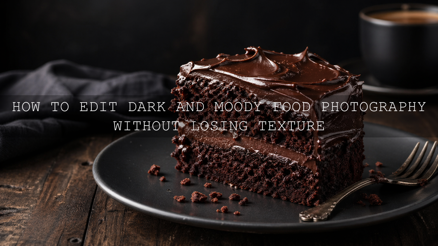
A Practical Before-and-After Editing Example
Imagine a photo of a chocolate cake on a dark wooden table. The original image is slightly bright, the background is distracting, and the frosting has good detail but not enough depth.
Here is how I would edit it:
- Apply a food photography preset to create a balanced starting point.
- Lower exposure slightly to create mood.
- Reduce highlights to protect the frosting shine.
- Lower blacks carefully to deepen the wooden table and background.
- Add a soft mask over the cake and lift exposure slightly.
- Add a small Texture boost to the cake surface and crumb details.
- Warm the image slightly so the chocolate feels rich, not gray.
- Add a subtle vignette to guide the eye back to the cake.
The final image should feel darker and more premium, but the cake should still look soft, rich, glossy, and edible. That is the real test of successful moody food editing.
Related Reading
- How to Edit Food Photos to Look Fresh, Tasty, and Real
- Food Photography and Color Storytelling
- Warm vs Cool Tones for Better Photo Storytelling
- Lightroom Presets vs Photoshop Actions
Final Tips for Better Dark and Moody Food Photography
Dark and moody food photography is not about hiding the food in shadows. It is about controlling attention. The shadows create atmosphere, but the texture creates appetite. When both work together, the image feels cinematic, premium, and emotionally engaging.
Before finishing your edit, zoom in and check the important details. Does the bread still look crisp? Does the sauce still have shine? Does the chocolate still feel rich? Does the garnish still look fresh? If the answer is yes, your moody edit is working.
For faster, more consistent edits, start with AI-Optimized Food Lightroom Presets, refine your shadows and texture manually, and continue exploring the Food Photography Lightroom Presets collection. Try these presets today — Buy 3, Get 9 FREE — and create food photos that feel rich, detailed, and ready for restaurants, blogs, menus, and social media.
FAQ
How do I make food photos look dark and moody without losing detail?
Use directional light, lower exposure gradually, protect the highlights, and use masks to brighten only the main food. Add Texture carefully and avoid crushing the blacks too far.
Are Lightroom presets good for dark and moody food photography?
Yes. Presets are useful as a starting point because they quickly shape tone, color, and contrast. For the best result, apply a preset first, then adjust exposure, masking, texture, and color for each image.
What Lightroom settings help preserve food texture?
Texture, careful sharpening, controlled Clarity, and local masks help preserve food texture. Avoid heavy noise reduction and avoid pushing blacks so far that small details disappear.
Should food photography be warm or cool for a moody look?
Most moody food photos work better with controlled warmth because warm tones often feel more appetizing. Cool tones can work for drinks, seafood, or luxury styling, but they should not make the food look dull or unnatural.
What foods look best with dark and moody editing?
Baked goods, chocolate desserts, coffee, grilled food, pasta, stews, roasted dishes, and fine-dining plates often work beautifully with dark and moody editing because they already have rich texture and depth.
Suggested Image Alt Texts
- Dark and moody food photography edit with rich shadows and visible texture
- Moody Lightroom food photo editing showing crispy bread texture and warm tones
- Dark restaurant food photography with controlled highlights and cinematic color
- Food photography presets for Lightroom used on a moody dessert image
- Close-up moody food photo with preserved sauce shine and detailed texture
Written by Asanka — creator of AAAPresets (10,000+ customers).


Leave a comment
This site is protected by hCaptcha and the hCaptcha Privacy Policy and Terms of Service apply.