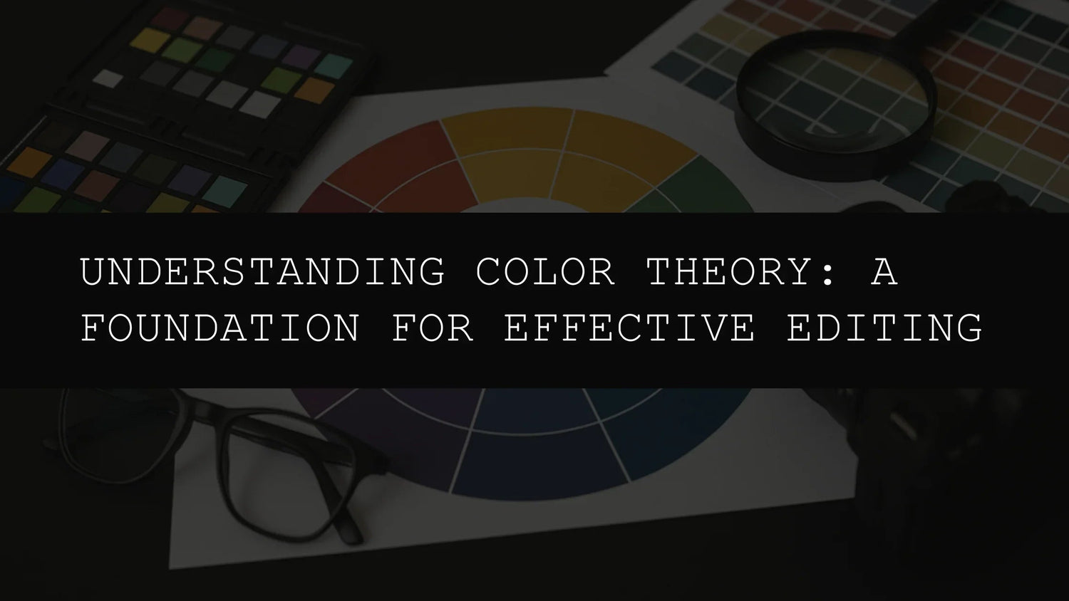
Understanding Color Theory: A Foundation for Effective Editing
In the realm of photo and video editing, a deep understanding of color theory isn't merely beneficial—it's fundamental. It's the unseen architect shaping the visual impact of your work, the subtle force guiding the viewer's eye and evoking specific emotions. Whether you're a seasoned professional aiming to refine your skills or a newcomer eager to master the art of visual storytelling, mastering color theory will significantly elevate your editing prowess, transforming ordinary images into captivating narratives. This goes beyond simply making your images "look good"; it's about communicating effectively through the visual language of color, creating mood, guiding focus, and telling stories with nuance and impact.
This in-depth exploration delves into the core principles of color theory, demonstrating how you can practically apply this knowledge to create effective and emotionally resonant edits. We'll explore the color wheel in detail, delve into various harmonious and contrasting color schemes, and show how our range of AI-Optimized Lightroom presets can simplify and enhance your workflow, providing you with powerful tools to effortlessly execute your creative vision.
The Color Wheel: A Deeper Dive into Chromatic Relationships
At the heart of color theory lies the color wheel, a visual map illustrating the complex relationships between different colors. Understanding this tool is not merely helpful; it's essential for creating visually balanced and aesthetically pleasing images, and for ensuring your editing choices contribute to the overall impact and narrative of your work. The color wheel is traditionally divided into primary, secondary, and tertiary colors, each playing a unique role in the overall composition and each contributing its own emotional weight to the final image.
Primary Colors: These foundational hues—red, yellow, and blue—cannot be created by mixing other colors. They are the building blocks of all other colors, the fundamental elements from which the entire spectrum is derived. Understanding their individual properties—red's intensity, yellow's warmth, and blue's coolness—is crucial for grasping how they interact and influence each other.
Secondary Colors: Mixing two primary colors creates secondary colors. Green (blue + yellow), orange (red + yellow), and purple (red + blue) are the secondary hues. They lie between the primary colors on the color wheel, enriching the visual palette with more complex and nuanced tones. The secondary colors often inherit properties of their parent primaries, adding layers of depth and complexity to the color relationships.
Tertiary Colors: These are formed by blending a primary and a secondary color, resulting in a broader spectrum of shades and tints. Red-orange, yellow-orange, yellow-green, blue-green, blue-violet, and red-violet are examples of tertiary colors, offering nuanced options for your editing process and allowing for a more finely tuned control over the emotional impact of your final product. They often represent a subtle shift in tone or mood, bridging the gap between the primary and secondary colors.
Warm vs. Cool Colors: Beyond the basic divisions, colors also fall under the broader categories of warm and cool tones. Warm colors (reds, oranges, and yellows) typically evoke feelings of energy, warmth, excitement, and even aggression. They tend to advance in an image, appearing closer to the viewer, creating a sense of immediacy and engagement. Cool colors (blues, greens, and purples), on the other hand, are often associated with calmness, serenity, melancholy, and even detachment. They tend to recede, creating a sense of depth and spaciousness.
Harmonious Color Schemes: Building Visual Unity and Balance
Harmonious color schemes create a sense of visual unity and balance, contributing to a more aesthetically pleasing and emotionally resonant overall effect. These schemes typically employ colors that lie close together on the color wheel, creating a pleasing and cohesive effect. The selection of a harmonious scheme is often dictated by the mood and message you wish to convey.
- Analogous Colors: These are colors located next to each other on the color wheel. They often create a smooth, gentle transition, perfect for evoking feelings of calm, tranquility, and natural harmony. The AI-Optimized Cherry Blossom Tones Lightroom Presets offer a beautiful example of this, featuring a soft, pastel palette ideal for capturing the delicate beauty of spring and evoking a sense of serenity and peace.

- Monochromatic Colors: Using variations of a single color—different shades, tints, and tones—creates a sophisticated and elegant look. This scheme is excellent for creating a sense of focus and consistency, highlighting a particular subject or mood without distracting the viewer with conflicting colors. It's a great choice for conveying a single strong emotion or emphasizing a specific detail.
- Triadic Colors: This scheme utilizes three colors evenly spaced on the color wheel, creating a vibrant and visually interesting palette without being overly jarring. It offers a broader range of color options while maintaining a sense of visual unity, making it ideal for creating lively and dynamic compositions. The balanced distribution of colors creates a sense of visual harmony, preventing any single color from overpowering the others.
High-Contrast Schemes: Injecting Visual Drama and Tension
In contrast to the harmonious palettes, high-contrast schemes create a more dramatic and visually striking effect. These schemes often employ colors that are directly opposite each other on the color wheel (complementary colors). This juxtaposition of colors draws the viewer's attention, creating dynamic tension, energy, and visual excitement. The impact of contrast can be used strategically to emphasize specific elements, highlight focal points, or create a sense of movement and dynamism.
For example, the AI-Optimized Dark Aesthetic Lightroom Presets are masters of contrast. These presets are designed to enhance dark tones, creating dramatic edits with deep contrasts and muted tones, perfect for enhancing mood and atmosphere, evoking feelings of mystery, intrigue, or even suspense. The use of deep shadows and contrasting highlights adds depth and visual interest to the photographs.

The strategic use of contrast can significantly amplify the impact of your images, drawing attention to key elements and creating a more powerful visual narrative. The careful balance of light and dark, warm and cool, can transform an ordinary image into a compelling piece of visual storytelling.
Advanced Color Theory Concepts
Beyond the basics of the color wheel and harmonious/contrasting schemes, several other concepts significantly impact the effectiveness of your edits. These include:
- Hue: This refers to the pure color itself, such as red, blue, or green, without any added tints or shades.
- Saturation: This describes the intensity or purity of a color. High saturation results in vibrant, bold colors, while low saturation produces muted, pastel tones.
- Value (Brightness): This refers to the lightness or darkness of a color. Light values create a brighter, airy feel, while dark values add drama and depth.
- Temperature: This describes the relative warmth or coolness of a color. Warm colors generally have a yellowish tint, while cool colors lean toward blue or green.
Mastering these concepts allows for a more nuanced and sophisticated approach to color editing, enabling you to fine-tune the emotional impact of your images with precision and control.
Leveraging AI-Optimized Lightroom Presets for Effortless Color Mastery
Our range of AI-Optimized Lightroom presets simplifies the application of color theory, providing professional-grade editing tools that are both powerful and accessible. These presets are designed to streamline your workflow, allowing you to achieve stunning results with minimal effort while still maintaining complete creative control. Here's how some of them can aid in enhancing your images based on color principles:
- AI-Optimized Bike Influencer Lightroom Presets: These presets are optimized to boost contrast and sharpness, ideal for creating bold and striking images that capture the energy and detail of bike adventures. They effectively utilize contrasting colors to highlight the subject matter while maintaining a visually appealing balance. The presets are carefully designed to enhance warm and cool tones found in outdoor settings, adding depth and visual interest.

- AI-Optimized Dark Skin Tones Lightroom Presets: Designed to enhance and balance rich, deep skin tones, these presets help create natural-looking images that honor the beauty of diverse complexions. The careful attention to color grading ensures a harmonious blend of tones and shadows, maintaining a realistic and flattering portrayal of the subject.

- AI-Optimized Night Photography Lightroom Presets: These presets are specifically designed to enhance low-light images, balancing exposure and reducing noise while simultaneously enhancing the dramatic contrast between light and shadow inherent in nighttime photography. They skillfully manage the limited color palette often found in nighttime scenes, accentuating the interplay of light sources and creating visually arresting images. The presets are optimized to preserve detail in both highlights and shadows, producing striking results.

By understanding and applying the principles of color theory, and by utilizing the power of our AI-Optimized Lightroom presets, you can significantly enhance your editing process. Experiment, refine your technique, and create images that are not only technically proficient but also emotionally resonant and visually stunning. The journey of mastering color theory is a continuous one, filled with creative exploration, refinement, and the ever-evolving pursuit of visual excellence.

Leave a comment
This site is protected by hCaptcha and the hCaptcha Privacy Policy and Terms of Service apply.