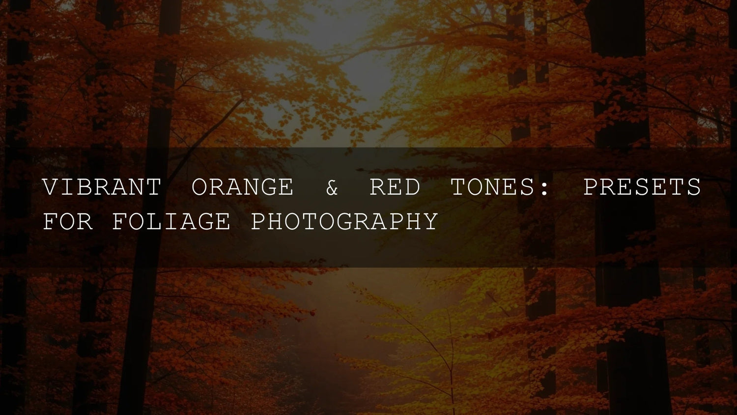
Autumn Lightroom Presets: Make Fall Foliage Pop (Without Losing Detail)
Autumn’s warm reds, oranges, and deep browns are gorgeous—and tricky. Autumn Lightroom presets help you shape color and contrast fast while protecting skin tones, skies, and texture. Below you’ll find a practical workflow, side-by-side comparisons of presets vs manual editing, and four proven looks—golden hour, matte film, vibrant leaves, and cinematic fall—so your fall foliage Lightroom presets deliver consistent, natural results.
If you want a ready toolkit, start with the AI-Optimized Golden Fall Forest Lightroom Presets and browse Lightroom Presets Collection. Try a few today — Buy 3, Get 9 FREE.
Why Autumn Color Is Hard (and How Presets Help)
Fall scenes mix saturated leaves, cool blue shadows, and skin under warm light. Push global saturation and you’ll crush reds, turn oranges neon, and shift skin to carrot-tone. A well-built preset gives you a balanced starting point—sensible HSL, gentle S-curve, controlled color grading—so you edit faster and avoid artifacts.
- Precision where it matters: Use selective tools to keep leaves rich without nuking neutrals—see Adobe’s guide to masking in Lightroom Classic for Subject/Sky/People/Landscape masks.
- Color harmony on purpose: Build palettes around complementary and split-complementary schemes using Adobe Color harmony rules.
- Consistent RAW handling: Cross-app edits rely on Camera Raw. Learn how Lightroom and ACR align in Adobe’s Color Grading overview.
Presets vs Manual Editing
- Presets are your calibrated baseline: repeatable, fast, and great for series (travel sets, client galleries). Tweak exposure/WB/contrast per image.
- Manual editing is surgical: perfect for edge cases (mixed light, heavy haze, bright wardrobe color casts).
- Best practice: Apply a preset you trust → correct WB/exposure → refine with Masks (People for faces, Sky for haze, Background for noise) → HSL micro-tuning on oranges/reds.
A Fast, Repeatable Fall Workflow
- Shoot for the grade: Expose to preserve highlight detail in leaves and clouds; underexpose slightly if the scene is contrasty.
- Set white balance first: Use a neutral point (road, stone, white mug). If uncertain, warm by +300–800K; balance with Tint.
- Apply your base: Use Golden Fall Forest or Matte Autumn Film as a one-click baseline.
- Mask intelligently: Subject/People for faces (add micro-contrast; protect skin saturation). Sky for dehaze. Landscape mask for foliage and ground. See Masking in Lightroom (Cloud).
- HSL finesse: Pull orange saturation back a touch, bump orange luminance for glow, and nudge red hue toward orange to avoid magenta leaves.
- Color grade wheels: Warm midtones, slightly teal/cool shadows, subtle golden highlights (keep it under 10–15).
- Finish: Add 5–15 grain for texture; apply a soft S-curve. Export with consistent sharpening.
Need install help? See How to Install Lightroom Presets (DNG & XMP).
Four Looks That Work in Autumn
1) Golden Hour Glow
For sun-kissed trails and backlit portraits. The AI-Optimized Golden Fall Forest Lightroom Presets warm midtones, deepen warm shadows, and preserve highlight roll-off so foliage glows without clipping skies. I tested this set on an outdoor couple session; faces stayed neutral while the leaves lit up with a gentle amber bias—no orange skin.

- Where it shines: Forest paths, park portraits, golden-hour city shots.
- Quick tweak: If jackets are too warm, mask clothing and reduce Orange Saturation −5 to −10.
2) Matte & Film Texture
Classic, timeless autumn with soft highlights and a subtle matte floor. Use AI-Optimized Matte Autumn Film Lightroom Presets to flatten contrast just enough for a print-like feel. I ran these on a lifestyle coffee-shop set: wood grain held detail, skin looked creamy, and reds leaned tasteful rather than neon.

- Where it shines: Cozy interiors, fashion, overcast parks.
- Quick tweak: Lift Blacks +2–5 for velvet shadows; keep Clarity modest to avoid waxy skin.
3) Vibrant Leaves That Pop
When the scene calls for punch, the Autumn Fall Vibrant Lightroom Presets amplify reds/oranges while protecting neutrals. Start bold, then dial intensity back to taste.

- Where it shines: Mountain vistas, leaf-covered paths, editorial travel shots.
- Quick tweak: If reds clip, reduce Red Saturation −5 and raise Red Luminance +5.
4) Cinematic Fall
For moody storytelling, the Cinematic Autumn Fall Lightroom Presets add filmic contrast and color separation for depth that reads well on social and prints.

- Where it shines: Lakes, foggy mornings, city at dusk.
- Quick tweak: Add a linear gradient from the frame edge with −0.2 to −0.4 Exposure to create a letterbox feel.
5) Classic Autumn Palette
Want a balanced, true-to-season edit? Autumn Fall Tones Lightroom Presets enhance warm hues while maintaining believable neutrals—ideal for varied lighting on a single day.

- Where it shines: Mixed sun/shade trails, family sessions, city parks.
- Quick tweak: Balance cool shadows with a small blue/cyan shift in the Shadow wheel; keep highlights warm.
Pro Tips to Avoid Common Fall Editing Mistakes
- Avoid orange skin: Mask People → pull Orange Saturation −5 to −12; keep Red Hue slightly toward orange.
- Keep skies believable: Use Sky mask; reduce Saturation before Dehaze to avoid cyan clipping.
- Control mixed light: Brush warm sun patches with −Saturation to stop them from glowing unnaturally.
- Preserve detail: Prefer Color Grading over global Temperature for tonal control (see Adobe’s Color Grading panel).
- Color intent matters: If printing, manage color consistently (ICC’s profile connection space overview explains why consistent profiles matter).
Try This Simple Before/After Workflow
- Apply Golden Fall Forest.
- Set white balance (use a neutral sidewalk or gray sweater; fine-tune with Tint).
- Mask People → raise Exposure +0.2, reduce Saturation −5.
- Mask Sky → Dehaze +8 to +18; keep Saturation modest.
- HSL: Red Hue +3 toward orange; Orange Luminance +6 for leaf glow.
- Color Grading: warm midtones; cool shadows slightly; highlights just a touch of gold.
- Add 5–10 grain; export.
Recommended Tools & Next Steps
Ready to build a consistent autumn look across a shoot? Explore the Matte Autumn Film and Cinematic Autumn Fall packs, plus Autumn Lightroom Presets Collection. If you want an all-season library, consider 1000+ Master Lightroom Presets. Try them today — Buy 3, Get 9 FREE.
Related Reading
- Warm & Moody Fall Editing: Cozy, Cinematic Color
- How to Edit Autumn Leaves for Maximum Vibrancy
- Matte Film Looks in Lightroom: A Practical Guide
- Cinematic LUTs for Drone Footage in Autumn
FAQ
What’s the best starting preset for mixed sun and shade?
Use a balanced baseline like Autumn Fall Tones, then refine with People/Sky masks to control localized warmth and haze.
How do I avoid neon reds in foliage?
Reduce Red Saturation slightly, nudge Red Hue toward orange, and raise Red Luminance for a brighter, less “ink-heavy” look.
Should I edit in Lightroom or Photoshop Camera Raw?
Both use the same underlying engine for RAW; keep your workflow consistent and profile-aware for predictable results.
Can I get the film look without crushing blacks?
Yes—lift Blacks +2–5 and add a gentle S-curve, or use Matte Autumn Film which is tuned for subtle lift.
Do these presets work on JPEGs?
Yes, but RAW gives more latitude. If using JPEGs, keep saturation changes small and rely more on Masking and Color Grading.
Written by Asanka — creator of AAAPresets (10,000+ customers
Leave a comment
This site is protected by hCaptcha and the hCaptcha Privacy Policy and Terms of Service apply.