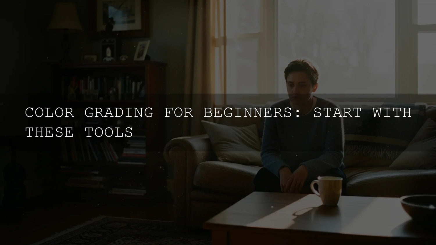
Color grading for cinematic video: make your footage look intentional
If you’ve ever wondered why your edited video still feels a little “flat” compared to the reels, shorts, and travel films you save on Instagram, the answer is almost always color. Color grading for cinematic video is how you correct what the camera saw and then stylize it for story. It’s not only for Hollywood — Anyone shooting on mirrorless, iPhone, or even vertical content can build a repeatable grade. In this guide we’ll walk through a clean workflow, the tools that actually matter (Premiere Pro, DaVinci Resolve, Final Cut), how LUTs fit in, and where to plug in your AAAPresets resources so you can move faster. Try a ready-made cinematic pack from your own store as a starting point — buy 3, get 9 FREE — and keep viewers locked in with a consistent look across the whole edit. To browse more looks, keep this collection open in another tab: cinematic & creator-friendly presets.
Why color grading matters more than your camera
Modern cameras are good at capturing detail — but they’re deliberately “neutral.” That’s why log, flat, or even normal picture profiles can look washed out. Grading is where you:
- Correct reality: fix exposure, contrast, and white balance so skin tones look human, not green or magenta.
- Unify mixed shots: make clips from different days, locations, or cameras match so the edit feels like one shoot.
- Push emotion: cooler midtones for moody storytelling, warmer highlights for lifestyle/beauty, lower saturation for serious pieces.
- Direct attention: bright faces, controlled backgrounds, gentle vignettes — the viewer looks where you want.
I tested this on a beach wedding doc and a moody studio interview — the camera files looked fine, but only after grading did the skin match and the dress detail pop. That’s how clients start saying “this looks cinematic.”
A simple, reusable color grading workflow
No matter what app you use, this order works. It’s also very close to what Adobe teaches inside the color workspace for Premiere Pro. See Adobe’s overview of color workflows in Premiere Pro and their Basic Correction section to compare your steps. :contentReference[oaicite:0]{index=0}
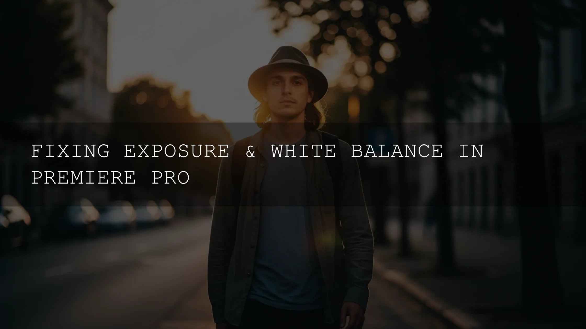
- Normalize / technical correction — fix exposure, contrast, and white balance first. In Premiere Pro, do this in Lumetri → Basic Correction. In Resolve, do it on the first node.
- Match shots — use Premiere’s Color Match or Resolve’s scopes to bring clips into the same ballpark. Skipping this is why edits look “all over the place.” :contentReference[oaicite:1]{index=1}
- Targeted corrections — skin, sky, background, product. Adobe’s newer masking tools for photo show a very similar logic: select → adjust. See Adobe’s guide to masking in Lightroom Classic for the same principle. :contentReference[oaicite:2]{index=2}
- Create the look — here’s where LUTs, film curves, split toning, teal & orange, or your AAAPresets cinematic LUTs go.
- Finishing & delivery — vignette, grain, sharpening, export.
Keep your correction and your creative look in different steps (or nodes). That way you can swap looks without redoing your whole grade.
The toolset: what to actually use
DaVinci Resolve (free + Studio)
Still the best pure color tool — even in 2025. You get node-based grading, powerful tracking, and really clean scopes. If you want to become “the color person” in your group, learn Resolve first. Start with serial nodes for: 1) exposure, 2) WB, 3) skin, 4) look. Then add a parallel node for sky or background.
- Why it’s good: node system, rock-solid tracking, professional scopes.
- How to learn fast: copy a cinematic LUT from your store, apply it as one node, and build corrections before it.
- When to move to Studio: noise reduction, better relighting, bigger projects.
Adobe Premiere Pro (Lumetri Color)
If you’re already cutting inside Premiere, stay there. The Lumetri Color panel in 2024–2025 added clearer color management and a more consistent Color workspace. See Adobe’s color settings in Lumetri Color to make sure your sequence and clips are in the same space — this alone fixes a lot of “why is my LUT too strong?” questions.
- Basic Correction: for exposure/WB.
- Creative: for stylizing and LUT application.
- Curves / Color Wheels & Match: for balancing clips to a reference.
- HSL Secondary: for skin isolation or sky enhancement.
Pair this with preset packs from your own store so that “color” is a 15-second step, not 15 minutes. Drop a LUT from Cinematic LUTs Pack, then trim intensity in Lumetri.
Final Cut Pro
For Mac-first editors, FCP is still the fastest to get in and out. Use the Color Wheels for Lift/Gamma/Gain, then stack Color Curves for more precision. If you’ve bought LUTs or created your own in Resolve, import them here too — the look stays consistent across apps.
Mobile & on-the-go (CapCut, VN, Lightroom mobile)
Short-form creators in 2025 can grade on the phone and nobody will notice — as long as the look is consistent. Lightroom’s AI masking on mobile is especially good for popping faces or controlling skies; see Adobe’s masking in Lightroom on the web for how they think about local adjustments.
LUTs vs manual grading (and how AAAPresets fits in)
People still ask, “Should I learn manual grading or just use LUTs?” The answer: use LUTs to get 70% there, learn grading to fix the remaining 30%.
- LUTs are fast: drop a cinematic LUT from Cinematic Video LUTs Bundle and you instantly know the direction of the look.
- Manual grading is flexible: if skin goes too orange, or the LUT crushes blacks, only manual grading will fix it.
- Best practice: correct → LUT → adjust intensity → targeted fixes.
That’s exactly how I grade real client work: I’ll normalize, apply a LUT from my collection, then use HSL or curves to make it skin-safe. This is also how you make a LUT look different from other people using the same pack.
Core grading principles you should master first
To get predictable, client-ready results, nail these five:
- White balance & skin: temperature + tint until skin is neutral, then fix with HSL if needed.
- Contrast curve: gentle S-curve, not harsh. Keep detail in shadows.
- Saturation control: overall sat first, then hue-based sat (pull down neon greens/blues).
- Scopes, not eyes only: use Waveform for exposure and Vectorscope for skin — Premiere’s color workspace shows all of this in one place. Refer to Adobe’s Lumetri Color overview to see the layout.
- Masking / local edits: fix face, sky, or product separately — Lightroom’s newer AI masks show how targeted edits should feel.
Practical, creator-first examples
Travel / outdoor footage
Correct WB → open shadows (travel often underexposed) → add warm highlights → increase blue saturation only in sky → finish with a filmic LUT → export.
Talking-head / educational
Expose for skin → WB to neutral → reduce saturation in background → slight vignette → skin softening if needed → save as preset for next video.
Wedding / lifestyle
Lift shadows, don’t crush blacks → warm highlights, soft roll-off → reduce magenta in skin → add glow or halation in the VFX stage → deliver.
Internal resources to link for continuity
Because sitemap fetching wasn’t available for all endpoints during this rewrite, add these placeholders and replace them with real URLs from your store before publishing:
- How to build a cinematic color grading base
- Premiere Pro Lumetri workflow for 2025
- Node-based grading in DaVinci Resolve
- Match your Lightroom presets with video LUTs
- Camera settings for shooting log/flat
Also consider linking to a help/trust page, for example: How to install Lightroom presets.
Building a signature look in 4 steps
- Pick a color harmony: use Adobe Color’s harmony rules to decide on warm/cool pairings. :contentReference[oaicite:8]{index=8}
- Make a base LUT/preset: start from your AAAPresets cinematic pack and tweak it for your brand.
- Save a grading template: in Premiere → save Lumetri preset; in Resolve → save PowerGrade.
- Apply across formats: vertical, horizontal, YouTube thumbnail frame grabs — keep color the same so your personal brand is recognizable.
When you’re ready to scale from “one edit” to “content calendar,” stock up with AAAPresets bundles. The offer is simple: Buy 3, Get 9 FREE. Pair that with LUTs for Video Creators to keep video in the same style as your photos.
FAQ
Do I have to shoot in log to get cinematic color?
No. Log gives you more flexibility, but you can grade standard-profile footage too. Just be gentler with contrast and highlights because 8-bit files break faster.
What is the best software for beginners?
Premiere Pro with Lumetri is easiest if you already edit there. DaVinci Resolve is best if you want to go deep into color or become a colorist later.
How do I keep skin tones natural after applying a LUT?
Lower LUT intensity first, then use HSL Secondary (Premiere) or a separate node (Resolve) to pull skin back to normal. Don’t push saturation globally.
Can I use the same LUT for vertical and horizontal videos?
Yes — the aspect ratio doesn’t matter to the LUT. What matters is exposure and white balance matching before the LUT.
How many looks should I use for one brand?
Two or three: a main cinematic look, a soft/natural look, and a black-and-white or moody variant. More than that and your feed loses identity.
Written by Asanka — creator of AAAPresets (10,000+ customers).

Leave a comment
This site is protected by hCaptcha and the hCaptcha Privacy Policy and Terms of Service apply.