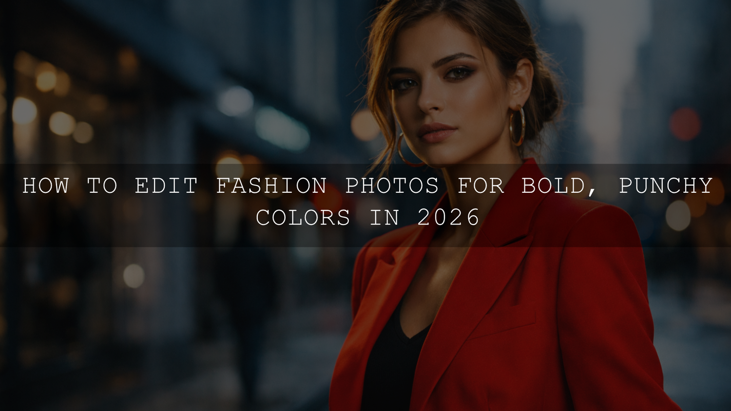
How to Edit Fashion Photos for Bold, Punchy Colors in 2026
If you want to edit fashion photos for bold, punchy colors in 2026, the goal is not simply to push saturation until everything looks louder. Strong fashion photography editing comes from a cleaner base: accurate white balance, confident contrast, selective HSL control, and skin tones that still look believable. When Lightroom fashion photo editing is done well, vibrant fashion photos feel polished, editorial, and expensive rather than oversaturated or messy.
I have tested this kind of workflow on fashion portraits shot in mixed light, including window light, storefront reflections, and cloudy outdoor scenes. The frames that looked strongest were never the ones with the highest saturation. They were the ones with the best color separation, deeper midtone contrast, and a clear focal color that led the eye.
If you want a faster starting point, begin with FASHION Portrait Lightroom Presets and browse the Portrait Photography Lightroom Presets collection. They are a strong fit for editorial portraits, lookbook images, and social-first fashion content, and you can keep your workflow flexible with Buy 3, Get 9 FREE.
Why bold colors work so well in fashion photography
Fashion is visual communication. Before anyone studies the pose, the fabric, or the styling, they react to color. Bold tones can make a garment feel more luxurious, youthful, rebellious, playful, or cinematic in seconds.
- They stop the scroll. Strong color contrast is often what makes a fashion image stand out on Instagram, Pinterest, and storefront pages.
- They shape mood. Deep reds feel dramatic, rich blues feel modern, and warm yellows can make a frame feel energetic and premium.
- They support styling. Good color grading helps the outfit remain the hero instead of getting lost in flat lighting.
- They build consistency. Repeating a recognizable color style across campaigns helps your work feel more branded and more professional.
Here’s why this matters: in fashion, color is rarely just decoration. It is part of the story, part of the brand, and often part of the sale.
Start with the right base before pushing color
One of the easiest mistakes in bold color grading is trying to fix everything with saturation. That usually creates orange skin, neon shadows, and backgrounds that fight the subject. A better approach is to build a neutral foundation first, then decide which colors deserve emphasis.
A reliable starting point in Lightroom is the default Adobe Color profile for raw files, followed by measured tone and color adjustments in the Basic panel, Color Mixer, and Tone Curve. Adobe also documents these as core parts of the Lightroom workflow. :contentReference[oaicite:0]{index=0}
- Correct exposure first. If the frame is too dark or too bright, color intensity becomes harder to judge.
- Set white balance before HSL. If the temperature is wrong, your reds, blues, and skin tones will all fight you.
- Clean up highlights and shadows. Good fashion edits usually have shape and depth, not just vivid color.
- Only then push the style. Once the image feels clean, you can decide where to add punch.
Step-by-step workflow for bold, punchy fashion colors
1. Get white balance right before you do anything dramatic
This is the hidden foundation behind most strong fashion edits. If a white shirt looks yellow or a gray wall looks blue, every color decision after that becomes less reliable. On editorial shoots, I usually look at neutral clothing details, white seams, or the brightest clean area in the frame before touching saturation.
A small white balance correction often makes the outfit color pop more naturally than a big saturation move. This is especially true with red, magenta, cobalt, emerald, and pastel styling, where mixed light quickly muddies the palette.
2. Use vibrance first, saturation second
For bold color grading, Vibrance is usually the smarter first move. Adobe’s Camera Raw documentation notes that Vibrance and Saturation both affect color intensity, while Color Mixer is the tool for adjusting specific color ranges. :contentReference[oaicite:1]{index=1}
A practical rule:
- Vibrance for a broader lift without making skin tones collapse.
- Saturation for a small finishing push after the image already feels balanced.
If I am editing a fashion portrait with a bright blazer or patterned dress, I usually raise Vibrance first, pause, and then ask one question: does the outfit feel clearer, or just louder? If it only feels louder, I leave Saturation low and move to HSL instead.
3. Use HSL or Color Mixer for the real punch
This is where fashion photos usually go from average to intentional. The HSL panel lets you control Hue, Saturation, and Luminance for individual colors, which is much more useful than pushing every color equally.
For example, if your model is wearing a red jacket:
- Increase Red Saturation carefully.
- Lower Red Luminance slightly to make the color feel deeper and richer.
- Check Orange because skin tone often lives there.
- Adjust nearby colors in the background so the jacket stays dominant.
I tested this on a fashion set with a red blazer against a cool gray street background, and the image improved most when I darkened the reds slightly instead of only saturating them. The red became more luxurious, the background stayed controlled, and the overall frame felt more editorial.
If you want more help with targeted color cleanup after applying a preset, read this HSL color correction guide for Lightroom presets.
4. Add contrast that supports color, not contrast that destroys detail
Punchy colors usually need depth behind them. Without enough contrast, bright colors can feel flat. With too much contrast, skin texture becomes harsh and shadows lose detail.
The best tools here are usually:
- Tone Curve for subtle shape and depth
- Contrast for global adjustments
- Clarity in moderation for garment texture
- Dehaze very lightly when the image feels washed out
A gentle S-curve often works better than a large Contrast increase because it gives you more control over where the image gets deeper and where highlights stay soft.
5. Use masking to push the subject without breaking the full frame
Modern Lightroom masking is one of the best tools for fashion editing because it lets you separate the outfit, skin, background, and face. Adobe’s official masking documentation shows that Lightroom can automatically detect subject, sky, background, objects, and people, which makes local color control much faster than the old manual-only workflow.
That matters in fashion work because you often want to:
- Boost the clothing color without overcooking skin
- Darken a background to make the outfit stand out
- Reduce distraction in a bright wall or pavement area
- Add a little more clarity to fabric while keeping the face softer
My usual approach is simple: create a subject mask, make the outfit and body feel strong, then create a background mask and pull distractions slightly back. Even a small difference between subject and background can make colors feel much punchier.
6. Protect skin tones at every stage
This is the checkpoint that separates polished fashion edits from amateur ones. Bold styling can absolutely coexist with natural skin, but only if you keep checking Orange, Red, and Yellow channels.
If skin starts looking too warm, too pink, or too flat:
- Reduce Orange Saturation slightly
- Lift Orange Luminance a touch for healthier-looking skin
- Correct white balance before changing Hue too aggressively
- Use a people or face mask when the subject needs separate treatment
For a deeper breakdown, read this guide to making presets work across different skin tones.
Presets vs manual editing for fashion photography
Presets win on speed and consistency. Manual editing wins on precision. The strongest fashion workflow usually combines both.
Here is the practical comparison:
- Presets are best when you want a repeatable editorial mood across a full campaign, lookbook, or content batch.
- Manual editing is best when lighting changes dramatically from frame to frame or when one image needs hero-level refinement.
The workflow I recommend is this: apply a strong preset first, then manually refine white balance, HSL, contrast, and masks. That gives you speed without losing control. If you want to compare broader editing approaches, see Lightroom presets vs Photoshop actions for editing.
If your goal is a softer editorial finish with strong color separation, try AI-Optimized Soft Cinematic Contrast Beauty Lightroom Presets. If natural skin needs to stay front and center, AI-Optimized Skin Tone Safe Pro Portrait Lightroom Presets are a safer match for beauty-led fashion portraits.
Color theory still matters, even when you use presets
Presets save time, but they do not replace taste. One of the fastest ways to improve vibrant fashion photos is to think in terms of color relationships. Complementary palettes create tension. Analogous palettes feel smoother. A single dominant color often looks stronger than five competing ones.
Adobe Color’s color wheel and harmony tool is useful if you want to plan or evaluate palette relationships before you grade heavily. :contentReference[oaicite:3]{index=3}
In practice, that means:
- A red outfit becomes stronger against cooler cyan or blue surroundings.
- A beige or cream outfit often benefits from controlled warmth and softer contrast.
- Monochrome styling works best when you create separation through luminance, not just hue.
If you are building a feed rather than a single hero image, this Instagram editing guide is a useful companion for keeping color direction consistent across multiple posts.
Advanced finishing moves that make fashion edits feel premium
Once the image already looks good, small finishing moves can make it feel expensive:
- Lower the brightest distractions. Pull down bright signs, sidewalks, or sky patches that compete with the outfit.
- Add selective depth. Darken the outer frame slightly if the subject needs more visual pull.
- Refine fabric texture. A little clarity on denim, leather, sequins, or tailoring can make the fashion feel more tactile.
- Keep blacks controlled. Crushed shadows often make strong color look cheap.
When you need a broader toolkit across portrait, editorial, and day-to-day client work, the AI-Optimized Lightroom Presets for Mobile and Desktop collection and the Lightroom Presets for Lightroom Mobile & Desktop collection give you more room to match different lighting styles without rebuilding your workflow each time.
Common mistakes that kill bold fashion color
- Too much global saturation. Everything gets louder, but nothing gets better.
- Ignoring skin tones. A great jacket color is not worth bad skin.
- Overusing clarity and dehaze. Fabric may look sharp, but faces start looking harsh.
- Skipping white balance. Dirty color usually starts here.
- No focal hierarchy. If every color is fighting for attention, the frame feels chaotic.
If your work includes fashion e-commerce or product-led portrait content, this guide to e-commerce and product photography presets is also worth reading because the same principles of clean color, controlled contrast, and buyer-friendly consistency apply there too.
Useful Adobe resources for this workflow
- Adobe’s guide to tone, Color Mixer, and Tone Curve adjustments in Lightroom Classic
- Adobe’s masking guide for subject, background, and people selections in Lightroom Classic
- Adobe Color’s color wheel and harmony tool
Related Reading
- How to fix weird preset colors with the Lightroom HSL panel
- How to keep presets working across different skin tones
- Lightroom presets vs Photoshop actions for editing
- How to build a cleaner Instagram-ready editing style
- Preset ideas for product and fashion e-commerce photography
FAQ
What is the fastest way to make fashion colors pop in Lightroom?
Start with white balance and exposure, then use Vibrance for a global lift and HSL for targeted color control. That usually looks better than pushing Saturation alone.
Is Vibrance better than Saturation for fashion photography?
Most of the time, yes. Vibrance is usually safer because it boosts muted colors more gently and helps protect skin tones from looking too orange or unnatural.
How do I keep skin tones natural when editing bold fashion photos?
Check Orange, Red, and Yellow channels often, correct white balance before heavy HSL moves, and use masking if the face needs separate treatment from the outfit or background.
Are presets enough for bold fashion photo editing?
Presets are the fastest starting point, especially for campaigns or batches, but the best results usually come from applying a preset first and then refining HSL, contrast, and masks manually.
Can I create punchy fashion edits on Lightroom Mobile?
Yes. Lightroom Mobile gives you strong control over exposure, color, masking, and HSL-style adjustments, so you can create polished fashion edits without needing a desktop for every image.
If you want to turn this style into a faster repeatable workflow, start with FASHION Portrait Lightroom Presets, pair them with AI-Optimized Soft Cinematic Contrast Beauty Lightroom Presets or Cinematic Portrait Film Lightroom Preset, and keep browsing through the AI-Optimized Lightroom Presets for Mobile and Desktop collection. If you need setup help before you begin, the AAAPresets FAQ page is a useful place to start. Buy 3, Get 9 FREE makes it easy to build a stronger fashion editing toolkit without overcomplicating your workflow.
Written by Asanka — creator of AAAPresets (10,000+ customers).
Leave a comment
This site is protected by hCaptcha and the hCaptcha Privacy Policy and Terms of Service apply.