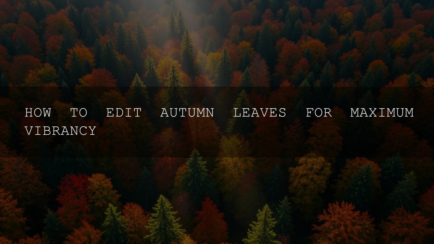
Embracing the Golden Hour: Why Fall Photography Demands Top-Notch Editing
Autumn has always been the season where light, color, and atmosphere converge into pure magic. From fiery red maples to golden oaks and misty mornings, fall delivers a natural palette photographers dream about. But capturing this fleeting spectacle isn’t just about pointing your camera—it’s about elevating those colors in post-production while keeping them authentic and emotional. Done right, your edits can make viewers feel the crisp air, smell the woodsmoke, and remember their own fall memories.
If you want to fast-track stunning edits, explore premium packs like 1000+ Master Lightroom Presets. They’re crafted to bring out warmth, depth, and cinematic tones—perfect for autumn. Try them today and expand your toolkit—Buy 3, Get 9 FREE. For broader options, you can also browse our Lightroom Presets collection.
The Science and Art of Autumn Hues
Those brilliant fall tones aren’t just aesthetic—they’re science. As chlorophyll fades, carotenoids (yellows, oranges) and anthocyanins (reds, purples) take center stage. Sunny days followed by crisp nights bring out the most intense reds, while tree species add variety to the spectrum. As editors, our job isn’t to invent color—it’s to amplify what’s already there. Respecting nature’s palette ensures your photos feel both vivid and believable.
Adobe explains this beautifully in Adobe’s guide to color adjustments in Lightroom, where subtle HSL tweaks can reveal hidden richness without overdoing it.
Setting the Stage: The First Steps in Your Editing Workflow
1. Mastering White Balance
White balance sets the mood. Too cool and your leaves look lifeless; too warm and they look muddy. Start with Lightroom’s eyedropper tool to correct tones, then nudge your sliders slightly warmer to enhance the cozy fall atmosphere. Think of it like tuning your guitar before playing—it makes every other adjustment sing.
2. Vibrance vs. Saturation
Saturation boosts all colors equally—often too harsh for autumn scenes. Vibrance, however, targets muted tones while protecting skin tones and avoiding oversaturation. For fall, start with vibrance (+10–20), then adjust saturation sparingly. This balance lets you enhance depth without losing realism.
For step-by-step examples, see our full guide on autumn presets.
Deep Dive with the HSL Panel
The Hue, Saturation, and Luminance panel gives you precision control over individual color families:
- Reds: Adjust hue towards orange to avoid magenta tones, and lower luminance for depth.
- Oranges: Boost saturation and luminance for that glowing golden-hour look.
- Yellows: Increase saturation and luminance for brilliance; shift hue slightly if greens creep in.
- Greens: Desaturate and shift towards yellow to make them feel late-season instead of spring-like.
- Browns: Slight luminance tweaks prevent muddy textures, adding earthy richness.
For a practical example, I tested this on a wedding shoot last fall—muting greens while enhancing oranges gave the couple’s photos a warm, nostalgic glow without overwhelming their skin tones.
Adding Depth: Luminance and Contrast
Autumn photography thrives on light and shadow play. Use luminance sliders to brighten yellows for glowing leaves or deepen reds for intensity. Combine this with subtle contrast adjustments—global for punch, clarity/texture for detail, and tone curves for precision. According to Adobe’s guide to tone curve adjustments, small S-curves can give your photos cinematic richness.
The Subtle Power of Vignettes
A slight vignette darkens edges, naturally drawing focus to your colorful subject. Keep it soft—too strong and it looks artificial. Used well, it enhances mood while controlling distractions.
Editing for Different Lighting Conditions
- Golden Hour: Enhance natural warmth; less need for heavy white balance corrections.
- Overcast Days: Add vibrance to bring muted colors to life; keep white balance neutral-to-warm.
- Harsh Midday Sun: Recover highlights and shadows carefully, and use the Dehaze slider sparingly for balance.
What to Avoid in Fall Editing
- Over-saturation—leaves shouldn’t look radioactive.
- Unrealistic hues—keep yellows golden, reds rich, and avoid neon greens.
- Blown highlights or crushed blacks—check your histogram.
- Over-sharpening or heavy noise reduction—detail matters, but natural textures matter more.
Pro Tools to Explore
- Selective Color Masks: Adjust reds or yellows independently for maximum control.
- Color Grading: Add golden highlights and warm shadows for cinematic looks (see Adobe’s color grading guide).
- AI Tools: Lightroom’s AI masking can isolate skies or subjects, speeding up complex edits.
- Dehaze: Great for foggy mornings, but use lightly to avoid unnatural looks.
Conclusion: Crafting Your Autumn Masterpiece
Editing autumn photos is about enhancement, not distortion. With careful white balance, nuanced color adjustments, and restraint, your images can capture both the science and the soul of fall. Whether you’re editing wedding portraits or street scenes, the tools in Lightroom give you everything you need to showcase autumn at its best.
For ready-to-use looks, explore our seasonal favorites like Autumn Fall Vibrant Lightroom Presets. Pair them with our Lightroom Presets collection to expand your creative library and elevate your fall storytelling.
FAQ
What’s the best way to keep fall edits looking natural?
Focus on vibrance instead of saturation, and always compare your edits to the original scene for balance.
Which Lightroom tool is most effective for autumn tones?
The HSL panel is essential—it lets you fine-tune reds, oranges, and yellows without affecting the entire image.
How can I fix dull colors from an overcast shoot?
Increase vibrance, warm your white balance slightly, and use selective luminance to brighten yellows and oranges.
Can presets speed up fall editing?
Yes—presets like AI-Optimized Autumn Gold Tones provide a strong foundation, saving time while keeping edits consistent.
Should I use vignettes for every autumn photo?
Not always, but a subtle vignette works well when you want to center attention on vibrant foliage or a main subject.
Written by Asanka — creator of AAAPresets (10,000+ customers).
Leave a comment
This site is protected by hCaptcha and the hCaptcha Privacy Policy and Terms of Service apply.