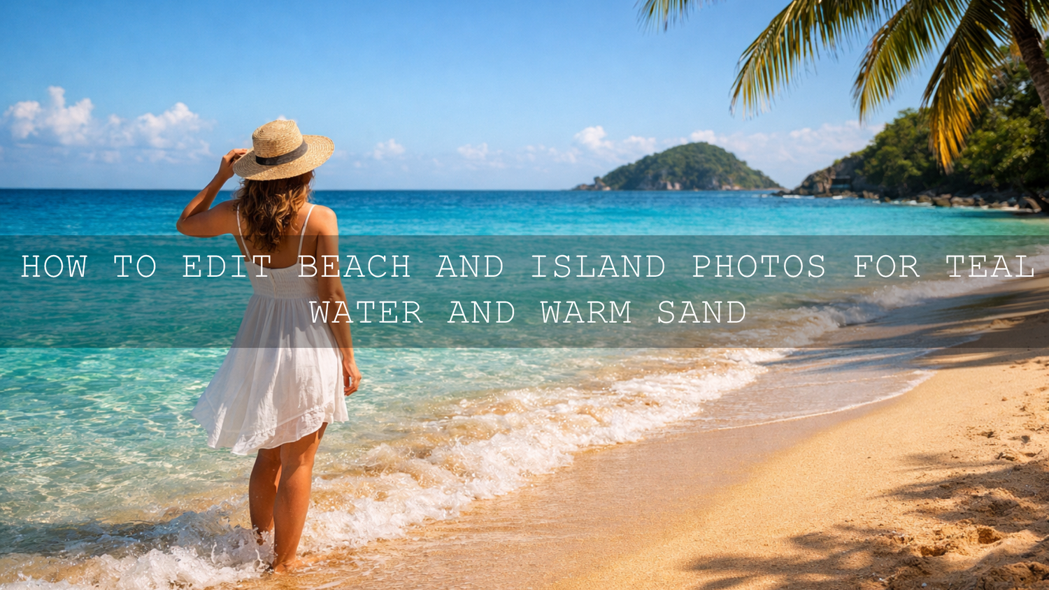
How to Edit Beach and Island Photos for Teal Water and Warm Sand
Beach photo editing works best when the final image still feels like the place you stood in: clear teal water, warm sand with texture, bright air, and skin tones that still look human. Good island photo editing is not about pushing every color until it glows. It is about shaping light, controlling highlights, and guiding the eye so the scene feels clean, sunny, and believable. When you get that balance right, your travel photos stop looking flat and start feeling like a real escape.
If you want a faster starting point, try Lightroom Presets For Beach Photos and browse the Bright Summer Lightroom Presets collection. That combination gives you a strong base for teal water, brighter sand, and a cleaner vacation look across a full set of images. It also fits naturally with Buy 3, Get 9 FREE.
The biggest mistake I see in beach edits is simple: people chase color before they fix tone. I have tested beach looks on bright noon coastlines, soft cloudy island scenes, and golden-hour shoreline portraits, and the best results almost always come after lowering harsh highlights first, then shaping the blues and yellows with more control. Once that foundation is right, the water starts to glow without turning fake, and the sand looks warm instead of muddy.
Why Beach Photos Often Look Flat Straight Out of Camera
Beach scenes are beautiful in real life, but they are tricky for a camera. Bright sun can wash out sand, reflections can make the ocean lose depth, and auto white balance can push the whole image too cool or too warm. Add haze, midday glare, or deep shadows under hats and umbrellas, and the file can feel less vibrant than the moment did.
That is why beach photo editing usually comes down to four things:
- Recovering highlight detail so white sand and bright skies still hold texture.
- Separating aqua, blue, and green tones so the water looks cleaner and more dimensional.
- Adding warmth carefully so the sand feels inviting without turning orange.
- Keeping people natural so skin tones do not get damaged by aggressive global edits.
Adobe’s own tools make this much easier when you understand where to work. For tone recovery, Adobe’s guide to tone and color adjustments in Lightroom is useful. For more targeted edits, Adobe Lightroom masking tools and Adobe’s Color Mixer guide help you refine water, sky, sand, and subject separately.
A Simple Step-by-Step Beach Photo Editing Workflow
1. Start with exposure before color
Before you touch teal tones or warmth, fix the overall brightness. Bring exposure to a balanced level, then reduce highlights if the sky or sand is clipped. Lift shadows only enough to reveal detail. On beach photos, too much shadow recovery can flatten the whole frame and remove that crisp sunlit feeling.
A practical starting point looks like this:
- Set exposure so faces, sand, and horizon feel balanced.
- Lower highlights to recover bright water reflections and blown sand.
- Adjust whites carefully to keep the image bright without losing detail.
- Add a little contrast only after the bright areas feel under control.
I often test this part first before applying any deeper look. On one shoreline set I edited recently, the biggest improvement happened before color grading even started. Pulling highlights back a little made the wave detail reappear, and that alone made the scene feel more premium.
2. Set white balance for the mood you actually want
White balance shapes the emotional feel of your beach image. Cooler edits can make the ocean look cleaner and more tropical. Slightly warmer edits make the sand, skin, and sunset tones feel softer and more welcoming. The trick is not to overdo either direction.
For midday beach photos, try a neutral or slightly cool balance first. For sunrise or sunset island photos, lean warmer, but stop before the whites in waves and clouds start looking yellow. This is where presets can save time. The Golden Hour Lightroom Presets are useful when your beach set needs more glow, while Lightroom Presets for Landscapes & Travel can help when you want a cleaner outdoor travel balance across beaches, cliffs, and wider scenery.
3. Build the teal water with control, not saturation
Teal water is one of the most requested travel editing looks, but it falls apart fast when you just boost blue saturation. Good teal water editing comes from shifting hue, saturation, and luminance in a controlled way.
Here is a more reliable process:
- Move aqua and blue hues slightly until the ocean feels cleaner and more tropical.
- Raise aqua luminance carefully to make shallow water feel clearer.
- Add saturation in smaller amounts than you think you need.
- Reduce green contamination if the water starts looking dirty or swampy.
If your file has uneven color, use masking rather than global sliders. A targeted water mask often looks much better than pushing the whole image. That is especially true when the subject is wearing blue clothing or standing against a bright sky.
For quick results, Lightroom Presets For Beach Photos are built for exactly this kind of coastal color separation. If your trip includes beaches, viewpoints, roads, and island landscapes in one story, AI-Optimized Cinematic Travel Landscape Wanderlust Lightroom Presets can help you keep that travel atmosphere consistent without rebuilding every edit from zero.

4. Warm the sand without making it orange
Warm sand is not the same as yellow sand. If you push orange and yellow too hard, the beach starts to look artificial and skin tones usually suffer too. What you want is subtle warmth with visible texture.
A strong method is to warm the sand through a mix of white balance, yellow luminance, and local masking instead of pure saturation. If the beach is bright, lower highlights first, then add warmth. That sequence keeps the sand soft and sunlit instead of crunchy and overprocessed.
Here is why this matters: beach sand often reflects a lot of surrounding light. A global warm edit can shift the whole frame, but a local adjustment lets the ocean stay clean while the shore feels golden and inviting.
5. Protect skin tones and bright clothing
One of the easiest ways to ruin a beach edit is to make people look too red, too orange, or too dull. This happens when the edit is designed only around the scenery. If your image includes portraits, couples, or family travel moments, always check the orange and red channels after you finish the water and sand.
I usually ask one question before I export: does the ocean look beautiful and does the person still look believable? If the answer is no, I back off the color. Great beach photo editing should make the place feel stronger, not make the subject look strange.
Presets vs Manual Editing for Beach Photos
Beach photo editing does not have to be a choice between speed and control. The best workflow usually combines both.
Presets are best when:
- You want a fast, repeatable starting point.
- You are editing a full vacation set and need consistency.
- You already know the mood you want: bright tropical, cinematic travel, soft warm, or golden hour.
Manual editing is best when:
- The lighting is mixed or difficult.
- The water color is uneven across the frame.
- You need to protect skin tones, swimsuits, or bright beach accessories from global color shifts.
The most efficient approach is simple: apply a good preset first, then fine-tune exposure, white balance, and HSL. That gives you both speed and polish. If you are new to importing files, the preset installation guide and the AAA Presets FAQ and help page make setup much easier.
How to Keep a Full Beach Vacation Set Consistent
A single beautiful image is great. A full set that feels connected is even better. That is what makes a travel blog, Instagram carousel, client gallery, or island trip album feel professional.
To keep your edit consistent across multiple beach photos:
- Choose one base look for the whole trip.
- Match white balance across scenes before deeper grading.
- Keep teal tones consistent instead of reinventing them image by image.
- Use similar contrast levels so the set feels unified.
- Adjust exposure per photo, but keep the color direction steady.
This is where collections help. If you want a brighter vacation feel, browse the Bright Summer Lightroom Presets collection. If you want more flexibility across beach, island town, hotel, and landscape shots, the Lightroom Presets for Lightroom Mobile & Desktop collection gives you a wider toolkit for the full journey.
For wider storytelling, these related guides can help you build a more complete travel editing workflow:
- Best Lightroom Presets for Coastal & Beach Travel
- Mastering Natural Light for Beaches and Outdoor Photos
- Warm vs Cool Tones: Which Presets Tell Your Story Best?
Common Beach Editing Mistakes and How to Fix Them
The water looks neon
Lower saturation first, then fix hue. In many cases the problem is not that the color is too strong, but that it is sitting in the wrong blue-green range.
The sand looks gray or dirty
Raise luminance in the yellows and oranges, then add warmth carefully. If the beach was backlit or hazy, a small contrast increase can help bring back shape.
The whole image feels too yellow
Back off white balance and check highlights. Bright sun can trick you into warming the file too much.
People look too orange after the edit
Reduce orange saturation or use a subject mask. Never judge a beach edit by the scenery alone if portraits are part of the frame.
The preset looks different on every photo
That usually means the exposure and white balance are too different between files. Normalize those first, then apply the preset again. The preset troubleshooting checklist and guide to stacking presets are helpful when you want more control.
Practical Pro Tips for Better Teal Water and Warm Sand
- Shoot a little brighter than you think you need if you want a clean tropical edit, but still protect the highlights.
- Use local masks for water and sand instead of pushing global color too far.
- Check the horizon and edge colors because haze near the horizon often needs separate treatment.
- Do not judge the edit only on your phone screen in bright sunlight because beach colors can look more intense outdoors than they really are.
- Export a few test images from the same set before finishing the whole gallery. That saves time and helps you lock the look faster.
If your goal is a faster, more polished workflow, start with Lightroom Presets For Beach Photos for dedicated shoreline edits, then add AI-Optimized Cinematic Travel Landscape Wanderlust Lightroom Presets when your trip includes wider island scenery, cliff views, roads, resorts, and travel storytelling. Pair those with the Lightroom Presets for Lightroom Mobile & Desktop collection if you want a bigger editing toolkit that stays flexible from phone to desktop.

Related Reading
- Best Lightroom Presets for Coastal & Beach Travel
- Mastering Natural Light for Beaches, Parks, and Homes
- Warm vs Cool Tones: Which Presets Tell Your Story Best?
- How to Stack Presets for Unique and Stunning Results
- 10-Step Troubleshooting Checklist for Preset Problems
FAQ
What is the best way to make beach water look teal in Lightroom?
Start by correcting exposure and white balance, then fine-tune aqua and blue hues with the Color Mixer. Small hue and luminance adjustments usually look better than heavy saturation boosts.
How do I make beach sand look warm without turning orange?
Recover highlights first, then add warmth gradually through white balance, luminance, and local masks. Avoid pushing orange saturation too far, especially if people are in the photo.
Are presets enough for beach and island photo editing?
Presets are an excellent starting point for speed and consistency, but the best results usually come after small manual adjustments to exposure, white balance, HSL, and masking.
Which presets are best for a full beach vacation album?
A dedicated beach preset pack works best for shorelines and ocean scenes, while a broader travel pack helps when your album includes resorts, island roads, viewpoints, and lifestyle photos too.
Can I use these beach photo editing workflows on Lightroom Mobile?
Yes. The same core principles apply on Lightroom Mobile and desktop: fix tone first, shape color second, and use selective edits whenever the water, sand, and subject need different treatment.
Written by Asanka — creator of AAAPresets (10,000+ customers).
Leave a comment
This site is protected by hCaptcha and the hCaptcha Privacy Policy and Terms of Service apply.