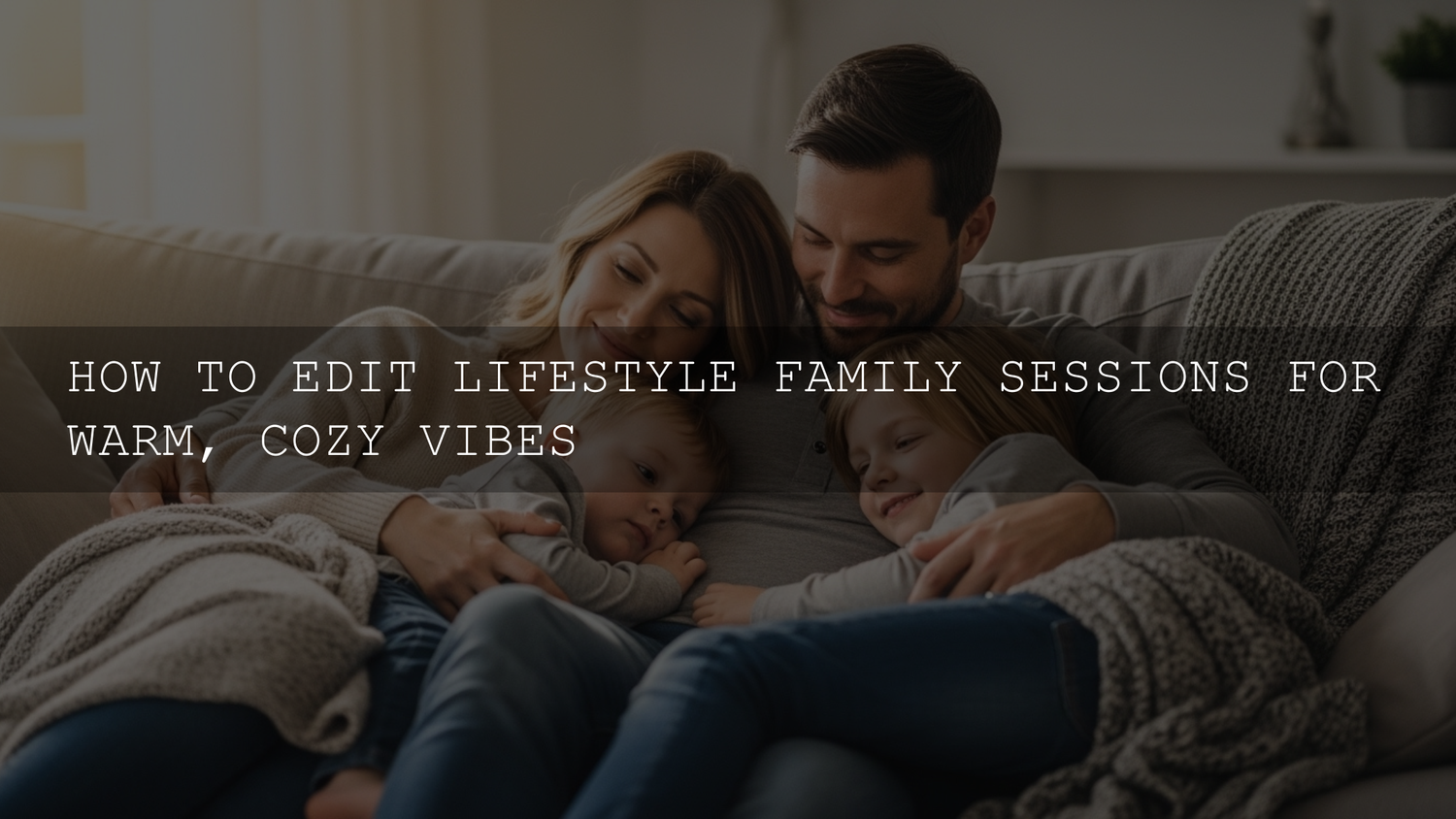
Warm and Cozy Family Photo Editing: A 2026 Workflow for Lifestyle Family Photography
You already did the hardest part: you showed up, connected with a family, and captured the real stuff—tiny laughs, messy hair, forehead kisses, and that “we live here” comfort. Now your job is to turn those moments into a consistent, warm and cozy family photo editing style that feels like a memory, not a filter. In this updated 2026 guide, I’ll walk you through a repeatable lifestyle family photography editing workflow (Lightroom Classic + Lightroom Mobile friendly) to get warm tones, soft light, and natural skin every time—without overdoing it.
If you want a fast starting point, try a portrait-ready base preset like AI Optimized Portrait Lightroom Presets and browse more options in Portrait Photography Lightroom Presets. And if you’re building a full toolkit, the 1000+ Master Lightroom Presets Bundle makes it easy to stay consistent across different homes, lighting, and seasons—plus you can Buy 3, Get 9 FREE when you add 12 to your cart.
What “Warm & Cozy” Actually Means (So Your Edits Don’t Turn Orange)
Warm and cozy isn’t “crank Temperature and call it done.” It’s a mix of tone, color, and softness that supports the story. Here’s the visual checklist I use:
- Comfortable skin tones: warm, healthy, and believable (no orange faces, no grey lips).
- Soft highlight roll-off: windows and bright areas glow gently instead of clipping.
- Lifted-but-not-flat shadows: you can feel depth in sweaters, hair, and couches without harsh contrast.
- Warm midtones: the “home” feeling usually lives in midtones (wood, blankets, skin, warm walls).
- Controlled cool colors: blues/greens don’t dominate; they support the warmth.
Pro tip: if your edit feels “warm” but not “cozy,” you’re usually missing softness (highlights, contrast, texture) more than warmth (temperature).
Step 1: Import, Cull, and Choose Your “Cozy Heroes”
Culling for cozy is different than culling for perfection. Keep the frames that feel like real life—even if they’re slightly imperfect.
- Look for connection: hands touching, leaning in, eye contact, shared laughter.
- Keep the atmosphere frames: wide shots with the room, the window light, the bed, the kitchen—these build story.
- Don’t delete “soft” too fast: a slightly soft frame can still be the emotional favorite (especially with kids).
If you need a fast install refresher before you start, here’s a clean walkthrough: How to Install Lightroom Presets in a Quick and Easy Way.
Step 2: White Balance First (Your Warmth Thermostat)
White balance is the foundation of warm tones and cozy color grading. Here’s the order that keeps skin natural:
- Neutralize before you warm: use the WB eyedropper on something neutral if you can (white shirt, grey wall). This gives you a clean starting point.
- Warm in small moves: push Temperature slightly warmer until skin looks healthy, not orange.
- Tint is the secret sauce: a tiny move toward magenta often removes “sickly green” indoor casts and adds richness.
Real-world example: living-room sessions often mix window daylight (cool) with warm lamps (yellow). In those scenes, I warm Temperature modestly, then use local masking on faces (next step) so skin stays perfect while the room stays cozy.
Step 3: Exposure, Highlights, and Soft Contrast (The Cozy Light Recipe)
Warm edits feel cozy when light looks gentle. Aim for “bright but soft,” not “bright and harsh.”
- Exposure: set overall brightness for faces first.
- Highlights: pull down until window areas keep detail and glow instead of blowing out.
- Whites: use Whites to control the brightest points (this prevents that crunchy, clipped look).
- Shadows: lift slightly for a welcoming feel, but don’t lift so far that blacks turn grey.
- Blacks: add a touch of depth back so the image doesn’t feel flat.
If you keep getting “too bright” results after applying presets, this troubleshooting guide is gold: Why Your Lightroom Presets Are Turning Photos Into Blinding Lights.
Step 4: Local Adjustments (Where Cozy Becomes Personal)
Global edits create the mood, but Lightroom masking makes it feel intentional. In 2026, masks are the difference between “preset look” and “signature look.”
Use masks for:
- Faces: slightly lift exposure, reduce highlights, and warm midtones just a touch.
- Windows: reduce highlights and whites to keep the glow controlled.
- Background clutter: lower exposure or saturation slightly so attention stays on connection.
- Blankets/wood tones: warm midtones subtly to amplify the cozy feeling.
Official resource if you want to go deeper: Adobe’s guide to masking in Lightroom Classic.
First-hand note: I tested this workflow on a low-light indoor family session with mixed window light and warm lamps—once I masked faces (slight warmth + highlight control), the whole set suddenly felt consistent and “homey” without pushing Temperature into orange territory.
Step 5: HSL / Color Mixer for Cozy Color Control (Without Killing Skin Tones)
This is where you “shape” the palette. The goal is warm dominance with controlled cool tones.
- Oranges (skin): keep saturation moderate; adjust luminance gently so skin looks bright and soft, not shiny.
- Yellows (indoor light/wood): if walls look too yellow, lower yellow saturation a little or shift hue slightly toward orange.
- Greens (plants/grass): reduce saturation a touch so green doesn’t steal attention.
- Blues (windows/jeans): lower saturation slightly so the scene stays warm and cozy.
If you want Adobe’s official breakdown of targeted color tools (Color Mixer / Point Color), this is helpful: Adobe’s guide to adjusting color in Lightroom (including Color Mixer).
Step 6: Color Grading / Split Toning (The “Cozy Film” Touch)
Color Grading (or Split Toning in older workflows) is perfect for subtle warmth that feels cinematic.
- Highlights: add a gentle warm hue (gold/peach) at low saturation for a soft glow.
- Midtones: a tiny warm push makes skin and wood feel inviting.
- Shadows: keep shadows neutral-warm (or slightly brown) so they don’t drift blue.
- Blending: blend more if you want a smoother “wrapped in warmth” feel.
Official reference if you want to understand the sliders (Hue/Sat/Blending) clearly: Adobe’s guide to working with tone and color (including Color Grading).
Presets vs Manual Editing for Warm, Cozy Family Sessions
Here’s the honest comparison—because both approaches matter.
Presets (best for speed + consistency)
Use presets when you want a fast baseline across a full gallery. They help you keep a consistent signature style across different homes and lighting. The key is to treat presets as a starting point, not a finish.
Manual editing (best for tricky light + hero images)
Go more manual when you have mixed lighting, strong color casts, or important “hero” frames that deserve extra polish. Manual tweaks also help you keep skin tones perfect while still pushing a warm, cozy mood.
The hybrid method (what I recommend)
Apply a preset first (for 70–80% of the look), then refine: white balance, highlights/whites, and masks on faces/windows. That’s usually the shortest path to cozy results that still look natural.
A Repeatable 10-Minute Cozy Workflow (Per Image)
- Apply your base preset (or start clean).
- Fix white balance for believable skin.
- Set exposure for faces.
- Pull highlights/whites to control window glow.
- Lift shadows slightly; add blacks for depth.
- Mask faces (tiny warm + highlight control).
- Mask background (slightly darker/less saturated if needed).
- HSL: reduce overpowering greens/blues; keep oranges clean.
- Color grade: warm highlights + warm midtones, subtle warm shadows.
- Finish: gentle vignette + subtle grain/texture.
If you’re editing family moments on mobile a lot (especially indoor sessions), this lighting-focused read helps you avoid “preset mismatch” problems: Mastering Lightroom Mobile Presets: Adapting to Any Lighting.
Finishing Touches: Texture, Grain, Sharpening, and Vignette
Cozy edits are usually soft, but not blurry. Think “gentle detail.”
- Sharpening: sharpen eyes and important details; mask sharpening so skin doesn’t look crunchy.
- Texture/Clarity: go easy—too much clarity kills the cozy vibe fast.
- Grain: a little grain can add nostalgic warmth (especially for lifestyle sessions).
- Vignette: subtle and wide—just enough to pull attention toward connection.
First-hand note: When I pushed a warm preset on a family session shot near a bright window, the image looked “nice” but not “cozy” until I reduced highlights, added a soft vignette, and introduced a tiny bit of grain—suddenly it felt like a real memory instead of a clean digital file.
Consistency Across the Whole Gallery (Your Signature Look)
Families hire you for a feeling—and they want that feeling across every photo, not just the hero shots.
- Sync in batches: edit 1–2 “anchor images,” then sync across similar lighting groups.
- Check skin tones every time: if skin shifts between frames, adjust WB and orange luminance/sat.
- Use one consistent base: choose one preset “family” and stick with it for the whole session.
- Calibrate your screen: if your monitor is off, your warmth will be inconsistent in prints and phones.
Related Reading (If You Want to Level Up Faster)
- Bright & Airy Presets for Lifestyle and Wedding Photography
- Crafting Authentic Vintage Film Looks with Lightroom Presets
- Fixing Overexposure When Presets Blow Out Highlights
- How to Install Lightroom Presets
Make It Easy for Clients to Say “Yes” (Without Sounding Salesy)
If you want a reliable warm-and-cozy baseline for family and portrait work, start with Bright Natural Lightroom Presets for clean warmth, or use AI Optimized Portrait Lightroom Presets when you want fast, flattering skin tone results. For baby sessions, 150+ First Years Baby & Newborn Lightroom Presets is built for soft, gentle tones. And for a complete “everything I need” library, grab the 1000+ Master Lightroom Presets Bundle—you can also Buy 3, Get 9 FREE when you add 12 packs to your cart and build a full client-ready toolkit.
For browsing, I recommend starting here: Portrait Photography Lightroom Presets and Lightroom Presets for Lightroom Mobile & Desktop. If you ever need licensing clarity (personal vs commercial), this page keeps it simple: File Licenses.
FAQs
Why do my “warm” edits make skin look orange?
Most of the time it’s too much Temperature combined with orange/yellow saturation. Warm less globally, then warm faces locally with masks, and control oranges in HSL so skin stays believable.
Should I edit family sessions differently than weddings?
Yes—family edits usually look best with softer contrast, gentler clarity, and more natural color. Weddings can handle stronger polish; family sessions need comfort and authenticity.
What’s the fastest way to keep a whole gallery consistent?
Edit 1–2 anchor images first, then sync settings across similar lighting groups. After syncing, quickly re-check white balance and highlights on each image—those two fixes solve most inconsistencies.
Do presets work for indoor window light and mixed lighting?
They work as a base, but mixed lighting almost always needs tweaks. Use masks on faces and windows, then refine tint and highlights to keep skin natural and light soft.
How do I get that cozy “film” feel without ruining sharpness?
Use subtle grain, soft highlight control, and a gentle vignette—then keep sharpening targeted (eyes/details only). Cozy is mostly tone and light quality, not blur.
Written by Asanka — creator of AAAPresets (10,000+ customers).

Leave a comment
This site is protected by hCaptcha and the hCaptcha Privacy Policy and Terms of Service apply.