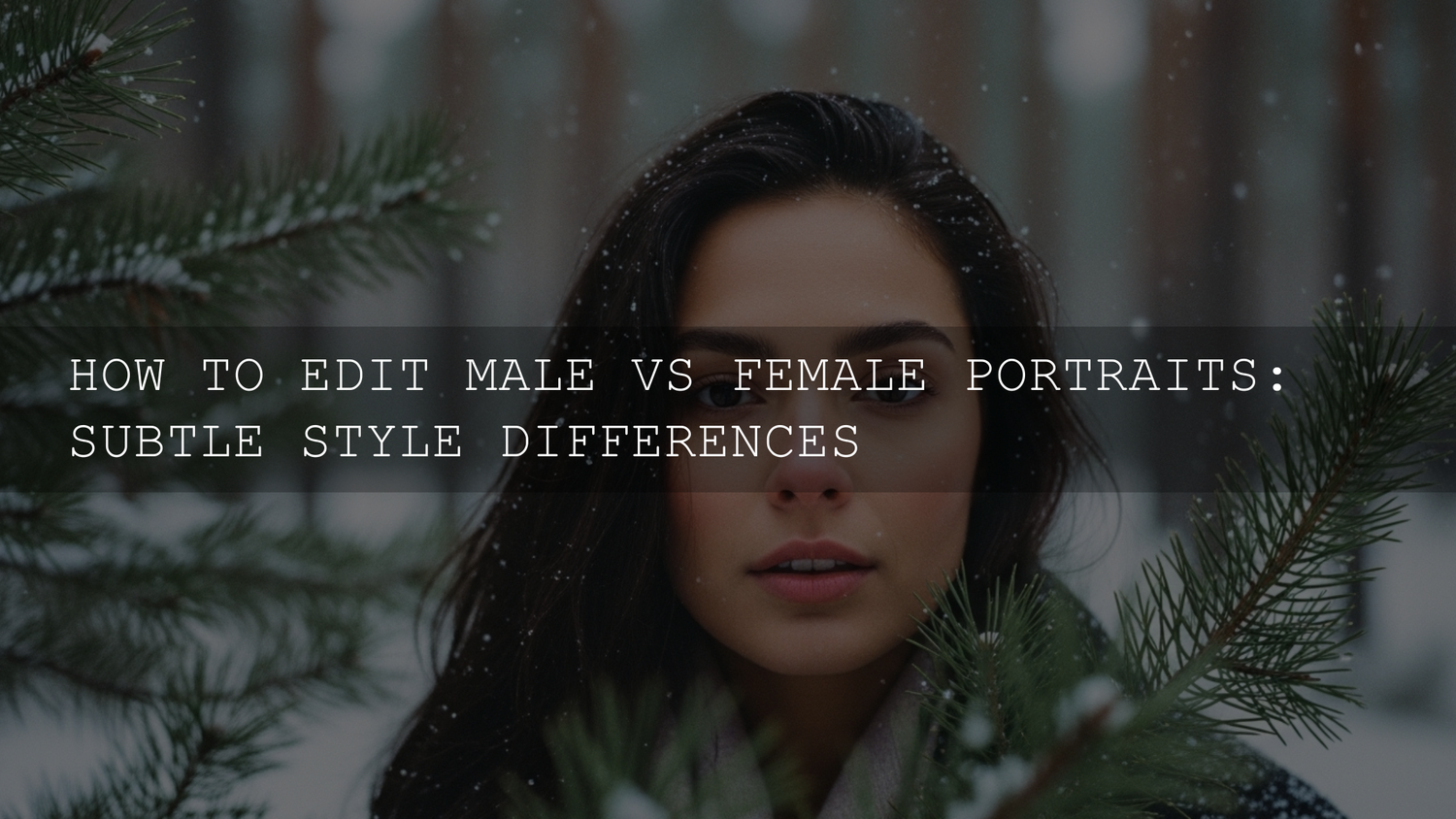
Male vs Female Portrait Editing in 2026: What Changes (and What Shouldn’t)
If you’ve ever asked, “Should my workflow change when I’m editing male vs female portraits?”—you’re not imagining it. Male vs female portrait editing often feels different because style trends, client expectations, lighting choices, and even wardrobe/texture can push you toward different decisions in skin retouching, color grading portraits, and detail work in Lightroom portrait presets or Photoshop.
But here’s the important part: it’s not about forcing anyone into a stereotype. The best portraits in 2026 are guided by intent—the vibe the subject wants, the story you’re telling, and how you want light/texture to read. Think “soft vs bold,” “clean vs textured,” “glowy vs gritty,” rather than “this gender must look like that.”
If you want a fast starting point for portrait edits, you can begin with a preset that’s designed to keep skin tones flattering and natural—then refine from there. For a quick, portrait-friendly base, try AI-Optimized Skin Retouch Portrait Lightroom Presets and browse the full Portrait Photography Lightroom Presets collection. If you’re building a full toolkit, you can also stack your cart with a few packs—Buy 3, Get 9 FREE when you add 12 to your cart.
The Foundation Is the Same: A Portrait Workflow That Works for Everyone
Before you split into “soft” or “textured” styles, lock in the fundamentals. This keeps your edits consistent and prevents you from over-retouching to “fix” something that was really just a white balance or exposure issue.
Step 1: Normalize exposure and white balance first
- Exposure: Get the face in a healthy range. If the forehead or cheeks are clipping, pull Highlights down before you add contrast.
- White balance: Correct mixed lighting (window + tungsten + LED) before you touch skin. Many “skin problems” are actually WB problems.
- Profile choice: Pick a neutral starting profile that holds highlight detail and doesn’t oversaturate reds/oranges.
Step 2: Do global tone before local retouching
Adjust overall contrast and curves first. If you sharpen/texture too early, you’ll exaggerate pores, beard, and makeup edges in a way that’s hard to undo.
Step 3: Use local masks to protect skin and control contrast
This is where modern Lightroom shines. If you need a refresher, Adobe’s official guide is worth bookmarking: Adobe’s guide to masking in Lightroom (Select People, Background, and more). A clean mask-based workflow lets you push drama in the background while keeping skin gentle and believable.
The Real Difference: “Soft-Glam” vs “Texture-Forward” (Not a Gender Rule)
Instead of thinking “female = smooth” and “male = rough,” use these two style targets:
- Soft-Glam / Polished: smoother transitions, softer micro-contrast, controlled texture, luminous highlights.
- Texture-Forward / Character: preserved pores and fine lines, stronger micro-contrast, deeper shadows, crisp edges.
Many women love texture-forward edits. Many men prefer polished edits. Your job is to match the brief.
Skin Retouching: Keep Texture Real, Fix Only What Distracts
Skin retouching is where edits can become “too much” fast—especially on social platforms where over-smoothing is common. In 2026, the premium look is clean, natural, and believable.
A universal “clean skin” order of operations
- Remove distractions: temporary blemishes, dust spots, lipstick on teeth, stray hairs across the face.
- Even tone lightly: reduce blotchiness and harsh under-eye shadows without flattening the face.
- Control shine: tame hotspots on forehead/cheeks while keeping a natural glow.
- Texture last: add or reduce Texture/Clarity only after the face shape and tone are right.
Soft-Glam retouch approach (common in many female portrait requests)
- Lower texture gently: apply a small negative Texture on skin-only masks—never globally.
- Lift under-eye shadows carefully: lift exposure a touch, then pull highlights down to avoid a “bright patch.”
- Protect pores: if you smooth, bring back micro-detail with a tiny amount of sharpening only where needed (eyes, lashes, brows).
Texture-forward retouch approach (common in many male portrait requests)
- Minimal smoothing: keep pores, fine lines, and beard texture. Clean the distractions, not the identity.
- Selective micro-contrast: add a touch of Texture on beard/stubble/clothing, but avoid pushing Texture on cheeks and forehead.
- Edge definition: sharpen brows, eyes, and jawline edges subtly for presence.
Pro tip: Use Photoshop only when Lightroom can’t do it cleanly
Lightroom is great for tone and masking, but detailed spot cleanup can be faster in Photoshop. Adobe’s official reference is here: Adobe’s Spot Healing Brush tool guide. Keep it subtle—tiny brush, low pressure, and avoid repeating patterns.
First-hand note: I tested a “polished” skin workflow on a low-light portrait session with mixed LED and warm room lights—once I fixed WB and highlights first, I needed way less retouching than I expected. The skin looked premium because the light was under control, not because everything was smoothed away.
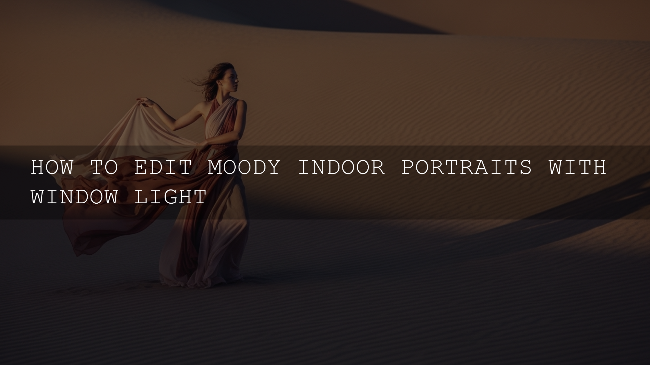
Color Grading Portraits: Build Mood Without Breaking Skin Tones
Color is where portraits become emotional. And it’s also where edits can go wrong (orange skin, gray lips, neon shadows). A reliable rule: grade the environment harder than the skin.
Soft palettes (often used for romantic, lifestyle, beauty, and gentle vibes)
- Warm highlights + neutral shadows: creates a welcoming feel without making skin “too orange.”
- Pastel compression: slightly reduce saturation in greens/blues while keeping skin lively.
- Clean whites: avoid yellow whites—especially in clothing and backgrounds.
Deeper palettes (often used for cinematic, editorial, dramatic, and “strong presence” vibes)
- Cooler shadows: adds depth while keeping highlights controlled.
- Richer midtone contrast: improves structure and “3D” feel.
- Desaturation with intention: pull saturation in the background first; keep skin natural so the subject stays alive.
Pro tip: Use a color wheel to design your grade
If you’re stuck choosing tones, use Adobe Color’s wheel (harmony-based palette builder) to map a simple scheme (complementary, split-complementary, analogous). Then match your shadows/midtones/highlights to that plan.
Lighting and Shadow: Sculpt the Face With Contrast (Without Making It Harsh)
Post-production lighting control is basically “invisible direction.” You’re guiding attention: eyes, cheekbones, jawline, expression. The trick is to separate shape from texture.
Soft-Glam lighting adjustments
- Brighten midtones, protect highlights: lift midtones slightly, pull highlights down to keep skin smooth.
- Feathered dodging: use gentle dodging on cheekbones and forehead—no sharp “beauty stripes.”
- Soft shadow lift: lift shadows slightly but keep enough depth so the face doesn’t go flat.
Texture-forward lighting adjustments
- Deepen shadows selectively: add depth around jawline and cheekbones to emphasize structure.
- Harder edge separation: increase background contrast or darken the background slightly for a stronger subject pop.
- Control hotspots: reduce oily shine without removing all highlights (highlights = dimension).
If you want a step-by-step masking refresher inside Lightroom workflows, this is a solid internal guide: How to use masking tools for stunning photo edits in Lightroom.
Dodging and Burning: The “Premium” Secret That Still Looks Natural
When people say an edit looks “expensive,” they often mean the face has smooth tonal transitions and controlled highlights/shadows. You can do this subtly in Lightroom with masks, or more precisely in Photoshop.
A simple dodge & burn map you can repeat
- Dodge (brighten): under-eye (tiny), upper cheekbones, forehead center (small), catchlights in the eyes.
- Burn (darken): under cheekbones (soft), jawline edge (subtle), sides of nose (very light), hairline shadows.
Pro tip: Don’t “draw” a new face
If your dodge/burn reshapes someone dramatically, it stops being a portrait and starts being an illustration. A premium result keeps the person recognizable and real.
Comparison: Presets vs Manual Editing (and When to Use Both)
This is the fastest way to speed up portrait editing without lowering quality:
- Presets: great for building a consistent base (tone curve, color response, overall mood).
- Manual refinement: necessary for skin, local light, and small distractions—because every face and every lighting setup is different.
If you want a deeper breakdown, see: Lightroom presets vs Photoshop actions: which is better for editing?
A practical “preset-first” portrait workflow
- Apply a portrait-friendly preset at 60–90% strength.
- Fix exposure and WB.
- Mask skin (People/Skin) and do subtle texture control.
- Mask background and push mood (contrast, saturation, color shifts).
- Finish with detail work (eyes, hair, clothing texture).
First-hand note: When I pushed a cinematic portrait preset on a backlit outdoor shoot, the biggest upgrade came from one step: I masked the background and lowered highlights slightly. The subject’s skin instantly looked cleaner, because the scene stopped “fighting” the face.
Detail Enhancement: Eyes, Hair, and Fabric (Do This Last)
Details are powerful, but they’re also where portraits can become crunchy. The premium trick is to sharpen where the viewer should look, not everywhere.
Detail checklist
- Eyes: tiny clarity/texture bump, brighten catchlights slightly, avoid neon-white eyes.
- Brows/lashes: micro-sharpening only if needed.
- Lips: restore natural color if the grade made them gray or oversaturated.
- Hair: tame flyaways that cross the face; keep natural volume.
- Beard/stubble: enhance texture carefully; don’t oversharpen pores on cheeks.
- Clothing: increase texture on fabric for realism (especially jackets, denim, knitwear).
Common Portrait Editing Mistakes (and Quick Fixes)
- “Plastic” skin: you smoothed globally. Fix: mask skin only and reduce smoothing; reintroduce micro-contrast in eyes and hair.
- Orange skin / weird undertones: WB and HSL need attention. Fix: correct WB first, then adjust orange luminance/sat gently.
- Overexposed face hotspots: fix highlights before contrast. This internal guide helps: Why your Lightroom presets are turning photos into blinding lights (and how to fix it).
- Too much clarity everywhere: crunchy skin and halos. Fix: move clarity/texture to background or clothing, not cheeks/forehead.
Making It Consistent Across a Full Shoot
The real “pro” look isn’t one perfect image—it’s 20 images that match. Here’s how to keep consistency:
- Pick a reference frame: your best-lit portrait becomes your anchor.
- Sync global settings: tone curve, WB, camera profile, and base grade.
- Then customize locally: each image gets its own skin mask tweaks and small exposure changes.
- Check skin tone continuity: if one image goes too warm/cool, fix it before exporting the set.
Related Reading (More Portrait Workflow Wins)
- Bias-free skin: inclusive grading across all skin tones
- Case study: editing 100 photos in under 30 minutes with presets
- How to install Lightroom presets (quick and easy)
Choosing Products That Match Your Portrait Style
If your portraits lean polished, skin-friendly, and fast-to-deliver, start with AI-Optimized Skin Retouch Portrait Lightroom Presets or the more editorial vibe of FASHION Portrait Lightroom Presets. If you want a broader toolkit for everything from portraits to weddings, travel, and lifestyle, the 1000+ Master Lightroom Presets Bundle is the “one library” option I’d reach for. You can also browse by style in Portrait Photography Lightroom Presets or explore automation-friendly packs in AI-Optimized Lightroom Presets—and if you’re stocking up, remember you can Buy 3, Get 9 FREE when you add 12 items to your cart.
One final trust note: if you’re using presets in client work, make sure your usage fits your needs by reviewing AAAPresets file licenses.
Do I have to edit male portraits “harder” and female portraits “softer”?
No. Those are style trends, not rules. Use the subject’s preferences and the story of the photo to choose “polished” vs “texture-forward,” then apply retouching with restraint.
What’s the fastest way to get consistent skin tones in Lightroom?
Fix white balance first, then use a People/Skin mask to make small local adjustments instead of pushing global sliders. This keeps skin natural while still letting you stylize the background.
Should I retouch in Lightroom or Photoshop?
Lightroom is excellent for tone, color, and mask-based shaping. Photoshop is better for detailed spot cleanup and precision retouching—use it only when Lightroom can’t do it cleanly.
Why do my portraits look “over-processed” after using presets?
Usually it’s too much texture/clarity, clipped highlights, or heavy global contrast. Reduce preset strength, recover highlights, and move strong adjustments into background masks.
How do I make a portrait look cinematic without ruining skin?
Grade the environment more than the skin, deepen shadows selectively, and keep highlights controlled on the face. A cinematic look is mostly contrast placement and color separation—not heavy smoothing.
Written by Asanka — creator of AAAPresets (10,000+ customers).
Leave a comment
This site is protected by hCaptcha and the hCaptcha Privacy Policy and Terms of Service apply.