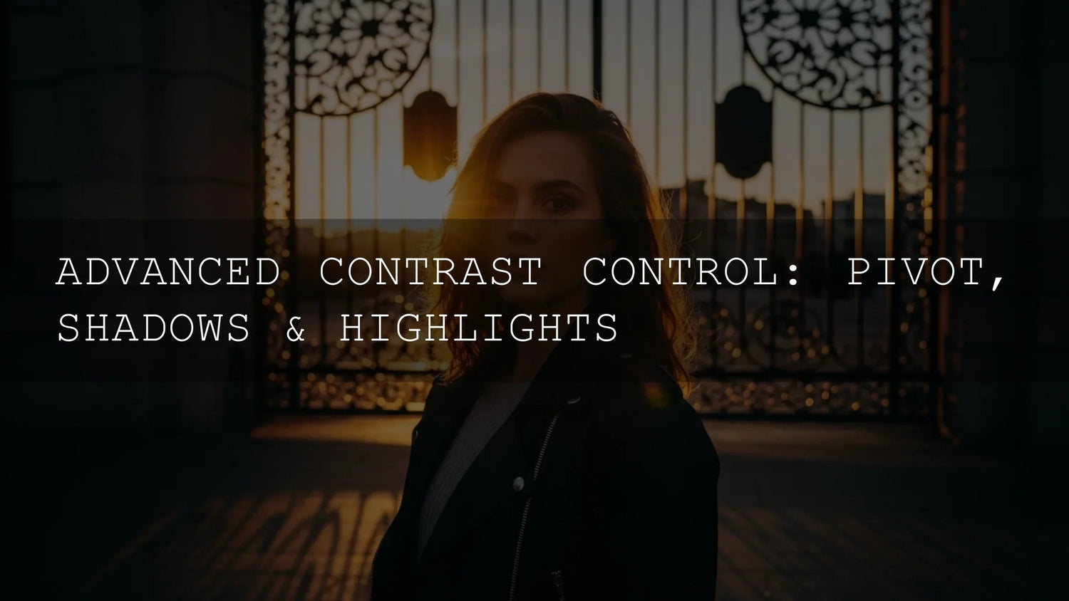
Mastering Contrast in Lightroom: Pivot, Shadows & Highlights for Natural Pop
If your photos feel flat or washed out, it’s usually a contrast problem. In Lightroom, you’re not limited to a single Contrast slider—you can sculpt tonality with Pivot, Shadows, and Highlights for depth, dimension, and mood. Below we’ll break down how each control works, the smartest order to edit in, and real-world workflows that keep skin tones clean and skies detailed. For fast results, try a proven look and then fine-tune: explore our Lightroom Presets for Mobile & Desktop and anchor your edit with a consistent style.
Want an easy jumping-off point that still preserves midtones? Start with a preset, then refine Pivot/Shadows/Highlights to taste. Try a bright, cinematic baseline like AI-Optimized Cinematic Bright or go moodier with rich blacks using Luxury Black Lightroom Presets. Try these presets today — Buy 3, Get 9 FREE. For broader browsing, see the full Lightroom Presets collection.
Why contrast matters (and what changes when you go beyond one slider)
Contrast guides the eye, shapes depth, and sets mood. Adobe’s definition is simple: it’s the difference between light and dark areas; you can affect it globally (Contrast) or locally (Clarity/Texture) and with curves or masks. Understanding this helps you avoid the “crunchy highlights, muddy shadows” look that happens when you only push one slider. See Adobe’s primer on contrast and the tools that change it.
Meet the trio: Pivot, Shadows, Highlights
Pivot: the midtone anchor
Pivot (sometimes called Midpoint) shifts where the Contrast adjustment “hinges.” Nudge Pivot higher to emphasize brightness in midtones (great for portraits), or lower it to bias toward richer shadows (great for dramatic landscapes). Use it after you tame extremes so global contrast doesn’t crush faces or clip skies. Adobe’s Light and Edit panels describe how global/light controls shape brightness and contrast before you fine-tune other ranges.
Shadows: reveal depth without noise
The Shadows control targets darker areas so you can lift detail in underexposed foregrounds, eyes, or dark fabrics—without brightening the whole frame. Over-lifting can add noise or halos; keep it subtle and re-add depth with Blacks or a small Contrast push. Review Adobe’s guidance on highlight/shadow adjustments in Lightroom to keep tonality natural.
Highlights: preserve detail and headroom
Highlights recovers information in bright regions—skies, speculars, window light—so clouds don’t clip to white and skin speculars stay controlled. Pull back just enough to reveal detail while maintaining sparkle. Adobe’s HelpX covers how Highlights and Shadows isolate the brightest and darkest ranges, and how to refine contrast with Clarity/Texture.
The editing order that prevents “see-sawing”
- Set Exposure & White Balance first. Get overall brightness and color neutral.
- Address extremes. Reduce Highlights to recover detail; raise Shadows to reveal form.
- Refine with Pivot. Adjust the midtone hinge so your global Contrast push doesn’t break skin tones or flatten foliage.
- Finish with Contrast/Clarity/Texture. Add micro-contrast (Clarity), surface detail (Texture), and a small global Contrast trim.
- Use local adjustments where needed. Brush or graduated masks let you target sky vs. subject without global compromises.
Real-world mini workflows
Portrait with delicate skin
- Exposure to taste; set WB from the eye whites.
- Lower Highlights slightly (tame forehead/cheek sheen), lift Shadows a touch for eye sockets.
- Raise Pivot a little so midtones (skin) stay luminous; tiny Contrast increase.
- Finish with modest Clarity on hair/clothing, not skin (use local mask).
Landscape: dramatic sky, dark foreground
- Pull Highlights to recover sky structure; raise Shadows for foreground textures.
- Lower Pivot slightly for richer mood; add Contrast to taste.
- Optional: a graduated mask for the sky to add Clarity selectively.
Product/brand shot with crisp edges
- Keep Highlights conservative to maintain specular fidelity.
- Use Texture for fine materials; small Clarity bump for edge definition.
- Check blacks with clipping warnings; adjust Blacks minimally.
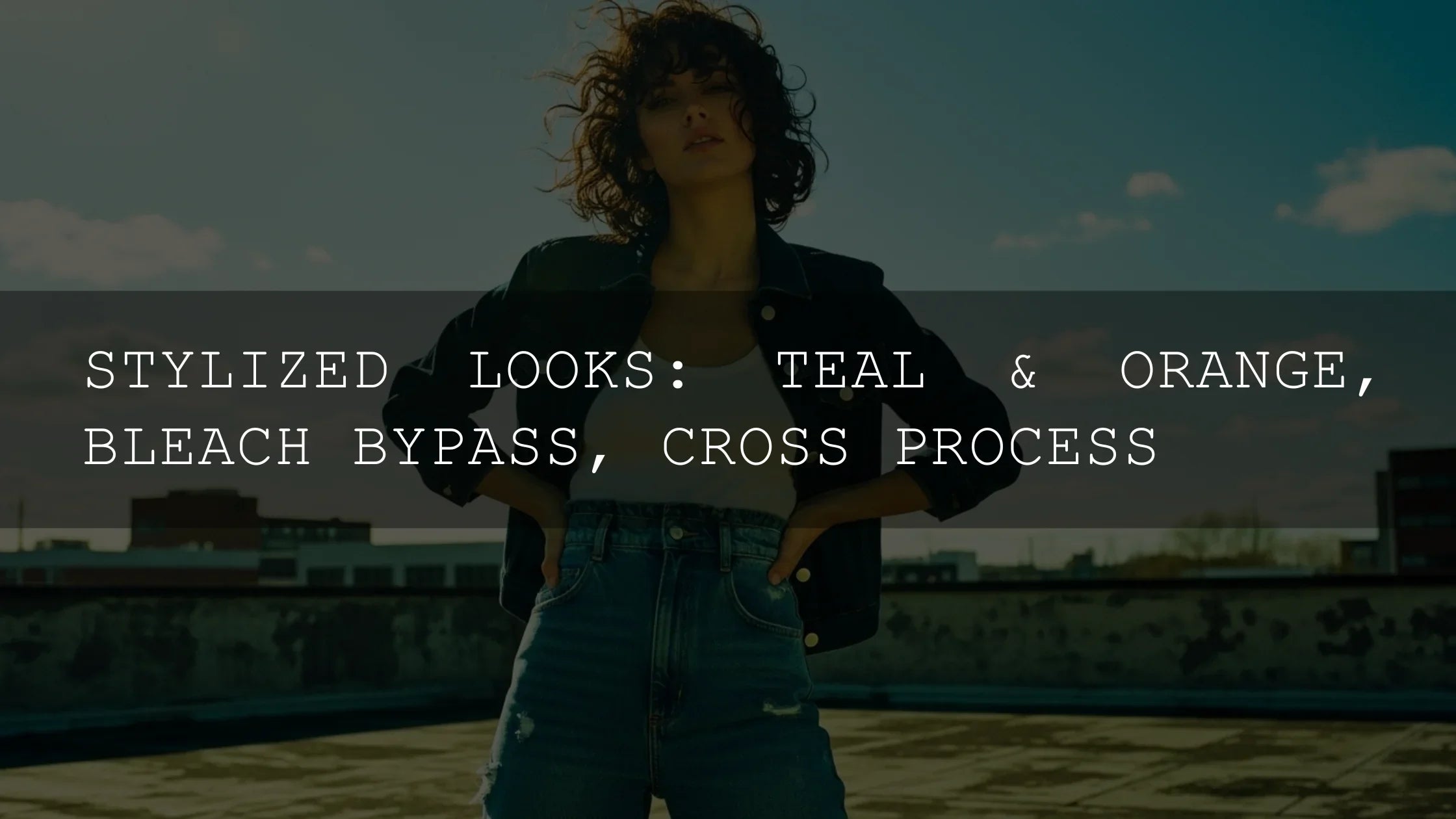
Presets vs Manual Editing (and how to combine them)
Presets provide a consistent starting look that speeds delivery and branding across shoots. Manual refinement (Pivot/Shadows/Highlights, local masks) personalizes the result to lighting and subject. A hybrid approach is fastest: apply a preset that fits your genre, then tune the trio for believable tonality. Explore 1000+ Master Lightroom Presets for breadth, or pick single-look tools like Cinematic Portrait Film to lock a vibe and refine midtones with Pivot.
Pro tips to keep contrast clean
- Edit globally, then locally. Use masks to avoid over-correcting the entire image.
- Mind midtones. If Contrast makes faces too dark/bright, adjust Pivot before touching Exposure again.
- Use Clarity/Texture carefully. They boost local contrast; overdoing them creates halos.
- Check highlights. Pull back just enough; flat highlights kill “shine.”
Try this 60-second test
- Apply a baseline preset from the Lightroom Presets collection.
- Highlights −20 to −40 (sky/skin speculars), Shadows +10 to +30 (eyes/fabrics).
- Pivot: small move up for portraits; small move down for moody landscapes.
- Contrast +5 to +15; Texture +5 (materials), Clarity +5 (edges).
Related reading
- Quick Lightroom Hacks: 5-Minute Edits for Creators
- LUTs Mastery: Tips, Guides & Best Packs
- Create Custom LUTs from Your Grades: Deep Dive
- Autumn & Fall Photo Editing Tips
Helpful Adobe references
- Adobe: What contrast is and where to adjust it (Lightroom Classic).
- Adobe: Edit panel—Exposure, Contrast, Highlights, Shadows explained (Lightroom mobile).
- Adobe: Clarity/Texture/Dehaze for micro-contrast.
Keep learning & get support
Need installation help or licensing info? Visit our FAQ & How-to page for “How to Install Lightroom Presets” and more.
Wrap-up: precise contrast without the crunch
Contrast isn’t just a single slider—it’s a mix of Highlights (protect detail), Shadows (reveal form), and Pivot (keep midtones believable). Once you balance those, a light touch of Contrast/Clarity/Texture can make your images feel polished rather than processed. If you want a fast, consistent baseline, start with a curated look and refine in seconds.
Build your go-to toolkit with 1000+ Master Lightroom Presets and explore more styles in Lightroom Presets for Mobile & Desktop — try them today, Buy 3, Get 9 FREE.
FAQ
What’s the best order: Exposure first or Contrast first?
Set Exposure and White Balance first, then adjust Highlights/Shadows, refine Pivot, and finish with Contrast/Clarity/Texture. This avoids chasing your tail.
How do I avoid halos when lifting shadows?
Use modest Shadow lifts, add Texture instead of heavy Clarity, and prefer local masks for problem areas like sky/subject edges.
Should I brighten midtones with Exposure or Pivot?
Use Exposure for global brightness; use Pivot to bias where Contrast acts so midtones stay natural (especially for skin).
Is Clarity the same as Contrast?
No—Contrast is global; Clarity increases local midtone edge contrast. Use sparingly to avoid a “crunchy” look.
Written by Asanka — creator of AAAPresets (10,000+ customers).

Leave a comment
This site is protected by hCaptcha and the hCaptcha Privacy Policy and Terms of Service apply.