Natural Skin Tones: A Practical Guide for Photographers, Editors, and Digital Artists
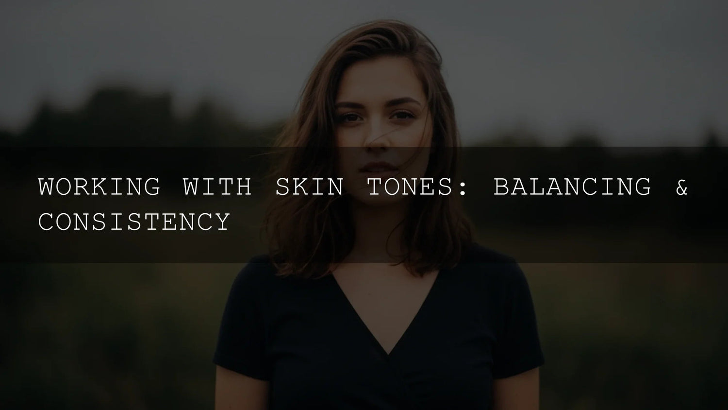
Getting natural skin tones right is one of the fastest ways to make your work look polished and professional. Whether you’re editing in Lightroom, Photoshop/Camera Raw, or grading video, the same fundamentals apply: understand undertones, control hue/value/chroma, and stay consistent from shot to shot. In this guide, we’ll break down skin tone correction, share step-by-step workflows, and show how to balance realism with style—so your portraits feel authentic across different lighting and devices.
Want a quick head start while you refine your technique? Try a proven portrait-friendly pack and keep iterating. Explore a top bundle and a browsable collection that work across genres—portraits, weddings, lifestyle, and travel: test portrait edits with a versatile preset bundle, or browse Lightroom preset collections. Try them today—Buy 3, Get 9 FREE.
Why Skin Tones Are More Than “One Color”
Real skin is a living surface that responds to light, atmosphere, and camera profiles. Differences in white balance, lens transmission, camera profiles, makeup, and background bounce can nudge skin toward pinks, olives, or ambers. That’s why two images from the same session can look different even before you touch the sliders. The goal isn’t to force a single “perfect” tone—it’s to keep each subject’s natural character while making the set feel cohesive.
Undertones: Cool, Warm, Neutral (and How to Spot Them)
Think of visible color (what you see) sitting on top of a subtle bias underneath (the undertone). Learn to identify it in references and your raws:
- Cool undertones: hints of pink/blue/red; lips skew magenta; veins read blue/purple.
- Warm undertones: hints of yellow/peach/gold; veins read green; olives often sit here.
- Neutral undertones: a balanced mix; shifts more with lighting than with pigment.
Tip: Evaluate under consistent lighting and glance-squint to simplify shapes and color families. Use Lightroom’s Color Mix (HSL) or Camera Raw’s Color Mixer to nudge oranges/reds where the skin actually lives. See Adobe’s official how-to on precise color editing with Color Mix and the Targeted Adjustment tool in Lightroom, and Camera Raw’s guide to color grading across shadows/midtones/highlights.
Hue, Value, Chroma: The Balancing Trio
Skin tone realism emerges from three controls used together:
- Hue: Skin lives mostly in reds/oranges/yellows. Small hue moves (±2–5) in the orange/red ranges often do the heavy lifting.
- Value: Lightness/darkness builds shape. Use Exposure, Shadows, and the Tone Curve to sculpt without oversaturating.
- Chroma (saturation): Natural skin is rarely highly saturated. Favor modest saturation with selective vibrance and HSL refinements.
For a deep dive on tonal tools, Adobe documents Lightroom Classic tone and color controls here: work with image tone and color. When you need a more stylized but controlled push, the Camera Raw Color Grading wheels are ideal for targeted warmth in highlights or subtle cyan in shadows for contrast (Adobe Color Grading overview).
A Repeatable Workflow for Consistent Skin Tones
1) Normalize the Base (WB & Profile)
- Set White Balance first. Use a gray card when possible; otherwise sample a neutral in the scene. A slightly warm WB is often more flattering for people.
- Pick a Camera/Profile that preserves skin realism before creative moves. See Adobe’s overview on using Camera/Creative Profiles in Camera Raw. Profiles shift the foundation without moving sliders—great for consistency across a set.
2) Shape with Light (Value Before Color)
- Establish exposure and contrast. Use Exposure, Shadows, Highlights, then fine-tune with the Tone Curve to keep midtone contrast gentle on skin.
- Preserve highlight detail in cheeks/forehead and avoid clipped speculars unless stylistically intended.
3) Refine Hue/Chroma (Where Skin Lives)
- Target oranges/reds in HSL/Color Mix: a slight negative saturation in orange plus a tiny hue shift toward red can remove the “spray tan” look; a touch of red luminance up can lift life into lips.
- In Camera Raw/Lightroom, use Targeted Adjustment to drag directly on the face for ultra-precise changes (Adobe tutorial).
4) Local Masks for Real Faces
- Select Subject or People masking: lower Texture/Clarity slightly for smoother pores while protecting detail in eyes/lashes/hair.
- Use a second mask for lips and under-eyes: nudge hue toward natural pinks for lips; reduce saturation in under-eye reds to calm fatigue.
5) Style Cohesively
- After neutralization, apply creative toning with Color Grading wheels (warm highlights, cooler shadows). Keep balance gentle so skin stays believable.
- Sync settings across the set, then spot-correct outliers with local masks.
Presets vs Manual Editing (Quick Comparison)
- Presets: Fast, repeatable starting points; great for batch work and creative direction. Still requires micro-adjustments for WB/Exposure/Skin HSL per image.
- Manual Editing: Maximum control and learning; slower but essential for tricky lighting, mixed color temperatures, or strong tints.
Best practice: Use a high-quality preset to establish direction, then fine-tune hue/value/chroma until the skin feels “alive.” Explore portrait-ready looks in a curated bundle: get a flexible preset foundation, and browse by style (portrait, wedding, lifestyle).
Lighting Scenarios and What Changes
- Golden Hour: Warm highlights, softened contrast. Reduce orange saturation slightly; lift red luminance for a healthy glow.
- Open Shade/Overcast: Cooler midtones, less saturation. Add a bit of warmth in WB; push orange saturation +3 to +6 to avoid “flat gray” skin.
- Mixed Artificial (tungsten + fluorescent + window): Normalize WB with a priority (usually key light), then use local masks to correct pockets of green/magenta tint.
- Backlight: Watch for cyan pollution in shadows; use Color Grading shadows toward a gentle amber or add local warmth to rim-lit edges.
Advanced but Practical: Small Touches That Add Realism
- Subtle complementaries: A whisper of teal/blue in shadows can make warm skin feel brighter by contrast. Keep it subtle to avoid color casts.
- Micro-variations: Cheeks, nose, ears often run warmer; jaw and forehead a hair cooler. Use 2–3 small masks to preserve this “human randomness.”
- Video editors: In Premiere Pro, watch the skin tone line on the Vectorscope to keep hues clustered in the natural range—see Adobe’s primer on correct skin tones and monitoring.
- Color harmony planning: When styling sets or picking wardrobe, use Adobe Color’s harmony rules to pre-plan flattering palettes against your subject’s undertones.
Common Skin-Tone Mistakes (And Quick Fixes)
- Oompa Loompa (too orange): Lower Orange Saturation, shift Orange Hue slightly toward red, add a subtle cool push to highlights.
- Ashen/Grey (lifeless): Increase Orange/Red Saturation modestly, warm WB by 100–300K, lift midtone contrast gently with the Tone Curve.
- Plastic Flatness: Rebuild value separation—add midtone contrast; use local dodge/burn with low flow to re-sculpt planes of the face.
- Body Part Mismatch: Sync baseline WB/HSL; then mask hands/neck to match face (reduce red saturation in hands; add warmth to neck if it’s too cool).
A Field-Tested Mini Playbook
- WB to neutral plus slight warmth (+100–300K).
- Set exposure; protect highlights in cheeks/forehead.
- HSL: Orange Saturation −5 to −10 if oversprayed; Red Luminance +2 to +6 for life in lips.
- Mask People: Texture −5 to −15 (avoid plastic); counter with a touch of Clarity on eyes/hair.
- Color Grading: tiny warm push in highlights, micro cool in shadows; Balance between −5 to +5.
- Sync across the set; spot-correct outliers.
For more official techniques straight from Adobe, see Lightroom color workflows and presets and Camera Raw color grading.
Related Reading
- Portrait editing fundamentals and preset selection
- Wedding skin tones: fast fixes for mixed light
- Color grading basics for consistent sets
- Targeting skin with HSL/Color Mix
- White balance techniques for people photography
Product Picks for Real-World Workflow
- All-round Master Lightroom Presets: broad coverage for portraits, lifestyle, weddings.
- Portrait Skin Tone Presets: tuned to keep hue/value/chroma natural.
- Cinematic LUTs: for hybrid editors who grade video and stills with similar looks.
Prefer to browse? Jump into Lightroom Preset Collections and filter by style or genre.
FAQ
What’s the quickest way to fix orange, overcooked skin?
Cool WB slightly, lower Orange Saturation, shift Orange Hue a tick toward red, and add a subtle cool push to highlights in Color Grading. Re-check lips and cheeks with local masks.
How do I match skin across a full gallery?
Normalize WB and profile first, then sync base settings. Use copy/paste or preset as a starting point, and spot-correct with masks. Keep a reference image open to compare.
Are presets enough for perfect skin?
Presets speed you up, but you’ll still tweak HSL and local masks per image. Think of presets as a strong baseline, not a one-click finish.
What if my scene has mixed lighting?
Choose a priority WB (usually the key light) and correct smaller regions with masks and the Tint slider. Watch for pockets of green/magenta from fluorescents.
Any official resources for learning the tools?
Yes—see Adobe’s guides for Lightroom color editing and presets, Camera Raw color grading, and Premiere’s skin tone monitoring.
Ready to apply this in your own work? Start with a reliable baseline and refine with masks and HSL. Try a portrait-friendly pack today—build consistency with a versatile preset bundle, and explore Lightroom preset collections. Buy 3, Get 9 FREE.
Written by Asanka — creator of AAAPresets (10,000+ customers).


Leave a comment
This site is protected by hCaptcha and the hCaptcha Privacy Policy and Terms of Service apply.