Sony A6400 & A6700 Color Grading Workflow for a Cinematic Look
If you’re shooting on a Sony A6400 or A6700 and dreaming of that rich, cinematic color you see in high-end films and YouTube channels, the good news is this: you already have the tools you need. With smart settings in-camera, a simple Sony A6400 and A6700 color grading workflow, and a few well-chosen LUTs, you can turn “flat and lifeless” S-Log3 clips into polished, professional visuals that feel like they came from a much more expensive cinema rig. Your Sony APS-C body is the sensor; color grading is where you build the story.
If you want a head start instead of grading from scratch every time, you can also layer your own grades on top of cinematic LUT packs like the 700+ Cinematic Video LUTs for Your Next Project and explore a wider toolkit inside the Cinematic LUTs Pack for Premiere Pro, DaVinci & Final Cut Pro collection. With the Buy 3, Get 9 FREE offer, loading 12 compatible packs into your cart means you’ll only pay for three, which is perfect when you’re building a Sony-focused color grading library in one go.
Why Color Grading Your Sony APS-C Footage Is Non-Negotiable
Color grading isn’t a fancy “extra” you add at the end; it’s the step that transforms Sony A6400 and A6700 footage from “nice” to unforgettable. Done properly, it lets you:
- Set the mood on purpose: Warm, soft grades can make a handheld A6400 clip feel nostalgic and intimate, while cooler, contrasty looks on A6700 S-Log3 footage can feel tense, futuristic, or clinical.
- Fix and unify your footage: Shots captured at different times or under mixed lighting never match perfectly in-camera. Grading lets you align white balance, contrast, and saturation so an entire sequence feels like one continuous world.
- Direct the viewer’s eye: A subtle lift on skin tones, a gentle vignette, or desaturating the background can push attention straight to your subject—even in busy environments like city streets.
- Develop a recognizable “Sony look” for your brand: As you repeat the same palette and contrast curve across multiple videos, your channel starts to feel cohesive and intentional.
- Rescue imperfect shots: If exposure or white balance was slightly off on your Sony APS-C body, grading is your second chance to recover highlight detail, open shadows, and fix color casts.
When I graded my first A6700 project shot in mixed daylight and tungsten, I was shocked at how much detail was hiding in the S-Log3 files once I pulled them into DaVinci Resolve and started working with scopes. The camera captured the information; grading made it usable.
Choosing the Best Starting Point: S-Log3 vs Cine vs Standard
The Sony A6400 and A6700 both give you a range of Picture Profiles, and the one you choose has a huge impact on how far you can push your grade later.
S-Log3: Maximum Flexibility for Cinematic Grades
S-Log3 is Sony’s log gamma curve designed to capture very wide dynamic range for footage that will be graded later. It produces a flat, low-contrast, low-saturation image in camera, but preserves a ton of information in shadows and highlights for you to shape in post. Sony even describes S-Log as a gamma curve optimized for wide dynamic range specifically intended for post-production grading, with S-Log3 offering smoother gradation in shadows and midtones than S-Log2.
- Pros: Maximum highlight detail, smoother gradients, excellent for 10-bit 4:2:2 files from the A6700, great for heavy color work.
- Cons: Requires proper exposure and careful grading; looks “terrible” straight out of camera until you apply a conversion LUT.
Cine Profiles (Cine1–4): The Balanced Option
Cine profiles give you more dynamic range than Standard while still looking more natural on the LCD. They’re ideal if S-Log3 feels intimidating or if you want a faster workflow with lighter grading.
- Pros: Flatter than Standard but easier to expose than S-Log3; require less aggressive treatment in post.
- Cons: Slightly less flexibility than S-Log3 for extreme grades or HDR deliveries.
Standard / Creative Styles: When to Use Them
Standard, Vivid, Portrait and similar creative styles are great if you need quick, ready-to-publish footage with minimal post work—but they bake in contrast and saturation curves that limit how far you can push your grade later.
- Best use: Fast social content, time-sensitive projects, or when you know you’ll only apply very light color tweaks.
- Avoid for heavy grading: If your goal is a full cinematic color grading workflow with LUTs and precise curves, shoot S-Log3 or Cine instead.
Color Modes & Gamut: Setting Up a Neutral Palette
Inside your Picture Profile, you’ll also select a Color Mode or gamut. For grading, you generally want a neutral, Rec.709-friendly starting point:
- With S-Log3: Pair it with S-Gamut3.Cine or similar wide gamut and a neutral mode like “Pro.” This combination preserves color information designed to be converted later via a technical LUT.
- With Cine profiles: Choose modes labeled for Rec.709 or other neutral gamuts rather than “vivid” or stylized options.
- Avoid heavy in-camera looks: Creative presets that push saturation or contrast will fight your grade later and can cause clipping or banding when you try to pull them back.
Dialing In Your Sony A6400 & A6700 for Grade-Friendly Footage
10-Bit 4:2:2 on the A6700: Why It’s a Big Deal
The A6700 can record 4K in 10-bit 4:2:2 with advanced XAVC formats, giving you far more color precision than the 8-bit options most older APS-C bodies relied on. That extra bit depth dramatically reduces banding and lets you push saturation, skin tones, and sky gradients much harder before the image falls apart.
On the A6400, you’re often working with 8-bit codecs, so it’s even more important to expose carefully and make gentler grading moves—but the overall workflow is exactly the same.
Expose to Protect Your Highlights
- Use zebras or a waveform: For S-Log3, aim to keep the brightest areas just below clipping, often around 90–95% on your waveform, depending on your scene.
- Expose “to the right” carefully: Slight over-exposure (ETTR) can help keep shadows clean, but never sacrifice important highlight detail—once it’s gone, no grade will bring it back.
- Use Gamma Assist or monitoring LUTs: If your camera or monitor allows it, enable a viewing LUT so the flat S-Log3 image is easier to judge while still recording in log.
White Balance, ISO, and Aperture Choices
- Set white balance manually: Avoid Auto WB for serious shoots. Use a gray card or set Kelvin values that match your lighting to reduce time spent fixing color casts later.
- Stay near base ISO: For S-Log3, shoot as close as possible to the base ISO recommended for your profile to minimize noise.
- Use aperture intentionally: A wider aperture can keep ISO lower for cleaner shadows, but make sure your subject stays in focus—especially with the shallow depth of field common on fast primes.
When I shot a low-light indoor sequence on the A6700 in S-Log3 at base ISO and exposed carefully with zebras, the resulting 10-bit files handled a heavy cinematic grade and added film grain without falling apart—something that would have been harder on older 8-bit APS-C cameras.
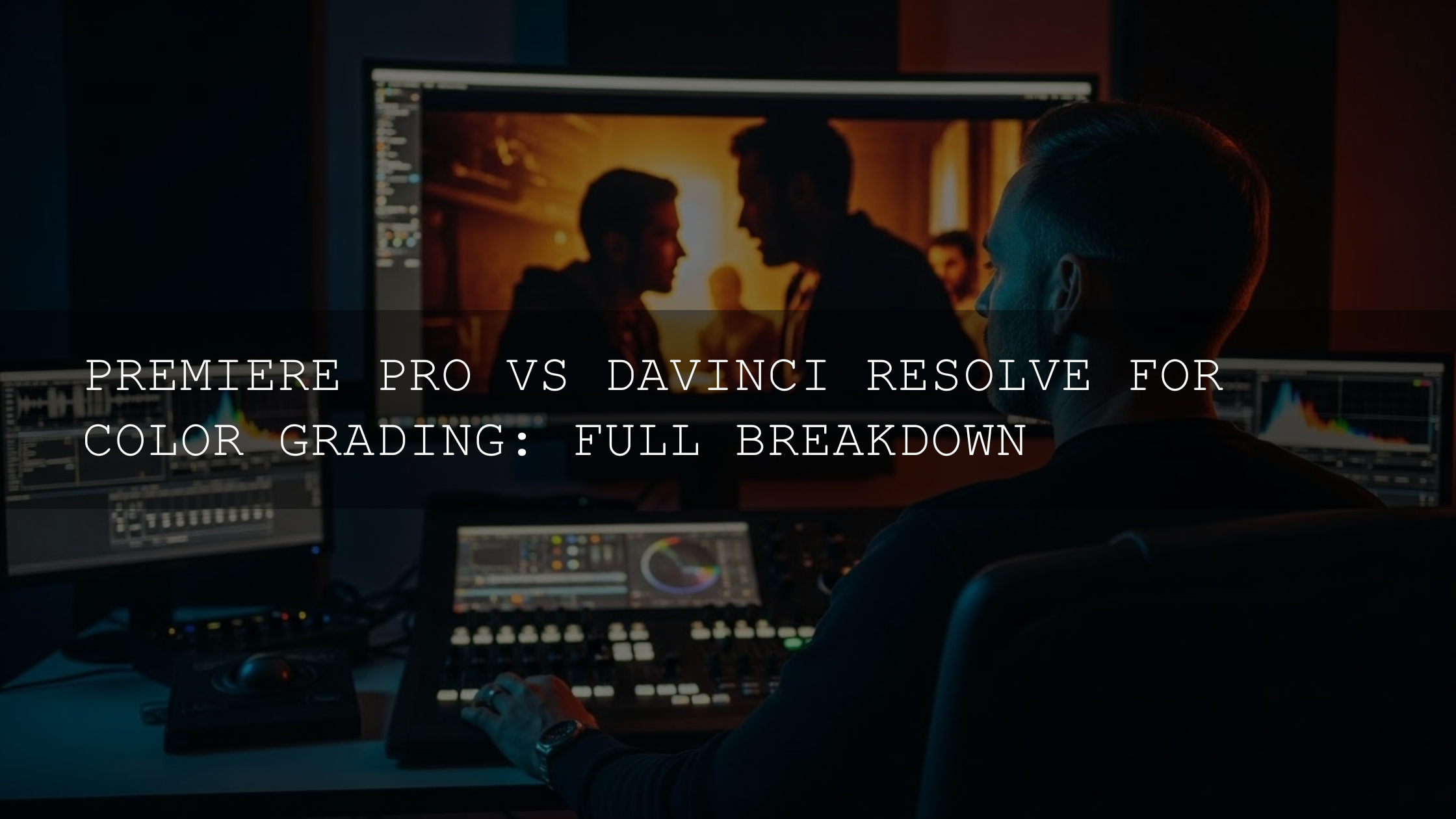
A Practical Color Grading Workflow for Sony A6400 & A6700 in 2025
Whether you’re in DaVinci Resolve, Adobe Premiere Pro, or Final Cut Pro, the steps are similar. The main difference is which tools you click—but the logic of the workflow stays the same.
1. Primary Color Correction: Make the Image Technically “Correct”
- Normalize white balance: Use temperature and tint controls—or the eyedropper on a neutral area—to remove strong color casts.
- Balance exposure: Use Lift/Gamma/Gain or Shadows/Midtones/Highlights to ensure your subject isn’t crushed into the shadows or clipped in the highlights. Watch the waveform or histogram as you adjust.
- Set contrast and black/white points: Increase contrast until the image “pops,” but leave breathing room at both ends of the scope to avoid clipping.
If you’re new to these tools in Premiere Pro, Adobe’s official guide to using the Lumetri Color panel for basic color correction is a great way to see how the Basic Correction, Creative, Curves, and Color Wheels sections all fit together.
2. Convert S-Log3 to Rec.709 with a Technical LUT
- Use the right conversion LUT: For S-Log3 and S-Gamut3.Cine, pick a LUT specifically designed to convert that combination to Rec.709. Applying the wrong transform is a fast way to get muddy, weird colors.
- Place it early in your node/stack: In DaVinci Resolve, many colorists put the conversion LUT on a node after primary correction so everything downstream works in Rec.709 space.
- Re-tune exposure after the LUT: Once the LUT is applied, go back and gently refine contrast, midtones, and highlights to get the exact balance you want.
For deeper dives into choosing and using LUTs with log footage, you can explore articles like the in-depth guide to the best LUTs for cinematic color grading in DaVinci Resolve or the walkthrough on crafting custom LUTs in Premiere Pro.
3. Creative Color Grading: Build Your Sony “Look”
- Shape the overall palette: Use color wheels to add warmth to midtones, cool down shadows, or introduce subtle tints that fit your story (e.g., teal shadows with warmer skin for a classic blockbuster feel).
- Protect skin tones: Check skin on the vectorscope and use HSL qualifiers or secondary corrections if you need to adjust skin separately from the background.
- Match shots: Compare similar shots side by side and match exposure, contrast, and color balance so cuts feel invisible.
- Experiment with stylized looks: Techniques like teal & orange, bleach bypass, or cross-processing can be powerful if used intentionally—guides such as the breakdown of teal & orange and other stylized grades can help you understand when and why they work.
On a recent edit, I took an A6400 handheld street sequence, dropped a cinematic LUT from AAAPresets, then added a subtle warm push in the midtones and cooler, slightly lifted shadows. The combination made the scene feel like a hazy, late-afternoon movie moment without destroying the natural Sony skin tones.
4. Finishing Touches: Polish Without Overdoing It
- Sharpen gently: Apply minimal sharpening so details pop without creating halos or a crunchy digital look.
- Noise reduction: If you shot at higher ISOs, apply just enough NR to tame noise while keeping texture—especially in hair and fabric.
- Vignette: A soft, subtle vignette can help guide the viewer’s eye toward your subject.
- Optional film grain: A fine layer of grain can add texture and help blend gradients, especially on 10-bit A6700 footage.
Presets & LUTs vs Manual Grading on Sony A6400 & A6700
When to Lean on LUTs and Presets
- Speed: LUTs give you a fast “base look” that you can tweak, which is ideal for YouTube uploads, client content, or tight deadlines.
- Consistency: Using the same LUT family across multiple Sony projects helps lock in a recognizable channel style.
- Inspiration: Dropping a new LUT pack on S-Log3 footage can reveal looks you might not have thought to build manually.
When Manual Grading Wins
- Tricky lighting or mixed color temperatures: Complex scenes often need custom corrections that a LUT alone can’t handle.
- Precise brand colors: If you need exact hues (brand clothing, product packaging), manual HSL work is essential.
- Matching multiple cameras: When matching your A6400/A6700 with other brands, you’ll probably combine LUTs with manual fine-tuning.
A powerful hybrid approach is to use a cinematic pack like the 700+ Cinematic Video LUTs as your starting point, then refine in your editor using curves and color wheels. If you also shoot stills, you can keep your brand consistent across photo and video by pairing these LUTs with a broad photo preset hub like the 1000+ Master Lightroom Presets Bundle.
Scopes, Wheels & Curves: Your Color Grading Compass
- Waveform: Shows luminance from left to right across the frame. Use it to set exposure and contrast without guessing.
- Vectorscope: Displays color hue and saturation. It’s your best friend for dialing in natural skin tones and avoiding oversaturated colors.
- Histogram: Gives a quick overview of tonal distribution—helpful for spotting clipped highlights or crushed blacks.
- Color wheels: Let you adjust shadows, midtones, and highlights independently in both color and brightness.
- Curves: Offer fine control for lifting shadows without affecting highlights, or targeting specific color channels for subtle shifts.
If you’re exploring DaVinci Resolve as your main grading tool, Blackmagic’s official training and color page overview are excellent starting points for learning how primaries, curves, and scopes are designed to work together.
Common Color Grading Mistakes with Sony APS-C Footage
- Over-grading: Cranking saturation and contrast until skin tones look radioactive and shadows clip is a quick way to make Sony footage feel cheap.
- Ignoring shot matching: If each angle in a scene has a different white balance or contrast, viewers will feel the jump—even if they can’t explain why.
- Breaking skin tones: Global tints that make skin look too magenta, green, or orange will distract more than any creative look helps.
- Banding on 8-bit clips: Pushing A6400 8-bit footage too far can cause visible color steps, especially in skies or gradients—make smaller, layered adjustments instead.
- Using the wrong LUT: Throwing a random LUT designed for a different profile or camera on S-Log3 footage usually leads to muddy, strange colors that are hard to fix.
Why the Sony A6700 Is a Color Grading Dream
The A6400 is still a workhorse, but the A6700 adds several upgrades that matter specifically for color grading:
- 10-bit 4:2:2 recording: Gives you smoother gradients and more robust color information for aggressive grades and stylized looks.
- Improved sensor performance: Cleaner noise handling at higher ISOs means your low-light footage can handle more contrast and saturation in post.
- AI-powered autofocus & IBIS: More stable, accurately focused footage from the start means you can concentrate on your grade instead of fixing technical issues.
In practice, this means you can confidently shoot fast-moving scenes in S-Log3 on the A6700, then stretch and shape the footage in post without constantly worrying about banding or tearing the image apart.
If you want to build a full ecosystem around your Sony cameras, it can also help to have a “home base” collection you can return to, such as the Cinematic LUTs for DaVinci Resolve collection or the Premium LUTs for Premiere Pro to Make Cinematic Videos, both of which are designed for serious video color work.
Keep Practicing, Keep Shooting, Keep Grading
Color grading is a skill that grows with every project. The more Sony A6400 and A6700 color grading sessions you complete, the faster you’ll recognize patterns: how S-Log3 behaves in harsh sun, how your LUTs respond to mixed light, and which curve shapes give you the exact contrast you like.
On days when you don’t feel like filming, you can still improve by re-grading older projects, experimenting with new LUTs, or testing a different workflow you’ve seen in tutorials or guides. Over time, your “guesswork” becomes instinct.
To keep learning, you might explore in-depth pieces on crafting a consistent color style for your channel or advanced topics like HDR video grading in Premiere Pro and matching Sony and Canon camera colors so your Sony workflow stays future-proof.
And if you’d like to know more about the brand behind these tools, the About AAAPresets page shares the story, mission, and creator behind the presets and LUTs you’re using.
Related reading from AAAPresets
- Crafting Custom LUTs in Premiere Pro
- Best LUTs for Cinematic Color Grading in DaVinci Resolve
- How to Build a Consistent Color Style for Your Channel
- Your Guide to HDR Video Grading in Premiere Pro
- Teal & Orange, Bleach Bypass & Cross-Processing Explained
When you’re ready to expand beyond a few favorite looks, you can browse broad starter hubs like the Lightroom Presets for Lightroom Mobile & Desktop collection or the multi-app Cinematic LUTs Pack for Premiere Pro, DaVinci & Final Cut Pro, taking advantage of the Buy 3, Get 9 FREE offer to build a full toolkit at once.
Frequently asked questions
What’s the best picture profile for color grading on the Sony A6400 and A6700?
If you’re comfortable grading and need maximum flexibility, S-Log3 (with S-Gamut3.Cine) is usually the best option. For a simpler workflow that still leaves room to grade, Cine profiles are a great middle ground. Standard and creative styles are better when you want fast turnaround and minimal grading.
Do I always need to shoot S-Log3 on the A6700 for YouTube videos?
No. S-Log3 is ideal when you have time to grade and want cinematic results, especially in challenging lighting. For quicker YouTube content, a Cine profile or even a well-tuned Standard profile plus light grading can look great and save time.
Can I get good results grading 8-bit footage from the A6400?
Yes, as long as you expose carefully and avoid extreme pushes in saturation or contrast. Use gentle, layered adjustments and rely on scopes to stay within a safe range. Shooting in a flatter profile (like a Cine option) often gives better results than trying to push a heavily processed creative style.
Do I need LUTs to color grade my Sony footage?
You don’t need LUTs, but they’re useful. Technical LUTs convert S-Log3 to Rec.709 accurately, and creative LUTs provide fast starting points for different looks. Many editors use LUTs as a base and then refine the grade manually with curves and color wheels.
Which software is best for grading Sony A6400 & A6700 clips?
DaVinci Resolve, Adobe Premiere Pro, and Final Cut Pro can all deliver professional results. DaVinci Resolve is especially strong for color-focused workflows, while Premiere Pro and Final Cut Pro are excellent if you’re already editing there and prefer an all-in-one timeline.
Written by Asanka — creator of AAAPresets (10,000+ customers).
Leave a comment
This site is protected by hCaptcha and the hCaptcha Privacy Policy and Terms of Service apply.