Mastering White Balance: Achieving Natural Colors in Your Photos
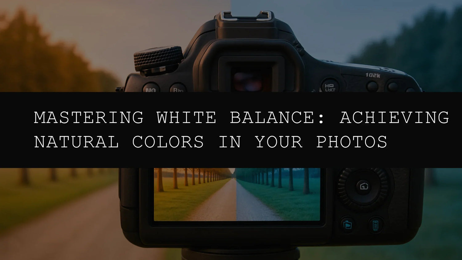
In the world of photography, achieving natural and accurate colors is paramount. White balance, often overlooked, plays a crucial role in determining how colors are rendered in your images. Mastering white balance is key to transforming your snapshots into professional-quality photographs, regardless of your subject matter. Whether you're capturing breathtaking aerial landscapes, intimate, moody portraits, vibrant street scenes, or perfectly balanced fashion shots, proper white balance ensures your photos look their best, conveying the true emotion and atmosphere of the moment. This comprehensive guide will delve into the intricacies of white balance, equipping you with the knowledge and techniques to capture and edit stunning, true-to-life images.
Understanding White Balance: The Foundation of Accurate Color Reproduction
White balance is the process of adjusting the color temperature of your image to ensure that white appears white, and other colors are accurately represented. Different light sources—daylight, incandescent bulbs, fluorescent lights, flash photography, and even shaded areas—emit light with varying color temperatures, measured in Kelvin (K). These variations affect how your camera's sensor interprets colors, potentially introducing color casts in your images. Without proper white balance correction, your photos may appear too blue, orange, yellow, or green, significantly impacting the overall aesthetic and realism of your work. For instance, a photo taken under incandescent lighting might exhibit a noticeable orange or yellow tint if the white balance isn't adjusted accordingly. Conversely, a photo taken in the shade could appear overly cool and bluish.
Understanding this fundamental concept is the cornerstone of producing photos with accurate and natural-looking colors. Think of it as calibrating your camera's 'color perception' to match the specific lighting conditions of the scene. This calibration ensures your images reflect the reality of the scene accurately, avoiding the jarring effect of unwanted color casts.
The Devastating Impact of Inaccurate White Balance: Color Casts and Their Consequences
Imagine capturing a stunning sunset: the sky should blaze with fiery oranges and reds, the clouds painted with warm hues. But if your white balance is off, the same sunset might appear as a dull, washed-out scene dominated by unnatural blues or greens. This is the result of a color cast—a shift in color that alters the true hues of your subject. Inaccurate white balance can completely derail your artistic vision, transforming beautiful photos into technically flawed images. The impact extends beyond sunsets; it affects all your images, from portraits to landscapes, and even still life shots.
In portraits, inaccurate white balance can significantly alter skin tones, making them appear unnatural or unflattering. A warm color cast might make skin appear too ruddy, while a cool cast might render it pale and lifeless. Similarly, in landscapes, inaccurate white balance can dramatically shift the colors of foliage, water, and sky, diminishing the vibrancy and natural beauty of the scene. In food photography, accurate color representation is vital for capturing the delicious appeal of the subject. An incorrect white balance setting could dramatically alter the food's color, making it less appealing than it actually is. In short, consistent and accurate white balance is crucial for maintaining the integrity and visual appeal of your photographic work.
White Balance Settings: A Comprehensive Guide to Your Camera's Options
Most cameras offer various white balance settings to help you overcome different lighting challenges. Understanding these options provides you with the tools to fine-tune your photos and maintain consistency. Let's explore the most common white balance settings in detail:
- Auto (AWB): The camera automatically determines the best white balance setting based on the scene. While convenient, AWB can sometimes misinterpret complex lighting situations, especially when dealing with mixed light sources or unusual color casts. This is a good starting point, but manual adjustments are often necessary for more precision.
- Daylight: Optimized for shooting outdoors on a bright, sunny day. It's generally a good choice for outdoor photography under clear skies. However, it might need adjustments on partly cloudy days or in harsh sunlight.
- Cloudy: Ideal for overcast conditions, where the light is diffused and cooler. It adds a touch of warmth to compensate for the cooler light, resulting in more natural-looking colors.
- Shade: Best for shooting in shady areas, where the light is softer and warmer than direct sunlight. This setting balances the colors in shaded environments, correcting for the warmer tones.
- Tungsten (Incandescent): Designed for indoor settings illuminated by incandescent light bulbs, which cast a warm, yellowish light. It compensates for the warmer tone of incandescent bulbs, producing more neutral colors.
- Fluorescent: Specifically for indoor settings with fluorescent lighting, which often produces a greenish or bluish cast. This setting corrects the cool tones prevalent in fluorescent lighting, resulting in more accurate color representation.
- Flash: Optimized for use with a flash, as flash photography produces a relatively neutral light. It helps maintain accurate colors in flash-lit scenes, minimizing color casts.
- Custom White Balance: This advanced setting allows you to manually set your white balance using a neutral gray or white object. This provides ultimate control over color correction and is excellent for unique lighting scenarios or when you need precise color calibration. It is best used when you have a neutral object available for calibration purposes.
- Kelvin (K): Some cameras allow you to manually adjust the white balance using a Kelvin temperature scale. This allows for the most precise control over color temperature, giving you the ultimate flexibility to fine-tune the colors in your images.
Beyond Auto: Mastering Manual White Balance for Professional-Level Results
While automatic white balance is convenient for quick snapshots, it's not always accurate. For precise control over the color temperature of your images and to consistently achieve natural-looking colors, manual white balance is highly recommended. By choosing the correct white balance setting for the specific lighting conditions, you'll significantly enhance the quality and realism of your photos. Manual white balance is particularly crucial when dealing with mixed lighting—a combination of daylight and indoor lighting, for instance—or when striving for a specific artistic effect.
With practice, you can develop an eye for quickly assessing lighting conditions and selecting the ideal setting. It involves observing the overall color cast of the scene and selecting the corresponding white balance setting to counteract the cast. For example, if the scene has an overall bluish tint, selecting the 'Tungsten' setting may be appropriate to counteract the cool tones. This process significantly refines your technical skills, leading to more visually appealing and technically sound images.
Lightroom Presets: Streamlining Your Workflow and Elevating Your Color Grading
Lightroom presets, carefully designed collections of adjustments, can take your image editing to the next level. They provide an efficient way to add specific styles and moods, complementing your work with a consistent look and feel. While mastering white balance is fundamental, Lightroom presets empower you to explore advanced color grading and stylistic choices beyond simple corrections. They are particularly useful for photographers who want to apply specific artistic treatments to their images quickly and efficiently, saving significant time and effort.
Moreover, Lightroom presets can be highly beneficial in maintaining consistency across your projects. Imagine you are working on a series of photographs that need to maintain a specific color palette. Rather than manually adjusting each image individually, you can apply a relevant preset that automatically applies a consistent color profile across your entire project. This consistency is crucial for photographers who maintain a distinct artistic style or who create content for a particular brand.
For stunning aerial shots that capture the vastness of the landscape, the AI Optimized Drone Aerial Lightroom Presets are a must-have. These presets offer enhanced clarity and vibrancy, perfectly complementing the unique perspective of aerial photography. 
To achieve a dreamy, otherworldly aesthetic reminiscent of anime, consider the AI-Optimized Anime Dreamy Lightroom Presets. These presets expertly blend soft pastel colors and glowing highlights, ideal for creating whimsical and enchanting visuals. 
For dramatic night shots brimming with cinematic mood, the AI-Optimized Cinematic Dark Street Lightroom Presets provide deep shadows and rich tones, perfect for capturing the atmosphere of urban nightscapes. 
When shooting professional photoshoots, the AI-Optimized Cinematic Photo Shoot Lightroom Presets deliver rich tones and balanced contrast, creating a polished, cinematic look. These presets are a valuable addition to any professional photographer's toolkit. 
For achieving natural and beautifully balanced edits of dark skin tones, the AI-Optimized Dark Skin Tones Lightroom Presets are specifically designed to maintain accurate and rich color grading, ensuring your portraits are both beautiful and true-to-life. 
Troubleshooting Common White Balance Issues
Even with careful attention to detail, you might encounter issues with white balance. Here are some common problems and their solutions:
- Color Casts: If your images have an overall color tint (e.g., blue, orange, green), adjust the white balance settings accordingly. Experiment with different presets or manually adjust the Kelvin temperature.
- Inconsistent Colors: If the colors in your image appear uneven, check your lighting conditions and ensure you're using a consistent light source. Avoid mixing different types of lighting in the same scene.
- Unnatural Skin Tones: If skin tones appear unnatural, carefully review your white balance settings, paying close attention to the color temperature of your light source.
- Over-Correction: Sometimes, over-correcting the white balance can lead to unnatural or washed-out colors. Strive for a subtle correction that retains the natural hues of your scene.
Conclusion: Elevating Your Photography Through Color Mastery
Mastering white balance and leveraging the power of Lightroom presets are fundamental skills for any photographer aiming for professional-level results. By understanding the nuances of white balance and employing the right tools, you can consistently achieve accurate, natural colors, allowing you to capture and convey the true essence of each moment. Consistent attention to detail, combined with the strategic use of editing tools such as Lightroom presets, elevates your photography from snapshots to works of art. Whether you're a seasoned professional or just starting out, mastering these techniques is paramount in your journey to capturing stunning, true-to-life images. Remember that practice is key; the more you experiment and learn from your experiences, the more confident and skilled you'll become in achieving perfect white balance in your photography.


Leave a comment
This site is protected by hCaptcha and the hCaptcha Privacy Policy and Terms of Service apply.