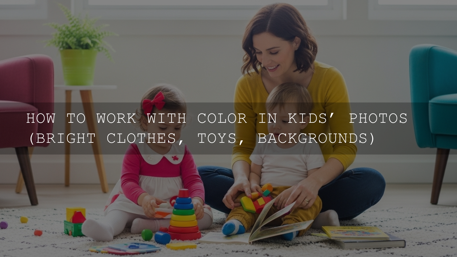
How to Use Color in Children’s Photos Without Letting Bright Clothes, Toys, or Backgrounds Take Over
Color can make or break children’s photography. When you’re working with bright clothes, colorful toys, and busy backgrounds, the goal is not to remove the energy. It’s to shape it. The best children’s photos still feel playful and real, but they also guide the eye, protect skin tones, and keep the frame from feeling chaotic. That balance is where smart editing, good composition, and the right portrait Lightroom presets or a flexible bundle like the 1000+ Master Lightroom Presets Bundle can save a huge amount of time.
If you want a fast starting point for bright, lively kid portraits, browse the Portrait Photography Lightroom Presets collection and test a few clean, natural looks before you start building your final edit. That is especially useful when you are sorting through a full family session and need consistency. And if you are building a larger toolkit, you can Buy 3, Get 9 FREE when you add 12 to your cart.
Why color matters so much in children’s photography
Children’s photography is naturally full of visual competition. A red shirt, a blue toy box, yellow building blocks, and a green playground can all appear in the same frame. That is exactly why color is not just decoration here; it becomes structure.
Here’s why this matters: when color is handled well, the image feels alive. When it is handled badly, the viewer does not know where to look.
- Color creates mood. Warm tones feel energetic and cheerful. Cooler tones can feel calm, dreamy, or reflective.
- Color controls attention. The brightest or most saturated part of the frame usually pulls the eye first.
- Color supports storytelling. Toys, clothes, walls, and outdoor locations often tell you what kind of childhood moment you are looking at.
- Color affects skin tones. Oversaturated reds, yellows, or greens nearby can easily spill into skin and make children look unnatural.
I have tested bright portrait presets on family and kid sessions where the original files looked fun in person but messy on screen. In almost every case, the winning edit was not the most colorful one. It was the one that kept the scene vibrant while gently simplifying the color relationships.
Start by choosing what the photo is really about
Before touching sliders, decide what the photo should say. Is the hero the child’s face, their laughter, the toy they are obsessed with, or the colorful environment itself?
That single choice changes the edit.
- If the child’s expression is the focus, reduce competing color elsewhere.
- If the play scene is the story, let more color remain in the background.
- If the outfit is part of the personality, protect that color and tame the surrounding tones.
- If the location matters, balance the palette instead of flattening it.
This is also where a preset-first workflow helps. Apply a clean base, then judge the frame. If your preset pushes every color at once, it is probably the wrong starting point for children’s photos. A softer option like AI-Optimized Soft Window Light Lightroom Presets usually gives you more room to keep skin natural.
How to handle bright clothes without making the image feel loud
Bright clothing is not the problem. Uncontrolled color relationships are the problem.
1. Let one color lead
If a child is wearing a vivid red, blue, or yellow outfit, treat that color as the visual anchor. Once you do that, the rest of the edit becomes easier. Instead of boosting all saturation, adjust the supporting colors so the main outfit color feels intentional.
2. Watch skin against nearby color
Bright shirts often reflect into the chin, cheeks, or arms. Red tops can warm skin too much. Green grass can add an unpleasant cast to shadows. Blue playground equipment can cool faces more than expected. This is where local correction matters more than global color.
Adobe’s official guides to masking in Lightroom Classic and the Color Mixer tool are genuinely useful if you want precise control without damaging the full image.
3. Lower saturation selectively, not globally
A common mistake is dragging overall saturation down. That usually dulls skin, clothes, and the environment at the same time. Instead:
- Lower the specific problem color in HSL or Color Mixer.
- Raise luminance slightly if the color still feels too heavy.
- Use a subject mask to restore life to the face if needed.
4. Use contrast to simplify, not dramatize
Children’s portraits usually look better with soft contrast than hard contrast. Too much contrast makes colorful clothing feel harsher. A gentle curve and slightly lifted shadows often keep the image playful.
How to use colorful toys as part of the composition
Toys are perfect for storytelling, but they need hierarchy. A frame with ten equally colorful objects rarely feels strong. A frame with one or two supporting props usually does.
Use toys in one of three roles
- Main prop: The toy is part of the child’s interaction and deserves attention.
- Color accent: The toy adds a small pop that balances the frame.
- Context layer: The toy stays softer, more blurred, or less saturated to build story without stealing focus.
For example, if a child is holding bright blocks, keep those blocks vivid and lower saturation in the other background toys. If the toy pile is just environmental context, blur it with depth of field during capture and reduce its presence during editing.
When I edit sessions like this, I often start with a clean base preset, then ask one question: “Which object would I miss if I removed it?” That object usually gets protected. The rest becomes supporting cast.
How to work with colorful backgrounds without flattening the scene
Busy backgrounds can still look polished when the color distribution is controlled. A bright mural, playroom wall, or park setup does not automatically ruin the frame. But it does mean you need separation.
Use these fast fixes first
- Cool or desaturate the background slightly if the subject is dressed in warm tones.
- Lower background clarity or texture to make the subject feel cleaner and more prominent.
- Darken the edges subtly so the eye returns to the center of action.
- Reduce the luminance of dominant background colors if they are brighter than the face.
If you regularly struggle with muddy or distracting edits, read this guide on fixing flat presets and restoring depth. It pairs well with kid and family sessions because busy scenes often need depth control more than more saturation.
A practical Lightroom workflow for colorful children’s photos
Let’s break it down into a repeatable workflow you can use on almost any session.
Step 1: Fix exposure and white balance first
Do not judge color until exposure is close and white balance is believable. If the file is too dark, colors look muddy. If it is too warm, skin turns orange fast. If it is too cool, the scene loses life.
For a clean starting point, Adobe’s official Lightroom page is still the best place to review the current toolset and workflow basics.
Step 2: Apply a preset that respects skin tones
Pick a preset that gives you a soft base instead of an aggressive style. For children’s photos, that usually means:
- gentle contrast
- natural whites
- moderate vibrance
- controlled yellow and green response
A strong starting point is a flexible portrait option like AI Optimized Portrait Lightroom Presets. If you want maximum variety for indoor, outdoor, bright, and soft edits, the Premium Lightroom Presets & LUTs Bundles collection gives you more room to match each scene.
Step 3: Adjust the Color Mixer or HSL panel
This is where you clean up color competition.
- Reduce red saturation if clothing is overpowering the frame.
- Shift yellow slightly warmer or softer if the environment feels too acidic.
- Lower green saturation in parks when grass starts to dominate skin.
- Raise orange luminance slightly if faces need softness without losing natural tone.
Step 4: Mask the subject
Create a subject or people mask and make small corrections there:
- slight exposure lift
- small warmth adjustment if skin went cool
- tiny texture reduction for a softer look
- subtle clarity control around the face only
This step is often what separates a professional-looking edit from a “preset only” result.
Step 5: Calm the background
Use an inverse subject mask or background mask to:
- reduce saturation a touch
- drop clarity slightly
- lower highlights if colorful objects are pulling attention
If you often see strange yellow or color casts after applying presets, this article on fixing yellow hue issues in Lightroom presets is worth bookmarking.
Step 6: Finish for consistency across the full gallery
Once you have one image working, sync the edit carefully across similar frames. Then fine-tune individual images where clothing or backgrounds changed.
Presets vs manual editing for children’s photography
This comparison matters because colorful children’s sessions can trick photographers into thinking presets are the problem. Usually, it is more about how the preset is used.
- Presets win for speed and consistency. They give you a repeatable base across a full gallery.
- Manual editing wins for problem-solving. It helps when one shirt, one wall, or one toy is throwing everything off.
- The best workflow combines both. Use a preset for the look, then use masking and HSL for control.
I almost never recommend fully manual editing from zero on a big kid or family gallery unless you want to spend far more time than necessary. A strong preset gets you close. The manual refinements make it look custom.
Real-world examples you can apply right away
Example 1: Red sweater in a green park
The red sweater is the personality piece. Keep it vivid, but reduce green saturation slightly and soften the background with a mask. Then lift orange luminance a little to keep skin gentle.
Example 2: Blue toys in a white playroom
Let the room stay clean and bright. Protect the whites, stop the blues from clipping, and use a subject mask so the child’s face remains warmer than the room.
Example 3: Multicolor play mat indoors
If the play mat is not important to the story, reduce its saturation selectively and let the child’s expression become the strongest visual point. This is a perfect use case for a soft base preset plus background masking.
Helpful mistakes to avoid
- Do not oversaturate all colors together. It makes the image louder, not better.
- Do not leave skin at the mercy of nearby objects. Reflective color casts are common in children’s photos.
- Do not sharpen every detail equally. Toys and patterns will start competing with faces.
- Do not use the same preset strength on every frame. Colorful scenes need small adjustments.
When a softer look works better than a vibrant one
Not every child photo needs maximum color. Some of the strongest edits are bright and airy, with controlled contrast and just enough color to feel alive. For that style, see Bright & Airy Presets for lifestyle photography. Even though it is not only about children’s photography, the workflow translates well to family and indoor kid sessions.
And if you are still building your editing toolkit, the 1000+ Master Lightroom Presets Bundle is the easiest way to test different color directions without starting from scratch every time. Pair that with the Portrait Photography Lightroom Presets collection for fast browsing. You can Buy 3, Get 9 FREE when you add 12 products to your cart, which makes it easier to build a practical set for portraits, kids, families, and indoor sessions.
Final thoughts
The best way to use color in children’s photos is to stop treating it like a problem that needs to be removed. Color is often the reason the moment feels real in the first place. Your job is to organize it. Keep the joy, soften the distractions, protect the skin, and let one clear subject lead the frame.
If you want help getting presets installed before your next session, the step-by-step Lightroom preset installation guide is a useful place to start. From there, test a clean portrait base, make small HSL adjustments, and use masking to finish with intention. That mix of speed and control is what makes colorful children’s photography look polished instead of chaotic.
FAQ
Should I reduce saturation in children’s photos?
Only selectively. Global saturation cuts usually make skin look flat. It is better to target the specific colors that are overpowering the frame, like greens, reds, or yellows.
What is the best preset style for colorful kid portraits?
A soft, clean portrait preset usually works better than a heavy cinematic or high-contrast look. Start with a natural base, then refine with masking and HSL adjustments.
How do I keep bright clothes from reflecting onto skin?
Use local masking on the subject and fine-tune temperature, tint, and color locally if needed. You can also reduce the saturation or luminance of the clothing color slightly if it is spilling too much.
Are presets enough for children’s photography?
Presets are excellent for speed and consistency, but most colorful scenes still need a few manual tweaks. The best results usually come from preset-first editing with a quick pass in HSL and masking.
What should I do if the background is too colorful?
Use a background mask to lower saturation, clarity, or highlights slightly. That keeps the environment in the story while bringing the viewer back to the child.
Written by Asanka — creator of AAAPresets (10,000+ customers).
Leave a comment
This site is protected by hCaptcha and the hCaptcha Privacy Policy and Terms of Service apply.