Detail Shot Editing for Interiors, Furniture, and Styled Decor in 2026
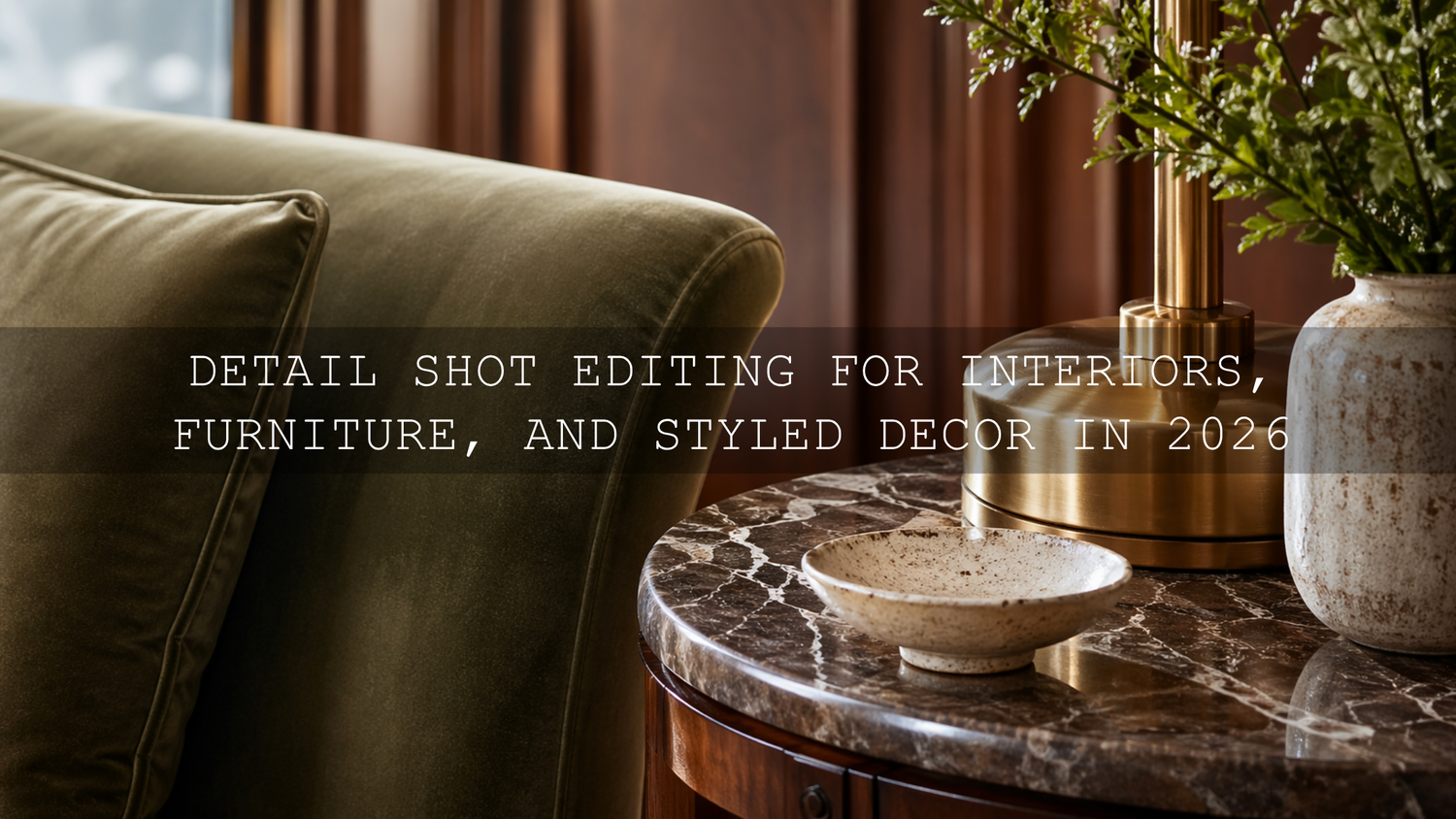
Detail shot editing is what turns good close-ups into images people stop and study. In interior detail photography, furniture detail photography, and decor photo editing, the smallest choices matter: the way velvet catches light, how wood grain reads on screen, whether brass looks premium instead of yellow, and whether shadows feel rich rather than muddy. If you want a faster starting point for polished interior close-ups, try the AI-Optimized Interior Design & Real Estate Lightroom Presets and browse the wider Lightroom Presets for Lightroom Mobile & Desktop collection. It is an easy way to build a cleaner workflow, and you can still use the Buy 3, Get 9 FREE offer naturally as you grow your editing toolkit.
Here’s why this matters. Wide shots sell the room, but detail shots sell the feeling. They show craftsmanship, styling taste, materials, finish quality, and the care behind a space. A close-up of stitched linen, a marble edge, a lamp base, or a hand-thrown ceramic object can say more about quality than an entire room overview. In 2026, where people scroll quickly and judge visual quality in seconds, strong detail editing helps your work feel more premium, more intentional, and more trustworthy.
I have tested interior presets on close-up edits of wood, fabric, matte paint, reflective metal, and stone surfaces, and the biggest improvement usually comes from subtle control rather than dramatic effects. Another thing I have seen repeatedly is that viewers respond better when textures stay believable. The best edits do not scream “preset.” They make the image feel clean, tactile, and expensive.
Why Detail Shots Matter More Than Most Creators Think
Whether you shoot for interior designers, furniture stores, real estate listings, Airbnb hosts, product brands, or your own decor content, close-up photography works as proof. It proves material quality. It proves styling intention. It proves that the room was not just staged well, but finished well.
A sofa can look nice in a full-room shot, but a close crop reveals the weave, the seam quality, the softness, and the color accuracy. A side table can look ordinary from across the room, but a detail frame can reveal craftsmanship, edge finish, and the quality of its surface. That is why editing detail shots is less about flashy effects and more about guiding the eye toward the best visual information.
If you also work across property and architecture, the article Presets for Real Estate Photography: Bright, Clean & Professional is useful for cleaner indoor color, and Real Estate & Architecture: How Color Grading Shapes Perception is a strong follow-up when you want your edits to feel intentional instead of generic.
What Makes a Great Detail Edit
A strong detail shot edit usually does five things well:
- Protects texture so fabric, wood, leather, stone, or metal still feel real.
- Controls highlights so glossy surfaces and windows do not pull attention away from the subject.
- Balances white balance so whites look clean and materials keep believable color.
- Adds depth through contrast and tonal shaping, not through harsh over-processing.
- Keeps consistency across a full set of images so the project feels professionally finished.
Adobe’s official resources are helpful here. For global tonal balance, Adobe’s guide to tone controls in Lightroom Classic explains how highlights, shadows, whites, and blacks work together. For selective corrections, Adobe’s guide to masking in Lightroom Classic is especially useful when you need to refine only the cushion, tabletop, artwork, or hardware instead of the whole frame. And if you want better palette decisions when styling or color grading, Adobe Color harmony rules can help you keep tones cohesive.
Presets vs Manual Editing for Detail Shots
Let’s break it down. This is not really a battle of one versus the other. The best workflow uses both.
What presets do best
Presets give you speed, consistency, and a reliable creative starting point. They help you move quickly across a full gallery of close-ups, especially when you need a matching look for upholstery, wood, decor, and architectural finishes in the same project. For indoor scenes and styled spaces, the AI-Optimized Interior Design & Real Estate Lightroom Presets are especially useful because they start from a cleaner indoor balance and save time on repetitive adjustments.
What manual editing still does better
Manual adjustments are where you finish the image properly. Presets cannot fully understand whether brass has gone too yellow, whether marble lost fine texture, or whether a shadow under a shelf is now too heavy. That is where small exposure tweaks, white balance corrections, masking, HSL adjustments, and local texture control matter.
The practical answer
Use a preset or LUT to get into the right visual neighborhood fast. Then refine. That gives you efficiency without sacrificing quality.
If you want a broader read on workflow decisions, Lightroom Presets vs Photoshop Actions: Which Is Better for Editing is worth reading, especially if you work across stills, product sets, and brand content.
Choosing the Right Look for the Subject
Not every detail shot needs the same treatment. The right edit depends on the material, the light, and the story you want to tell.
For bright interiors, neutral decor, and clean luxury spaces
When the goal is crisp, airy, and premium, a balanced neutral edit usually works best. You want whites that feel clean without going blue, warm tones that stay controlled, and enough contrast to define shape without making the space feel hard. This is where the Real Estate LUTs Pack and the AI-Optimized Interior Design & Real Estate Lightroom Presets make a strong pair. They work well for cabinet details, fabric textures, styled shelves, kitchen materials, and architectural finishes.

For dramatic styling, premium objects, and editorial close-ups
If you want deeper mood and more graphic texture, monochrome or restrained contrast can create a high-end editorial feeling. The Luxury Black and White LUTs Pack is excellent for emphasizing shape, stitching, grain, and form. For still images, the AI-Optimized Luxury Black and White Lightroom Presets are ideal when you want detail shots of leather, stone, sculptural decor, or furniture edges to feel refined and timeless.

For heritage spaces, antique surfaces, and story-rich scenes
Some detail shots benefit from warmth, softness, and a lived-in visual tone. Antique wood, old stone, brass fixtures, artisan ceramics, and vintage decor often look best with a color treatment that feels gentle and narrative rather than clinically neutral. In those cases, the AI-Optimized Historic Travel Look Lightroom Presets can help you create a timeless finish without making the image feel heavy or artificial.
A Step-by-Step Workflow for Better Detail Shot Editing
- Start with exposure. Before applying style, make sure the image is fundamentally readable. Lift dark frames only enough to reveal texture. Pull highlights back if polished surfaces or bright windows are distracting.
- Fix white balance early. Warm lamps, cool daylight, and reflective surfaces can create ugly color shifts fast. Neutralizing the base image first makes every preset work better.
- Apply the preset or LUT. Choose the look that matches the subject, not just your personal preference. Clean and bright for airy interiors, deeper monochrome for graphic luxury, warmer tones for historic or crafted subjects.
- Refine texture carefully. Texture and clarity are powerful, but easy to overdo. On linen, wood, woven surfaces, and stone, small increases often look better than aggressive ones. The goal is tactile realism, not crunchy over-sharpening.
- Use masking for local corrections. Brighten a fabric fold, soften a hot reflection on metal, or reduce distraction in the background. This is often what separates a quick edit from a professional one.
- Check color relationships. If one accent color starts pulling too much attention, reduce its saturation slightly. Decorative styling should feel harmonious, not chaotic.
- Finish with consistency. Compare the detail shots side by side. The set should feel cohesive in brightness, color temperature, and contrast.
Common Mistakes That Make Detail Shots Look Cheap
- Too much clarity. It may look “sharp” at first, but it often makes textiles and surfaces feel harsh.
- Over-warming indoor shots. This can make whites turn beige and metals turn yellow.
- Ignoring mixed lighting. Window light plus warm bulbs can make decor colors inconsistent from frame to frame.
- Crushing shadows. Deep shadows can feel dramatic, but they also hide finish quality and craftsmanship.
- Using one look for every subject. Marble, velvet, matte paint, brass, glass, and dark wood do not all respond well to the same treatment.
If indoor color is your biggest issue, read Why Do My Presets Look So Bad Indoors? Simple Fixes for Indoor Lighting. And if your frames mix daylight and interior light, Mastering Presets in Tricky Mixed Lighting will save you time.
Pro Tips for Textures, Metals, Wood, and Fabric
For velvet and woven fabrics: keep highlights soft and avoid too much dehaze. You want richness, not stiffness.
For wood grain: increase texture slightly before pushing contrast. Contrast alone can make wood look flat or muddy.
For brass and warm metal: watch yellow saturation closely. A premium gold tone usually looks better when it is slightly restrained.
For marble and stone: protect highlight detail first, then build local contrast gently so veining stays visible.
For glass and glossy ceramics: use masking to control reflections instead of darkening the whole image.
These details are also important in product-led work. If you shoot decor, retail items, or styled brand sets, The Best Lightroom Presets for E-commerce & Product Photography is a helpful companion article.
Building a Faster Workflow Without Losing Quality
The fastest editors are not the ones who rush. They are the ones who repeat a smart system. Build one base correction for exposure and white balance, apply the right preset or LUT, then make only the local refinements that matter most. That keeps your workflow efficient while still protecting material realism.
If you are building a larger editing library for interiors, products, and mood-driven close-ups, it makes sense to combine a clean indoor set, a monochrome set, and a broader browsing option. A simple combination is the AI-Optimized Interior Design & Real Estate Lightroom Presets for natural indoor work, the AI-Optimized Luxury Black and White Lightroom Presets for premium editorial close-ups, and the Bundles collection when you want more looks in one place.
Related Reading
- Presets for Real Estate Photography: Bright, Clean & Professional
- Real Estate & Architecture: How Color Grading Shapes Perception
- The Best Lightroom Presets for E-commerce & Product Photography
- Why Do My Presets Look So Bad Indoors? Simple Fixes for Indoor Lighting
- Mastering Presets in Tricky Mixed Lighting
Final Thoughts
Great detail shot editing is not about making everything louder. It is about making the right things clearer: texture, craftsmanship, tone, shape, and mood. When your edit helps viewers feel the softness of fabric, the finish of wood, the weight of stone, or the elegance of styling, the image becomes more persuasive.
If you want to speed up your detail shot editing without losing that polished professional finish, start with the AI-Optimized Interior Design & Real Estate Lightroom Presets for clean close-ups, add the Luxury Black and White LUTs Pack or AI-Optimized Luxury Black and White Lightroom Presets for dramatic premium looks, and explore the Lightroom Presets for Lightroom Mobile & Desktop or Bundles collection to build a workflow that fits your style. It is a practical way to edit faster, stay consistent, and take full advantage of Buy 3, Get 9 FREE.
FAQ
What is the best way to edit detail shots of furniture and decor?
Start with exposure and white balance, apply a preset or LUT that matches the scene, then refine texture, highlights, and local contrast with masking so the materials stay believable.
Should I use presets for interior detail photography?
Yes, presets are excellent for speed and consistency, especially across full projects. The best results come when you treat them as a starting point and still fine-tune each image.
How do I make textures stand out without over-editing?
Use small texture and clarity adjustments, protect highlights, and avoid crushing shadows. Subtle edits usually make fabrics, wood, and stone look more premium than aggressive sharpening.
Are black and white edits good for decor detail shots?
They can work beautifully when the subject has strong shape, contrast, or texture. Black and white is especially effective for luxury finishes, sculptural objects, and editorial-style close-ups.
What causes detail shots to look muddy indoors?
Mixed lighting, poor white balance, heavy shadows, and over-warm color treatment are the most common reasons. Correcting the base light first makes presets work much better.
Written by Asanka — creator of AAAPresets (10,000+ customers).
Leave a comment
This site is protected by hCaptcha and the hCaptcha Privacy Policy and Terms of Service apply.