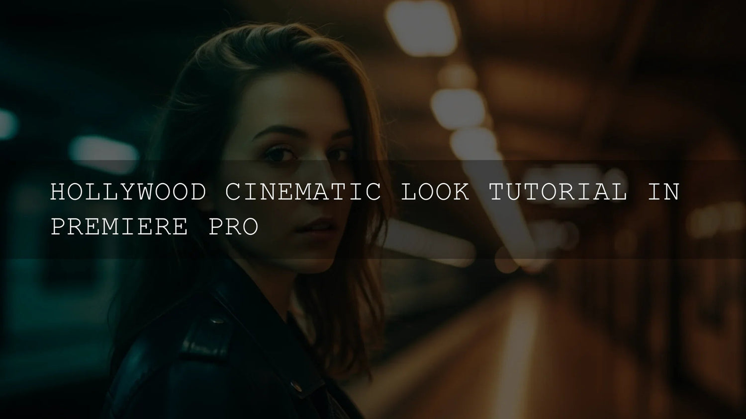
How to Get the Hollywood Cinematic Look in Premiere Pro (Practical, No-Fluff Guide)
Want that unmistakable Hollywood cinematic look in Adobe Premiere Pro—rich color, sculpted contrast, creamy highlights, tasteful grain, and an immersive widescreen frame? This guide walks you through a reliable workflow for cinematic color grading, aspect ratios, texture, and consistency. We’ll use Premiere Pro’s Lumetri Color, scopes, and simple effects, plus a few pro tricks that scale from client ads to travel films. I’ll also show where presets/LUTs speed things up—and where to grade by hand for precision.
If you’d like a head start, try a curated LUT bundle designed for cinematic color, then refine by hand. Explore cinematic LUTs for Premiere Pro, and keep browsing the full Video LUTs collection—there’s a Buy 3, Get 9 FREE offer so you can test multiple looks quickly.
What “Cinematic” Really Means
- Intentional color shaping: Direct emotion and story with palettes (teal shadows, warm skin; cool mids, gold highlights). The point isn’t saturation—it’s control.
- Managed dynamic range: Deep blacks with detail, protected highlights, and a gentle roll-off—never crunchy or blown out.
- Lens-like depth cues: Shallow DoF at capture; in post, emphasize subject separation through luminance and hue contrast.
- Organic texture: Subtle film grain adds tactile realism and masks digital harshness.
- Widescreen framing: 2.39:1 or 1.85:1 “signals cinema” and focuses the eye.
Shoot to Grade: Capture Settings That Make Post Easy
- Shoot Log/flat profiles when possible: C-Log, S-Log, V-Log, BMD Film—more latitude for grading and smoother gradients.
- Expose with intention: Protect highlights; use the histogram/zebra to avoid clipping bright skin or skies.
- Use the 180° shutter rule: 24 fps ≈ 1/48, 25 fps ≈ 1/50 for natural motion blur.
- White balance on set: A proper WB reference card saves time (and noise) later.
From experience: on wedding shoots, I slightly underexpose faces in strong backlight and recover mids in-grade—it preserves highlight detail in the veil/dress and keeps skin luminous after the LUT.
Premiere Pro Workflow: Clean, Repeatable, Cinematic
1) Prep Color Management & References
- Create a references bin: stills from films/ads that match your intended tone.
- Open Window > Workspaces > Color. Ensure your sequence and clips are interpreted correctly (Rec.709 unless you’re in a managed HDR workflow). See Adobe’s overview of Lumetri Scopes and how to read them to keep exposure and saturation honest.
2) Balance the Shot (Lumetri > Basic Correction)
- Input LUT (Log → Rec.709): Apply a camera transform in Basic Correction > Input LUT if shooting Log. If you don’t have a camera LUT, start neutral and move to Curves later.
- White Balance: Eyedropper a true gray/white if available; otherwise adjust Temperature/Tint watching the vectorscope skin line.
- Exposure & Contrast: Use waveform to place skin around ~55–65 IRE (varies with scene). Set Whites/Blacks to kiss the edges without clipping; nudge Highlights/Shadows to reclaim detail.
3) Sculpt Contrast & Tone (Curves)
- RGB Curves “cinema S”: Gentle lift in highlights, gentle drop in shadows, keep midtone detail for faces.
- Hue vs Sat: Tame neon greens; give reds a modest bump for richer skin and wardrobe.
- Hue vs Hue: Push skies slightly toward teal while protecting skin.
4) Build the Palette (Color Wheels & Match)
- Shadows: Nudge cool/teal (tiny move goes far).
- Midtones: Keep near-neutral for natural skin.
- Highlights: Warm toward amber/gold for glow.
- Dial global Saturation down a touch for a filmic, less-digital feel.
For LUT users: treat a creative LUT as a starting point. Apply it on an Adjustment Layer, then refine Curves/Wheels beneath. Adobe’s guide to Looks & LUTs in the Lumetri Color panel explains the mechanics of applying LUTs cleanly.
5) Targeted Clean-Up (HSL Secondary)
- Isolate skin tones; even their hue/sat across shots.
- Separate sky/foliage ranges for subtle mood shifts without contaminating faces.
6) Texture & Grain (Subtle but Transformative)
- Add gentle grain for tactile realism; test at 4–10% intensity and a small grain size for 4K deliveries. Keep it felt, not seen.
- Apply on an Adjustment Layer above your grade so it’s uniform across edits.
7) Widescreen Framing (Aspect Ratio Two Ways)
- Sequence method: Set a custom Frame Size (e.g., 3840×1607 for ~2.39:1) when creating the sequence. Adobe’s guide to working with aspect ratios shows exactly where to change frame size.
- Adjustment Layer + Crop (recommended): Apply the Crop effect to an Adjustment Layer and trim Top/Bottom until the math matches your target ratio. This is fast, reversible, and consistent across a whole timeline.
Presets & LUTs vs Manual Grading (When to Use Each)
- Use LUTs/presets when… you need fast creative exploration, batch consistency, or a cohesive brand look across many clips. Then refine exposure/skin with wheels and HSL.
- Manually grade when… the scene is mixed lighting, tricky skin, or you’re matching shots shot on different cameras.
- The sweet spot: A high-quality LUT for direction + hand-tuned Curves/HSL for polish. For a curated starting library, test cinematic LUTs designed for narrative color and broader looks with Master Lightroom Presets (for thumbnail/stills).
Three Cinematic Recipes You Can Apply Today
A) Classic Teal & Orange
- Balance exposure and WB; anchor black/white points.
- RGB Curves: soft S-curve; protect midtones.
- Wheels: tiny teal in shadows; slight warmth in highlights; keep mids neutral.
- HSL Secondary: unify skin around the vectorscope skin line; reduce green spill.
- Finish with a very subtle vignette and grain.
Dive deeper with a companion read on building teal-and-orange palettes.
B) Moody Desaturated Thriller
- Pull global saturation ~5–15% down; compress highlights slightly.
- Shift shadows toward blue-gray; keep skin lifelike with HSL Secondary.
- Lift blacks a hair (film fade) to avoid crunchy contrast.
For handling flat camera files first, see how to fix flat & washed-out footage.
C) Vibrant Adventure Documentary
- Expose skin around 60 IRE; open mids for clarity.
- Selective saturation: blues in skies +10–15%; greens tempered for a natural look.
- Warm highlights for golden-hour glow; keep shadows neutral.
Compare methods in a practical LUT-first workflow and revisit exposure/contrast fundamentals to lock the base.
Consistency Across a Whole Edit
- Adjustment Layers: Place the creative grade on a top-most Adjustment Layer; do clip-level fixes underneath for speed.
- Shot matching: Use scopes and skin line as your truth; match one hero shot first, then ripple the logic.
- Calibrated monitoring: A calibrated display prevents surprise shifts on client devices.
- Reference stills: Keep your look consistent scene-to-scene; update the hero still if the story tone changes.
Try, Iterate, Deliver
Great cinematic grading is measured—not loud. When in doubt, pull back 10%. Then add texture and a widescreen crop to frame the story. If you want plug-and-play starting points that still leave room for craft, explore cinematic LUTs crafted for narrative color, and keep browsing Video LUTs to build your personal look library.
Related Reading
- Teal-and-Orange: Why It Works (and When Not to Use It)
- Fix Flat & Washed-Out Footage in Premiere Pro
- A Cinematic LUTs Workflow That Leaves Room for Art
- Exposure & Contrast for a Film Look
FAQ
What’s the fastest path to a cinematic look in Premiere Pro?
Balance exposure/white balance, apply a tasteful creative LUT on an Adjustment Layer, then refine Curves and Color Wheels. Add subtle grain and a 2.39:1 crop.
Should I grade before or after adding a LUT?
Balance first (WB, exposure, black/white points), add the LUT, then fine-tune with Curves/HSL. This keeps the LUT from exaggerating problems.
How do I keep skin tones natural with teal shadows?
Place teal only in shadows; keep mids near-neutral; use HSL Secondary to protect and unify skin around the vectorscope skin line.
What aspect ratio should I use for a “cinema” feel?
2.39:1 is the classic modern scope; 1.85:1 is also cinematic with more vertical headroom. Use sequence frame size or an Adjustment Layer with Crop for flexibility.
Do I need grain?
No, but a very light grain adds tactile realism and binds CG, slow-motion, and mixed-camera shots together.
Outbound References (for deeper study)
- Read Adobe’s guide to Lumetri Scopes to place exposure and keep skin on target.
- Review Adobe’s Looks & LUTs documentation for correct Input LUT and creative LUT usage.
- Set framing confidently with Adobe’s article on working with aspect ratios.
Written by Asanka — creator of AAAPresets (10,000+ customers).

Leave a comment
This site is protected by hCaptcha and the hCaptcha Privacy Policy and Terms of Service apply.