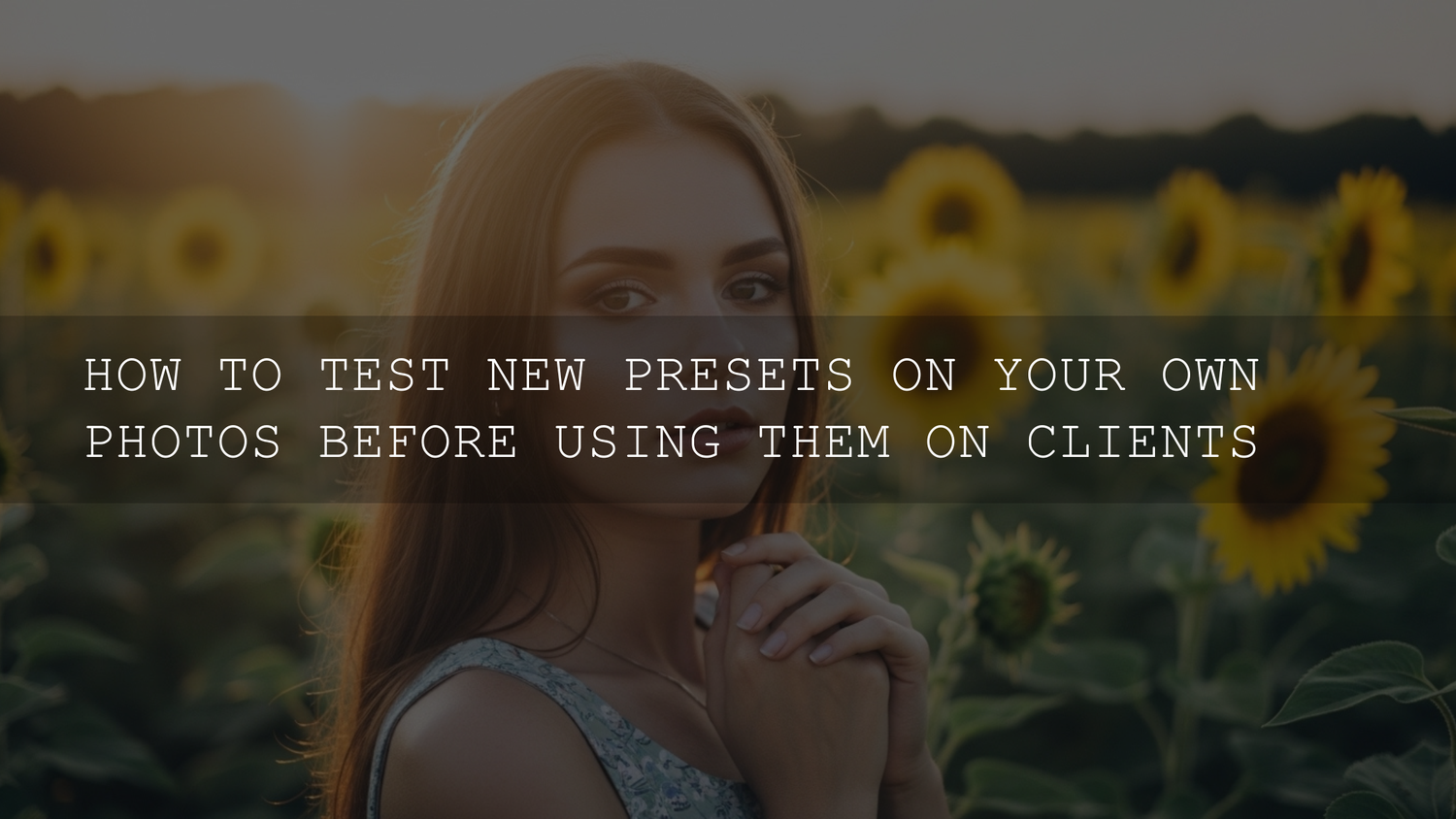
Test Lightroom Presets Before Client Photos: The Pro Quality-Control Workflow (2026)
That “new preset pack” feeling is real. You see a cinematic preview, imagine the whole gallery matching that vibe, and you want to apply it instantly. But if you’re doing client work, the smartest habit you can build is simple: test Lightroom presets before client photos. It’s the fastest way to protect skin tones, avoid weird color shifts, and keep your editing style consistent across every shoot.
I’ve learned this the hard way. The first time I dropped a bold preset onto a low-light wedding reception set, the dance-floor LEDs turned skin a little too magenta and the shadows got crunchy. The preset wasn’t “bad” — it just wasn’t built for that lighting. A 10-minute test on my own files would’ve saved me an hour of fixing.
If you want a reliable starting point with tons of options for different lighting and moods, you can start with the 1000+ Master Lightroom Presets Bundle and browse the main collection for more styles in Lightroom Presets for Mobile & Desktop. If you’re building your toolkit, you can Buy 3, Get 9 FREE when you add 12 items to your cart.
Why testing presets is non-negotiable (even in 2026)
Preset previews are usually shot and edited under “perfect” conditions. Your real-world client work isn’t. Testing is what keeps you in control — not the preset.
- Consistency: Clients hire you for your look. Testing makes sure a new pack fits your signature style instead of replacing it.
- Color safety: Presets can push greens neon, crush shadows, or shift skin tones fast — especially under mixed lighting.
- Speed under deadlines: When you know how a preset behaves, you edit faster because you already know the two or three fixes it usually needs.
- Brand protection: “Untested” edits are the fastest way to deliver a gallery that feels inconsistent from image to image.
And it’s not only about Lightroom. The same logic applies to LUTs, too: test first, then deploy. (If you also grade video, the 700+ Cinematic Video LUTs For Your Next Project is a strong library — but just like presets, LUTs need real-world testing per camera and lighting.)
What can go wrong when you skip testing
Here are the common “preset surprises” that show up in client galleries (usually at the worst possible time):
- Muddy or gray skin: Midtones get compressed and faces lose life.
- Orange/red “overcooked” faces: HSL shifts hit oranges too hard (especially under warm indoor light).
- Neon greens and cyan skies: A punchy tone curve + saturation can turn nature into a cartoon.
- Crushed blacks or clipped highlights: Detail disappears in suits, hair, clouds, and white dresses.
- Halos and crunchy texture: Sharpening/clarity stacks add edge artifacts, especially around hairlines.
- Banding in gradients: Smooth skies or studio backdrops can show ugly transitions.
If you’ve seen any of these, you’ll love these deeper reads: how to keep colors natural while using powerful presets, how to fix muddy skin tones caused by presets, and why presets can look different after a Lightroom update.
Build a “preset test set” (your personal lab)
The goal is to test presets on files that match your real work — not your “best highlight reel” only. Create a single folder/album that includes these four categories:
1) Your reliable “baseline” images
Pick 10–20 photos you know well. They should represent your typical client scenarios:
- Golden hour + harsh midday sun
- Indoor tungsten/LED + mixed window light
- Backlit portraits and high-contrast scenes
- Different skin tones (this matters for every portrait niche)
- Greens (parks), blues (sky/water), and warm tones (wood/skin)
2) Your “problem files”
Add the photos that used to be painful: the underexposed ones, the weird mixed light, the high ISO, the blown highlights. If a preset behaves well here, it’s usually flexible in real jobs.
3) A niche set for your work
If you do weddings, include a white dress + black suit. If you do street, include neon signage and shadowy alleys. If you do product, include whites that must stay white.
4) RAW and JPEG examples (if you deliver both)
Presets react differently because RAW has more recoverable data and different “starting” color. Testing both prevents surprises later. A related deep dive: RAW vs JPEG: why presets behave differently.
The deep-dive preset testing protocol (step by step)
This is the exact workflow I recommend when you’re evaluating a new pack.
- Duplicate a test catalog/album: Create a folder named “Preset Test – Pack Name – 2026”.
- Apply the preset with zero tweaks: No exposure, no WB, no masking. You’re learning the preset’s “true personality.”
-
Check these 6 things first:
- White balance: Does it push green/magenta or yellow/blue too far?
- Skin tones: Do faces look healthy, or gray/orange/pink?
- Highlights: Are clouds, foreheads, dresses clipping?
- Shadows: Is detail crushed in hair and suits?
- Texture: Did clarity/texture make skin gritty?
- Color problem areas: Greens, reds, and blues (common “break points”).
- Make only “minimum viable fixes”: Your goal is not to rebuild the photo — just stabilize it.
- Save a refined variant if you repeat the same fixes: Example: “Preset Name – Portrait Safe” or “Preset Name – Indoor Fix”.
- Repeat on the whole test set: A preset is only “client-ready” if it behaves well across variety, not just one hero image.
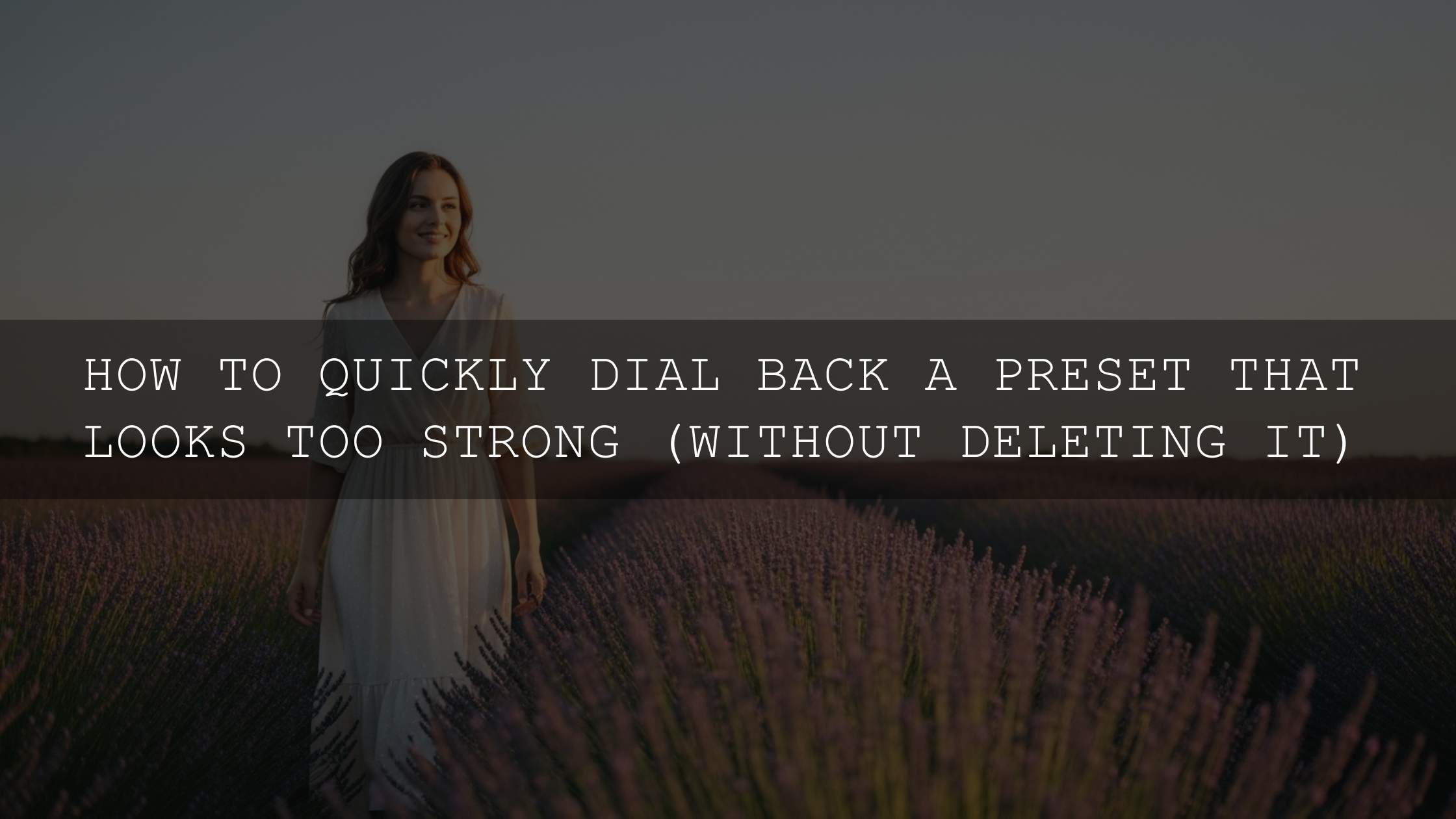
The 5-minute rescue workflow (the order matters)
When a preset looks wrong, most people panic and start random slider chaos. Instead, follow this order — it’s the quickest way to get back to natural results.
- White Balance first: Use Temp/Tint until skin stops looking sick. A “bad preset” often becomes great after WB is corrected.
- Exposure second: Bring the face into a normal brightness range before judging contrast.
- Highlights/Shadows third: Recover dress detail, sky detail, and hair detail.
- HSL/Color Mixer fourth: Fix oranges (skin), greens (foliage), and blues (sky) with tiny moves.
- Masking last: If only the face is off, don’t punish the whole image — fix it locally.
If you want to get better at precise, natural-looking fixes, here are two official resources I recommend bookmarking: Adobe’s masking guide for local adjustments in Lightroom and Adobe’s official guide to installing third-party presets and profiles in Lightroom.
Real examples: what “testing” reveals fast
Example 1: Neon street at night. A strong street preset can look incredible on city scenes, but it may shift shadows toward purple and oversaturate reds. Testing shows you if your “default fix” should be reducing red saturation or lifting shadow luminance. If street is your niche, try a pack like AI-Optimized Neon Street Lightroom Presets — then build a “Night Fix” variation during testing.
Example 2: Portrait skin tone safety. Some cinematic presets look perfect on landscapes, then flatten faces. Testing across skin tones helps you decide if you need a portrait-specific base. For portrait-heavy work, you can start with AI-Optimized Dark Skin Tones Lightroom Presets as a safer baseline and then add your style through small tone curve tweaks.
Example 3: “It looked different yesterday.” If a preset suddenly changes after an update, it’s often because Lightroom’s processing and profiles shift. Testing a pack on your personal files after updates helps you catch these changes before a paid shoot. Also worth reading: presets acting up after updates (and the fix workflow).
Presets vs manual editing: what actually wins in client work
Presets win when lighting is consistent and you want a cohesive look fast — engagements, outdoor sessions, travel sets, brand shoots with one location.
Manual editing wins when lighting is chaotic — mixed LED/tungsten, receptions, harsh overhead indoor light, or anything where skin tone accuracy is critical.
The best approach is a hybrid: preset for style, manual correction for reality. If you want a more stable baseline across different camera files, consider setting your raw defaults and profiles intentionally. This official guide helps: Adobe’s guide to setting RAW defaults in Lightroom.
Pro tips you can use today (small tweaks, big difference)
- Stop judging the preset at 1:1 only: Check the face at 1:1, but judge overall color and vibe at “fit to screen.”
- Fix luminance before saturation for skin: Muddy skin usually needs orange luminance lifted slightly, not heavy desaturation.
- Keep global Saturation conservative: Use Vibrance, then target specific colors in HSL/Color Mixer.
- Make two variants per preset: One for “daylight,” one for “indoor/mixed.” This alone makes a pack feel 10x more usable.
- Don’t stack chaos: If you’re stacking presets, test combinations on your own files first so you don’t compound sharpening/clarity artifacts.
Related reading (fast wins for common preset problems)
- How to use strong presets without ruining colors
- How to fix muddy, gray skin tones in Lightroom
- Why presets look different after updates (and how to fix it)
- How presets can speed up your Lightroom workflow
Wrap-up: treat presets like a tool, not a gamble
Testing is what turns presets from “hope this works” into a reliable system. You’ll deliver more consistent galleries, protect your client’s skin tones and colors, and edit faster because you already know your fixes.
If you want one set that covers nearly every vibe (portraits, travel, street, landscapes, indoor, outdoor) with tons of variations, grab the 1000+ Master Lightroom Presets Bundle and browse more options in Premium Lightroom Presets & LUTs Bundles. Remember: Buy 3, Get 9 FREE when you add 12 items to your cart — it’s the easiest way to build a full toolkit without overthinking it.
If you ever get stuck installing files or something looks “off” after import, you can always reach out via AAAPresets Contact.
FAQs
How many photos should I test a preset on before using it for clients?
Test at least 10–20 images that match your real client scenarios (indoor, outdoor, mixed light, different skin tones). If a preset behaves well across variety, it’s much safer for paid work.
Why does the same Lightroom preset look different on every photo?
Because each photo has a different starting point: white balance, exposure, camera profile, dynamic range, and color palette. Presets are a starting style — you still need quick corrections to “seat” the look properly.
What’s the fastest fix when a preset makes skin tones look weird?
Correct white balance first, then adjust exposure, then fine-tune orange luminance/saturation in the Color Mixer. If only the face is off, use masking to fix it locally instead of changing the whole image.
Should I use presets or manual editing for weddings?
Use a hybrid. Presets are great for consistent daylight sets, but receptions and mixed lighting usually need manual correction for skin tones, highlights, and shadows.
Do presets behave differently after Lightroom updates?
Yes, sometimes updates change how Lightroom interprets profiles and processing. That’s why it’s smart to re-test your go-to presets after major updates before editing client galleries.
Image Alt Text Suggestions
- Photographer comparing before and after edits to test Lightroom presets before client photos
- Lightroom preset testing workflow with white balance and exposure corrections for natural skin tones
- Preset vs manual editing comparison showing color grading differences on a portrait
- Preset validation checklist for client gallery quality control in Lightroom Classic
- Testing cinematic Lightroom presets on indoor mixed lighting to prevent muddy skin tones
Written by Asanka — creator of AAAPresets (10,000+ customers).
::contentReference[oaicite:0]{index=0} ::contentReference[oaicite:0]{index=0}

Leave a comment
This site is protected by hCaptcha and the hCaptcha Privacy Policy and Terms of Service apply.