
Visual consistency: how to build a unified color grade across photos and videos
If you want consistent color grading across photos and videos, the fastest path is a unified color grade that travels with you from Lightroom presets to Premiere Pro LUTs (and even DaVinci Resolve). When your stills and your edits share the same visual DNA, your brand becomes instantly recognizable—on Instagram carousels, YouTube, TikTok, and client decks.
Creators who lock in a single aesthetic don’t just look better; they work faster. Apply a core look, refine per shot, and keep the story feeling like it lives in one world. Here’s how to make that happen—step by step—with practical examples you can ship today.
Want a head start? Try a photo–video combo: build your photo base with the 1000+ Master Lightroom Presets Bundle, then extend the exact vibe to motion using our 700+ Cinematic Video LUTs. You can mix and match across the Cinematic LUTs collection—and yes, the current offer is simple: Buy 3, Get 9 FREE.
Why a unified cross-platform aesthetic matters now
- Brand recognition: A cohesive grade becomes your signature. Audiences spot your work in seconds.
- Professional polish: One look across mediums signals craft, care, and reliability to clients.
- Better storytelling: Color is emotion. A consistent grade keeps the mood intact from hero stills to hero shots.
- Workflow speed: A reusable look + small per-shot trims = less second-guessing, more publishing.
Photo vs. video: what’s actually different (and how to bridge it)
Stills (Lightroom / Camera Raw)
- Precision per frame: You can sculpt one image to perfection—great for dialing in the master reference.
- RAW latitude: Huge room to push tones and color, perfect for defining your base aesthetic.
Motion (Premiere Pro / Resolve / FCP)
- Continuity over time: Shots must match as lighting and angles change.
- Codecs & color spaces: Log, Rec.709, HDR—all behave differently and influence how your look lands.
Bridge the gap: craft your look on a hero still, export that transformation as a LUT, then refine clip-by-clip in your NLE. Adobe’s docs are helpful starting points—see Premiere Pro: basic color correction & LUT options and Lightroom Classic: tone & color grading. For palette planning, build schemes in Adobe Color’s harmony tool.
Your blueprint for a unified color grade
1) Define the core aesthetic
Pick a mood you can live with across mediums: airy & bright, rich & cinematic, or muted & filmic. Build a mood board and lock a few anchor references.
2) Create a master reference (photo or short clip)
Perfect one frame that screams “this is us.” That becomes your benchmark for everything else. I like to keep this open side-by-side while grading.
3) Build your palette with intention
Choose dominant hues, supporting colors, and a contrast curve. Keep skin tones protected and decide how far you’ll push shadows/highlights. A limited palette reads more premium than a patchwork of looks.
4) Start with presets & LUTs, then refine
- Photos: Apply a close preset from 1000+ Master Lightroom Presets, adjust WB/exposure, then tune Color Grading wheels to match your reference.
- Videos: Apply a base look from 700+ Cinematic Video LUTs or the 300+ Music Video LUTs Pack, then tweak in Lumetri (curves, HSL, vignette) or Resolve (node stack).
Pro tip: A LUT is a starting point, not a finish line. Always fine-tune exposure, WB, saturation, and secondaries after the LUT.
5) Nail foundational corrections before the “look”
Fix WB, exposure, and contrast first. Then color grade. This keeps your look repeatable. In Premiere, do it under Basic Correction before creative tweaks in Lumetri; see Premiere Pro color help.
6) Match shots methodically
Use scopes (waveform, vectorscope) to align brightness and hue across clips. Premiere’s Comparison View & Color Match are handy—review Adobe’s guide to matching colors between shots.
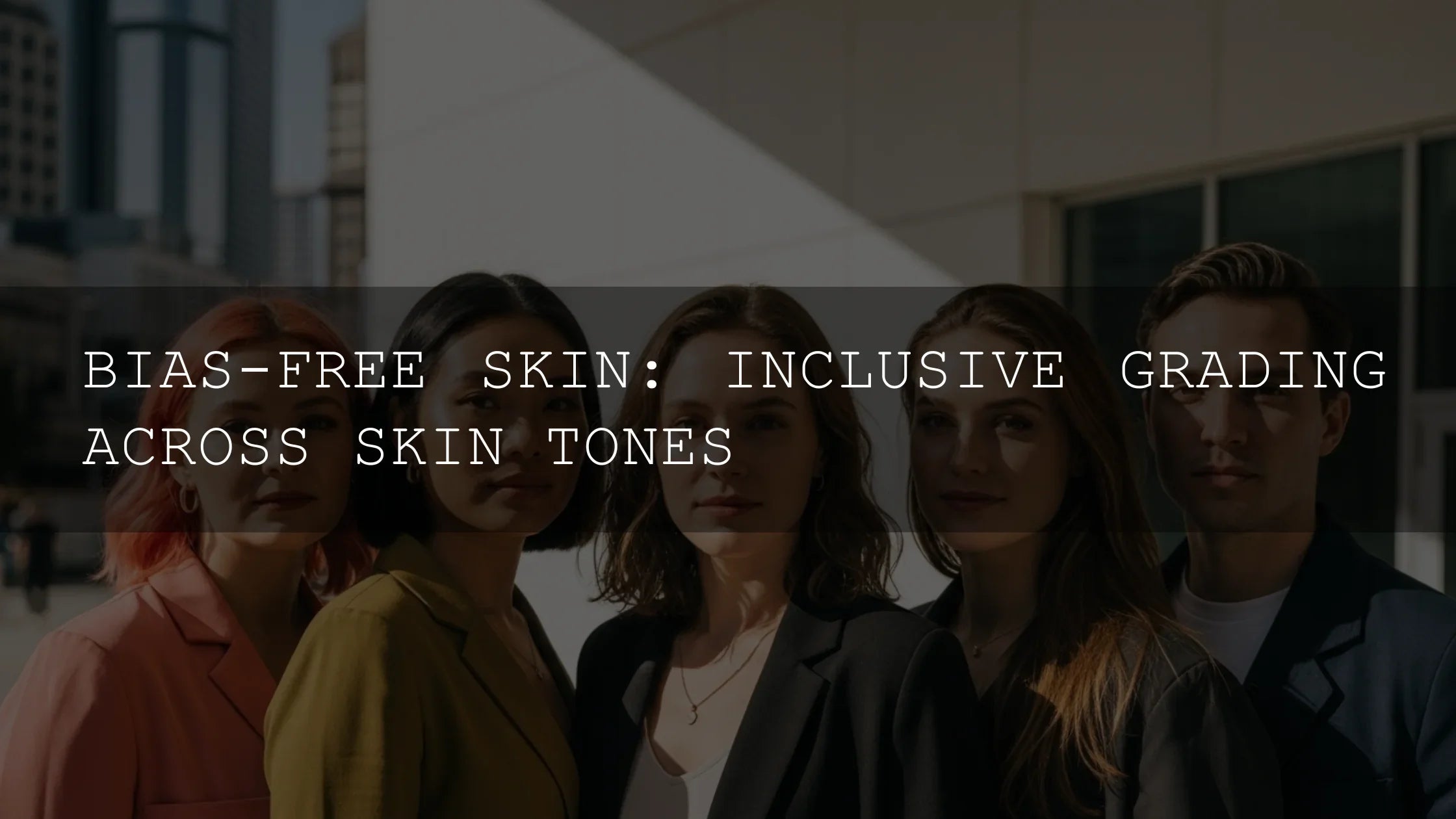
7) Protect skin tones
Audiences forgive stylized skies; they won’t forgive weird skin. Use targeted masks/secondaries to keep skin near the line on the vectorscope. In Lightroom, lean on the Color Grading wheels; in Premiere, combine HSL Secondary with subtle global tweaks.
8) Systematize for speed
- Photo batches: Sync settings across sets, then fix outliers.
- Video scenes: Grade one hero shot, save a look, then ripple that grade across the scene and trim per-clip.
9) Test across screens
Export a small set (3–5 photos + a 15–30s montage) and check on phone, laptop, and a calibrated display. Adjust until the look holds everywhere.
10) Document your look
Save the preset/LUT, plus a short note on WB intent, contrast shape, and saturation limits. Future-you (and your collaborators) will thank you.
Presets vs. manual editing (which should you use?)
Short answer: both. Presets/LUTs give you a fast, consistent baseline; manual adjustments give you control and polish. For a deeper dive, read LUTs vs. Manual Color Grading.
A realistic cross-platform workflow (example)
- Photos (Lightroom): Apply a base preset from the Lightroom Presets collection. Correct WB/exposure; refine with Color Grading wheels and HSL.
- Video (Premiere Pro): Convert/log to Rec.709 if needed; apply a matching LUT from Cinematic LUTs. Use Basic Correction, then Curves/HSL for fine skin work.
- Shot matching: Use scopes and the Comparison View; keep a reference still visible.
- QC: Play back on multiple screens; check faces and brand colors.
From my own tests: I graded a small brand campaign by building the look on a still, exporting a LUT, and finishing motion in Lumetri. The final held up across phone and desktop with only minor warmth trims on sunset clips.
Resources to deepen your grade (official & neutral)
- Adobe: tone & color grading in Lightroom Classic
- Adobe: basic color correction options in Premiere Pro (LUTs + Lumetri)
- Adobe Color: build palettes with harmony rules
Recommended reads on our blog
- Color grading Reels/Shorts/TikToks in Resolve
- Achieve a film look with LUTs + grading
- LUTs vs manual color grading
- Cinematic warmth & golden tones
- Lightroom Mobile series: presets + LUTs for a cross-platform aesthetic
Install & support
New to installing? Start here and bookmark for later: Install Lightroom presets & import/apply LUTs (FAQ hub).
Try the look today
Lock in your signature grade across stills and motion. Build the photo base with the 1000+ Master Lightroom Presets Bundle, then translate the vibe to video using 700+ Cinematic Video LUTs or the high-impact 300+ Music Video LUTs Pack. Browse more combos in our bundles—and remember, you can Buy 3, Get 9 FREE.
FAQ
How do I make my photos and videos look the same?
Create a master reference image, build a matching LUT from that look, apply it in your NLE, then refine per shot using scopes and selective adjustments.
Should I start with a preset/LUT or grade from scratch?
Start with a preset or LUT for speed and consistency, then customize. This hybrid approach ships faster and still feels bespoke.
What about skin tones when using strong looks?
Protect skin with targeted masks/secondaries and keep it near the vectorscope skin line. Adjust global saturation after skin looks natural.
Will this work if I shoot in different lighting or on different cameras?
Yes—normalize first (e.g., convert log to Rec.709), then apply your look. Use shot matching tools to align exposure and hue across cameras.
Written by Asanka — creator of AAAPresets (10,000+ customers).
Leave a comment
This site is protected by hCaptcha and the hCaptcha Privacy Policy and Terms of Service apply.