
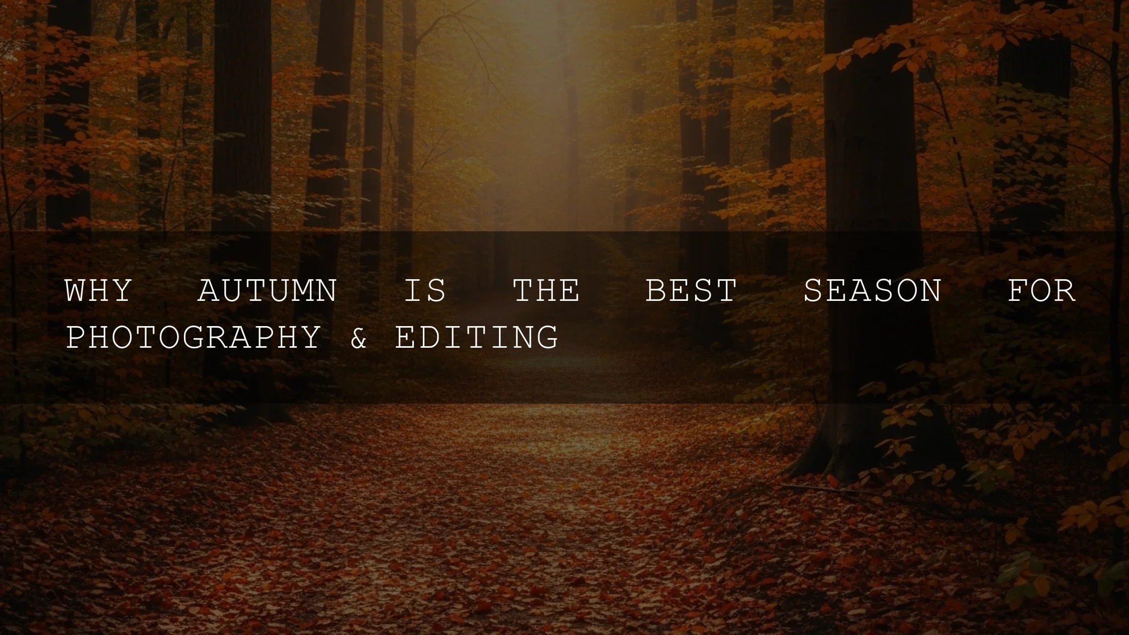
Why Autumn Colors Speak to Our Emotions
As summer’s green fades, autumn steps in with a dramatic show of reds, oranges, and yellows that do far more than decorate the landscape. These warm hues trigger deep psychological responses—evoking comfort, nostalgia, and resilience. For photographers and creators, autumn isn’t just a season; it’s an opportunity to capture emotion in its most vivid form. The color story of fall also ties directly into editing: the right Lightroom presets can help translate this seasonal magic into imagery that feels alive and timeless.
If you want to fast-track stunning edits, explore packs like 1000+ Master Lightroom Presets. They’re designed to enhance warmth, depth, and mood—perfect for bringing out autumn’s cinematic glow. You can try them today—Buy 3, Get 9 FREE—and expand your creative library.
The Power of Warm Colors: Red, Orange, and Yellow
Autumn’s palette is more than pretty leaves—it’s a natural symphony of wavelengths that influence mood and perception. Here’s why each shade matters:
- Red: Energizing and bold, red ignites passion and focus. Think of crimson maple leaves or the warmth of a fire. Studies show it can increase alertness and create a sense of vitality.
- Orange: The true ambassador of fall. Orange combines the energy of red and the joy of yellow, symbolizing abundance and creativity. It feels both festive and grounding, ideal for cozy gatherings.
- Yellow: The last reminder of summer light, yellow sparks optimism and clarity. From golden birch trees to bright aspen, it brings positivity into cooler days.
For editors, this color psychology translates directly into tonal choices. Boosting warmth in highlights or enhancing orange saturation can amplify these emotional effects. Adobe explains how color correction in Lightroom can shape mood in post-production.
Nostalgia and the Emotional Pull of Autumn
Falling leaves aren’t just beautiful; they’re emotional triggers. For many, they recall childhood: crunching leaves underfoot, sipping apple cider, or trick-or-treating beneath fiery trees. These memories become powerful anchors of security and joy. As adults, revisiting this palette in our photos can be a way to reconnect with that sense of belonging. This is why autumn editing so often leans toward warm tones, film-inspired looks, and matte finishes—styles that amplify memory and story.
I tested this firsthand during a wedding shoot last October. By applying an autumn wedding preset, the golden tones in the background created an instant nostalgic effect. The couple loved the result because it matched the memory they wanted to preserve.
From Evolution to Culture: Why We Crave Fall Colors
Our ancestors read fall’s colors as signals of abundance—ripe fruit and nuts ready to harvest. Over centuries, these associations turned positive. Today, cultural traditions reinforce this link: Japan’s koyo viewing, North America’s leaf-peeping, or harvest festivals worldwide. For creators, autumn colors are a universal visual language that speaks across cultures.
To edit with this in mind, consider working with split-toning tools or Adobe Color harmony rules to design palettes that reflect both cultural tradition and psychological impact.
Resilience Through Change: Autumn as a Metaphor
Nature’s grand finale before winter is more than a spectacle; it’s a lesson in resilience. The richness of fall color reminds us that change can be beautiful. In editing, this translates into bold contrasts—deep shadows paired with glowing highlights—to symbolize endurance. It’s a visual story of strength in transition.
When I edit autumn street photography, I often preserve natural shadows while gently lifting warm midtones. This maintains authenticity while emphasizing emotional depth. Adobe’s resource on editing photos for mood and tone is invaluable for balancing realism with artistry.
Bringing Autumn Indoors: Everyday Creative Applications
You don’t have to step into the forest to feel fall’s impact—you can bring it into your images or environment year-round:
- Home Editing Studios: Use warm-toned bulbs and autumn-colored accents to create a cozy editing space that influences your creative mood.
- Food Photography: Highlight seasonal produce like pumpkins, cranberries, and squash. A food photography preset can emphasize the richness of these natural hues.
- Video Work: Apply cinematic LUTs with warm midtone adjustments for fall-themed video storytelling.
The combination of sight, scent, and memory makes fall an immersive creative theme. This is why many creators build preset packs specifically for this season.
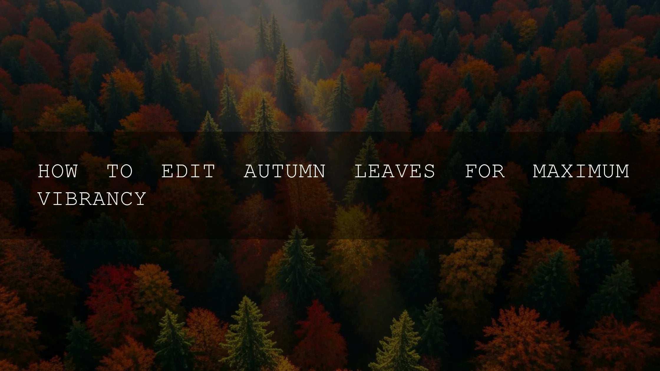
Presets vs Manual Editing for Autumn
One of the biggest debates in editing is whether to rely on presets or build looks manually. Here’s a quick comparison for fall imagery:
- Presets: Fast, repeatable, and style-consistent. Ideal for bulk editing autumn photoshoots. Packs like Autumn Fall Vibrant Lightroom Presets instantly add seasonal warmth.
- Manual Editing: Offers precision and personal touch. Best for unique projects where you want to fine-tune individual tones.
For most creators, a hybrid approach works best: start with a preset, then tweak exposure, shadows, and HSL to refine the mood.
Related Reading
- Why Autumn Lightroom Presets Make Fall Photos Pop
- Street Photography: Editing for Real Life & Raw Moments
- Cinematic LUTs for Transforming Your Video Footage
Final Thoughts: A Timeless Palette for Every Creator
Autumn’s palette is more than a fleeting spectacle—it’s a timeless reminder of warmth, comfort, and connection. For photographers and videographers, it offers an endless source of inspiration and storytelling depth. Whether through AI-Optimized Autumn Gold Tones or manual edits in Lightroom, the goal is the same: to preserve autumn’s mood in a way that resonates emotionally.
Start exploring autumn-inspired editing tools today. With bundles like 1000+ Master Lightroom Presets and seasonal collections from our Lightroom Presets collection, you’ll have everything you need to transform your fall photos into timeless stories.
FAQs
Why do autumn colors feel so comforting?
Warm reds, oranges, and yellows are linked to primal associations with fire, food, and light. They naturally evoke warmth, safety, and nostalgia.
What presets are best for fall photography?
Presets that enhance warm tones, slightly soften highlights, and preserve shadows work best. Try autumn-specific packs like Autumn Fall Vibrant Lightroom Presets.
Is it better to use presets or edit manually for autumn photos?
Presets save time and create consistency, while manual editing gives control. Many photographers start with presets and then fine-tune manually.
How can I make my fall photos look cinematic?
Use LUTs or Lightroom profiles that deepen shadows and enhance orange/red tones. Adding subtle grain or matte finishes also creates a cinematic mood.
Can I apply autumn-inspired edits year-round?
Yes. Warm tones are versatile and can create a cozy, nostalgic atmosphere in any season. Many photographers use fall presets even for indoor or lifestyle shoots.
Written by Asanka — creator of AAAPresets (10,000+ customers).
Leave a comment
This site is protected by hCaptcha and the hCaptcha Privacy Policy and Terms of Service apply.