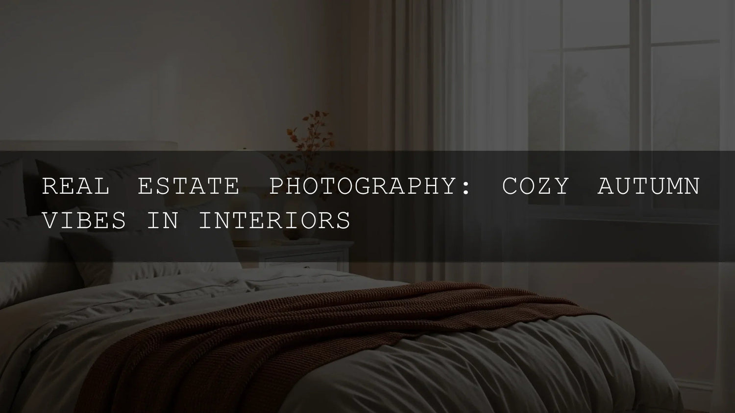
Cozy, Buyer-Ready Interiors: How to Color-Grade Real Estate Photos for an Instantly Welcoming Autumn Look
When people browse listings, they aren’t just comparing floor plans—they’re asking, “Can I feel at home here?” That’s why warm, well-balanced real estate photography remains a quiet superpower in the autumn months. In this guide, we’ll blend styling, shooting, and editing so your images feel both inviting and accurate. You’ll learn a practical workflow, pro tips for interior design presets, and how to keep architectural clarity while shaping mood with color grading.
If you want a fast, consistent starting point, try the AI-Optimized Interior Design & Real Estate Lightroom Presets to brighten and balance rooms, then layer seasonal warmth with AI-Optimized Cozy Cabin Warm Lightroom Presets. Both are built for a quick, one-click baseline you can tweak in seconds—and you can browse the full range in our Lightroom Presets collection. Try them on your next listing—Buy 3, Get 9 FREE.
The Psychology of Warmth (Without Losing Accuracy)
Warmth signals comfort and belonging, but buyers still need to read the space truthfully: wall colors, materials, window size, and flow. The trick is to nudge mood through targeted color work while preserving detail and neutrality in key surfaces (whites, grays, metal, stone).
- Start neutral, add warmth locally. Set a clean baseline white balance first so trim, tile, and ceilings don’t drift too yellow. Then add warmth selectively to textiles, wood, and pools of light using Lightroom’s Masking tools for precision.
- Favor golden accents over global orange. Global warmth can tint everything. Instead, use Color Grading on shadows/midtones for subtle, cinematic depth. See Adobe’s guidance on tone & color controls.
- Match light sources, then stylize. Balance mixed lighting (daylight + lamps) first; afterward, stylize warmth for mood. For WB fundamentals, review Adobe’s primer on white balance workflow.
A 5-Step Fall Interior Edit Workflow
- Baseline WB & exposure. In the Basic panel, use the WB eyedropper on a neutral surface (cabinet, tile) to avoid color bias. Dial Exposure until the histogram breathes; keep Highlights restrained to protect windows.
- Architectural clarity. Apply the Interior Design & Real Estate Presets for a bright, clean foundation. They’re tuned for interiors, so verticals, edges, and finishes remain crisp.
- Local warmth for “cozy.” With Masking, paint warmth onto throws, wood, and lamp pools. Add a touch of midtone lift; reduce warmth on ceilings/trim to keep whites honest.
- Texture management. Add gentle Presence (Clarity/Texture) to architectural details; soften fabrics slightly to imply plush comfort. Avoid over-sharpening textiles and noise in shadows.
- Final polish. Use Color Grading for a whisper of amber in midtones and a cooler blue in highlights (window light) for depth. Subtle vignette to center attention on seating or the hearth.

Presets vs. Manual Editing (When to Use Which)
- Presets (speed & consistency): Great for large listing sets, agent portfolios, and Airbnb galleries where you need a unified look fast. The Interior Design & Real Estate pack establishes a dependable baseline across mixed rooms and lighting.
- Manual (fine control): Essential for tricky rooms (mixed color temps, strong casts, heavy wood tones). After one-click, refine locally with Lightroom’s Masking panel—targeting walls, ceilings, and windows separately.
- Hybrid (best of both): Apply a preset, then manually protect whites/stone and boost warmth only in textiles and wood. This keeps accuracy for finishes while selling the feeling.
Styling Cues That Photograph Well in Autumn
- Textiles that invite: Knit throws, boucle cushions, and thick rugs add visible tactility. Keep colors in an autumn palette (burnt orange, rust, ochre, deep brown) to harmonize with your grade.
- Layered lighting: Warm practical lamps plus daylight from one direction create pleasing contrast. Mask lamps to increase glow; keep ceiling whites neutral.
- Natural accents: Branches, foliage, bowls of pears, and ceramic mugs imply seasonality without clutter. Edit to keep these as subtle color anchors.
- Fireplace focus: If there’s a hearth, anchor your composition around it. Add a local warmth mask to firelight zones.
My Field Note
I tested this approach on a two-bedroom condo: the baseline edit with the Interior Design & Real Estate Presets cleaned up mixed daylight + lamp color instantly. A light pass of Cozy Cabin Warm on throws and the dining table wood made the set feel “move-in ready” without turning ceilings yellow. The agent reported more saves and inquiries within 48 hours.
Pro Tips for Honest-Yet-Warm Color
- Protect “truth surfaces.” Mask trim, ceilings, appliances, and countertops to keep them neutral; buyers rely on these for reading maintenance and finish quality.
- Window discipline. Recover highlight detail where possible; a soft roll-off looks premium. If the view is unimportant, keep windows bright with minimal texture so interiors stay the star.
- WB before warmth. Set correct WB first, then add warmth locally. Adobe’s guide to white balance covers when to aim neutral vs. preserve mood.
- Color harmony. Planning props? Use Adobe Color’s harmony rules to pick complementary accents that won’t fight wall paint or floors.
Workflow Shortcuts with AI-Optimized Presets
The fastest route to “bright, clean, inviting” is to set a neutral WB, apply Interior Design & Real Estate for clarity and balance, then paint warmth from Cozy Cabin Warm where it matters. Need variety for multiple properties? Keep a few finishing looks in your pocket with the 1000+ Master Lightroom Presets Bundle and file them by “baseline,” “warmth,” and “polish.”

Before You Export: Consistency Checklist
- All rooms share similar WB and overall brightness (avoid a “patchwork” look across the gallery).
- Whites are clean—not cream—unless the paint truly is warm.
- Wood and textiles carry most of the warmth; metals and stone read accurately.
- Verticals are straight (transform & guided uprights); door frames don’t “bow.”
- One signature angle for each room (wide + a detail shot for mood).
Related Reading
- Presets for Real Estate Photography: Bright, Clean & Professional
- Autumn & Fall Photo Editing Tips: Cinematic Lightroom Presets Guide
- Cinematic Warmth: How Golden Tones Create Intimacy
- Top 10 Fall Lightroom Presets
Get the Look—Fast
Ready to make buyers imagine the first mug of cocoa in their new living room? Start with the AI-Optimized Interior Design & Real Estate Lightroom Presets for clean, architectural clarity, then layer Cozy Cabin Warm for that signature autumn glow. Browse more looks in our AI-Optimized Presets collection—Buy 3, Get 9 FREE.
What’s the best starting point for editing an autumn interior?
Begin with a neutral white balance and even exposure, then apply a real-estate-focused preset for balance. Add warmth locally to textiles and wood using Lightroom Masking so ceilings, trim, and appliances stay true.
How do I keep whites from turning yellow when I warm the image?
Mask whites (ceilings, trim, tile) and reduce Temp/Tint slightly on that mask. Add warmth to midtones via Color Grading instead of raising global Temp.
My windows blow out—should I HDR every frame?
Not always. Preserve a gentle roll-off in highlights and prioritize interior readability. If the view is a selling point, bracket; if not, a single exposure with highlight recovery looks more natural.
Can I do this on Lightroom Mobile?
Yes. The same principles apply: WB first, preset baseline, local warmth via Masking (available on mobile). Export consistent brightness across the set.
Which packs should I start with?
Use Interior Design & Real Estate for clarity and balanced light; layer Cozy Cabin Warm for seasonal mood. For variety, keep the 1000+ Master Bundle handy.
Written by Asanka — creator of AAAPresets (10,000+ customers).


Leave a comment
This site is protected by hCaptcha and the hCaptcha Privacy Policy and Terms of Service apply.