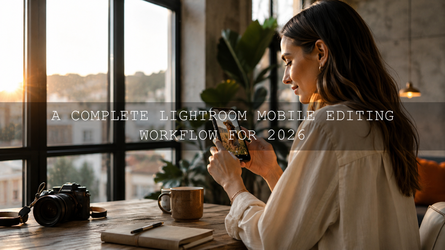
A Complete Lightroom Mobile Editing Workflow for 2026
A reliable Lightroom Mobile editing workflow can turn an ordinary smartphone photo into a polished image without forcing you to spend hours adjusting every slider. The best approach combines Lightroom Mobile presets, manual exposure correction, careful color refinement, selective masking, and platform-ready export settings.
I tested this workflow on a bright outdoor portrait and a warm indoor lifestyle photo. The same preset gave both images a consistent style, but the indoor photo still needed a cooler white balance and softer orange tones. Here’s why this matters: presets provide the creative foundation, while your manual adjustments make that foundation fit the actual lighting, subject, and camera file.
For a flexible starting point, explore the 1000+ Master Lightroom Presets Bundle or browse the complete Lightroom Mobile Presets collection. Apply a style that matches your photograph, refine it using the workflow below, and try different looks with our Buy 3, Get 9 FREE offer.
Why Lightroom Mobile Works So Well for Mobile Photo Editing
Lightroom Mobile combines professional editing controls with a workflow designed for phones and tablets. You can organize photos, apply presets, correct light and color, use local masks, remove distractions, crop for different platforms, and export finished images without transferring everything to a computer.
The advantage is not simply convenience. Lightroom Mobile keeps your adjustments editable, which means you can return to a photograph and change the exposure, white balance, preset, crop, or mask without permanently damaging the original image.
Presets make this process faster by applying a prepared combination of adjustments. According to Adobe’s guide to editing photos with Lightroom presets, presets can include changes to exposure, contrast, saturation, color grading, and other settings.
That does not mean a preset should make every creative decision. Different photos begin with different brightness levels, white balance, dynamic range, colors, and camera profiles. A polished result usually comes from applying a preset and then making several small corrections.
Step 1: Import and Organize Your Photos
A fast editing workflow begins before you touch the exposure slider. Importing hundreds of unsorted images into one library makes it harder to find your best frames and encourages you to waste time editing photographs you will never publish.
Create Albums for Projects and Subjects
Organize imported photos into albums based on their purpose. Useful album names might include:
- Italy Travel Photos 2026
- Summer Portrait Session
- Spring Product Collection
- Instagram Content June
- Street Photography Colombo
A project-based album structure makes it easier to compare similar images, copy edits between photographs, and maintain a consistent visual style.
Rate and Flag Before Editing
Complete a quick selection pass before applying presets. Flag your strongest photographs, reject obvious mistakes, and use star ratings to separate finished images from possible alternatives.
Check four things during this first review:
- Focus: Is the main subject acceptably sharp?
- Expression: Does the photograph capture the right emotion or moment?
- Composition: Is the subject positioned clearly without distracting edges?
- Exposure: Does the file contain enough highlight and shadow detail to edit?
Editing only your strongest frames is one of the easiest ways to improve both quality and speed. For larger photo sets, follow this step-by-step Lightroom culling workflow.
Step 2: Correct the Basic Exposure Before Applying a Preset
A preset performs more predictably when the starting photograph is reasonably balanced. You do not need to complete the entire edit first, but correcting major exposure or white-balance problems can prevent a preset from becoming unnecessarily strong.
- Crop and straighten the photograph.
- Correct severe underexposure or overexposure.
- Check whether the white balance is clearly too warm, cool, green, or magenta.
- Enable appropriate lens corrections when needed.
- Remove obvious distractions that could affect your editing decisions.
Pro tip: Do not brighten an underexposed image only by raising Shadows. Begin with Exposure for the overall frame, then use Shadows to recover darker areas. This normally creates a more balanced tonal structure.
Step 3: Apply a Lightroom Mobile Preset That Matches the Scene
Open your selected photograph, go to the Presets panel, and preview several styles before choosing one. Adobe provides current instructions for importing and managing preset files in its Lightroom Mobile preset guide.
Choose a preset according to the subject and lighting rather than choosing only by its name. For example:
- Use clean or bright presets for products, food, interiors, and airy lifestyle content.
- Use portrait presets that protect skin tones for faces and wedding photographs.
- Use cinematic presets for travel, street photography, fashion, and storytelling images.
- Use moody presets when the original photograph already contains directional light and strong shadows.
- Use vintage presets when grain, faded blacks, and restrained colors support the subject.
The Cinematics Look Lightroom Presets Pack is a useful option for dramatic travel, street, lifestyle, and environmental portraits. For cleaner commercial or social-media images, try the Bright and Minimal Lightroom Presets.
After applying the preset, pause before changing anything else. Compare the edited version with the original and identify the exact problem. Is the image too dark, too warm, too saturated, or simply too strong? Making a diagnosis first prevents random slider adjustments.
Presets vs Manual Editing: Why the Best Workflow Uses Both
Presets and manual editing are not competing methods. They solve different parts of the editing process.
Use Presets For
- Creating a consistent color palette
- Establishing contrast and tonal character
- Building cinematic, bright, warm, vintage, or moody styles
- Speeding up repetitive edits
- Keeping a collection visually cohesive
Use Manual Editing For
- Correcting exposure for an individual photograph
- Fixing white balance under mixed lighting
- Protecting skin tones
- Recovering a bright sky or dark foreground
- Removing color casts from walls, clothing, or artificial lights
- Preparing the correct crop and export for each platform
A preset gives you speed and stylistic consistency. Manual editing provides accuracy. The strongest Lightroom Mobile editing workflow uses a preset to establish the look and manual adjustments to make that look believable.
Step 4: Refine Light Without Flattening the Photograph
Open the Light panel and adjust the image in a logical order.
Exposure
Use Exposure to correct the overall brightness. Make small changes and watch the subject rather than relying only on the background. A bright wall or sky can make a correctly exposed face appear darker than it really is.
Highlights and Shadows
Reduce Highlights when bright clouds, white clothing, reflective skin, or windows are losing detail. Raise Shadows when important areas are too dark, but avoid lifting them until the image becomes gray and flat.
Whites and Blacks
Whites control the brightest tonal endpoint, while Blacks control the darkest. A small reduction in Blacks can add depth, but aggressive adjustments may crush hair, dark clothing, and background texture.
Contrast and Tone Curve
Use Contrast for a broad adjustment. Use the Tone Curve when you need more precise control over shadows, midtones, and highlights.
Pro tip: If an edit feels flat, do not automatically increase Clarity or Dehaze. First check whether the black point, white point, and midtone contrast need correction. Tonal adjustments often produce a cleaner result.
Step 5: Correct White Balance and Protect Natural Color
White balance is one of the first settings to check after applying a preset. A photograph captured under warm indoor lighting may become excessively orange, while a shaded outdoor portrait may become too blue.
Use Temperature to move the image between warm and cool. Use Tint to correct green or magenta color casts. Neutral objects such as white clothing, gray walls, or silver products can help you judge the correction, but the final decision should still support the intended mood.
For portraits, pay particular attention to orange, red, and magenta. If the overall photograph looks good but the face appears too warm, avoid cooling the entire image immediately. Open the Color Mix panel and reduce Orange Saturation slightly or raise Orange Luminance.
The AI-Optimized Skin Tone Safe Pro Portrait Presets provide a practical foundation for portraits, weddings, fashion photographs, and lifestyle content where natural-looking skin is important.
For more help adapting a preset to sunlight, shade, indoor light, and mixed lighting, read this guide to adjusting Lightroom Mobile presets for different lighting conditions.
Step 6: Use Vibrance, Saturation, and Color Mix Carefully
Vibrance and Saturation can both strengthen color, but they should not be treated as interchangeable.
- Vibrance: Generally emphasizes less-saturated colors more selectively.
- Saturation: Changes the intensity of colors across the entire photograph.
- Color Mix: Controls the hue, saturation, and luminance of individual color ranges.
If green foliage is too bright, reduce Green Saturation rather than lowering saturation globally. If a blue sky looks unnaturally dark, raise Blue Luminance or reduce Blue Saturation. If skin appears orange, correct the orange channel without removing color from the rest of the image.
Pro tip: Temporarily look away from the screen for several seconds before reviewing strong colors. Your eyes quickly adapt to saturation, making an over-edited image seem normal while you are working on it.
Step 7: Improve the Subject With Lightroom Mobile Masks
Masks allow you to adjust one area without changing the entire photograph. This is often the difference between an obvious preset edit and a professionally refined image.
Lightroom includes masking options for subjects, skies, backgrounds, objects, people, brushes, linear gradients, and radial gradients. Adobe explains these controls in its official guide to masking for local adjustments in Lightroom.
Useful Mobile Masking Examples
- Portrait: Brighten the face slightly while leaving the background unchanged.
- Landscape: Reduce sky highlights without darkening the foreground.
- Food: Add texture to the dish while keeping the table soft.
- Product: Brighten the product and reduce distracting background saturation.
- Street photography: Use a radial mask to guide attention toward the subject.
Keep local adjustments subtle. A subject that is dramatically brighter, sharper, or warmer than its surroundings can look pasted into the image.
I have found that a small subject-mask exposure increase often looks more natural than raising global exposure. It improves the focal point while preserving atmosphere in the background.
Step 8: Add Detail Without Over-Sharpening
Sharpening cannot repair missed focus, motion blur, or a heavily compressed source image. It can, however, improve the appearance of existing detail.
Zoom to 100 percent before judging sharpening and noise reduction. Watch hair, eyelashes, fabric, foliage, and smooth gradients.
- Increase sharpening gradually.
- Use masking to reduce sharpening in smooth areas.
- Apply luminance noise reduction carefully to low-light photographs.
- Use color noise reduction when colored speckles appear in shadows.
- Avoid removing so much noise that skin and texture look painted.
A clean image is not necessarily a completely noise-free image. A small amount of natural texture often looks better than aggressive smoothing.
Step 9: Compare the Before and After
Review the original photograph regularly. Ask whether the edit improves the subject, light, and story rather than simply making the image more dramatic.
Look for common warning signs:
- Skin has become orange, gray, or magenta.
- Clouds and white clothing have lost detail.
- Shadows have become solid black.
- Green foliage looks fluorescent.
- Clarity has created harsh skin texture.
- Noise reduction has removed important detail.
- The background attracts more attention than the subject.
The same preset can look different on two photographs because each file begins with different exposure, white balance, colors, and camera information. This guide explains why Lightroom presets look different on every photo and how to correct them.
Step 10: Save a Custom Preset for Repeated Work
When you create a variation that works well for a particular camera, location, or content series, save it as a new user preset.
Useful custom variations could include:
- Cinematic Preset – Indoor Warm Light
- Portrait Preset – Cloudy Day
- Product Preset – White Background
- Travel Preset – Bright Midday
- Instagram Preset – Soft Skin
Save only the adjustments you want to reuse. Exposure, white balance, cropping, healing, and highly specific masks may need to remain photo-dependent.
For a broader routine you can repeat across different subjects, follow this guide to building a consistent Lightroom editing workflow with presets.
Step 11: Export Photos With the Right Settings
A strong edit can still look soft or incorrectly colored when exported carelessly. Open Lightroom’s Share or Export options and choose settings according to the final destination.
Recommended Starting Settings for Online Photos
- File type: JPEG for websites and most social platforms
- Color space: sRGB for broad compatibility
- Quality: Approximately 80–100, depending on file-size limits
- Dimensions: Match the platform and intended crop
- Output sharpening: Use a moderate screen setting when appropriate
- Metadata: Include or remove location and camera data according to your privacy needs
Pixel dimensions matter more for screen display than the PPI value. A file with the correct width and height in pixels will display at those pixel dimensions regardless of whether its metadata says 72 PPI or 300 PPI. PPI becomes more important when planning a specific print size.
Use DNG or TIFF only when you need a higher-quality handoff, archive, print workflow, or further editing. For additional options, review Adobe’s Lightroom photo export and sharing guide.
Before publishing an important image, export a test JPEG and view it in your phone’s gallery, browser, and intended social app. This can reveal brightness, crop, sharpening, or color differences that were less obvious inside the editor.
A Fast Lightroom Mobile Editing Checklist
- Import photographs into a clearly named album.
- Flag and rate the strongest images.
- Crop, straighten, and correct major exposure problems.
- Apply a Lightroom Mobile preset that matches the scene.
- Adjust exposure, highlights, shadows, whites, and blacks.
- Correct white balance and protect skin tones.
- Refine individual colors using Color Mix.
- Use masks for subjects, skies, and backgrounds.
- Apply careful sharpening and noise reduction.
- Compare the edit with the original.
- Export a test JPEG using the correct crop and dimensions.
Related Reading
- Common Lightroom Mobile editing mistakes and how to avoid them
- Why presets look different on desktop and mobile screens
- How AI-optimized presets support a faster mobile workflow
Frequently Asked Questions
Should I edit exposure before or after applying a Lightroom Mobile preset?
Correct severe exposure problems before applying the preset, then complete the precise exposure adjustment afterward. This helps the preset preview more accurately while preserving flexibility.
Can Lightroom Mobile presets work on both RAW and JPEG photos?
Yes. Presets can work on RAW and JPEG files, but RAW images normally provide more editing flexibility for highlight recovery, shadow correction, and white-balance changes. JPEG files may require gentler adjustments.
Why does the same preset look different on every photo?
Each photo begins with different lighting, exposure, white balance, subject colors, camera processing, and dynamic range. The preset applies the same saved settings, but those settings interact differently with each starting image.
Do I need to use every Lightroom editing panel?
No. Use only the controls that solve a visible problem or support your creative goal. Unnecessary adjustments can make an image look over-processed and make your workflow slower.
How can I install AAAPresets in Lightroom Mobile?
Download the provided preset files, import them through Lightroom Mobile’s Presets panel, and organize them into preset groups when available. You can also review the AAAPresets installation and frequently asked questions page for additional help.
A professional mobile edit does not require dozens of extreme adjustments. It requires a repeatable process: choose the right photograph, apply an appropriate preset, refine light and color, use local masks where necessary, and export carefully.
Build your mobile editing toolkit with the 1000+ Master Lightroom Presets Bundle, or explore more styles in the Lightroom Presets for Mobile and Desktop collection. Try different cinematic, bright, portrait, travel, and vintage looks today with our Buy 3, Get 9 FREE offer.
Written by Asanka — creator of AAAPresets (10,000+ customers).

Leave a comment
This site is protected by hCaptcha and the hCaptcha Privacy Policy and Terms of Service apply.