
Grading BRAW for YouTube, Short Films, and Ads: A Practical BRAW Color Grading Workflow
If you’re shooting Blackmagic RAW (BRAW), you already gave yourself the biggest gift in post: flexibility. A clean BRAW color grading workflow lets you change exposure, white balance, and color science with far less “breakage” than heavily compressed codecs. The trick isn’t just making it look good—it’s making it look right for where it’s going: YouTube, a short film, or an advertisement.
In this guide, I’ll show you a repeatable, platform-aware workflow (Resolve-first, but adaptable) using scopes, color management, and smart LUT placement. We’ll also compare LUTs vs manual grading so you can move faster without sacrificing quality.
If you want a fast starting point after you build a solid base grade, try a curated LUT library like the 700+ Cinematic Video LUTs Pack and browse looks designed specifically for Resolve in our DaVinci Resolve LUTs collection. If you add 12 items to your cart, you can Buy 3, Get 9 FREE—perfect when you want multiple looks for YouTube, film, and commercial deliveries.
The golden rule: grade for the destination, not your timeline
The same BRAW clip can need three different “finishes.” A YouTube grade should survive bright phones and random TVs. A short film grade should feel intentional and controlled. An ad grade should be instantly readable and brand-accurate.
Before you touch saturation or contrast, lock these decisions:
- Delivery color space (most commonly Rec.709 for SDR; sometimes P3 D65 or HDR formats for cinema/ads).
- Viewing context (phone screens, laptops, calibrated monitors, projection).
- Creative intent (punchy & bright vs moody & nuanced vs clean & brand-safe).
If you want a quick refresher on what Blackmagic RAW is designed for, this is a helpful reference: Blackmagic Design’s official overview of Blackmagic RAW.
Step-by-step BRAW color grading workflow (Resolve-first, platform-ready)
Step 1: Set your BRAW “digital negative” correctly
Your BRAW settings are the foundation. Get these right first, and everything downstream becomes easier (and cleaner).
- White balance & tint: Correct here using RAW controls whenever possible. It’s cleaner than trying to “fight” a bad WB later with Hue vs Hue or qualifiers.
- ISO/exposure trim: Small RAW exposure adjustments can save highlights or lift midtones before you start shaping contrast. Keep it subtle—big pushes can reveal noise or clip channels.
- Color science: Start with the newest available Blackmagic color science in your camera/Resolve pipeline for the cleanest baseline, then stylize later.
- Gamma/log choice: If you’re doing proper color management, keep it in a log/film-like space until your transform.
First-hand note: I tested this workflow on a mixed-light indoor shoot (warm practicals + cool window light) and the biggest quality win was fixing WB in the BRAW controls first—skin tones stayed natural without heavy secondary correction.
Step 2: Pick a color management approach (CST or DaVinci Color Management)
This is where many grades go wrong. If you transform incorrectly, you’ll chase problems all day.
- Option A: Color Space Transform (CST): Great if you like explicit control and a node-based template. You transform from your BRAW gamma/gamut into Rec.709 (or your target space), then build your look.
- Option B: DaVinci Color Management (RCM): Great if you want consistency across cameras and easy output switching (Rec.709 vs P3 vs HDR).
Either way, your goal is the same: a clean transform, then creative grading on top. If you want to go deeper in Resolve learning, this is a strong official starting point: Blackmagic’s official DaVinci Resolve training resources.
Step 3: Build the base grade with scopes (not your eyes)
Scopes make your grade consistent across monitors and rooms. Start here before any “look LUT.”
- Normalize exposure: Use waveform to place faces (often in a comfortable midtone range) and protect highlights.
- Set black point: Bring shadows down until the image has depth, but don’t crush detail unless it’s a deliberate style choice.
- Set highlight roll-off: Keep bright areas smooth—especially skies, windows, and specular highlights.
- Balance neutrals: A quick neutral check (white/grey objects) helps prevent color casts.
Pro tip you can test now: Temporarily drop saturation to near-zero while adjusting exposure/contrast. If it looks good in “almost B&W,” it will usually look great once color returns.
Step 4: Skin tones and secondaries (where “pro” polish happens)
Even the best LUT won’t save bad skin tones. Whether it’s a YouTube talking head, a cinematic short, or a commercial, skin needs to feel believable.
- Qualify skin gently: Use wider selections and softer keys; avoid crunchy edges.
- Use the vectorscope as your guide: Keep skin near the skin tone line, then adjust tastefully.
- Control saturation by luminance: Prevent bright areas from looking “radioactive.”
- Local contrast: A little midtone contrast can add clarity without making it harsh.
First-hand note: When I pushed a teal/orange look too early on a sunset drone shot, the sky looked amazing—but faces turned unnatural. Fixing skin in a dedicated node and reducing highlight saturation made the look hold together on every display I tested.
Step 5: Creative look (this is where LUTs can help—if you use them correctly)
Once your base grade is clean, you can add character: warm vs cool mood, filmic contrast, selective color, or a punchy commercial pop.
A practical approach:
- Apply the look after normalization: LUTs behave better when footage is already balanced.
- Lower LUT intensity: Often 20–60% is more realistic than 100%.
- Re-balance after LUT: Minor exposure/sat tweaks make the LUT feel “made for” the shot.
If you want a wide range of starting looks (and then refine them), try the 700+ Cinematic Video LUTs Pack or go more “movie trailer” with the 120+ Blockbuster LUTs Bundle.
Comparison: LUTs vs manual grading (what’s better for BRAW?)
Manual grading is best when consistency and accuracy matter most (short films, brand ads, mixed lighting). LUTs are best when you want speed, exploration, and a repeatable “starting look” (YouTube series, tight deadlines, fast client previews).
When manual grading wins
- You have difficult skin tones (mixed light, underexposure, strong color casts).
- You need a very specific mood (festival film look, narrative continuity).
- You must match multiple cameras and scenes precisely.
When LUTs win
- You’re producing volume (weekly YouTube content, reels, fast-turnaround edits).
- You want consistent branding across a channel or series.
- You need quick client options (“Look A / Look B / Look C”) before the final pass.
Best of both: Build a clean base grade manually, then use LUTs as a creative layer. If you need help importing LUTs cleanly across Windows and Mac, here’s a practical internal guide: How to Import and Apply LUTs in Windows & Mac.
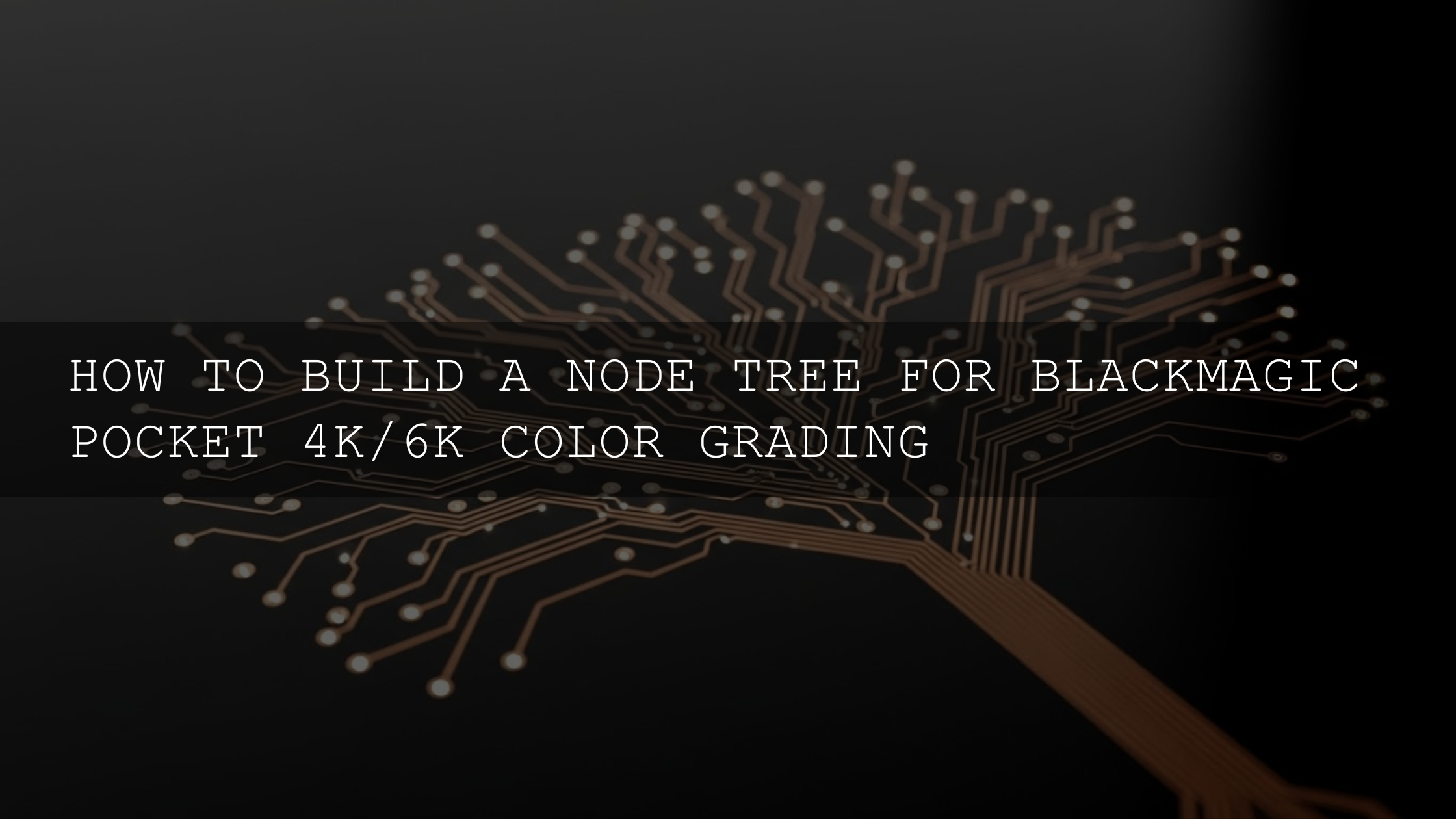
A node-based template you can reuse (DaVinci Resolve)
Here’s a simple node order that stays organized and non-destructive:
- Node 01 – RAW setup: BRAW exposure/WB/tint adjustments.
- Node 02 – Transform: CST or color-managed pipeline to your working space.
- Node 03 – Base contrast: Lift/Gamma/Gain or curves to shape dynamic range.
- Node 04 – Balance: Neutralize casts, stabilize whites/greys.
- Node 05 – Skin: Dedicated skin refinement node.
- Node 06 – Look: Creative grade or LUT (reduced intensity).
- Node 07 – Texture: Noise reduction/sharpen/film grain (subtle).
- Node 08 – Output trim: Legal levels check, small tweaks for delivery.
Pro tip: Keep your look/LUT node after skin correction if the LUT pushes skin too far. If the LUT helps skin, place it before the skin node and refine after.
Platform-specific finishing: YouTube vs short film vs advertisements
YouTube (Rec.709 SDR, survives bad screens)
- Keep it readable: Slightly brighter midtones often look better on phones.
- Avoid crushed blacks: Shadow detail disappears on many consumer displays.
- Control saturation: Vivid colors are good, but oversaturation breaks compression and looks cheap fast.
Short films (cinematic continuity, controlled contrast)
- Match scene-to-scene: Consistent skin tone and black level matter more than “wow” contrast.
- Respect highlight roll-off: A smooth highlight transition feels more filmic.
- Test in a dark environment: What looks “perfect” on a bright room monitor can feel too dark in proper viewing.
Advertisements (clarity + brand accuracy + speed)
- Brand colors must be correct: Product packaging and logos can’t shift.
- Clean skin + clean whites: “Commercial clean” usually means less stylization than you think.
- Build a repeatable pipeline: Ads move fast; templates and consistent transforms are a superpower.
If you also grade in Adobe workflows sometimes, this is a useful official reference for keeping color settings consistent: Adobe’s guide to color management in Premiere Pro.
Real examples: three quick BRAW scenarios (and what to do)
1) YouTube travel vlog (outdoor daylight + quick turnaround)
- Balance exposure and WB in RAW controls.
- Normalize to Rec.709.
- Add a mild contrast curve + gentle vibrance.
- Apply a subtle cinematic LUT at reduced intensity and re-balance.
To speed up your YouTube series while keeping quality, start with a versatile pack like the 700+ Cinematic Video LUTs Pack and tweak per location.
2) Short film dialogue scene (mixed lighting, skin accuracy matters)
- Fix WB/tint in BRAW settings first.
- Use scopes to place skin and manage highlights.
- Do skin tone secondaries before any heavy look.
- Keep the grade subtle and consistent across angles.
3) High-impact ad (product color + fast client approvals)
- Normalize cleanly and keep whites neutral.
- Protect brand colors (often needs selective saturation control).
- Create 2–3 look options quickly, then refine the approved one.
For bold ad-style looks, the 120+ Blockbuster LUTs Bundle can help you explore punchy options fast—then you refine for brand accuracy.
Common BRAW grading mistakes (and how to avoid them)
- Applying a look LUT too early: Normalize first, then stylize.
- Ignoring scopes: Scopes are your consistency tool.
- Over-saturating highlights: Control saturation by luminance to keep skies and skin clean.
- Bad skin tones: Fix WB early, then isolate and refine skin gently.
- Forgetting the viewing environment: Test on the kind of screen your audience actually uses.
If you want a deeper dive into common color grading mistakes and how pros avoid them, this internal post is a great companion: Mastering color grading by avoiding common pitfalls.
Related reading (internal)
- How professional colorists use grading in real jobs
- Matching smartphone and cinema camera footage for consistent results
- Top DaVinci Resolve transitions for filmmakers
- How to import and apply LUTs (Windows & Mac)
Bring it all together: a clean base grade + the right look for the platform
BRAW gives you room to be both fast and precise—but the secret is order: fix the digital negative, normalize correctly, build a clean base with scopes, then stylize. When you do that, the same footage can become a punchy YouTube grade, a nuanced short film look, or a crisp ad finish—without falling apart.
If you’re ready to apply cinematic looks on top of your corrected base grade, explore the 700+ Cinematic Video LUTs Pack and browse the DaVinci Resolve LUTs collection. And if you’re building a full toolkit for different clients and platforms, remember: you can Buy 3, Get 9 FREE when you add 12 items to your cart.
Want to learn more about who we are and how we build these workflows and tools? Visit About AAAPresets.
Should I grade BRAW in DaVinci Resolve or can I use Premiere Pro?
DaVinci Resolve is often the most streamlined choice for BRAW grading because of its color tools and node workflow, but you can absolutely grade BRAW in other NLEs depending on your pipeline. The key is consistent color management and using scopes to keep results reliable.
When should I apply LUTs in a BRAW color grading workflow?
Apply LUTs after you’ve corrected white balance, normalized the image, and set your base exposure/contrast. Then reduce LUT intensity and re-balance so the look feels natural for your shot and platform.
What’s the safest color space for YouTube delivery?
Most creators deliver SDR in Rec.709 because it’s the most consistent across devices. Keep midtones readable, avoid crushed blacks, and control highlight saturation to prevent ugly compression artifacts.
How do I keep skin tones looking natural when using cinematic LUTs?
Fix WB/tint early in RAW controls, then refine skin in a dedicated node before or after the LUT (whichever keeps skin most realistic). Use the vectorscope to keep skin in a believable range and avoid over-saturation.
What’s a quick way to make my grade look more “cinematic” without overdoing it?
Focus on smoother highlights, controlled saturation (especially in highlights), and consistent contrast across shots. Subtle texture (light grain) and careful color separation often look more cinematic than heavy teal/orange pushes.
Image alt-text suggestions
- BRAW color grading workflow in DaVinci Resolve using scopes and Color Space Transform for Rec.709 delivery
- Blackmagic RAW clip before and after color grading for YouTube with clean contrast and natural skin tones
- Node-based BRAW color grading workflow showing RAW settings, CST, skin tone correction, and LUT finishing
- Comparison of LUTs vs manual grading for BRAW footage in DaVinci Resolve for short films and ads
- Platform-specific BRAW color grading: YouTube Rec.709 vs short film cinematic look vs advertisement brand colors
Written by Asanka — creator of AAAPresets (10,000+ customers).
::contentReference[oaicite:0]{index=0}
::contentReference[oaicite:0]{index=0}
::contentReference[oaicite:0]{index=0}
Leave a comment
This site is protected by hCaptcha and the hCaptcha Privacy Policy and Terms of Service apply.