Balance Warm & Cool: A Practical Guide to Autumn Lightroom Presets
Autumn Lightroom presets can do more than “make it warmer.” The best fall photo editing strikes a deliberate balance between warm and cool tones—letting oranges and reds glow while sky blues, shadows, and mist stay believable. In this guide, we’ll map a simple workflow to harmonize color temperature, add depth with local adjustments, and keep skin tones natural. You’ll also find a quick comparison of Presets vs Manual Editing, step-by-step pro tips, and links to Adobe resources for masking, color grading, and color harmony.
Want a fast head start with cohesive results across a whole shoot? Try a purpose-built look and refine from there. For peak foliage and cozy portraits, start with AI-Optimized Autumn Gold Tones Lightroom Presets. To browse more options, explore the Fall Presets Collection—and if you’re building a toolkit, you can buy strategically and Buy 3, Get 9 FREE.
Why Fall Color Demands a Balanced Edit
Fall scenes often mix a warm subject (leaves, earth, late-day sun) with cooler elements (shade, mist, blue hour). Pushing everything warm removes atmosphere; pushing everything cool dulls foliage. The goal is controlled separation:
- Foreground vs background: Foreground can take a touch more warmth/contrast; backgrounds carry cooler air and softer detail.
- Color intention: Keep oranges/reds saturated but clean; let sky/shadows carry subtle cool tints for depth.
- Local contrast: Add texture where the eye should land; keep distant layers gentle.
Two Lightroom tools make this easy: careful white balance (global) and targeted masking (local). If masking is new, skim Adobe’s guide to masking in Lightroom Classic and Lightroom (cloud) masking basics for quick context.
Presets vs Manual Editing (What to Use When)
- Presets (speed & consistency): Great for fast turnarounds, galleries, or client sets. A good preset encodes tone curve, color mixes, and contrast in a way that’s cohesive across lighting changes.
- Manual tweaks (precision & polish): After the preset, use masking for sky/leaf/subject refinements, then micro-adjust HSL and split-toning (Color Grading) for the scene’s mood.
- Hybrid reality: Apply preset → fine-tune white balance → mask subjects/skies/leaves → adjust Color Mixer/Grading for harmony. That’s the quickest path to professional results.
Choose the Right Autumn Lightroom Preset (by Scenario)
Golden Foliage & Cozy Sunlight
AI-Optimized Autumn Gold Tones Lightroom Presets intensify oranges/reds, clean the yellows, and give foliage a luminous depth without crunchy contrast. Ideal for portraits among trees, lifestyle walks in parks, or scenic overlooks with layered color.
For golden hour portraits or backlit foliage, keep a soft glow and flattering skin tones with AI-Optimized Cinematic Golden Hour Lightroom Presets or the lighter touch of AI-Optimized Golden Hour Lightroom Presets. These are designed to lift shadows, keep detail, and add cinematic warmth without oversaturation.
Moody Overcast, Rain, and Mist
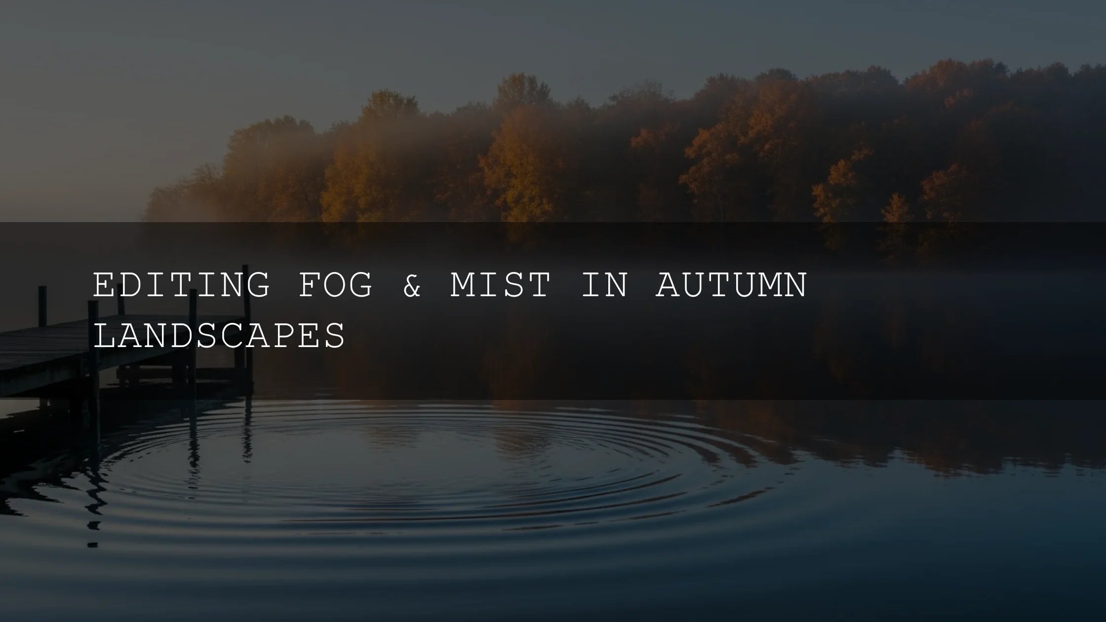
On grey or rainy days, embrace the atmosphere. AI-Optimized Moody Rainy Day Lightroom Presets deepen contrast, protect highlight detail, and lean into cooler palettes for story-rich frames—perfect for street scenes, reflective paths, or foggy forest edges.
Shooting at the edge of the season? Late-autumn scenes with bare branches and frost often benefit from the cleaner cool of AI-Optimized Cinematic Winter Lightroom Presets for crisp air, refined blues, and elegant minimalism.
A Step-By-Step Workflow for Warm–Cool Harmony
- Start with intent: Decide the emotional center: cozy warmth, misty calm, or cinematic drama. This guides your preset choice.
- Apply a base preset: Use Autumn Gold for foliage pop; Cinematic/standard Golden Hour for backlit portraits; Moody Rainy Day for overcast/drizzle; Cinematic Winter for late-season cool.
- Set white balance globally: Nudge Temp/Tint until skin looks natural and the scene’s “air” feels right. (See Adobe’s Color Grading overview inside the Edit panel for how Temp/Tint interacts with color grading.)
- Mask with intention: Use Select Subject for faces/clothing, Select Sky for sky glow, and brush masks for leaf clusters. (Quick refresher: Lightroom Classic masking.)
- Shape color with Color Mixer: Clean reds/oranges (avoid neon), control yellows/greens for natural leaves, and keep cool blues gentle. (See Adobe’s guide to adjusting color and Color Mixer.)
- Split-tone with Color Grading: Add a subtle warm bias to highlights and a mild cool bias to shadows. Balance/Blend sliders fine-tune cross-over. (More on color harmony: Adobe Color harmony rules.)
- Micro-contrast & texture: A little Clarity/Texture in the subject; keep distant layers softer to preserve depth. Avoid global crunch.
- Series consistency: Sync settings or apply the same preset family, then spot-correct per image with masks for a cohesive gallery.
Real-World Mini Case Studies
- Park portraits at golden hour: Base with Cinematic Golden Hour → mask face/hands to protect skin → add gentle cool to shadows so leaves pop without orange skin.
- Foggy woods at sunrise: Base with Moody Rainy Day → slight warm push in highlights → cool, low-contrast background to keep atmosphere; a touch of Dehaze only where needed.
- Town square after rain: Base with Moody Rainy Day → mask reflections to lift midtones → nudge Color Mixer blue/cyan saturation down a hair so jackets/skin stay natural.
Pro Tips for Natural-Looking Fall Color
- Protect skin first: After the preset, mask skin and ensure it’s not too orange or grey. Tiny Temp/Tint tweaks inside the mask go a long way.
- Let shadows stay cool: Cool shadows sell depth; warm highlights sell sunlight. This warm–cool split feels cinematic.
- Control yellows: Yellows easily clip. Reduce Yellow luminance slightly; adjust Green hue toward yellow for believable foliage transitions.
- Use luminance/Color Range masks: Target leaf clusters or skies precisely for clean adjustments (see Luminance Range masking).
- Keep the sky believable: If you warm the whole frame, re-cool the sky with a sky mask to avoid plastic blues.
Recommended Tools & Where They Fit
- AI-Optimized Autumn Gold Tones — foliage-first warmth with clean reds/oranges; great starting point for parks, trails, and family sessions.
- AI-Optimized Cinematic Golden Hour — backlit portraits, warm rim-light, consistent glow across a set.
- AI-Optimized Golden Hour — softer take on the same palette; excellent for mixed lighting or lighter skin corrections.
- AI-Optimized Moody Rainy Day — overcast, drizzle, fog, blue hour; adds structure and atmosphere without crushing detail.
Want an all-in-one library? The 1000+ Master Lightroom Presets Bundle covers seasons, portraits, landscapes, and more—handy if you edit across genres.
Related Reading
- Unlock the Magic of Fall: The Best Autumn Lightroom Presets
- The Best Presets for Golden Hour & Blue Hour Shots
- Top Lightroom Presets for Autumn
- Best Lightroom Presets for Spooky Halloween Photo Edits
- Unlock the Seasons: Stunning Seasonal Mobile Presets
Quick Troubleshooting & Learning Links
- Adobe’s guide to masking in Lightroom Classic
- Masking for Lightroom (cloud/mobile)
- Color Grading overview (highlights/shadows/midtones)
- Adobe Color harmony rules (complementary/analogous)
Where to Browse Next
Curate a consistent fall look by exploring the Fall Presets Collection or the broader AI-Optimized Lightroom Presets. Try the looks on a small test set, then roll them across your gallery—Buy 3, Get 9 FREE makes it easy to build a palette that covers sun, shade, and storm.
FAQ
How do I keep skin tones natural when warming foliage?
After applying your preset, create a Select Subject mask and nudge Temp/Tint for skin only. Keep global warmth modest and use Color Grading to warm highlights while leaving shadows slightly cool.
What if my blues look neon after boosting foliage?
Lower Blue saturation in Color Mixer, shift Aqua hue slightly toward cyan, and add a cool shadow tint via Color Grading to keep depth without electric blues.
Should I use Dehaze on fog?
Sparingly. Dehaze globally can kill atmosphere. Instead, brush Dehaze where you need edge clarity, and keep background mist soft.
How can I learn masking quickly?
Start with Select Subject/Sky, then try Luminance/Color Range for leaves and skies. Adobe’s masking guides linked above are excellent quick references.
Written by Asanka — creator of AAAPresets (10,000+ customers). • Need help installing? See our FAQ and install tips.


Leave a comment
This site is protected by hCaptcha and the hCaptcha Privacy Policy and Terms of Service apply.