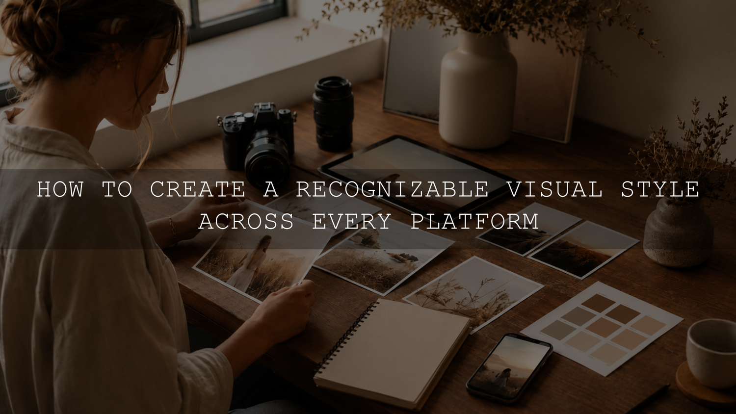
A cross-platform visual style card is a short set of visual rules that keeps your content recognizable across Instagram, TikTok, YouTube, LinkedIn, Pinterest, ads and your website. Build it by defining the visual traits that must stay consistent, adapting layouts for each platform, and using presets, LUTs and templates as editable starting points rather than fixed one-click answers.
This guide shows a practical system for creators, photographers, small businesses and social media teams who want a cleaner, more memorable visual identity across every channel they use.
Start With a One-Page Visual Style Card
Before choosing templates or editing tools, write down what the brand should look and feel like. A short style card is easier to use than a long brand document that nobody opens during production.
Your visual style card should include:
- Three words that describe the mood, such as clean, warm, cinematic, minimal, nostalgic, bold or editorial.
- One approved hero photo that represents the visual direction.
- One approved video frame that matches the same mood.
- Your main color palette and supporting neutral colors.
- Your headline font, body font and any accent font rules.
- Your preferred lighting style, contrast level and saturation range.
- Skin tone, product color or brand color rules that should not be distorted.
- The approved Lightroom presets, video LUTs and template styles used for the brand.
This style card gives every creator, editor or designer the same target. It also helps you avoid changing the look every time you see a new trend.
Choose a Color System You Can Repeat
Color is one of the fastest ways people recognize a brand. The goal is not to use the exact same background on every post. The goal is to repeat a small group of color relationships until they become familiar.
A simple cross-platform color system can include:
- One primary brand color for backgrounds, covers, accents or visual identity.
- Two secondary colors for highlights, buttons, graphic shapes or seasonal variation.
- One light neutral and one dark neutral for text, borders and clean backgrounds.
- Clear rules for when colors should be strong, muted, warm, cool or minimal.
Do not choose colors only because they look good in one Instagram post. Test them on a phone screen, a YouTube thumbnail, a website banner, a story graphic and a small profile image. If a color looks beautiful in a large design but becomes unreadable on mobile, it is not practical enough for a full visual system.
Use Typography as a System, Not a Mood Change
Typography should support recognition. If every carousel, thumbnail and story uses a new font, the brand starts to feel random even when the colors are consistent.
Keep your type system simple:
- Use one headline font for strong titles, thumbnails and carousel covers.
- Use one readable body font for educational posts, captions inside graphics and website sections.
- Use one optional accent font only for small details, not for important information.
- Set basic rules for uppercase, spacing, alignment and text size.
For platform-native text, such as TikTok captions or Instagram story text, choose the closest available style and keep placement consistent. A native app font can still feel on-brand if the color, spacing, background and editing style match the rest of your system.
Set Photo and Video Editing Rules
Your visual style will break quickly if photos, videos and thumbnails are edited with unrelated color grades. This is where presets and LUTs are useful, but they should be treated as editable foundations.
Document the editing traits that matter most:
- Warm, cool or neutral white balance direction.
- Soft, natural, high-contrast or faded black levels.
- Vibrant, muted, pastel or realistic saturation.
- Clean, warm, cinematic or film-inspired highlight color.
- Natural skin tone protection for portraits and people-focused content.
- Product color accuracy for e-commerce, brand campaigns and paid ads.
- Grain, clarity, sharpness and texture rules.
For a deeper photo and video workflow, use the AAAPresets guide to harmonizing photos and videos for a unified brand aesthetic.
Build a Small Preset and LUT Toolkit
A large editing library is useful for testing, but daily consistency usually comes from a smaller approved toolkit. Instead of choosing a new look for every post, build a small group of related looks for common production situations.
A practical toolkit might include:
- One main Lightroom preset for your core photo style.
- One softer indoor preset for home studio, office or window-light content.
- One brighter daylight variation for travel, outdoor and lifestyle photos.
- One skin-safe or product-safe variation for portraits and e-commerce content.
- One matching creative LUT for video content.
- One lower-intensity LUT version for clips that are already colorful or contrasty.
Adobe’s Lightroom Classic preset documentation explains how to create and import Develop presets, including importing preset files or a zip file. Adobe also provides current guidance for importing DNG presets in Lightroom Mobile. If you create your own video look, Adobe’s Premiere Pro guide explains how to export a reusable .cube LUT.
Remember that a preset or LUT does not remove the need for manual correction. Exposure, white balance, lighting, camera profile and subject color can still change the result. Use your tools to create a repeatable direction, then fine-tune each file so the finished set feels connected.
Create Templates for Repeatable Content Types
Templates keep your style consistent when you publish often. They also reduce the time needed to create new posts, thumbnails, stories and ads.
Create templates for your most repeated content types:
- Instagram carousel covers.
- Pinterest pins.
- YouTube thumbnails.
- TikTok and Reels cover frames.
- Quote or testimonial posts.
- Product launch announcements.
- Educational tip graphics.
- Website and blog feature images.
- Email campaign banners.
Each template should use the same color system, typography rules, spacing logic and image treatment. The content can change, but the visual structure should feel familiar.
Adapt the Same Identity for Each Platform
Cross-platform branding does not mean posting the same design everywhere. Each platform has a different format, pace and viewer expectation. The brand identity should stay consistent, while the layout and delivery adapt.
- Instagram and Pinterest: Prioritize strong still images, clean covers, recognizable colors and a consistent grid or board feel.
- TikTok, Reels and Shorts: Keep the video grade, cover style, text placement and movement energy consistent, even when the content is more casual.
- YouTube: Use a repeatable thumbnail system with the same headline style, contrast level and subject treatment.
- LinkedIn: Use a cleaner, more spacious version of the same identity so the content feels professional without becoming visually disconnected.
- Website and email: Use the most polished version of the style, with readable text, strong hero images and consistent product or brand colors.
The rule is simple: bend the format, not the identity.
Audit Your Current Visual Presence
Before redesigning everything, review what you already have. Open your main platforms side by side and compare them as if you are a new visitor.
- Check whether your profile images, banners and covers feel connected.
- Compare your latest nine to twelve posts on each platform.
- Look for repeated color shifts, font changes and template inconsistency.
- Compare your video thumbnails with the actual video grade.
- Check whether your website images match your social content.
- Identify three visual rules that should become non-negotiable.
- Update the most visible assets first, such as profile images, banners, thumbnails and pinned posts.
You do not need to fix every old post. Start with the touchpoints people see first, then apply the new system to future content.
Common Mistakes That Break Visual Consistency
- Using too many presets: A different look on every post makes the brand feel unstable.
- Ignoring source lighting: Editing cannot fully match files captured under completely different lighting conditions.
- Changing fonts too often: Typography inconsistency can make even good designs feel unbranded.
- Over-color-grading people or products: Skin tones and product colors should stay believable.
- Copying trends without filtering them through the brand: Trends can be adapted, but they should not replace your identity.
- Approving each asset alone: A photo, Reel cover or thumbnail may look good by itself but clash when viewed with the full campaign.
Use a Final Publishing Checklist
Before you publish a batch of content, review the full set together. Ask these questions:
- Do the photos, videos and graphics share a clear color mood?
- Are the fonts and text placements consistent?
- Do thumbnails match the video style?
- Do skin tones and product colors still look natural?
- Does the content feel adapted for each platform without becoming a different brand?
- Can someone recognize the brand without seeing the logo or username?
If one asset feels like it came from a different campaign, adjust it before publishing. Small corrections at this stage can make the full brand presence feel much more professional.
Choose Tools That Support Your Style
If you want a broad starting library for photo editing, the 1000+ Master Lightroom Presets Bundle includes DNG files for Lightroom Mobile and XMP files for Lightroom desktop workflows. For video, the 700+ Cinematic Video LUTs Bundle includes .cube LUTs for compatible editing software.
Use a small group of related looks from your toolkit, refine them for your real lighting and save your final choices in your visual style card. You can also browse the Lightroom presets for mobile and desktop and the cinematic LUT collection when building a consistent editing system. Eligible presets and LUTs are included in the current Buy 3, Get 9 FREE offer.
Frequently Asked Questions
Should every platform use the same design?
No. The identity should stay consistent, but the format should adapt. A LinkedIn graphic, TikTok cover, YouTube thumbnail and website banner can use different layouts while sharing the same color system, typography, editing style and visual mood.
How many colors and fonts should a visual style use?
Most creators and small brands can start with one primary color, two supporting colors, one light neutral, one dark neutral, one headline font and one body font. Add more only when the system still feels easy to repeat.
Can presets and LUTs make every photo and video match perfectly?
No. Presets and LUTs help create a repeatable direction, but source lighting, camera settings, white balance, exposure and file type still affect the final result. Apply the look, then adjust each important asset so the full set feels connected.
What should I update first if my brand already looks inconsistent?
Start with the most visible assets: profile images, banners, pinned posts, YouTube thumbnails, Reel covers, website hero images and product visuals. Then apply the new system to future content instead of trying to redesign every old post.
Written by Asanka — creator of AAAPresets.

Leave a comment
This site is protected by hCaptcha and the hCaptcha Privacy Policy and Terms of Service apply.