
How to Edit Mountain Photos and Videos for More Depth and Drama
Mountain photo editing works best when you protect the things that make high places feel epic in the first place: distance, texture, light, weather, and scale. Good mountain landscape editing is not about forcing every ridge to look ultra-sharp or turning every sky dark blue. It is about shaping tone and contrast so your cinematic mountain photos still feel believable. The same idea applies to mountain video color grading. You want more drama, but you also want the scene to feel real.
I have tested this kind of workflow on bright midday ridgelines, foggy viewpoints, and cold mountain sunsets where the raw file looked flatter than the real scene. In most cases, the problem was not that the image needed more color. It was that the foreground, mid-ground, and background were not separated clearly enough.
If you want a fast starting point, try the AI-Optimized Cinematic Landscape Lightroom Presets and browse the Professional Lightroom Presets for Landscape Photography collection. That gives you a strong base for cleaner skies, better ridge separation, and richer mountain tones, and it fits naturally with our Buy 3, Get 9 FREE offer.
Why Mountain Scenes Often Look Flat Straight Out of Camera
Mountains are dramatic in real life, but cameras often compress that feeling. Distant peaks can lose contrast in haze. Bright clouds can pull attention away from the land. Deep valleys can turn muddy. If your frame has no strong foreground anchor, the whole view can feel wide but not immersive.
Here’s why this matters: depth is what makes a mountain image feel big. Without depth, a mountain photo becomes just a record of a place. With depth, it starts to feel like an experience.
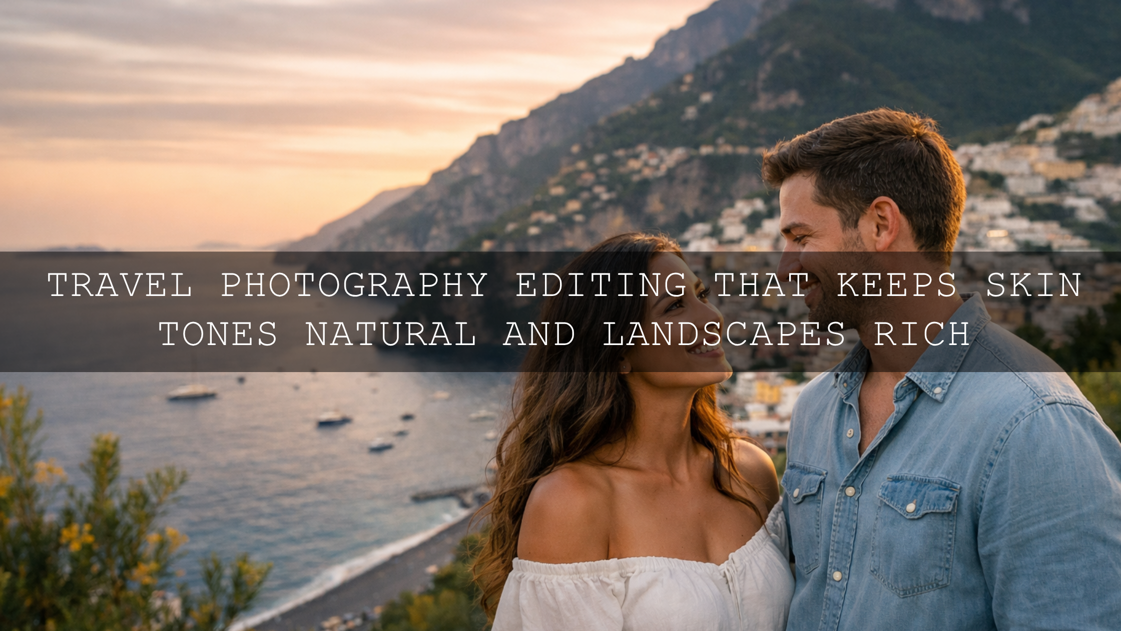
If your images lean more toward hiking and travel scenery, this guide on editing mountain and hiking photos for crisp, clean tones is a useful companion read.
What Actually Creates Depth in Mountain Landscape Editing
- Foreground interest: Rocks, trails, grass, trees, or water give the viewer a place to enter the frame.
- Layer separation: Nearby land, middle ridges, and distant peaks should not all sit at the same contrast level.
- Atmospheric perspective: A little haze, mist, or softer contrast in the distance helps the scene feel deeper.
- Directional light: Side light and backlight reveal ridges, cliffs, and texture far better than flat overhead light.
- Controlled color: Blues, greens, snow tones, and shadows need to stay believable or the image starts to look artificial.
Pro tip: If you only make one major improvement, make the viewer feel distance. That usually matters more than adding extra saturation or extra clarity.
A Step-by-Step Workflow for Mountain Photo Editing
This workflow works well in Lightroom, Lightroom Classic, and Adobe Camera Raw. It is simple enough for fast edits, but strong enough to produce a polished result.
1. Start with exposure, not effects
Before you touch color, correct the image so the brightest clouds and snow still hold detail. Bring highlights down first if needed. Then raise exposure only until the scene feels open enough. I usually keep mountain photos slightly darker than portrait edits because the shadows help preserve scale.
2. Set your black point carefully
Mountain scenes need shadow depth, but crushed blacks can remove texture from forests, cliffs, and valleys. Lower blacks and shadows gradually until the frame feels grounded, then stop before rock and tree detail disappears.
3. Keep the sky strong without overpowering the land
A dramatic sky can help, but it should support the mountain, not compete with it. This is where Adobe’s Lightroom masking guide becomes useful. A sky mask lets you darken or add structure to the sky separately while keeping the mountains natural.
4. Use Color Mixer for cleaner blues and greens
Many mountain images fail because the greens get neon or the blues turn too cyan. Use Adobe’s Color Mixer walkthrough to refine individual color channels instead of pushing global saturation. Lower green saturation slightly if the slope looks fake. Shift blue hue a little if the sky feels too tropical for an alpine scene. This is one of the fastest ways to make mountain landscape editing feel more professional.
5. Add local contrast where the eye should go
Global clarity on the whole frame usually makes mountains feel harsh. A better approach is to add local texture or clarity only to the important areas: ridge lines, foreground rocks, or tree detail. Keep the farthest peaks a little softer. That difference in texture helps the viewer read depth more naturally.
6. Warm the light, not the whole frame
If the scene was shot during sunrise or sunset, warm the highlights and leave the shadows slightly cooler. If the whole image becomes warm, the mountain atmosphere often disappears. For better color balance ideas, the Adobe Color harmony wheel is a good reference when you want warm light and cool shadows to work together without fighting.
7. Finish with restraint
The best cinematic mountain photos usually look deliberate, not loud. One final pass is often enough: check highlights, check horizon, check distracting bright spots, and reduce any color that feels too aggressive. When the image feels calm, deep, and clear, you are usually done.

If you want a faster base look before fine-tuning manually, the Landscape Cinematic Lightroom Presets Pack is a strong choice for photos that need richer tone, cleaner contrast, and more believable depth without overprocessing the scene.
Presets vs Manual Editing for Mountain Photos
Both approaches work. The best results usually come from combining them.
- Manual editing: Best when every image has different weather, altitude haze, or mixed lighting. You get full control, but it takes longer.
- Presets: Best when you want speed, style consistency, and a reliable starting point across a full set of travel or landscape images.
- Hybrid workflow: Apply a preset first, then solve the specific file with exposure, white balance, masking, and Color Mixer adjustments.
That hybrid method is the one I trust most. On my own landscape edits, the preset often gets me 70% of the way there, but the final quality usually comes from the small manual fixes after that.
How to Color Grade Mountain Footage for More Drama
Mountain video color grading follows the same visual logic as photo editing: separate layers, protect highlights, and avoid overdoing the grade. The difference is that video needs consistency shot to shot. If one clip is too warm and the next is too cold, the cinematic mood breaks immediately.
Use LUTs as a base, not a final answer
LUTs are excellent for getting to a polished look quickly, especially when you want a consistent feel across a full hiking film, drone sequence, or travel edit. For moodier mountain scenes, the Cinematic Landscape Dark and Moody Video LUTs work well when clouds, fog, snow, or dramatic shadows are part of the story. If you want a cleaner all-purpose outdoor grade, the Cinematic Landscape Nature Outdoor LUTs Pack is a more flexible starting point.
Balance exposure before the creative look
Do not drop a strong LUT onto badly exposed footage and hope it fixes everything. Bring your clip into a clean baseline first. Recover highlights, lift shadows only as much as needed, and correct white balance before applying the LUT. Then reduce LUT intensity if the look feels heavy.
Keep the distance readable
In mountain video, it is easy to over-contrast the shot until the distant layers merge together. Keep enough tonal separation so the viewer can still read atmosphere and scale. If you want more ideas for moodier grades, see this dark and dramatic color grading guide.
Use a repeatable workflow
When you are editing multiple clips, consistency matters more than perfection on one shot. Build a repeatable sequence: normalize exposure, correct white balance, apply LUT, adjust strength, then refine shadows and highlights. If you want a platform-specific install walkthrough, this guide on how to install and use LUTs in Premiere Pro, DaVinci Resolve, and Final Cut Pro is useful.

Common Mistakes That Kill Depth and Drama
- Too much clarity: This makes every plane of the image feel equally sharp, which reduces depth.
- Too much dehaze: A little can help; too much makes mountains look cut out and unnatural.
- Oversaturated greens and blues: This is one of the fastest ways to make a mountain edit look cheap.
- Crushed valley shadows: Dark is fine. Empty is not.
- Ignoring the foreground: If the front of the frame is weak, the scale of the peaks is weaker too.
- Applying the same look to every weather condition: Sunny alpine scenes, foggy ridges, and snowy trails all need different treatment.
When to Go Moody and When to Stay Clean
Not every mountain image needs a dark cinematic finish. Clean grades usually work better for open daytime views, travel photography, and bright alpine color. Moody grades usually work better for fog, winter, rain, storm light, blue hour, and storytelling-driven edits.
If your scene leans cold, distant, or frosty, this article on using cool presets to create distance and drama is worth reading. If you want broader inspiration for travel-friendly landscape edits, these travel Lightroom preset ideas can also help you choose a direction faster.
Related Reading
- How to edit hiking and mountain photos for crisp, clean tones
- Using cool presets to create distance and atmospheric drama
- Dark and dramatic color grading ideas for cinematic storytelling
- How to install and use LUTs in Premiere Pro, DaVinci Resolve, and Final Cut Pro
- Travel preset ideas that also work beautifully on mountain scenes
If you want your mountain photos to feel bigger and your footage to feel more cinematic without spending hours building every edit from scratch, start with the AI-Optimized Cinematic Landscape Lightroom Presets for photos or the Cinematic Landscape Dark and Moody Video LUTs for mood-heavy footage, then explore the broader Cinematic LUTs collection for more outdoor looks. If you want to learn more about the brand behind these tools, you can also visit About Us.
What is the best way to add depth to mountain photos?
The best way is to separate foreground, mid-ground, and background with tone, contrast, and texture. A strong foreground anchor, controlled sky, and softer distant peaks usually create more depth than simply adding more clarity.
Should I use Dehaze on mountain landscapes?
Yes, but lightly. Small Dehaze adjustments can improve ridge definition, but too much makes clouds, trees, and distant peaks look harsh and unrealistic.
Are presets enough for mountain photo editing?
Presets are an excellent starting point, especially when you want speed and consistency. The strongest results usually come from applying a preset first and then refining exposure, white balance, masking, and color channels manually.
What kind of LUT works best for mountain footage?
It depends on the mood. Cleaner outdoor LUTs work well for bright landscapes and travel edits, while dark and moody LUTs work better for fog, storms, snow, or cinematic storytelling.
Written by Asanka — creator of AAAPresets (10,000+ customers).

Leave a comment
This site is protected by hCaptcha and the hCaptcha Privacy Policy and Terms of Service apply.