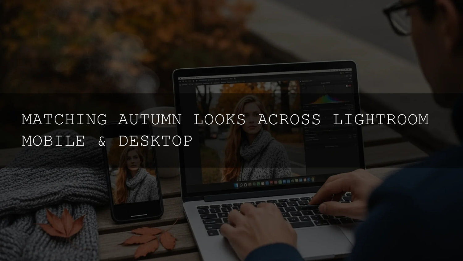
Match Autumn Looks Across Desktop & Mobile with Lightroom Presets
Autumn is a color storyteller—molten gold leaves, ember reds, earthy browns, and cool blue air. With the right autumn Lightroom presets, you can translate that palette into a cohesive look across both desktop and mobile so every portrait, landscape, and travel shot feels like part of the same series. Below, we’ll map a practical workflow to choose the right packs, install them in both Lightroom Classic/CC (XMP) and Lightroom Mobile (DNG), and fine-tune for skin tones, foliage, and mixed light. I’ll share field notes from real shoots and include quick links to helpful Adobe resources, plus internal guides and collections to keep you moving fast.
Quick start: If you want a warm, cinematic base straight away, try AI-Optimized Autumn Gold Tones Lightroom Presets and then browse the broader Lightroom Presets for Mobile & Desktop collection—you can build a toolkit strategically and Buy 3, Get 9 FREE in one go.
Why Autumn Needs a Balanced Edit
Fall scenes commonly mix warm subjects (leaves, late-day sun, wood, earth) with cooler elements (shade, blue sky, mist). Push everything warm and skin tones go orange; cool it all down and foliage looks dull. The winning formula is a warm bias with cool anchors—glowing oranges/reds balanced by believable blues and neutral shadows. That’s what the best fall Lightroom presets try to establish from the first click.
Pick Your Signature Autumn Style (and the Right Pack)
Choose the “lens” you want your audience to feel. Here are five proven looks, when to use each, and where they shine:
1) Golden & Cozy (Warm Portraits, Lifestyle, Travel)
For the golden-hour look that flatters skin and amplifies leaf glow, start with AI-Optimized Autumn Gold Tones Lightroom Presets. I use this when a shoot needs warmth without plastic skin—weddings, café lifestyle, backlit portraits. Tip: lift Shadows +5–10 and nudge Temp +2–4 if your camera leans cool.

2) Matte Film (Editorial, Fashion, Nostalgic Portraits)
When you want cinematic softness with modern color control, use AI-Optimized Matte Autumn Film Lightroom Presets. The gentle roll-off in highlights + restrained contrast gives expensive texture. I tested this pack on an outdoor fashion portrait set—lifting blacks slightly and pulling Blue Primary Saturation −5 kept denim and sky elegant instead of neon.

3) Vibrant & Punchy (Landscapes, Parks, Travel Reels)
Want foliage to command the frame? Autumn Fall Vibrant Lightroom Presets are tuned to intensify reds/oranges/yellows without wrecking skies. If reds go too hot on a specific file, drop HSL > Reds Saturation −5 to −10 and shift Hue +2 to keep faces natural.

4) Natural & Versatile (Everyday Shoots, Mixed Light)
If you want an “always looks good” base, use Autumn Fall Tones Lightroom Presets. This is my set-and-forget for family sessions or travel diaries—apply, then ride Exposure ±0.25 and Temp ±300 K to match the scene.

5) Cinematic Landscape (Grand Scale, Mood, Depth)
For sweeping parks, forests, and scenic overlooks, Cinematic Autumn Fall Lightroom Presets introduce bolder shaping (contrast/curves) and a filmic palette that grades skies and shadows with intention. Pair with a radial mask over your main subject to guide the eye.

Desktop ↔ Mobile Harmony: XMP vs DNG (and a 5-minute Setup)
Great looks are wasted if they don’t follow you between devices. Here’s the cleanest way to keep edits consistent:
- Know your formats: Desktop uses XMP (Lightroom Classic/CC + Adobe Camera Raw). Mobile reads DNG presets natively. Adobe’s official docs cover installing presets on desktop and how mobile import works. See: Install custom presets & profiles in Lightroom (desktop) and Import presets in Lightroom for mobile.
- Install on desktop (XMP): In Lightroom Classic or Lightroom (CC), go to File > Import Profiles & Presets, select the pack’s XMP files, and import. If you sync via Creative Cloud, these can surface on mobile automatically.
- Install on mobile (DNG): Open a DNG preset file in Lightroom Mobile, tap the three-dot menu, and “Create Preset.” Keep a “Autumn” preset folder so sets stay organized on the go.
- Syncing advantage: With Creative Cloud on, your presets and edits are available everywhere. That means you can grade a forest shot on desktop, then reuse the same preset on a café portrait from your phone to keep the feed consistent.
- Micro-tweaks per image: Every file differs. After applying a preset, adjust Exposure, White Balance, and HSL Reds/Oranges for skin realism; use Masking (Subject/Sky/Background) to target local contrast where the eye should go.
If you’re new to Lightroom tools, Adobe’s guides to editing and presets on mobile and using the Adobe Color harmony wheel are excellent refreshers for color relationships and on-device workflow.
Step-by-Step: A Reliable Autumn Edit
- Apply your base preset (e.g., Autumn Gold Tones) to set white balance bias, foliage hue, and contrast curve.
- Set global balance: Aim for a warm bias with neutral shadows. Start with Temp +200–400 K, Tint +2–5 if greens feel too cool.
- Protect skin: In HSL, nudge Orange Hue −2 to −6 to soften carrot-orange cast; reduce Orange Saturation −5 if needed.
- Shape depth with masks: Use Subject to brighten faces +0.2 to +0.4 exposure; Background to lower highlights; Sky to keep blues calm. See Adobe’s guide to masking in Lightroom for precise targeting.
- Curve for mood: Add a soft S-curve for punchy foliage; for matte film, lift blacks slightly and compress highlights.
- Calibrate for polish: Tiny tweaks in Calibration (Blue Primary Saturation −5 to −10) can tame oversaturated skies while preserving leaf warmth.
- Finish with local color: A radial filter over the subject with Temp +2 and Saturation +3 can add “sun” where you want attention.
Field note: I shot a backlit couple’s session under maple trees. The Matte Autumn Film base + an oval radial mask over faces (Clarity −5, Texture −5) gave that editorial creaminess while keeping leaf glow intact.
Presets vs Manual Editing: When to Choose Which
- Presets are best for speed, brand consistency, and batch edits. You’ll still adjust exposure/WB and a couple of HSL sliders for each image family.
- Manual shines for edge-cases: sodium-vapor streetlights, indoor tungsten + window mix, or heavy fog. In these scenes, craft local masks first, then apply a preset to retain intentional contrast and color mapping.
- Hybrid wins most days: Set the look with a preset, then manually target problem areas (skin, sky, deep shade) with masks/HSL.
Keep Your System Organized (and Fast)
- Create a preset folder “Autumn – Portrait” vs “Autumn – Landscape” so you don’t scroll endlessly on mobile.
- Name your go-to variation “Autumn Gold – Soft Skin” or “Vibrant Foliage – Overcast” to remind yourself of intent.
- Use synced albums like “Autumn WIP” to move sets from desktop to phone cleanly.
Try These, Then Fine-Tune
Explore these packs to build a flexible, cross-device workflow:
- AI-Optimized Autumn Gold Tones — warm portraits/lifestyle with believable skin.
- AI-Optimized Matte Autumn Film — editorial matte with cinematic mood.
- Autumn Fall Vibrant — high-impact landscapes and travel sets.
- Autumn Fall Tones — natural, adaptable base for mixed lighting.
- Cinematic Autumn Fall — grand scenic depth with filmic contrast.
Want to browse more options? Head to the Fall Presets for Lightroom collection and the broader Lightroom Presets library. Try what fits your subject first—then keep a couple of “rescue” looks for overcast, shade, or tungsten.
Related Reading
- Top 10 Fall Lightroom Presets — quick comparisons to pick your base.
- Autumn & Fall Photo Editing Tips — Series Hub — seasonal articles in one place.
- Golden Hour in Autumn — Preset Guide for Skin & Leaf Glow.
- Best Autumn Lightroom Presets for Portraits, Landscapes & Travel.
- Lightroom Mobile — Tips & Tricks for fast on-phone edits.
Helpful Adobe Resources
- Install custom presets & profiles in Lightroom (desktop)
- Import presets in Lightroom for mobile
- Adobe Color — Harmony rules & palette builder
FAQ
Do I need XMP or DNG for my presets?
Use XMP for Lightroom Classic/CC on desktop and DNG for Lightroom Mobile. Install both to keep your look consistent across devices.
How do I keep skin tones natural with warm autumn palettes?
After applying the preset, fine-tune HSL > Orange Hue/Saturation and balance Temp/Tint. Use a Subject mask to lift exposure and reduce saturation slightly on faces.
My reds look too intense—what should I adjust?
Drop Reds Saturation −5 to −15 and nudge Reds Hue +2 to +6. In Calibration, lower Blue Primary Saturation −5 to calm overall punch without killing foliage.
What’s the fastest way to edit a whole autumn set?
Sync or copy/paste after the first “hero” image, then correct outliers with masks (faces, sky, deep shade). Presets + small per-image tweaks are faster than rebuilding looks every time.
Where can I get help if I’m stuck installing?
Check our FAQ (How to Install Lightroom Presets) or contact us—we’ll walk you through XMP/DNG setup.
If you’re building a seasonal toolkit, start with a look you love and layer from there. Explore AI-Optimized Autumn Gold Tones, add a cinematic option like Cinematic Autumn Fall, and keep a versatile base such as Autumn Fall Tones. Browse the full range in our Fall Presets collection—try them today and Buy 3, Get 9 FREE.
Written by Asanka — creator of AAAPresets (10,000+ customers).

Leave a comment
This site is protected by hCaptcha and the hCaptcha Privacy Policy and Terms of Service apply.