
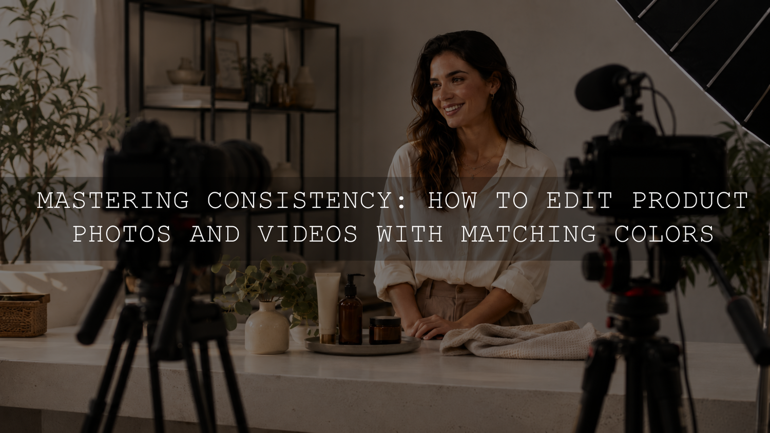
Matching photo and video colors requires more than applying a similar-looking preset and LUT. A reliable workflow is to create a neutral technical base first, choose one reference image, match the visible characteristics of the creative look and then refine exposure, white balance, skin tones and important brand colors for each file.
Your photographs and videos do not need to be perfectly identical. They should feel as though they belong to the same visual system, with similar highlight warmth, shadow color, contrast, saturation and treatment of important subjects.
What Color Consistency Actually Means
Color consistency does not mean forcing every photograph and video clip to use the same temperature value or identical editing settings. Photos and videos may come from different cameras, sensors, profiles, lighting conditions and editing applications.
A consistent brand look is created by repeating a controlled group of visual characteristics:
- Similar highlight and shadow colors
- A recognizable contrast level and black point
- Consistent treatment of whites and neutral surfaces
- Believable and repeatable skin tones
- Accurate product and packaging colors
- A controlled saturation range
- A similar balance between polished, cinematic, faded or natural tones
For social-media planning beyond color grading, see the guide to building a consistent Instagram aesthetic with Lightroom presets.
Step 1: Choose a Hero Photo and Reference Video Frame
Begin with one well-exposed photograph that represents the visual direction you want the brand to follow. This becomes the hero photo against which other images and video frames are compared.
Choose a photograph containing several useful reference points:
- A neutral white, grey or black object
- A person’s skin, when people appear regularly in the content
- An important product or packaging color
- Bright highlights and darker shadow areas
- Colors that regularly appear in the brand’s locations, clothing or props
Edit the hero photograph until those elements look intentional and believable. Then choose a representative frame from a video recorded under similar lighting. Do not begin by comparing a daylight photograph with a video filmed under mixed indoor lighting, because the lighting difference may be greater than the difference between the preset and LUT.
Step 2: Capture Files That Can Be Matched More Easily
Use RAW for Photographs When Practical
RAW files normally provide greater flexibility for correcting white balance, recovering tonal detail and refining individual colors than finished JPEG files. A JPEG can still be edited, but the camera has already processed its white balance, contrast, sharpening and color rendering.
Adobe’s RAW versus JPEG guidance explains why RAW files provide more control over white balance and highlight recovery during editing.
Use Log or a Grading-Friendly Video Profile Carefully
When your camera supports it and your workflow is prepared for color management, Log or another profile designed for grading can provide more flexibility than a strongly processed vivid profile. However, Log footage is not automatically better-looking and should not be treated as finished footage.
When a Log profile requires conversion, the editing application must interpret or transform the footage correctly before a creative LUT is applied. Incorrectly handled Log footage may appear washed out, overly contrasty or strangely saturated.
Standard-profile video can also be matched successfully. It often provides less freedom for major exposure and white-balance corrections, particularly when highlights are clipped or the lighting contains a strong color cast.
Control the Capture Conditions
Whenever possible, photograph and film the subject under the same lighting. Manually controlling white balance also prevents the camera from changing color temperature between clips during the same scene.
For color-critical products, record a short reference shot containing a neutral grey card or color target before the main content. The target does not need to remain in the published image. It gives the editor a neutral starting point when the camera, location or lighting changes.
Step 3: Correct the Technical Base Before Adding a Look
A preset or creative LUT should normally shape the style after the basic technical problems have been corrected. Applying a strong creative look to an underexposed, incorrectly balanced or improperly interpreted file often exaggerates the original problem.
Prepare the Photograph
- Choose the intended camera or Adobe profile.
- Correct exposure without clipping important highlights.
- Adjust white balance and tint using a neutral reference where available.
- Recover available highlight or shadow detail without forcing clipped areas.
- Correct obvious lens or mixed-light problems.
- Apply the creative preset.
- Refine exposure and white balance again if the preset changes the balance of the image.
The selected photo profile matters because profiles determine the starting interpretation of color and tonality. The same preset can look different when one image begins with Adobe Color and another begins with a camera-matching profile.
Prepare the Video
- Confirm the source color space, gamma or camera profile.
- Apply the appropriate input transform or color-management setting when required.
- Balance exposure and white balance before the creative grade.
- Match the brightness of related clips.
- Apply the creative LUT.
- Reduce LUT strength and make secondary color corrections.
Modern Premiere color management can automatically transform supported RAW and Log media to a chosen color space. The same correction-first principle applies in DaVinci Resolve, Final Cut Pro and other color-managed applications.
For a deeper video workflow, read the guide to video color grading with LUTs.
Step 4: Work on a Calibrated and Controlled Display
A calibrated monitor gives you a more dependable reference for editing decisions. It does not guarantee that every customer will see exactly the same colors because phones, monitors, brightness settings, display modes, browsers and viewing environments vary.
The goal of calibration is to make your own editing display more predictable. Keep the room lighting reasonably consistent, avoid editing beside strongly colored lights and do not set the monitor excessively bright. A very bright display can encourage edits that look too dark on other devices.
Hardware measuring devices such as colorimeters can create more accurate monitor profiles than visual calibration alone. Adobe recommends calibration and profiling to help Lightroom Classic display colors reliably and consistently. See Adobe’s Lightroom Classic color-management guidance.
Step 5: Build a Paired Preset and LUT Look
A Lightroom preset and a video LUT can share the same creative direction, but they do not store the same types of adjustments.
A Lightroom preset may include settings such as:
- White balance
- Exposure and tonal controls
- Tone curves
- Color Mixer adjustments
- Color grading
- Texture, clarity and dehaze
- Sharpening and noise reduction
- Lens corrections
- Masking settings when supported
A standard LUT maps input color values to output color values. It can influence color relationships, contrast and tonality, but it cannot reproduce Lightroom features such as masking, texture, sharpening, lens correction or image-specific exposure recovery.
Instead of trying to copy every setting, match the visible characteristics:
- Warmth or coolness of the highlights
- Color of the shadows
- Contrast and black-point depth
- Brightness of the midtones
- Overall saturation
- Skin-tone hue and luminance
- Rendering of greens, blues, reds and brand colors
When saving a reusable Lightroom preset, consider excluding image-specific exposure and white-balance settings unless most content is captured under controlled conditions. This allows the preset to establish the creative style without forcing every photograph toward the exposure or color temperature of the original hero image.
AAAPresets offers a 1000+ Master Lightroom Presets Bundle in DNG and XMP formats for photo workflows and a 700+ Cinematic Video LUTs Bundle in .cube format for supported video-editing applications. Use them as creative starting points, then correct each photograph or clip for its own lighting and exposure.
Step 6: Compare the Photo and Video Side by Side
Open the hero photograph beside a representative video frame. Compare them at a similar size rather than judging one full-screen and the other as a small thumbnail.
Review the image in this order:
- Neutral objects: Check whether whites, greys and blacks lean too yellow, blue, green or magenta.
- Exposure: Compare important midtones, bright surfaces and shadow detail.
- Skin tones: Look for orange, yellow, magenta, grey or desaturated skin.
- Product colors: Compare packaging, clothing and branded objects with the real subject or a controlled reference.
- Contrast: Check whether one format has much deeper blacks or harsher highlights.
- Saturation: Look for colors that become fluorescent, muddy or unnaturally intense.
- Overall mood: Decide whether both files communicate the same warm, clean, cinematic, pastel, dark or natural direction.
Video scopes can support this visual comparison. A waveform helps compare exposure, an RGB parade can reveal channel imbalances, and a vectorscope can help identify excessive saturation or shifts in skin-tone direction. Scopes should support the visual decision rather than replace it.
Step 7: Protect Skin Tones, Products and Brand Colors
A global adjustment that fixes one color may damage another. Reducing orange saturation can calm an overly warm background but make skin appear grey. Cooling the entire image can neutralize a white wall while making a product’s warm color inaccurate.
Use local or targeted controls when the correction affects only part of the image:
- Lightroom masks for faces, subjects or backgrounds
- Color Mixer or HSL adjustments for specific hues
- Secondary color corrections in video-editing software
- Power windows or tracked masks in advanced video workflows
- Separate product-safe and creative versions of the same look
For e-commerce content, accurate product color should normally take priority over a dramatic creative effect. A slightly less stylized grade is preferable to a product that appears to be a different material, finish or color.
Step 8: Test the Look Across Several Real Files
Do not approve a brand preset or LUT after testing it on one ideal image. Use a small validation set containing the situations your brand encounters most often:
- Direct sunlight
- Open shade
- Warm indoor lighting
- Mixed window and artificial light
- Light and dark skin tones
- White and black products
- Strong brand colors
- Footage from each frequently used camera or phone
A useful preset and LUT pairing should provide a recognizable foundation across this set without requiring extreme corrections. It does not need to produce an identical result automatically.
Common Reasons Photos and Videos Still Do Not Match
The Same Preset Looks Different on Two Photographs
Check the camera profile, starting white balance, exposure, lighting and file type. A RAW file and JPEG may respond differently, while files from different camera brands can begin with noticeably different color rendering.
The LUT Makes the Video Too Strong
Reduce the LUT intensity or blend amount. Full strength is not automatically the intended finishing point. Correct exposure and white balance before deciding whether the LUT itself is unsuitable.
The Photo Looks Warm but the Video Looks Magenta
Temperature alone may not be the problem. Compare tint and individual red, orange and magenta channels. Mixed LED lighting can introduce green or magenta shifts that a temperature adjustment cannot remove.
Skin Matches but the Product Does Not
Use separate corrections for skin and the product. A single global hue or saturation change may not protect both accurately.
The Edit Looks Different on a Phone
Check the phone’s brightness, display mode, blue-light reduction setting and whether the application handles color profiles correctly. Also review the exported file rather than comparing only an editing preview.
Mixed Lighting Cannot Be Corrected Globally
When one side of a subject is lit by daylight and the other by a warm lamp, one white-balance setting cannot neutralize both areas. Use local masks, secondary corrections or simplify the lighting during capture.
Create a Practical Brand Color Guide
Document the system so that the look can be repeated by you or another editor. The guide should record decisions rather than one universal temperature value.
Include:
- The approved hero photograph and reference video frame
- The Lightroom preset and LUT names
- The intended photo and video profiles
- The normal contrast, saturation and black-point direction
- Examples of acceptable skin tones
- Protected product and brand colors
- Rules for indoor, outdoor and mixed-light content
- The usual LUT intensity range
- Standard photo and video export settings
- A list of adjustments that should remain image-specific
A fixed value such as 5200K may be useful in a controlled daylight setup, but it should not become a universal brand rule. Different cameras, light sources and environments can produce different results at the same Kelvin setting.
Export and Review the Final Assets Together
Export a small group of final photographs, Reel covers and video clips before processing an entire campaign. Review them together on the website, social-media preview or content-planning grid where customers will encounter them.
For standard web and social-media SDR delivery, many workflows use sRGB for photographs and Rec.709 for video. Confirm the required specification for the destination, client or platform, especially when working with HDR footage or wide-gamut assets.
Evaluate the final group at thumbnail size as well as full-screen. Small differences are normal, but one asset should not appear dramatically colder, darker or more saturated than the surrounding content unless the contrast is intentional.
Final Checklist
- Use a hero photograph and reference video frame.
- Capture RAW photos when practical.
- Use Log only when the workflow can interpret it correctly.
- Correct profiles, color spaces, exposure and white balance first.
- Calibrate the editing display without expecting identical results on every device.
- Match visible characteristics instead of copying incompatible settings.
- Reduce LUT intensity when necessary.
- Correct skin tones, products and brand colors separately.
- Test the look across different cameras and lighting conditions.
- Document the approved workflow in a brand color guide.
- Review exported photos and videos together before publishing.
Frequently Asked Questions
Can a Lightroom Preset Be Converted Directly into a Video LUT?
Some color and tonal characteristics can be translated into a LUT, but the LUT will not reproduce every Lightroom setting. Masking, sharpening, texture, lens corrections and image-specific recovery adjustments do not transfer in the same way.
Do I Need RAW Photographs and Log Video?
No. JPEG photographs and standard-profile video can still be matched. RAW and properly managed Log files generally provide more flexibility when major color, white-balance or tonal corrections are required.
Do I Need a Hardware Calibration Device?
It is not required for basic social content, but a hardware colorimeter can provide a more accurate and repeatable editing reference. Calibration improves your display’s reliability; it cannot control how every customer device displays the final content.
Should One Preset and LUT Be Used for Every Campaign?
Not necessarily. A brand may use a small family of related looks for product photography, lifestyle content, seasonal campaigns and low-light video. The looks should share recognizable color and tonal characteristics rather than being completely unrelated.
Browse the Lightroom presets for mobile and desktop and the cinematic LUT collection to build a coordinated photo-and-video editing toolkit. Under the current Buy 3, Get 9 FREE offer, add 12 eligible items to the cart and pay for only 3.
Written by Asanka — creator of AAAPresets, serving more than 10,000 customers.


Leave a comment
This site is protected by hCaptcha and the hCaptcha Privacy Policy and Terms of Service apply.