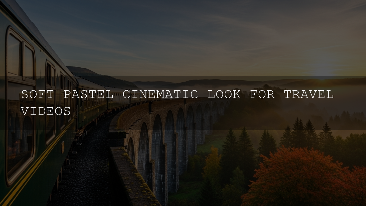
Soft Pastel LUTs for Travel Videos: Your Complete Cinematic Guide
If you’ve ever paused mid-scroll because a travel reel looked like a dreamy postcard, you’ve already seen what soft pastel LUTs for travel videos can do. Viewers are drawn to gentle, cinematic looks that feel like memories—soft skies, creamy highlights, and muted shadows instead of harsh contrast and neon saturation. A good pastel color grading workflow turns your footage into something calmer, more emotional, and more “bingeable” on Reels, Shorts, TikTok, or YouTube.
The best part? You don’t need to be a full-time colorist to get there. With the right pastel color grading LUTs, plus a simple step-by-step workflow, you can take flat, ordinary clips and transform them into cohesive, cinematic travel stories that still look natural. In this guide, we’ll walk through why the soft pastel cinematic look works so well, how to build your LUT toolkit, and how to apply everything inside Premiere Pro, DaVinci Resolve, Final Cut Pro, and more.
If you’d like a head start, you can build a pastel-ready toolkit with curated LUT packs like the Pastel Bright Video LUTs, Cinematic Spring Light LUTs Pack, and Spring Bloom Cinematic LUTs Pack. Combine them with AAAPresets’ Premium LUTs for Premiere Pro to make cinematic videos and take advantage of the Buy 3, Get 9 FREE offer to explore multiple looks without overspending.
Why the Soft Pastel Cinematic Look Works So Well for Travel
Soft pastel grading is about emotion first, color second. Instead of screaming for attention with extreme saturation, you’re gently steering the mood: calm mornings, nostalgic afternoons, and romantic blue hours. Pastel palettes often soften the contrast, lift shadows slightly, and reduce harsh primaries. The result is a look that feels peaceful and reflective—perfect for travel stories, couples’ getaways, and slow, cinematic B-roll.
From a storytelling perspective, pastel tones push the focus back onto your subject: faces, gestures, architecture, landscapes. When you lower contrast and saturation a touch, viewers stop staring at the grade and start following the story. That’s especially important when you want your content to feel timeless instead of locked to a particular trend.
Color-theory-wise, pastels often sit in gentle complementary or analogous combinations—soft blues and pinks, washed-out greens and creams, or gentle lavender accents. If you want to explore pairings before you even start grading, you can experiment with harmony rules and pastel palettes using tools like Adobe Color’s color harmony tools to preview how hues interact before you ever touch your footage.
When Soft Pastel LUTs Shine in Your Travel Footage
- Beach and coastal trips: Think pastel skies, seafoam, and sun-kissed skin tones that feel calm rather than intense.
- Old towns and historic streets: Softening contrast on stone, brick, and painted facades creates a romantic, “cinema postcard” mood.
- Cherry blossoms, gardens, and spring scenes: Pastel LUTs naturally enhance pinks, light greens, and soft whites without clipping detail.
- Morning and golden hour walks: A pastel cinematic look pairs beautifully with low, warm light and long shadows.
- Minimalist interiors & cafés: Pastel grading can turn simple shots of coffee, books, and windows into lifestyle moments.
As someone who has graded travel clips, wedding highlights, and lifestyle reels with these pastel LUTs, I’ve found they’re especially powerful when you want clips from different days, cameras, and locations to feel like a single, cohesive film rather than random snippets.
Your Pastel LUT Toolkit: 5 Packs for Different Vibes
You don’t need hundreds of LUTs to get a beautiful soft pastel cinematic look. A tight kit of pastel-friendly LUT packs gives you enough variety to match different locations and lighting, while keeping your overall style consistent. Here are five packs that work especially well for travel videos and lifestyle films.
1. A Nostalgic Journey – 80s Vintage Pastel Tone LUTs Pack
The 80s Vintage Pastel Tone LUTs Pack is your go-to when you want retro warmth—think pastel-tinted film, soft highlights, and gentle contrast that feels like a childhood vacation on VHS (but in HD/4K). It’s perfect for old towns, classic cars, vintage cafés, and any scene where you want that nostalgic, slightly dreamy atmosphere.
Use it for:
- Road trips with older cars or motorcycles
- Sunset city walks with neon signs softened into pastel glows
- Retro-feeling locations like diners, arcades, or coastal boardwalks
2. Whispers of Spring – Cinematic Film Blossom Tones LUT Pack
The Cinematic Film Blossom Tones LUT Pack leans into soft pinks, cream highlights, and delicate contrast inspired by spring blossoms. It shines on cherry blossom shots, romantic walks, engagement trips, and any scene filled with flowers or subtle pastels in the environment.
In my own grading, this pack has been a favorite for couples’ travel edits and wedding-style story reels filmed in parks, gardens, and tree-lined streets. Skin tones stay gentle and flattering, while the background picks up a soft bloom that feels cinematic rather than over-edited.
3. Radiant Light – Cinematic Spring Light LUTs Pack
The Cinematic Spring Light LUTs Pack is designed to enhance soft natural light and pastel colors, making it ideal for airy travel vlogs, lifestyle films, and wedding videos. It lifts the brightness just enough to feel fresh and luminous without sacrificing detail, which is perfect for overcast days and diffused light.

Use this pack when you want soft greens, delicate skies, and bright interiors to feel clean and modern. It’s especially good on handheld travel footage where you need a quick “one-click” starting point that still looks premium.
4. Vibrant Softness – Pastel Bright Video LUTs
The Pastel Bright Video LUTs are perfect when you want a pastel look that still pops. This pack includes 8 professional-grade .CUBE LUTs tuned for bright, airy tones and delicate pastel hues, optimized for soft contrast and vibrant highlights. It’s ideal for sunny beaches, colorful cities, and travel content where you want energy without losing the pastel charm.
Because these LUTs are designed for non-destructive grading and work across major editors like Premiere Pro, DaVinci Resolve, and Final Cut Pro, they’re a great “daily driver” pack for creators who edit a lot of travel and lifestyle footage and want a consistent bright pastel aesthetic.
5. Nature’s Embrace – Spring Bloom Cinematic LUTs Pack
The Spring Bloom Cinematic LUTs Pack focuses on soft natural colors, floral tones, and warm sunlight—perfect for nature shots, hikes, and destination trips filled with greenery and blossoms. It’s especially strong on forest paths, gardens, mountain viewpoints, and any travel sequence where nature is the main character.

When I tested this pack on sunrise hikes and botanical garden footage, it helped unify greens and floral tones beautifully, keeping the overall image soft and cinematic instead of crunchy or overly saturated.
Soft Pastel LUTs vs Manual Editing: What’s the Difference?
You can absolutely build a pastel look manually from scratch—but LUTs make the process faster and more repeatable. Here’s a quick comparison:
- LUTs (Presets): One-click starting point, consistent style across multiple clips, easy to reuse on future projects, and great for batching content.
- Manual editing only: Maximum control, but slower and harder to match across many clips—especially if you’re editing lots of travel footage from different cameras.
The sweet spot for most creators is a hybrid approach: use soft pastel LUTs to establish a base look, then make manual tweaks (exposure, contrast, white balance, selective color) per clip. If you want to go deeper on this topic, you can also explore AAAPresets’ dedicated guide on LUTs vs manual color grading for a detailed breakdown.
Step-by-Step Workflow: From Flat Footage to Pastel Dream
- Start with clean, well-exposed footage. Aim for balanced exposure and avoid blown highlights. If your camera supports LOG or a flat profile, use it for more dynamic range.
- Do a simple technical correction first. In Premiere Pro, you can use the Lumetri Color panel for basic exposure and white balance corrections before applying any creative look. Adobe’s foundations of color correction guide is a great reference if you’re still learning the basics.
- Apply your pastel LUT on an adjustment layer. Instead of dropping LUTs directly onto clips, add an adjustment layer and apply the LUT there. In Premiere Pro, you can load .CUBE LUTs via the Creative section of Lumetri Color, or by following Adobe’s official tutorial on applying Looks and LUTs with Lumetri Color.
- Dial back the intensity. Very rarely does 100% LUT strength look best for pastels. Use the intensity/opacity slider in your editor to blend the LUT with the original image until it looks natural.
- Fine-tune skin tones and key colors. Use HSL or curves to protect skin tones while enhancing skies, water, foliage, or flowers. This keeps people looking natural while the scene takes on that dreamy pastel vibe.
- Match shots across the sequence. Use a reference frame and adjust neighboring shots so the grade feels consistent from clip to clip, even if lighting changes.
- Add subtle finishing touches. A light film grain overlay, a gentle vignette, or a slight contrast curve can help unify the final look without breaking the softness.
Pro Tips for Natural, Professional Pastel Results
- Less is more: If your footage looks obviously “filtered,” reduce LUT intensity. Pastel looks thrive on subtlety.
- Watch your highlights: Overexposed skies and white surfaces can break quickly with pastel LUTs. Pull down highlights and whites if they start to clip.
- Use scopes: Rely on waveform and vectorscope to avoid crushing shadows or over-pushing saturation. This is especially helpful when grading LOG footage.
- Calibrate your monitor: A poorly calibrated display can trick you into pushing the grade too far. Even a basic calibration step helps your pastel colors translate better to phones and laptops.
- Build a repeatable “pastel preset” workflow: Save a base grade (LUT + small adjustments) as a preset in your editor so you can apply it quickly across future travel projects.
Where These LUTs Fit in a Bigger Cinematic Workflow
Soft pastel LUTs are just one chapter in your broader cinematic story. For example, you might use a pastel pack for daytime exploration, then switch to a more contrasty film look for night scenes. If you’re grading in DaVinci Resolve and want to combine looks, AAAPresets has in-depth guides like How to achieve a film look in DaVinci Resolve using LUTs & grading tools and Best LUTs for cinematic color grading in DaVinci Resolve (2025 deep dive) that show how to stack LUTs with manual grading for more advanced results.
If you’re exploring lighting-specific looks, the guide on matching LUTs with lighting styles (daylight, indoor, blue hour) can help you decide which pastel LUT pack to reach for in different situations.
Recommended Collections and Support Pages
Want to explore beyond pastel LUTs and build a full cinematic toolkit? Start with these:
- Cinematic LUTs Pack for Premiere Pro, DaVinci & Final Cut Pro and more – a curated hub for cinematic LUTs that pair beautifully with pastel looks for complete travel film workflows.
- Premium LUTs for Premiere Pro to make cinematic videos – ideal if you mainly edit in Premiere and want a consistent LUT ecosystem.
- Frequently Asked Questions – covers common questions about downloads, licensing, and support so you can grade confidently across client and personal projects.
Related Reading
-
DaVinci color grading for music videos – step-by-step workflow
-
The ultimate color grading workflow in Premiere Pro for beginners (2025)
-
What are LUTs? The complete beginner-to-pro guide
-
How to install and use LUTs in Premiere Pro, DaVinci Resolve & Final Cut Pro
FAQs: Soft Pastel LUTs for Travel Videos
What are soft pastel LUTs for travel videos?
Soft pastel LUTs are look-up tables designed to create gentle, low-contrast, and lightly saturated color palettes—think creamy highlights, lifted shadows, and subtle hues instead of harsh primaries. They’re ideal for travel footage because they make locations feel calm, nostalgic, and cinematic without looking over-edited.
Do these pastel LUTs work in Premiere Pro, DaVinci Resolve, and Final Cut Pro?
Yes. The LUT packs mentioned here are delivered as .CUBE files, which are compatible with major editors like Adobe Premiere Pro (via Lumetri Color), DaVinci Resolve, Final Cut Pro, and many other apps that support standard LUT formats. Always check the product description for any specific workflow notes, but in general you can use the same LUTs across multiple platforms.
How do I avoid washed-out skin tones with pastel grading?
Apply the pastel LUT on an adjustment layer, then lower its intensity until skin tones look natural. After that, use HSL or curves tools to slightly warm skin tones and protect them from becoming too gray or desaturated. Keeping a close eye on the vectorscope helps ensure skin stays in a natural range while the rest of the frame gets the pastel treatment.
Can I mix different pastel LUT packs in one project?
Yes—but do it intentionally. You might use one pastel LUT pack for daytime outdoor shots and another for indoor café scenes. To keep the film feeling cohesive, pick one “hero” look and use the others as variations, then match contrast and saturation across your edit so the overall mood still feels unified.
What’s the best way to start if I’m new to LUTs?
Begin with a small set of pastel LUTs and a simple workflow: correct exposure and white balance, apply one LUT on an adjustment layer, reduce intensity, then refine. Once you’re comfortable, explore more advanced techniques in guides like AAAPresets’ LUTs mastery articles and Adobe’s tutorials on the Lumetri Color panel.
Written by Asanka — creator of AAAPresets (10,000+ customers).

Leave a comment
This site is protected by hCaptcha and the hCaptcha Privacy Policy and Terms of Service apply.