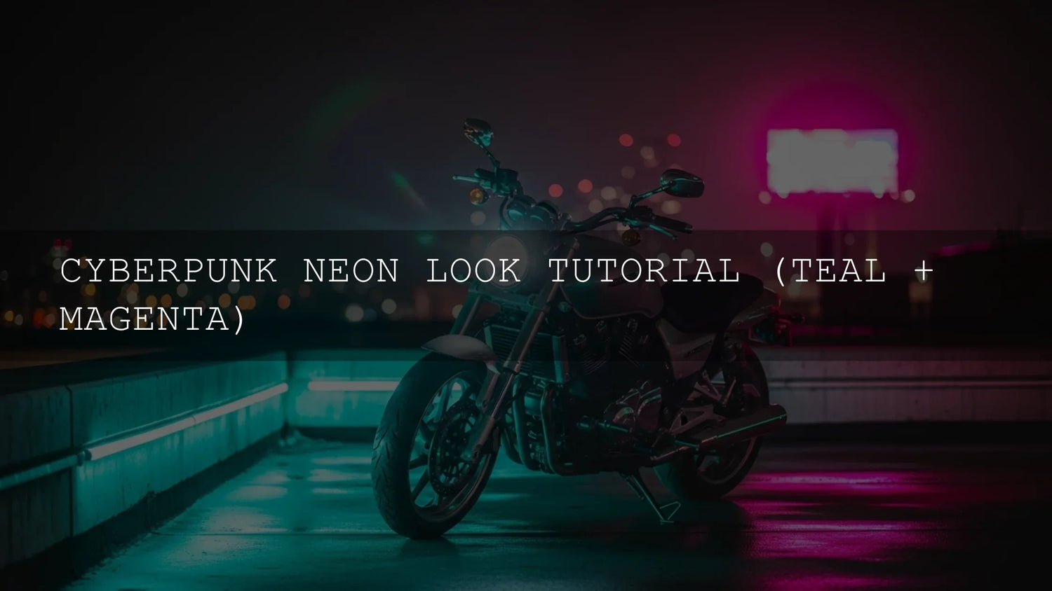
The Cyberpunk Teal & Magenta Neon Look—Why It Works
Cyberpunk teal and magenta neon color grading is more than a bold aesthetic—it’s a storytelling device. By pairing cool, futuristic teal with energetic magenta, you create deliberate tension that feels urban, synthetic, and charged. In photography and video, this “near-complementary” pairing instantly reads as neon city at night, making it perfect for street portraits, rain-slicked cityscapes, product shots with LED accents, and narrative sequences in Premiere Pro, DaVinci Resolve, or Lightroom. If you want to test the look fast, try a curated preset/LUT workflow first and then fine-tune by hand—Buy 3, Get 9 FREE makes it easy to explore multiple directions without breaking your flow: 1000+ Master Lightroom Presets and Lightroom Presets Collection.
Color Theory in Plain English
Teal and magenta sit far enough apart to create high contrast, but close enough to blend without looking cartoonish. Teal often lives in shadows and highlights of metals, glass, and water; magenta thrives in midtones and emissive light sources (signage, screens, tubes). For quick palette checks and to avoid clashing hues, try Adobe Color’s wheel and harmony rules to keep your ranges consistent and intentional.
Your Toolkit: What You Need
- Editing apps: Lightroom/Lightroom Classic or Photoshop for photos; Premiere Pro or DaVinci Resolve for video. See Adobe’s overview of color workflows in Premiere Pro to plan your pipeline.
- Source material: Night scenes, LED signage, reflective surfaces (water, glass), and directional light. City rain is a bonus.
- Starting looks: Test with LUTs/presets to sketch a direction, then dial it in. Cinematic Video LUTs
- Reference board: Collect frames from your favorite cyberpunk films/games to keep hue ranges and contrast targets consistent.
Photo Workflow (Lightroom & Photoshop)
I field-tested this look on a rainy night market shoot in Colombo: reflective puddles, LED signage, and dark alleys gave me perfect teal carriers and magenta emitters.
1) Establish the Base
- Exposure & Contrast: Slight underexposure (+ contrast) deepens shadows for neon to sit against.
- White Balance: Start clean or a touch cool; a neutral base prevents muddy mixed lighting later.
2) Color Grading Panel (Shadows/Midtones/Highlights)
In Lightroom/Camera Raw, use the 3-way Color Grading wheels (shadows, midtones, highlights). Adobe’s guide covers the controls in detail: Lightroom Classic: image tone & Color Grading.
- Highlights → Teal/Cyan: Nudge Hue toward cyan/teal, add modest saturation. Teal in bright speculars feels futuristic.
- Midtones → Magenta: Push midtones to magenta/fuchsia; it reads as neon emission and skin tint warmth (use lightly on faces).
- Shadows: Two options—either a blue-teal wash for cohesion, or neutral/blue-violet for punchy contrast.
- Balance/Blending: Adjust to keep transitions smooth; avoid bands where tones meet.
3) Targeted Tweaks
- HSL/Color Mixer: Push Blues/Cyans toward teal; pull Reds/Pinks toward magenta. Lift/darken luminance to steer focus.
- Selective Color / Curves (Photoshop): Add cyan to the Cyan/Blue channels and red+blue to midtones for nuanced magenta. Precision-mask glows to keep alleys neutral.
- Local Adjustments: Brush or radial mask to intensify sign glows only; let walls and asphalt stay cooler for contrast.
- Texture, Clarity, Dehaze: A touch of grit sells the urban vibe; keep noise controlled but present.
4) Skin Tones That Still Look Human
- Protect faces: Use a mask to reduce magenta saturation on skin; add a gentle warmth via Temp/Tint.
- Prevent banding: Keep saturation moderate; if you see posterization, ease gradients and export at higher bit depth.
Once your base is consistent, consider saving a custom preset for repeatable teal/magenta behavior across a series. For speed, start with a curated pack then customize: 1000+ Master Lightroom Presets. For topic-adjacent reading, see The Best Street Photography Lightroom Presets.
Video Workflow (Premiere Pro & DaVinci Resolve)
1) Prep & Color Management
- Normalize first: Fix exposure and white balance. In log workflows, convert to a working space before stylizing.
- Stackable passes: Treat contrast/exposure, color management, and creative look as separate layers/nodes for control.
2) Wheels & Curves for the Look
- Shadows → Teal: In Color Wheels, tug Shadows toward cyan/blue; in RGB Curves, lift blue/lower red in the low end.
- Midtones → Magenta: Nudge midtone puck toward magenta; in Curves, add red+blue in mid-range.
- Highlights: Cool with a touch of cyan; keep whites clean enough to avoid cyan clipping.
- HSL Secondary: Isolate blues to drive them into teal; isolate warm signage and rotate toward magenta.
For planning your pass order and tool choices, see Adobe’s color workflow overview for Premiere Pro.
3) Make It Glow (But Not Radioactive)
- Glow: Apply glow to emissive elements (signs, screens). Lower threshold, moderate radius, restrained intensity.
- Masks & Tracking: Track sign panels; grade them hotter while the environment stays teal and moody.
- Atmosphere: Add subtle rain, haze, or steam overlays—let neon scatter in the air for depth.
- Grain: Light film grain unifies composites and reduces banding.
If you prefer a head start, audition a neon-tilted LUT and finish the look with wheels/curves for consistency across shots: Cinematic Video LUTs. For more context on Lumetri and matching shots, check Adobe guidance on color wheels & matching.
Presets vs. Manual Editing
- Presets/LUTs—Speed & Consistency: Great for mood blocking, series work, and client previews. They’re starting points.
- Manual—Precision & Intent: Essential for skin, signage, and mixed lighting. You’ll still refine even when starting from LUTs.
- Best of Both: Start with a curated look, then mask, rebalance, and shape contrast per shot.
Common Mistakes & Quick Fixes
- Overcooking saturation: If neon looks radioactive, pull saturation, raise exposure slightly, and re-blend shadows/midtones.
- Greenish skin: Add a warm mask on faces; reduce teal in the lower midtones.
- Muddy shadows: Lift blacks just a hair, add blue (not green) in the low end, and reduce dehaze.
- Banding in gradients: Lower saturation, soften glow, add a hint of grain, export at higher bit depth.
- Inconsistent grade across shots: Copy/paste primary corrections first, then re-target HSL Secondary per shot.
90-Second Recipe (Photos or Video)
- Normalize exposure and WB; add gentle S-curve for contrast.
- Shadows: push toward teal/cyan; Highlights: add cyan/blue; Midtones: nudge to magenta.
- HSL: rotate Blues/Cyans toward teal; reduce Yellow/Green saturation to spotlight your neon pair.
- Mask faces to keep skin natural; reduce magenta where necessary.
- Add subtle glow on emissive sources; sprinkle fine grain to unify.
Real-World Use Cases
- Street portrait under neon: Teal shadows in the alley, magenta midtones on cheeks; glow only on signs. Portrait Presets: Editing Skin Tones the Right Way
- Rainy cityscape: Teal in puddles, magenta in window reflections; dehaze slightly to hold detail. Urban Street Photography Presets: City at Night Editing for Maximum Impact
- Product with LEDs: Neutral product, neon background; mask product to preserve accurate color. The Best Lightroom Presets for E-commerce & Product Photography
Related Reading
- A Practical Guide to Cinematic Color Grading with Curves & Wheels
- Mastering the Mood: Editing Fog and Mist in Autumn Landscapes
- Secondary Color Grading: The Secret Weapon You’re Not Using (Yet)
- Mastering Complex Node Trees: Your Ultimate Guide to Cinematic Visuals
Want a fast, professional starting point for this aesthetic? Explore a curated pack and then customize: Cinematic Video LUTs and LUTs for Premiere Pro & Resolve Collection. Need installation help? How to Install Lightroom Presets. Try these today—Buy 3, Get 9 FREE.
Expert Tips You Can Apply Today
- Lock the blacks: Keep a consistent black level across a sequence; your neon will feel anchored.
- Use hue-v-sat curves: Cap the saturation on problem hues (greens/yellows) so teal/magenta dominate.
- Shape with vignettes: Radial vignettes around the subject add “tunnel” focus perfect for neon storytelling.
- Reference responsibly: Keep a 3–5-frame reference strip from your hero shot to ensure continuity scene-wide.
FAQ
How do I keep skin tones natural in a heavy magenta grade?
Mask faces and reduce magenta saturation in midtones; warm them slightly. Preserve a natural pivot while the environment stays stylized.
Is teal always in the shadows and magenta in the midtones?
No, but it’s a reliable default. You can swap roles if your scene demands, as long as one color reads as “emissive” and the other as “environment.”
Should I start with a LUT or grade from scratch?
Start with a LUT/preset to explore directions quickly, then refine with wheels, curves, and masks for control and consistency.
How bright should the glow be?
Just enough to feel luminous without clipping or bleeding everywhere. Keep emissive areas localized and protect fine detail.
What export settings help avoid banding?
Use higher bit depth where possible, add light grain, and avoid crushing gradients with extreme saturation.
Outbound References
- Adobe Color: create and test harmony rules
- Lightroom Classic: image tone & Color Grading (shadows/midtones/highlights)
- Premiere Pro: color workflows, passes, and Lumetri strategy
Written by Asanka — creator of AAAPresets (10,000+ customers).


Leave a comment
This site is protected by hCaptcha and the hCaptcha Privacy Policy and Terms of Service apply.