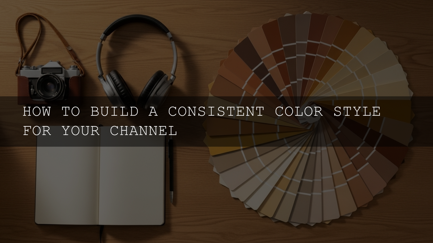
How to Build a Consistent Color Style for Your Channel
If you want your content to feel instantly recognizable, you need a consistent color style for your channel—from your YouTube channel color palette and thumbnails to your color grading and social posts. In 2025, viewers scroll fast, and brand color consistency helps them stop, recognize you, and click. In this guide, we’ll walk through how to define your color style, build a palette, apply it across your channel, and use presets, LUTs, and smart workflows to keep everything cohesive.
By the end, you’ll know exactly how to create a simple but powerful color system you can reuse on every video and platform, without feeling overwhelmed by color theory.
Why Color Consistency Matters for Your Channel
Think about your favorite creators: you can probably “see” their channel in your head before you even type their name. That’s the power of a consistent color system. When your YouTube channel color palette and your color grading all work together, you get:
- Stronger brand recognition: When viewers see your signature colors in a thumbnail or short, they should immediately think of you. Over time, your colors become a visual shorthand for your name and niche.
- A more professional look: A cohesive color style makes your channel feel intentional, trustworthy, and “put together,” even if you’re filming on a phone.
- A smoother viewing experience: Consistent tones and contrast make your content easier on the eyes. Viewers don’t have to constantly adapt to wildly different looks from video to video.
- Clear emotional messaging: Warm, bright colors feel energetic and optimistic. Cooler, muted tones feel calm and educational. Your palette quietly tells viewers what to expect from you.
- Faster content creation: Once your system is dialed in, you stop guessing. You grab your trusted presets, LUTs, and HEX codes and get straight to creating.
If you’re ready to translate this into real-world results, you can later plug in products like Lightroom presets and cinematic LUTs that match your style, such as 1000+ Master Lightroom Presets Bundle and 700+ Cinematic Video LUTs Pack. With the AAAPresets Buy 3, Get 9 FREE offer (add 12 items to your cart), it becomes easy to build a full toolkit for your brand colors without breaking the bank.
Step 1: Define Your Channel Personality and Audience
Before you pick any colors, get clear on who you are on camera and who you’re talking to. Your brand color consistency should reflect your vibe, not fight it.
Ask yourself:
- Is my channel high-energy, calm, cinematic, playful, or serious?
- Who is my ideal viewer, and what do they already like visually?
- What emotions do I want people to feel when they see my thumbnails?
Here are some quick directions you can take:
- Energetic & fun channels (gaming, vlogs, reaction): Use brighter, punchy colors—electric blues, neon greens, hot pinks, oranges. These scream “click me” and suit fast-paced edits.
- Calm & educational channels (productivity, finance, study, self-help): Softer tones and pastels (muted blues, sage greens, beige, warm gray) create trust and focus.
- Cinematic & storytelling channels (filmmaking, travel, short films): Rich, moody palettes—deep teal, warm orange, burgundy, charcoal—work beautifully with cinematic LUTs and gentle film grain.
- Natural & wellness channels (fitness, mindfulness, outdoors): Earthy tones like forest green, sand, sky blue, and warm browns feel organic and grounded.
Jot down 3–5 words that describe your channel (for example: bold, playful, high-energy or calm, minimalist, trustworthy). Those words will guide your color decisions and help you stay committed when you’re tempted to change things every week.
If you want more inspiration on mood-based color grading, you can later connect this with Soft pastel cinematic look in Lightroom or From flat footage to a filmmaker-quality color grading workflow.
Step 2: Learn Just Enough Color Theory to Be Dangerous
You don’t need to become a color scientist—but understanding a few basics will help you build a harmonious YouTube channel color palette that looks intentional instead of random.
- Complementary colors: Opposites on the color wheel (blue/orange, red/green, yellow/purple). They create high contrast and are great for call-to-action elements or text that must stand out.
- Analogous colors: Neighbors on the wheel (blue–blue-green–green). They feel natural and calming—perfect for educational or soothing content.
- Triadic color schemes: Three evenly spaced colors on the wheel (like red–yellow–blue). These give you variety with balance, ideal if you use multiple accent colors.
- Monochromatic: One base color with different tints and shades. This looks minimal and modern and is easy to keep consistent.
You can experiment visually using tools like Adobe Color’s online color wheel, which lets you generate palettes using complementary, analogous, and triadic schemes. Once you like a combination, note down the HEX codes—that’s your starting palette.
Step 3: Build a Core Color Palette You Can Actually Maintain
A sustainable palette for brand color consistency usually has 3–5 core colors plus neutrals. Think of it like a wardrobe: a few strong pieces you mix and match, instead of 20 random shirts.
1. Primary Color – Your Hero Shade
This is the color that represents your channel at a glance. It should appear in your logo, key text areas, and recurring design elements.
- Make sure it feels aligned with your personality and niche.
- Check that it looks good both on light and dark backgrounds.
- Test it on a thumbnail and your channel banner—does it still feel right when scaled down?
2. Secondary Colors – Support & Structure
Choose 1–2 secondary colors that support your hero color without competing with it.
- Use them for backgrounds, shapes, and less important text.
- They can be analogous (neighbors) to your primary color for a smooth, cohesive look.
3. Accent Color – The Click Magnet
Your accent color is used sparingly where you want attention: Subscribe buttons, “New Video” labels, progress bars, or key words on thumbnails.
- High contrast with your primary and background colors is good here.
- Use it consistently for CTAs so viewers learn that this color = action.
4. Neutrals – The Clean Canvas
Don’t forget your whites, blacks, and grays. They provide breathing room so your brand colors don’t overwhelm the viewer.
- Pick a main background neutral (for example, off-white or dark gray).
- Choose a neutral for body text that’s easy to read on both desktop and mobile.
Pro tip: Once you’ve locked in these choices, save them in your editing tools and design apps. For example, in Premiere Pro, you can keep your brand swatches handy while following Adobe’s color grading overview for Premiere Pro to align your footage with your brand palette.
Presets vs Manual Color Editing for Channel Consistency
There are two main ways to keep a consistent color style for your channel: manual adjustments every time, or using presets and LUTs as a base.
Manual Editing
- Pros: Full control, custom look for every scene, great for learning.
- Cons: Time-consuming, easy to drift away from your core look, hard to maintain consistency when you’re tired or in a rush.
Presets & LUTs
- Pros: Fast, repeatable, and perfect for building visual consistency across episodes, seasons, and playlists.
- Cons: Can look generic if you don’t tweak them; you still need to learn basic color correction.
In my own workflow, I like to use a technical correction first (fix exposure and white balance), then apply a creative LUT or preset as a starting point. For example, I’ve tested cinematic LUTs from 700+ Cinematic Video LUTs Pack on travel footage; once I found a look I loved, I used it across an entire series and only made small tweaks per shot. That saved a huge amount of time and kept the series visually glued together.
If you prefer stills, a bundle like 1000+ Master Lightroom Presets Bundle can give you a reliable base for your thumbnail photos, Instagram posts, and community tab images—all aligned with the same color identity.
Step 4: Apply Your Color Style Across Every Touchpoint
Creating a consistent color style for your channel isn’t just about one LUT or one preset. It’s about applying the same logic everywhere your viewers see you.
Thumbnails – Your Most Important Billboard
- Use your primary and accent colors consistently: For example, make all your key text boxes the same color and shape, and keep your logo in a fixed position.
- Keep text readable: High-contrast combinations (light text on dark background or vice versa) are essential on mobile screens.
- Stick to 2–3 layout templates: This helps your grid look unified. You can still vary images and headlines while keeping color and structure consistent.
For more thumbnail-focused inspiration, you might later connect this guide with Mastering camera shake and flicker video transitions if you’re leaning into dynamic, high-energy edits.
Channel Art & Profile Picture
- Use your primary color in your banner and logo so first-time visitors instantly “feel” your brand.
- Ensure your profile picture works well at tiny sizes—it should still read clearly in comments and notifications.
- Repeat your accent color in small elements like icons, borders, or taglines.
Video Intros, Outros, and On-Screen Graphics
- Intros & outros: Keep your intro short but consistent. Use the same color blocks, logo animation, and accent colors every time.
- Lower thirds: Design one lower-third style for your name and one for titles, and reuse them. Change the text, not the colors.
- On-screen text & callouts: Headlines, chapter markers, or “Step 1 / Step 2” overlays should follow your channel palette so they feel connected to your brand.
Color Grading Your Footage to Match Your Brand
Your footage doesn’t have to perfectly match your brand colors, but it should harmonize with them. For example, if your brand is cool and minimal, avoid super warm, saturated grades unless it’s a deliberate choice.
- Do a basic correction pass first—exposure, contrast, and white balance.
- Apply a creative LUT or preset that leans into your brand’s mood.
- Fine-tune temperature and saturation so skin tones look natural but the overall mood stays on-brand.
If you grade in Premiere Pro, you can follow Adobe’s guide to using the Lumetri panel for basic color correction and then layer your LUTs and creative adjustments on top. If you’re working with LOG footage or building a filmmaker-style pipeline, you’ll get even more from this when you connect it with Color grading LOG footage like a filmmaker.
Website, Shorts, and Social Media
Your brand doesn’t stop at your main channel page. Apply the same palette to:
- Instagram Reels and grid thumbnails
- TikTok cover frames
- YouTube Shorts titles and overlays
- Your website or landing pages
Using a consistent palette plus reusable presets creates a seamless experience when someone discovers you on one platform and later follows you elsewhere. When you’re ready, you can browse Lightroom Presets Collection and Video LUTs Collection to build a toolkit that works across both photo and video.
Step 5: Document Your System so You Don’t Drift
The easiest way to lose brand color consistency is to rely on memory. Instead, treat your color style like a mini brand guide.
- Write down your HEX codes: List your primary, secondary, accent, and neutral colors with their codes in a simple doc.
- Save presets and LUTs as your “default look”: In Lightroom, save your go-to preset for thumbnails. In Premiere Pro or DaVinci Resolve, save your favorite LUT and grading node setup as a starting template.
- Make a simple checklist: Before you export a video, run through a short list: Are thumbnails on-brand? Is the grade consistent? Are lower thirds using the right colors?
- Stay open to evolution: You can tweak your palette over time (for example, slightly warming up your tones or softening saturation), but keep changes gradual so returning viewers still recognize you.
Later, if you need help installing and organizing your tools, you can connect this with How to Install Presets to smooth out your technical setup.
Bringing It All Together
Creating a consistent color style for your channel isn’t about perfection—it’s about building a simple system you can repeat. Start by defining your channel’s personality, then design a focused YouTube channel color palette, choose reliable presets or LUTs, and apply the same logic across thumbnails, channel art, intros, and social posts.
When I tested this with my own cinematic LUTs on a series of travel vlogs, something interesting happened: even before people remembered the titles, they recognized the look. Comments shifted from “Nice video” to “I knew this was yours from the colors alone.” That’s the level of recognition you’re aiming for.
If you’re ready to turn your ideas into a visual system, explore bundles like 1000+ Master Lightroom Presets Bundle, 700+ Cinematic Video LUTs Pack, and 300+ Music Video Color Grading LUTs. When you combine those with the AAAPresets Buy 3, Get 9 FREE offer, you can build a complete, channel-wide color toolkit and keep your brand cohesive for years of uploads.
FAQ: Consistent Color Style for Your Channel
How many colors should my YouTube channel color palette have?
Most creators do best with 3–5 core colors plus neutrals. One hero color, one or two secondary colors, one accent color for callouts, and a couple of neutral tones are enough to build strong brand color consistency without feeling limited.
Do I need presets or LUTs to keep my color style consistent?
You can build a consistent look manually, but presets and LUTs make it much faster and easier. Use presets or LUTs as a starting point, then fine-tune exposure, contrast, and saturation for each video so your brand look stays cohesive but still fits the footage.
What if my channel covers multiple topics—can I still have one consistent color style?
Yes. Think of your palette as the “glue” between topics. You can use one primary brand color and then assign different secondary or accent colors for each series or playlist, while keeping your overall mood and grading style consistent.
How do I keep my thumbnails and footage aligned with the same color style?
Use the same brand palette in your design app and your editing software. Create a thumbnail preset in Lightroom or Photoshop and a grading preset or LUT in Premiere Pro or DaVinci Resolve, then apply both to every upload so your stills and video share the same visual DNA.
What’s the fastest way to test a new color style without breaking my whole channel?
Create a small test series—three to five videos—with the new palette and presets. Update thumbnails, intros, and grading just for that series, then review your analytics and viewer feedback. If the response is good, slowly roll the new style out across your channel.
Written by Asanka — creator of AAAPresets (10,000+ customers).

Leave a comment
This site is protected by hCaptcha and the hCaptcha Privacy Policy and Terms of Service apply.