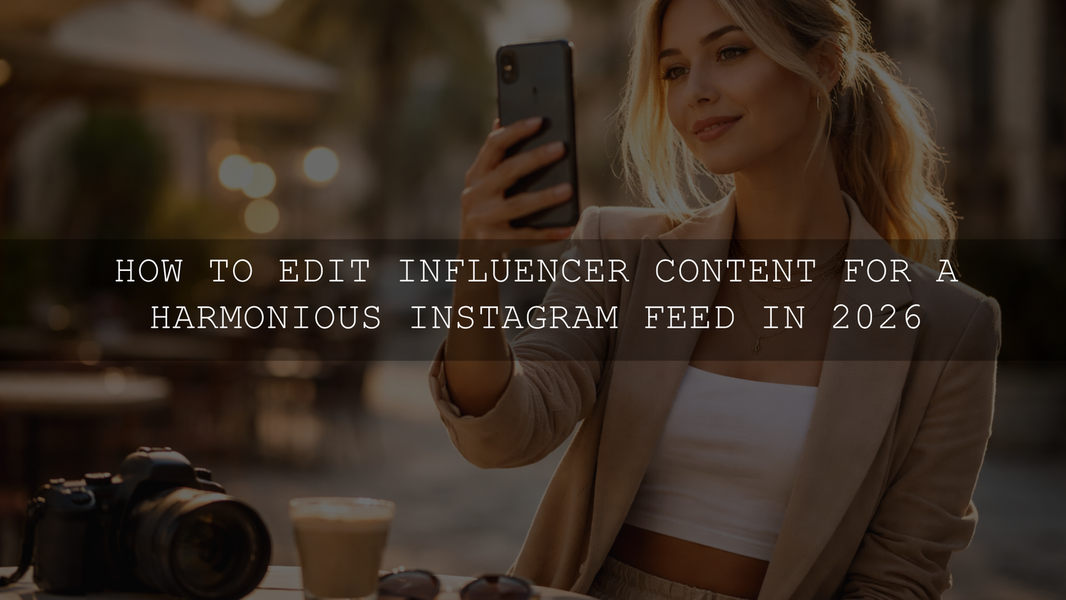
How to Edit Influencer Content for a Harmonious Instagram Feed in 2026
If you want to edit influencer content for a harmonious Instagram feed in 2026, the goal is not to make every post look identical. The goal is to make your photos and videos feel like they belong together. A strong feed has a clear visual language: consistent light, believable skin tones, repeatable contrast, and color choices that support your brand instead of distracting from it. When your edits feel connected, your profile looks more intentional, more professional, and far more memorable.
If you want a faster starting point, begin with Insta Fashion Blogger Lightroom Presets and browse the Stunning Instagram Presets For Content Creators collection. That gives you a practical shortcut for lifestyle, fashion, portrait, and creator-focused content, and you can keep testing new looks with Buy 3, Get 9 FREE.
What matters most is not chasing a different trend every week. It is building a repeatable editing workflow you can trust when you are posting outfit photos, behind-the-scenes clips, beauty close-ups, travel frames, or branded content. That is where presets, LUTs, and a few smart manual adjustments become so powerful.
Why a harmonious Instagram feed still matters
A cohesive feed does more than look pretty. It helps people understand your style before they read a single caption. That first glance is often what decides whether someone scrolls away or taps follow.
- It makes your brand recognizable. When your posts share a visual rhythm, followers start spotting your content faster.
- It improves trust. Consistent editing makes your page feel more polished and more intentional.
- It supports stronger engagement. People are more likely to explore a profile that feels curated instead of random.
- It helps with collaborations. Brands usually prefer creators whose content already looks stable and publish-ready.
- It reduces editing stress. A defined system saves time because you are not reinventing your color style for every post.
Here’s why this matters in practice: a harmonious feed is usually the difference between “this creator posts nice photos” and “this creator has a real visual identity.”
Start by choosing one visual direction
Before opening Lightroom or your video editor, decide what your feed should feel like. A good Instagram aesthetic usually comes down to four choices:
- Brightness: airy and bright, balanced and natural, or dark and moody.
- Color temperature: cool, neutral, or warm.
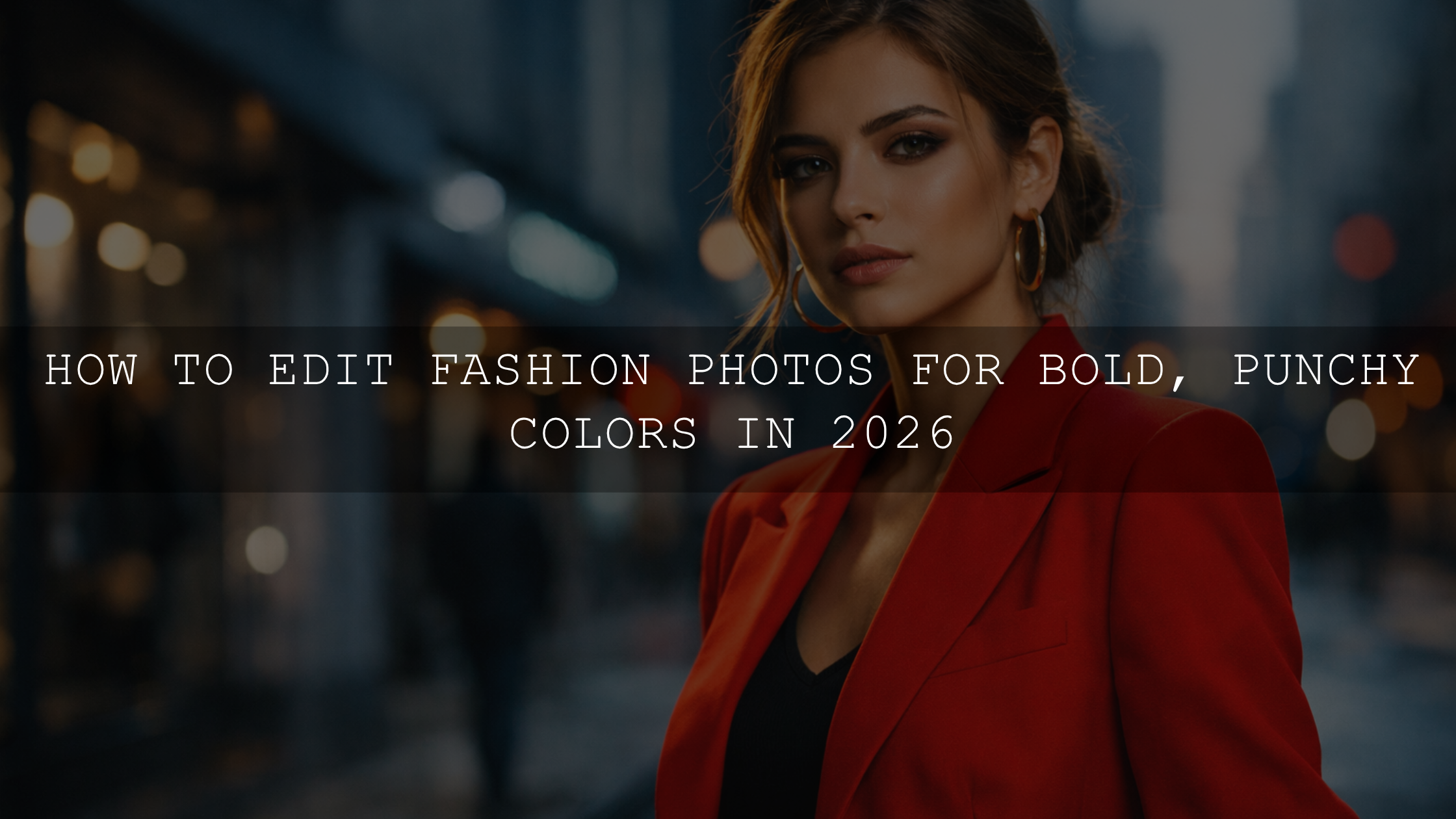
- Contrast style: soft and creamy, clean and editorial, or bold and punchy.
- Color priority: skin-first, outfit-first, product-first, or environment-first.
I have tested this kind of workflow on mixed creator batches where one set came from window-light portraits, one from phone video outdoors, and one from indoor fashion shots. The biggest improvement always came from choosing the mood first, then keeping white balance and contrast decisions consistent across the entire batch.
A preset should support your visual identity, not replace it. Your editing system works best when the preset matches the story you are already trying to tell.
Presets vs manual editing: what actually keeps a feed consistent?
Presets give you speed. They help you start from the same visual base every time. That is why they are so useful for influencer workflows, especially when you are editing multiple photos from the same shoot or trying to keep a campaign visually connected.
Manual editing gives you control. Even a great preset still needs small adjustments depending on light, skin tone, background color, and camera differences. Adobe’s own guides on editing photos with presets in Lightroom and masking for local adjustments in Lightroom are worth reviewing because they show exactly where presets end and refinement begins.
The strongest results come from using both:
- Use a preset or LUT for your visual base.
- Correct exposure and white balance for the specific image.
- Use masking to fix faces, products, or backgrounds without changing the whole frame.
- Adjust HSL only when one color is breaking the harmony of the feed.
If you want a broader toolkit for testing multiple looks across different niches, the 1000+ Master Lightroom Presets Bundle is a practical option for creators who do not post the same type of content every day.
The best preset direction for different influencer niches
Fashion and lifestyle creators
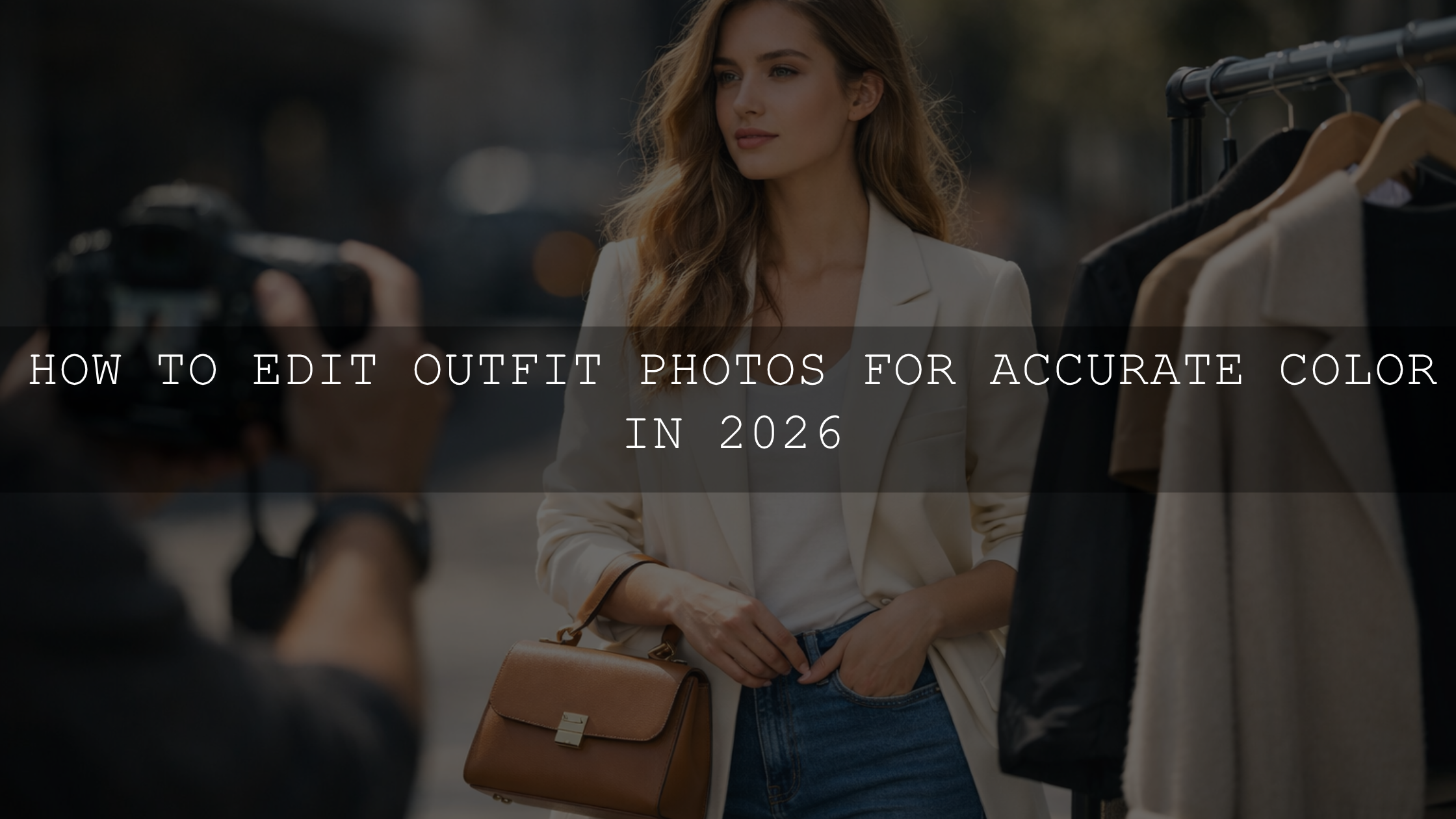
If your content depends on clean wardrobe tones, flattering portraits, and polished branding, Insta Fashion Blogger Lightroom Presets make a strong starting point. They suit outfit posts, editorial street portraits, day-in-the-life content, and product styling where you want a refined but social-friendly finish.

Automotive, bike, and adventure creators
If your brand is built around motion, machinery, travel, and strong contrast, AI-Optimized Bike Influencer Lightroom Presets fit naturally. They work especially well when you need more clarity, deeper contrast, and a cinematic edge without losing the energy of the original shot.

Beauty, skincare, and soft editorial video
For creators working with close-up faces, makeup, bridal content, or elegant portrait video, Soft Contrast Beauty LUTs help maintain softer highlights and cleaner skin presentation. That kind of control is especially useful when your content needs to look flattering across Reels, talking-head clips, tutorials, and campaign footage.

If portrait consistency is a core part of your brand, the Portrait Photography Lightroom Presets collection is a strong next step for browsing complementary looks.
A step-by-step workflow for a cohesive Instagram feed
Let’s break it down into a workflow you can actually repeat every week.
- Audit your last 9 to 12 posts. Look for mismatches in warmth, exposure, contrast, and saturation. Most messy feeds are not caused by “bad photos.” They are caused by inconsistent editing choices.
- Choose one base preset family. Pick a look that matches your niche and use it as your default starting point instead of jumping between unrelated styles.
- Normalize exposure first. Before creative edits, fix overall brightness so one post is not dramatically darker or flatter than the next.
- Lock white balance early. This is one of the main reasons a feed feels disconnected. Warm indoor shots and cool outdoor shots need to meet in the middle.
- Refine skin and subject areas with masking. Use subject or people masks when faces, makeup, clothing, or products need separate treatment.
- Control one or two key colors. Adobe’s Color Wheel and harmony tools can help you think more strategically about repeating tones across your grid.
- Batch edit related images. If content comes from the same location, event, or campaign, apply the same base treatment first, then fine-tune only what changes.
- Check your feed in grid view before posting. A photo can look good on its own and still break the rhythm of your profile.
The four edits that make the biggest difference
1. White balance
This is usually the fastest way to make a feed feel either connected or chaotic. If one image is amber and the next is blue, your profile loses flow immediately. I usually correct white balance before touching color grading because it gives every preset a cleaner starting point.
2. Contrast
Decide whether your brand feels soft, balanced, or dramatic. Then keep that decision consistent. Random contrast swings are one of the biggest reasons creator feeds look unplanned.
3. Skin tone control
If you post people, skin tones have to stay believable. This is especially important in beauty, fashion, and lifestyle content. Strong edits can still work, but they should not make faces look muddy, green, orange, or grey.
4. HSL color tuning
This is where you shape the feed around brand colors, location tones, or recurring wardrobe palettes. If your greens, oranges, blues, or reds keep drifting from post to post, HSL tuning is usually the fix.
Real-world example: one shoot, three content types
Imagine one creator day includes an outdoor coffee shot, an indoor mirror portrait, and a short beauty Reel. These files will never match perfectly straight out of camera. The mistake is trying to force them into the same look with no adjustments.
A better system looks like this:
- Outdoor stills: use a fashion or lifestyle preset as the base, then reduce highlight harshness.
- Indoor portrait: warm the skin slightly, correct mixed lighting, and keep blacks from crushing too hard.
- Beauty video: apply a soft LUT base, then protect highlights on the face and reduce overly saturated reds.
I have seen creators get much stronger before-and-after results simply by lowering preset intensity a little and using one targeted mask on the face or subject. That small step often keeps the edit stylish while preventing the “over-filtered” look.
Common mistakes that break feed harmony
- Using a different preset style on every post.
- Ignoring white balance shifts between phone and camera files.
- Over-editing skin until texture disappears.
- Letting bright backgrounds compete with the subject.
- Keeping one image extremely saturated while the next is muted.
- Applying the same preset at full strength to every image regardless of light.
If your edits keep looking faded or inconsistent, these guides may help: why presets look washed out or low contrast, how to make one preset work across different camera brands, and how to install Lightroom presets step by step.
How to keep photos and Reels visually connected
A harmonious Instagram feed is not only about still photos anymore. Reels, talking-head clips, tutorials, and BTS footage now sit next to static posts inside the same profile. That means your video color treatment should feel related to your photo treatment.
A simple rule is this: keep the same temperature bias, contrast mood, and skin-tone standard across both. If your photos are soft and warm but your Reels are cold and contrast-heavy, the brand disconnect becomes obvious. For creators posting mixed media every week, read these Lightroom preset ideas for Instagram aesthetics and this guide to mobile export settings for Instagram and short-form content so the final posts stay clean from edit to export.
What to do if your feed already feels messy
You do not need to delete everything and start over. Usually, you only need a reset plan:
- Choose one editing direction for the next 9 posts.
- Use one preset family for most still images.
- Use one LUT family for your recurring video format.
- Keep a short checklist: exposure, white balance, skin tone, contrast, key colors.
- Review your grid before posting instead of after posting.
If you are rebuilding your visual identity from scratch, start with one of the niche products above or use the 1000+ Master Lightroom Presets Bundle to test multiple directions while keeping one workflow. If you want to compare styles first, the Instagram presets collection for content creators and the portrait preset collection make it easier to build a system that matches your niche. And if you need help choosing the right fit, you can always reach out through our contact page.
Related Reading
- How to elevate your Instagram aesthetic with Lightroom presets
- How to make one preset work across different camera brands
- How to fix washed-out or low-contrast preset results
- Mobile export settings for Instagram, TikTok, and Pinterest
Frequently Asked Questions
Are presets enough for a consistent Instagram feed?
They are the fastest starting point, but they work best when followed by small manual adjustments to exposure, white balance, and skin tones.
What is the most important setting when editing influencer content?
White balance is usually the most important because color temperature mismatches make a feed feel disconnected faster than almost anything else.
Should every post use the exact same preset?
No. It is better to use one preset family or one visual direction, then fine-tune each image so it still looks natural in its own lighting.
How do I make my photos and Reels match?
Keep the same temperature bias, contrast style, and skin-tone treatment across both your photo presets and your video LUTs.
What kind of content benefits most from batch editing?
Campaign shoots, events, travel sets, outfit series, and any group of images captured in similar light benefit the most because a shared base edit keeps them visually connected.
Written by Asanka — creator of AAAPresets (10,000+ customers).
Leave a comment
This site is protected by hCaptcha and the hCaptcha Privacy Policy and Terms of Service apply.