
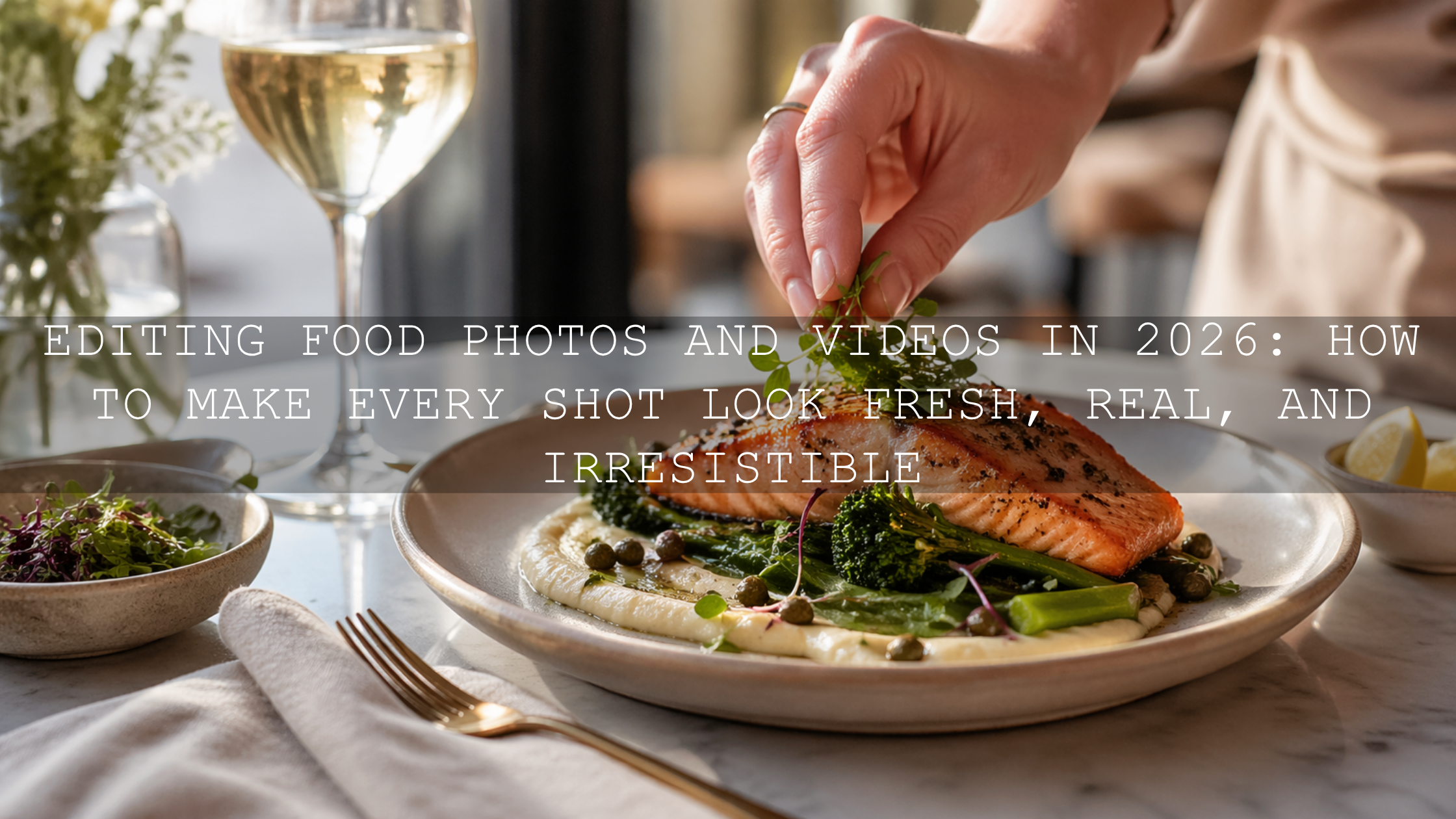
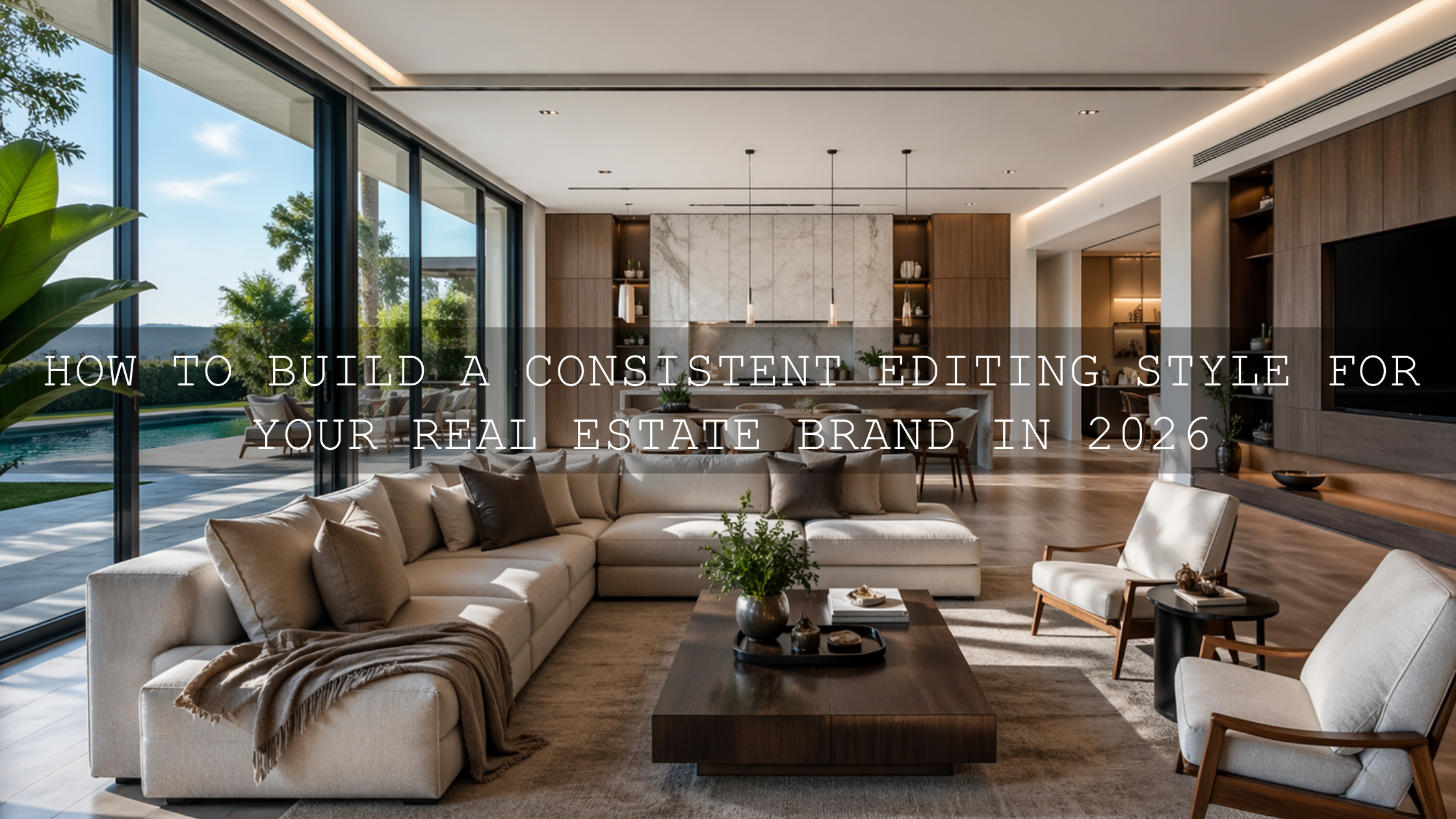
How to Build a Consistent Editing Style for Your Real Estate Brand in 2026
A consistent editing style for your real estate brand is one of the fastest ways to make your listings look more professional, memorable, and trustworthy in 2026. In visual real estate marketing, people often decide how they feel about a property before they read a single word. That means your real estate photo editing, real estate video editing, and overall presentation style need to feel intentional from the first thumbnail to the final walkthrough clip. When your colors, contrast, brightness, and mood all work together, your brand starts to feel stronger, cleaner, and easier to recognize.
If you want a faster starting point for interiors, listing photos, and polished property marketing, try the AI-Optimized Interior Design & Real Estate Lightroom Presets and browse the Lightroom Presets for Lightroom Mobile & Desktop collection. It is a simple way to build visual consistency without slowing down your workflow, and you can use the Buy 3, Get 9 FREE offer naturally as you expand your editing toolkit.
Here’s why this matters. Buyers, renters, agents, developers, Airbnb hosts, and interior designers are all comparing visual quality at speed. If one listing feels bright and airy, the next feels orange and muddy, and the next looks cold and over-sharpened, the brand behind those images feels inconsistent too. A clean, repeatable style helps your photos and videos feel like part of one professional system rather than a random set of edits.
Why visual consistency matters more than ever
Real estate is emotional. People are not only comparing square footage and location. They are imagining comfort, lifestyle, prestige, and possibility. Your editing style helps shape that emotional first impression. A consistent look can make your content feel calm and premium, while inconsistent editing can make even a strong property feel scattered.
- It improves brand recognition. When your listings share a visual signature, people begin to recognize your work before they see your logo.
- It builds trust. Clean, balanced, believable edits suggest care, attention to detail, and professional standards.
- It speeds up production. A repeatable system cuts down decision fatigue and helps you batch edit faster.
- It supports better conversions. Strong, polished visuals keep buyers and renters engaged longer and encourage more clicks, saves, and inquiries.
I’ve tested this kind of workflow on bright condo interiors, darker rental units, and mixed-light office spaces, and the biggest difference almost always comes from consistency rather than heavy editing. When the full property gallery feels unified, the listing instantly looks more premium.
Start by defining your real estate brand look
Before you choose presets or LUTs, define the visual identity you want people to associate with your brand. This is where many creators go wrong. They jump into editing before deciding what the finished work should feel like.
Ask yourself:
- Do you want your brand to feel luxury and editorial?
- Do you want it to feel bright, airy, and approachable?
- Do you want it to feel modern, minimal, and architectural?
- Do you want it to feel warm, family-friendly, and welcoming?
Once you answer that, editing choices become easier. A luxury brand may lean into deeper contrast, cleaner blacks, restrained color, and stronger shape definition. A family-home brand may work better with soft highlights, natural warmth, and open shadows. A modern architecture brand may benefit from cooler neutrals, straight lines, and crisp detail.
If you want to understand how color affects perception in property marketing, this related article on real estate and architecture color grading is a strong companion read.
Match interior and exterior edits without making them look identical
One of the biggest challenges in real estate editing is that interiors and exteriors need different treatment, but they still need to belong to the same visual story.
Interiors usually need balanced white balance, protected window detail, cleaner shadows, and a brighter overall presentation. Exteriors often need better sky handling, perspective control, and stronger separation between building materials, greenery, and the surrounding environment. Drone footage adds another layer, because aerial scenes can quickly look oversaturated or too flat if the grade is not controlled.
That is why it helps to use tools that are designed for these specific situations. For photo work, the AI-Optimized Interior Design & Real Estate Lightroom Presets are a smart foundation for rooms, windows, architectural details, and listing images that need a bright but believable look. For video, the Real Estate LUTs Pack gives you a clean starting point for property tours, walkthrough footage, and commercial real estate content. If drone shots are part of your brand, the Drone Aerial LUTs Pack helps keep aerial footage polished and cinematic without breaking the overall style.

Presets vs manual editing for real estate brands
A lot of creators frame this as an either-or choice, but the best workflow usually uses both.
Presets and LUTs
Presets and LUTs are ideal when you want speed, consistency, and a reliable starting point. They help you create a recognizable look across many images and clips, especially when you are editing a full property set.
Manual editing
Manual editing is what gives you precision and flexibility. Every property has different light, wall colors, window intensity, floor tones, and camera conditions. Manual adjustments help you adapt your look to the actual scene.
The real answer is this: use presets and LUTs for direction, then refine manually for accuracy. I’ve found that one well-built base look saves far more time than trying to reinvent the grade for every listing. But I’ve also found that trusting a one-click result without small corrections is where consistency starts to break.
A practical editing workflow you can repeat for every property
If you want your real estate brand editing style to stay consistent, build a repeatable sequence and follow it every time. Here is a simple workflow that works well for both Lightroom and video-based projects.
- Correct exposure first. Do not judge color before the image brightness is in the right place.
- Neutralize white balance. Mixed indoor lighting can ruin consistency faster than almost anything else.
- Fix perspective and lines. Straight verticals matter in architecture and interior work.
- Apply your base preset or LUT. This is where your signature look starts to appear.
- Adjust highlights and shadows. Keep windows controlled and corners readable.
- Refine color. Keep whites clean, wood tones believable, and greens under control.
- Sharpen carefully. Real estate images should look crisp, not crunchy.
- Batch sync similar shots. Once one frame is right, carry that look across the set.
Adobe’s official tools are especially useful here. Lightroom’s Geometry tool for straightening lines and perspective is valuable for architectural corrections, while Adobe’s masking workflow in Lightroom Classic helps you target windows, walls, floors, or darker corners without affecting the whole image. For speed and consistency across sets, Adobe also documents how to batch-apply presets in Lightroom.
Use masking and local adjustments to keep images believable
A strong real estate brand look should feel polished, not fake. That usually means local corrections matter more than dramatic global edits.
For example:
- Use masking to gently recover bright windows instead of darkening the whole room.
- Lift shadow detail in corners without flattening the full image.
- Control orange or yellow indoor casts without turning the entire room blue.
- Refine selective texture on wood, tile, stone, and fabrics so details feel premium.
This is where many listing galleries separate into two categories: ones that look naturally professional, and ones that look obviously over-processed. A believable edit usually wins long term because it protects trust. Buyers want the home to look impressive, but they also want it to feel real.
Keep your interior photos bright, but not washed out
Bright real estate photos perform well because they feel open and welcoming, but too much brightness can make rooms lose depth. The goal is not just “lighter.” The goal is clear, balanced, dimensional.
To get there:
- Keep whites clean, but do not let them clip.
- Preserve some shadow structure so rooms still feel grounded.
- Watch neutral walls carefully, especially in mixed daylight and tungsten scenes.
- Use moderate contrast so trim, textures, and architectural lines stay defined.
If your work focuses heavily on rooms, interiors, rentals, and listing sets, you may also want to read Presets for Real Estate Photography: Bright, Clean & Professional for more workflow ideas.
Build a video style that matches your photo style
A lot of real estate brands look consistent in photos but fall apart in video. That usually happens because the still-photo look is clean and controlled, while the video grade becomes too teal, too contrast-heavy, or too cinematic in a way that no longer fits the brand.
Your real estate video editing style should support your photo work, not fight it. If your images are bright, natural, and premium, your video should carry the same feeling. That is where the Real Estate LUTs Pack is useful for day-to-day property footage, while the Drone Aerial LUTs Pack can help aerial sequences feel dramatic without looking disconnected from the listing gallery.
For a more stylized but still controlled photographic look, the Cinematic Film Look Lightroom Presets can work well when you want a refined, storytelling-driven finish for luxury properties, boutique stays, or premium marketing campaigns.

When black and white can strengthen a luxury real estate brand
Most real estate marketing should stay in color, but selective black and white work can add sophistication when used intentionally. It can be especially effective for luxury architectural details, mood-driven teaser content, premium social media campaigns, or editorial-style portfolio sections.
The key is restraint. Black and white should feel like a brand decision, not a rescue plan for weak color. If you want that elegant monochrome finish, the Luxury Black and White LUTs Pack can help create a dramatic, polished look that still feels clean and upscale.

Create brand rules so every property still feels like your brand
If you work alone, this keeps your output stable. If you work with a team, this becomes even more important. Write down simple editing rules such as:
- Target brightness range for interiors
- Preferred white balance direction
- How much contrast feels “on brand”
- How much saturation to allow for greenery and sky
- How to treat windows and exterior views
- Whether your brand leans warm, neutral, or cool
- Which preset or LUT is the default starting point for each property type
These small rules turn your editing style into a system. That is how brands stay consistent across listings, agents, seasons, and content formats.
Related reading
- Real Estate & Architecture: How Color Grading Shapes Perception
- Presets for Real Estate Photography: Bright, Clean & Professional
- Best LUTs for Drone Footage
- The Ultimate Guide to Grading for Real Estate, Travel, and Landscape Projects
Make your editing style easier to maintain over time
The most effective real estate brands do not chase a new look for every post. They refine one strong visual language and make it easier to repeat. That means fewer random creative decisions, faster turnaround, and a cleaner brand impression across websites, social media, listing portals, brochures, and video reels.
If you want a simpler system, start with the AI-Optimized Interior Design & Real Estate Lightroom Presets for photos, support your footage with the Real Estate LUTs Pack, and explore the wider Buy 3 Get 9 Free collection or the broader Lightroom Presets for Lightroom Mobile & Desktop range as your brand expands. If you need help with installation or product basics, the FAQ page is a useful support resource.
How do I create a consistent editing style for my real estate brand?
Start by defining the mood you want your brand to communicate, then use one repeatable workflow for exposure, white balance, perspective, preset or LUT application, and final refinements. Consistency comes from rules, not from guessing on every image.
Should all real estate photos use exactly the same preset?
No. It is better to use the same visual direction, then adjust for each scene. Interiors, exteriors, twilight shots, and drone footage all need different corrections, but they should still feel like part of one brand system.
Are presets enough for professional real estate photo editing?
Presets are a great starting point for speed and consistency, but manual refinements still matter. Exposure, white balance, masking, and perspective correction are usually what make the final result feel professional and believable.
How do I keep interiors bright without losing detail?
Control highlights first, protect windows, keep some shadow depth, and avoid pushing exposure so far that walls and textures flatten out. A bright image should still have shape, contrast, and realistic color.
Can one brand style work for both photos and video?
Yes, and it should. Your video grade should support the same mood, brightness level, and color behavior as your photo edits so the full property presentation feels unified across all platforms.
Written by Asanka — creator of AAAPresets (10,000+ customers).
Leave a comment
This site is protected by hCaptcha and the hCaptcha Privacy Policy and Terms of Service apply.