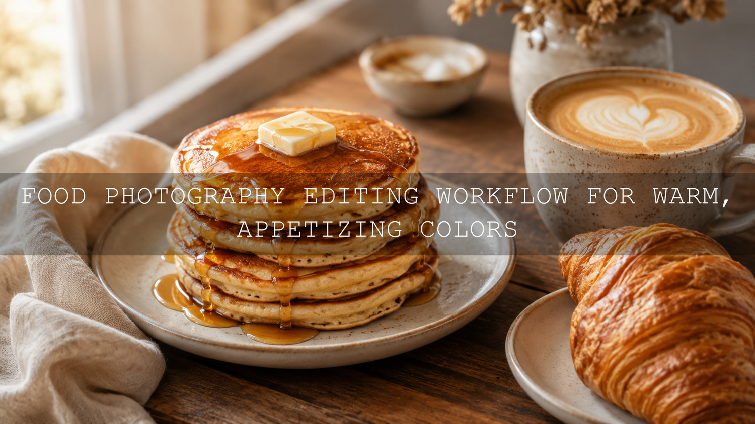
Food Photography Editing Workflow for Warm, Appetizing Colors
A strong food photography editing workflow helps your images feel warm, natural, and mouthwatering without making the food look fake. In 2026, food photos need to do more than show a dish. They need to make people feel the softness of fresh bread, the shine of sauce, the richness of coffee, and the comfort of a cozy table scene. Here’s why this matters: warm food photography can improve your blog visuals, restaurant content, product pages, Pinterest posts, and social media engagement when the edit supports the real texture and color of the food.
If you want a faster starting point, try AI-Optimized Food Lightroom Presets for rich color, balanced light, and appetizing detail, or browse the full Food Photography Lightroom Presets collection. Try these presets today with Buy 3, Get 9 FREE when you add 12 presets to your cart and pay for only 3.
Why Warm Food Photography Works So Well
Warm color makes food feel inviting. Golden browns, creamy whites, soft oranges, deep reds, and gentle amber tones all create a sense of comfort. Think of a fresh croissant by a window, pasta with glossy tomato sauce, pancakes with maple syrup, or coffee beside a linen napkin. The warmth is not only in the food itself. It comes from light, white balance, background color, shadow depth, and careful Lightroom color grading.
I have tested warm food presets on café images, dessert shots, and home-style meal photos, and the biggest lesson is simple: the best edit keeps the food believable. If the white plate turns orange, the edit has gone too far. If the sauce looks flat, the shadows need more shape. If the crust loses detail, the texture adjustment needs to be more controlled.
The goal is not to make every food photo yellow. The goal is to make the viewer feel that the dish is fresh, rich, and worth tasting.
Start Before Lightroom: Shoot for Warmth First
Editing works best when the original photo already has good light and clean color. A preset can speed up the process, but it cannot fully fix harsh lighting, poor focus, or messy styling. Before you begin editing, build warmth into the photo during the shoot.
- Use soft natural light: Window light is ideal for food because it wraps around the subject and keeps texture visible.
- Avoid harsh direct sunlight: Strong sunlight can blow out highlights on plates, sauces, and glassware.
- Shoot in RAW when possible: RAW files give you more room to adjust white balance, highlights, shadows, and color without damaging the image.
- Choose warm props: Wood, linen, cream ceramics, terracotta, warm stone, and neutral backgrounds support an appetizing edit.
- Keep styling simple: Too many props can distract from the food, especially when the edit adds extra warmth and contrast.
For more mood-based food editing, you may also like this guide on editing dark and moody food photography without losing texture.
Step 1: Import, Cull, and Choose the Best Base Image
Start by importing your RAW images into Lightroom. Do not edit every shot. Choose the strongest frame first. Look for sharp focus, balanced composition, clean styling, good shadow direction, and food that still looks fresh. Warm editing cannot save a dish that already looks dry, dull, or badly lit.
When selecting images, ask yourself:
- Is the main food sharp?
- Does the light make the dish look three-dimensional?
- Are the highlights recoverable?
- Do the shadows still show texture?
- Does the color already support a warm food photography style?
A good base image makes every later step easier. This is especially important for cakes, bread, coffee, grilled food, pasta, and desserts where texture sells the photo.
Step 2: Balance Exposure Before Touching Color
Many beginners start by increasing saturation or warming the white balance immediately. That usually creates an artificial edit. Instead, balance the light first. In Lightroom, adjust exposure until the food feels bright enough but not washed out. Then control highlights and shadows.
- Set Exposure: Brighten the image until the food looks clear and readable.
- Reduce Highlights: Protect shiny areas such as sauce, glaze, plates, and metal cutlery.
- Lift Shadows: Reveal detail in bread, chocolate, coffee, grilled edges, or dark backgrounds.
- Set Whites and Blacks: Add a full tonal range without clipping important detail.
- Add gentle Contrast: Use contrast to create depth, not harshness.
For detailed Lightroom controls, Adobe explains how to use color and light tools in its official Lightroom editing guide for presets and photo adjustments.
Step 3: Fix White Balance for Natural Warmth
White balance is the heart of warm food photography editing. A small temperature adjustment can make a photo feel cozy, while too much can make the whole scene look orange. Start with the Temperature slider, then refine with Tint.
For baked goods, coffee, roasted dishes, and autumn meals, a warmer temperature usually works well. For salads, fruit, seafood, or white desserts, use a softer adjustment so the food still looks fresh. If the image becomes too yellow, move the Tint slider slightly toward magenta or reduce the temperature until white plates and napkins look believable again.
Here’s a simple test: find something in the image that should be neutral, such as a white plate, silver spoon, or cream napkin. It can be slightly warm, but it should not look stained or unnatural. That neutral object helps you judge whether the food photography edit is still realistic.
Step 4: Use the Color Mixer for Appetizing Food Colors
The Color Mixer is one of the most powerful tools for food photography Lightroom editing. Instead of increasing global saturation, adjust the colors that actually matter. Adobe’s official Lightroom Color Mixer guide explains how hue, saturation, and luminance can control individual color ranges.
Reds and Oranges
Reds and oranges often control sauces, berries, spices, roasted edges, and golden food tones. Slightly increasing saturation can make the food look richer, but be careful. Too much red can make tomatoes, strawberries, or meat look unrealistic. Lowering orange luminance slightly can make crusts and roasted areas look deeper and more premium.
Yellows
Yellows affect pasta, pastry, butter, cream, fries, cheese, and warm highlights. If yellows are too bright, the image can look cheap or over-edited. If they are too dull, the food can look cold. A small saturation increase with controlled luminance usually works better than a heavy yellow shift.
Greens and Blues
Greens are important for herbs, salads, matcha, pistachio, and vegetables. Keep greens fresh but not neon. Blues often appear in shadows, plates, windows, or backgrounds. For warm food photography, slightly reducing blue saturation can help the food stay the main focus.
For a more colorful style, Vibrant Lightroom Presets for Food Photography can help create stronger color while keeping the edit clean and food-focused.
Step 5: Add Color Grading Without Making Food Look Fake
Color grading is where your food image starts to feel styled. Use it gently. Warm highlights can make glaze, butter, syrup, or pastry glow. Warm midtones can make the whole table scene feel cozy. Slightly warm shadows can stop dark areas from feeling cold or lifeless.
A good starting point is:
- Highlights: Add a soft golden tone for warmth and light.
- Midtones: Add a gentle orange or amber tone for atmosphere.
- Shadows: Add a muted brown or warm red tone for depth.
- Blending: Keep it subtle so the color grade supports the food instead of overpowering it.
For color theory support, use the Adobe Color harmony wheel to understand warm palettes, complementary colors, and balanced food styling combinations. This is helpful when choosing props, backgrounds, and brand colors for a food blog or restaurant page.
Presets vs Manual Editing for Food Photography
Presets and manual editing both have a place in a professional food photography workflow. The best choice depends on speed, consistency, and how much control you need.
- Presets are best for speed: They give you a polished starting point in one click, which is useful for blogs, menus, social posts, and product galleries.
- Manual editing is best for precision: You can adjust each image based on the dish, lighting, and background.
- The best workflow uses both: Apply a preset first, then fine-tune exposure, white balance, Color Mixer, and masks.
For example, if you are editing a warm café set, you could start with Coffee Time Lightroom Presets, then reduce yellow saturation slightly, lift shadows on the cup handle, and add a small radial mask on the latte art. This gives you speed without losing control.
Step 6: Use Masks for Local Warmth and Detail
Global edits affect the whole image, but food photography often needs local control. A sauce may need more shine, bread may need more texture, and the background may need less attention. This is where masks are powerful.
- Brush warmth onto the main dish: Add a small amount of temperature or saturation only where the food needs it.
- Brighten the hero area: Use a radial mask to guide the viewer toward the main food.
- Darken distracting edges: A soft vignette can create focus without looking obvious.
- Enhance texture selectively: Add Texture to crust, toppings, herbs, or baked edges, but avoid overdoing it on smooth sauces.
- Protect highlights: Reduce highlights on shiny plates, oil, syrup, or glass to keep detail.
I tested this type of local adjustment on a warm dessert photo with cream, caramel, and a wooden table. The preset created the overall mood, but the final image only felt professional after adding a small mask to brighten the caramel and another mask to soften the background.
Step 7: Sharpening and Noise Reduction for Clean Food Texture
Texture is one of the biggest reasons food photos succeed. Viewers want to see crispy edges, soft cake crumbs, glossy sauce, fresh herbs, and creamy details. Sharpening helps, but too much sharpening makes food look crunchy in the wrong way.
Use sharpening carefully and apply masking so smooth backgrounds do not become noisy. If the image was shot in low light, use noise reduction lightly. Too much noise reduction can make food look plastic and remove the small details that make it appetizing.
For dark restaurant photos or evening café shots, this related article on preserving texture in moody food photography is especially useful.
Step 8: Export for Web, Shopify, Pinterest, and Social Media
After editing, export the image correctly so the warm colors stay consistent online. For web use, JPEG is usually the most practical format. sRGB is the standard color space for web and social sharing, and Adobe explains this in its official Lightroom Classic color FAQ.
- Use sRGB for web: This helps colors display more consistently online.
- Resize for the platform: Blog hero images, Shopify product photos, Pinterest pins, and Instagram posts all need different dimensions.
- Balance quality and file size: Keep images sharp but optimized for faster page loading.
- Check on mobile: Food photos are often viewed on phones, so make sure warmth and detail still look good on a small screen.
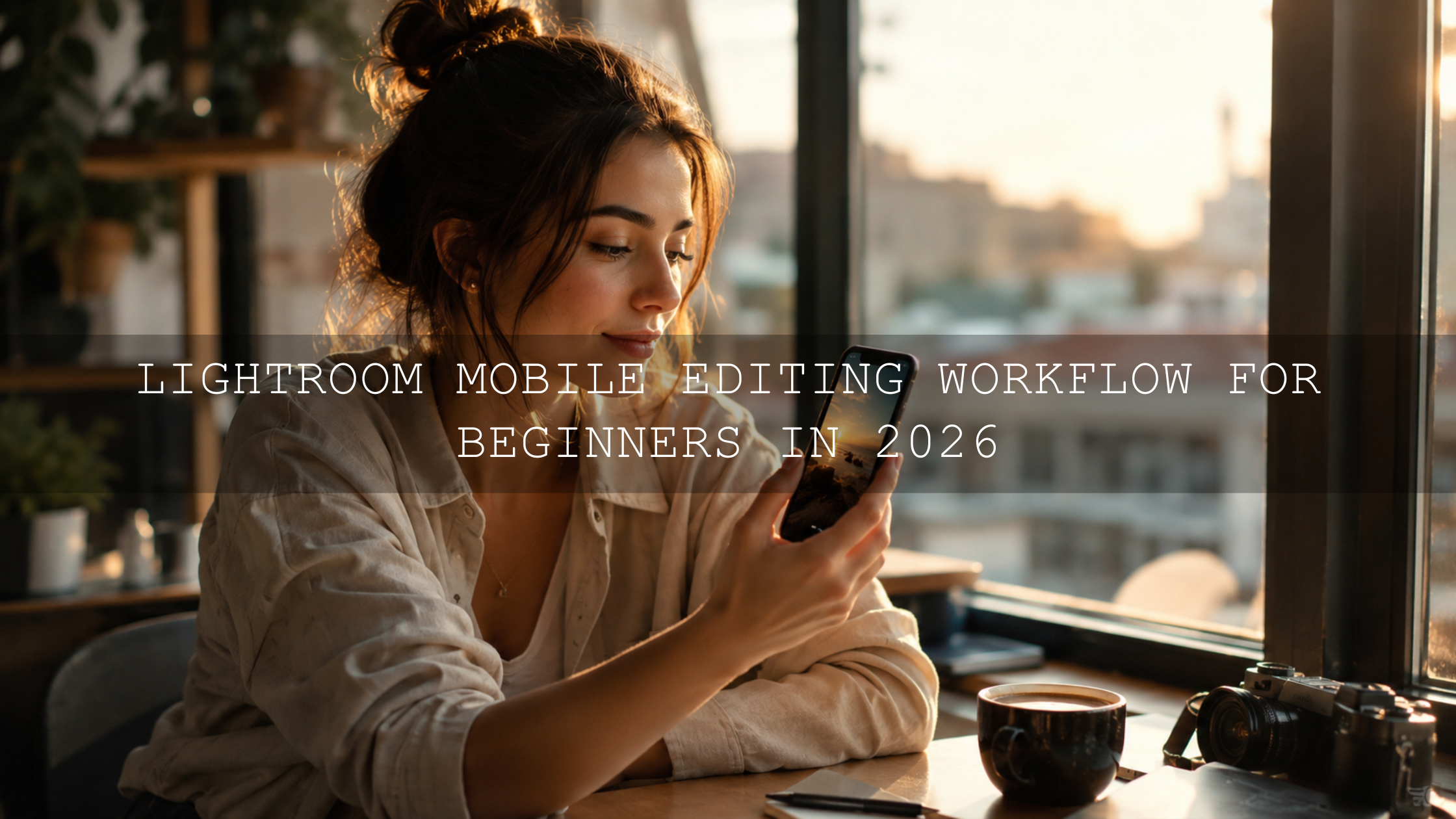
For mobile-focused editing, read this guide to mouthwatering food photography in Lightroom Mobile.
Common Warm Food Editing Mistakes to Avoid
- Over-saturation: This makes food look artificial, especially reds, oranges, and yellows.
- Too much warmth: A warm edit should still leave plates, cream, and napkins looking believable.
- Muddy shadows: Dark areas should keep detail and shape.
- Ignoring greens: Herbs and vegetables should look fresh, not dull or yellow.
- Inconsistent edits: A food blog, menu, or product gallery needs a consistent color style.
Seasonal food content needs extra care because autumn, winter, summer, and café images all use warmth differently. For seasonal inspiration, explore warm autumn food photography editing ideas.
Recommended Lightroom Presets for Warm Food Photography
For everyday food bloggers, chefs, restaurants, and creators, Food Photography Presets For Lightroom are a strong choice because they are designed for appetizing tones, clean light, and consistent color. If you want a more modern editing workflow, AI-Optimized Food Lightroom Presets can help you build polished edits faster while still allowing manual adjustments.
For creators who edit many different styles, the Lightroom Presets for Lightroom Mobile and Desktop collection gives you more flexibility beyond food, including lifestyle, product, travel, portrait, and social media edits. For food-only content, the Food Photography Lightroom Presets collection is the best place to browse focused options.
Related Reading
- How to edit dark and moody food photography without losing texture
- Warm autumn food photography editing guide
- Lightroom Mobile food photography editing workflow
- Presets that can help your photos stand out on Pinterest
Final Food Photography Editing Workflow
- Choose a strong RAW image with clean light and sharp food detail.
- Balance exposure, highlights, shadows, whites, and blacks first.
- Warm the white balance carefully while keeping neutral objects believable.
- Use the Color Mixer to refine reds, oranges, yellows, greens, and blues.
- Add subtle color grading for warm highlights, cozy midtones, and rich shadows.
- Use masks to brighten the hero food, control distractions, and protect texture.
- Sharpen carefully and reduce noise only where needed.
- Export in the right size and color space for your website or social platform.
Warm food photography editing is about balance. The best images feel rich, fresh, and natural at the same time. Start with a good photo, use Lightroom with intention, and let presets speed up the parts of the workflow that repeat from image to image.
To create consistent warm food edits faster, start with Food Photography Presets For Lightroom or try AI-Optimized Food Lightroom Presets. You can also browse the full Food Photography Lightroom Presets collection and use the Buy 3, Get 9 FREE offer to build a complete editing toolkit for blogs, menus, restaurants, cafés, and social media content.
FAQ
How do I make food photos look warm in Lightroom?
Start with exposure and white balance, then use the Color Mixer to refine oranges, yellows, reds, greens, and blues. Add subtle color grading to highlights and midtones for warmth, but keep white plates and neutral props natural.
Should I use presets for food photography?
Yes, presets are useful when you want speed and consistency. The best workflow is to apply a food photography preset first, then adjust exposure, white balance, masks, and color settings for each image.
Why do my warm food photos look too orange?
The temperature may be too high, or the yellow and orange saturation may be overdone. Reduce warmth slightly, check neutral areas like plates and napkins, and use the Color Mixer instead of only global saturation.
What colors make food look more appetizing?
Warm reds, oranges, yellows, creams, browns, and soft golden tones often make food look more appetizing. Greens should stay fresh, and blues should usually be controlled so they do not make the image feel cold.
What export settings are best for food photos online?
Export food photos as JPEG files in sRGB for web use. Resize based on the platform, keep enough quality for sharp detail, and avoid files that are too large because they can slow down your website.
Written by Asanka — creator of AAAPresets (10,000+ customers).

Leave a comment
This site is protected by hCaptcha and the hCaptcha Privacy Policy and Terms of Service apply.