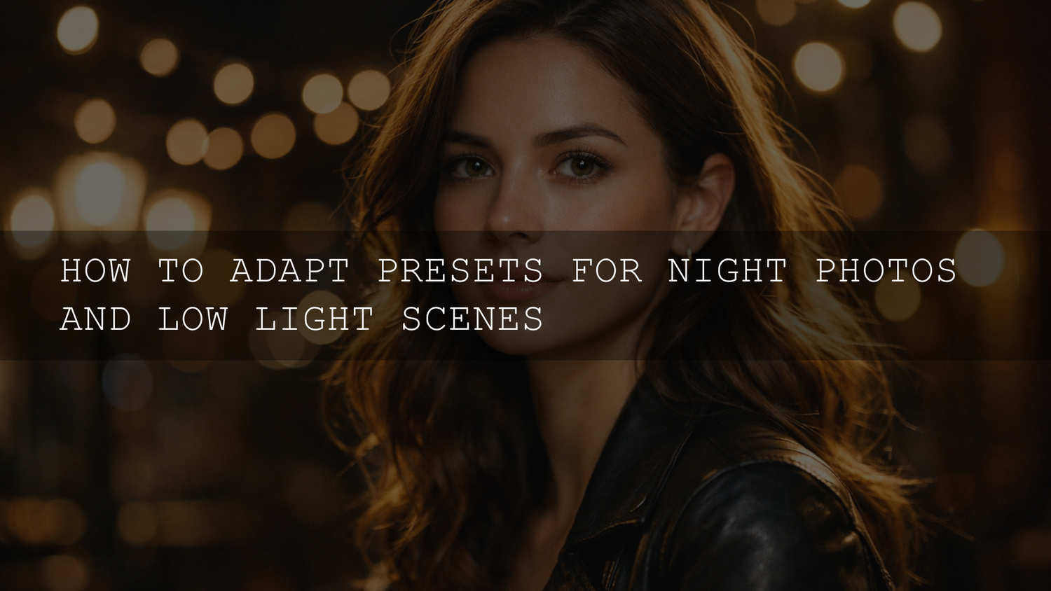
Night Lightroom Presets: How to Make Your Daytime Presets Work in Low Light (2026 Workflow)
You finally nail your “signature look” in Lightroom… then you shoot at night, apply the same preset, and everything falls apart. If you’ve ever struggled with night Lightroom presets turning your photos into a noisy, orange, over-sharpened mess, you’re not doing anything wrong—low light is a totally different playground. The good news: you can adapt your existing low light photography presets (and even your daytime favorites) with a repeatable workflow that keeps the mood while fixing noise, white balance, and blown highlights.
If you want a night-ready starting point right now, try a pack made specifically for city lights—AI-Optimized Cinematic Dark Street Lightroom Presets—and browse the full Lightroom Presets for Lightroom Mobile & Desktop collection. And if you’re building your toolkit, you can Buy 3, Get 9 FREE when you add 12 items to your cart.
Why presets break at night (and why it’s not your fault)
Most presets are designed and tested in “clean light”—daylight, open shade, or controlled indoor setups. Night scenes have three problems that fight presets at the same time: high ISO noise, mixed lighting, and extreme contrast (deep shadows + bright signs/streetlights).
- Noise gets amplified fast: Any preset that lifts Exposure/Shadows, adds Clarity/Texture, or sharpens aggressively will magnify grain.
- White balance becomes “color chaos”: Sodium vapor (yellow/orange), LEDs (green/cyan), neon (magenta/blue) can all exist in one frame—daylight-tuned presets misread it.
- Highlights clip and lose detail: Streetlights and neon signs blow out easily. Presets can push Whites/Highlights too far and turn lights into white blobs.
- Sharpening looks harsher: Sharpening can grab onto noise and create halos, especially in dark areas and skies.
- The mood gets “flattened”: A bright/airy preset can destroy the natural drama of a night scene by lifting blacks too much.
Here’s the mindset shift that fixes everything: Night edits are about control, not brightness. You’re sculpting light—keeping the shadows, protecting the highlights, and letting color feel intentional.
The 7-step workflow to adapt any preset for night photos
This is the exact order I recommend because it prevents you from “chasing your tail.” When you fix the foundation first, your preset becomes a style layer—not a problem generator.
-
Start with a clean base exposure (before judging the preset). Night photos often look “too bright” after a preset because the preset was built to lift midtones. Set a realistic base first: pull Exposure down until the scene feels like night again. Then apply your preset (or keep it applied) and continue.
-
Rescue highlights first (streetlights, neon, headlights). Drop Highlights and Whites until bright areas regain shape. If your image still feels “blinding,” check this related guide: Why your presets turn photos into blinding lights (and how to fix it).
-
Lift shadows gently (but don’t kill the mood). Raise Shadows just enough to reveal essential detail (faces, buildings, texture). If shadows get crunchy or noisy, stop and move to noise reduction (next step). Night photos look cinematic when some areas stay dark—don’t try to make it daytime.
-
Do noise reduction the “smart way” (detail first, plastic never). Zoom to 1:1 and reduce noise. If you shoot RAW, Lightroom’s AI tools are a game changer—see Adobe’s official guide to Enhance (Denoise, Raw Details, Super Resolution). In most cases, apply Denoise early, then continue color work.
-
Fix white balance and color casts (this is the night preset secret). If your scene looks too orange/green/blue, don’t fight it with Saturation. Correct Temperature/Tint first, then fine-tune with HSL. If you constantly struggle with weird lighting, this indoor guide helps because the logic is the same: Why presets look bad indoors (simple fixes for artificial lighting).
-
Reduce Clarity/Texture/Dehaze if the photo looks gritty. Many presets add Clarity/Texture for punch. At night, that punch often becomes harshness. Pull Clarity down a bit to smooth noise and make light bloom more naturally. Use Dehaze with caution—it can add noise and weird halos.
-
Sharpen last (and mask it). Sharpening should enhance edges, not grain. Keep sharpening subtle and avoid sharpening the sky. Local adjustments help a lot—see Adobe’s guide to Masking in Lightroom Classic so you can sharpen only where it matters.
A real “before/after” example you can copy tonight
Let’s say you shot a rainy street at dusk with neon signs and your preset makes everything too bright, too orange, and too noisy.
- Before (after preset): neon highlights clipped, skin tones orange/green, shadows lifted too far, noise visible in sky and dark pavement, halos around edges.
- After (fixed): highlights regain color and shape, shadows stay moody but readable, neon looks vibrant (not radioactive), skin tones come back to normal, noise is controlled without looking plastic.
Try these starting points (then adjust by eye):
- Highlights: down until light sources show detail (often -40 to -80)
- Whites: down slightly if clipping remains (often -10 to -40)
- Shadows: up gently (often +10 to +35), stop before noise gets ugly
- Clarity: down a bit if gritty (often -5 to -20)
- Noise reduction: moderate first, then refine with masking
I tested this exact order on a handheld city street shoot with wet roads and neon signs, and the biggest difference wasn’t “more sliders”—it was simply doing highlights + denoise before trying to “style” the photo.
Noise reduction that still looks cinematic (Lightroom Classic + Mobile)
Lightroom noise reduction should feel invisible. The goal is clean tone transitions in shadows while keeping real texture in faces, jackets, bricks, and signs.
- Zoom to 1:1: judging noise while zoomed out lies to you. Always check at actual pixels.
- Prefer AI Denoise for RAW: when available, it usually preserves detail better than pushing sliders hard. Use Adobe’s Enhance/Denoise documentation as your reference.
- Mask the sky: skies and dark walls show noise first. Apply heavier noise reduction locally to those areas, and keep faces/subjects more detailed.
- Be careful with “extra pop”: too much Texture/Clarity will reintroduce the look of noise, even if you denoised well.
If you edit on your phone, this guide covers a practical approach to noise and mixed lighting: Mastering Lightroom Mobile presets for any lighting.
White balance at night: how to stop orange, green, and “weird blue”
This is where most night edits fail. A preset can’t guess your lighting situation—so you have to guide it.
- Pick your “hero light”: decide what should feel neutral. Is it the person’s face? The street? The storefront? You can’t make every light source neutral at once.
- Temperature/Tint first: fix the overall cast before touching saturation. If skin looks sickly green, Tint toward magenta usually helps.
- Use HSL to control problem colors: orange/yellow streetlights often need reduced saturation and sometimes slightly reduced luminance so they don’t dominate the scene.
- Masking is the cheat code: adjust skin separately from neon signs. Use Lightroom masking tools to keep faces natural while leaving the environment dramatic.
For a deeper understanding of why presets react so differently across photos (especially under mixed light), this article is a helpful companion: Why presets look different on every photo (and how to fix it).
Keep the night mood: contrast without crushed blacks
Night images should have depth. That doesn’t mean “black hole shadows,” and it doesn’t mean “gray everything.” The sweet spot is controlled contrast.
- Set black and white points intentionally: use Blacks/Whites (or Curves) to anchor the image. If everything looks foggy after a preset, this guide helps: Fix washed-out/low-contrast preset results.
- Use Curves for “cinematic control”: a gentle S-curve can add punch while preserving highlight detail. Lift the very bottom point slightly if blacks look too harsh—just don’t lift it so much that noise becomes obvious.
- Let some areas go dark: a night shot often looks more premium when the frame has intentional negative space.
When I pushed a moody preset on a candlelit dinner photo, the best result came from protecting highlights first (so candles kept shape) and lifting shadows only on faces with a mask—everything else stayed naturally dark.
Presets vs manual editing for low light: which is better?
This is the honest answer: you want both. The fastest workflow is “preset first, manual second.” The cleanest workflow for tricky files is “manual base first, preset second.”
Preset-first (fastest for consistent shoots)
- Best for: street sessions, nightlife events, travel nights where lighting repeats
- How it works: apply a night-friendly preset, then fix exposure, highlights, noise, and WB
- Watch out for: noise amplification if the preset lifts shadows hard
Manual-base-first (best for mixed lighting nightmares)
- Best for: indoor + outdoor mixes, neon + tungsten + LED in one frame
- How it works: neutralize exposure/WB + denoise, then apply a preset at lower intensity for style
- Watch out for: over-editing—keep it simple once the base is clean
Build 2–3 “Night Starter” presets you’ll actually use
Instead of forcing a daytime preset to behave every time, create a small set of night-focused presets. Here’s a simple way to build them:
-
Pick one real night RAW you love (street neon, warm interior, dark cinematic portrait).
-
Apply your workflow: highlights → denoise → WB → contrast → sharpen last.
-
Save as a new preset with a descriptive name (e.g., “Neon Night Clean,” “Warm Interior Glow,” “Moody Street Film”).
-
Test on 10 photos from the same type of scene and refine once.
If you shoot urban scenes often, this is a great inspiration piece for building looks (including cinematic night styles): Urban street photography presets: a guide to the best looks.
Recommended AAAPresets for night and low-light edits
If you want presets that already “think like night” (controlled highlights, moody contrast, and modern color for city lighting), these are strong picks:
- AI-Optimized Cinematic Dark Street Lightroom Presets for dramatic, film-inspired urban night mood.
- AI-Optimized Neon Street Lightroom Presets for bold neon, rainy streets, and nightlife color.
- AI-Optimized Midnight Flash Street Lightroom Presets for crisp “flash street” energy and punchy night contrast.
- 1000+ Master Lightroom Presets Bundle if you want a massive library to build custom night starters fast.
If you like browsing by style and saving favorites, start with Lightroom Presets for Lightroom Mobile & Desktop, and for best-value packs explore Premium Lightroom Presets & LUTs Bundles.
Quick troubleshooting: common night preset problems (fast fixes)
- “My night photo looks too orange/yellow.” Fix white balance first, then reduce Orange/Yellow saturation in HSL. If skin is affected, mask the face and correct locally.
- “Everything looks gritty and noisy.” Reduce Clarity/Texture, apply Denoise (especially for RAW), and avoid heavy sharpening on the sky.
- “Streetlights are pure white blobs.” Pull Highlights/Whites down, then add a touch of contrast with Curves (not with Whites).
- “My preset makes the photo look flat.” Reset Blacks/Whites, add a gentle curve, and avoid lifting blacks too far. Use this as a reference: Fix washed-out preset results.
- “My edits look different photo to photo.” Normalize exposure + WB before applying presets. This guide explains why: Why presets look different on every photo (and how to fix it).
One last step that saves hours: install & organize presets properly
If you’re building a night workflow, clean organization matters. Install presets correctly, group them by use (Neon / Dark Street / Warm Indoor), and you’ll move faster on every edit. For a quick install walkthrough, see How to install Lightroom presets (quick and easy). For Adobe’s official reference, use Adobe’s guide to installing presets and profiles in Lightroom.
If you’re ready to turn your night shots into clean, cinematic edits, start with AI-Optimized Neon Street Lightroom Presets or the moodier Cinematic Dark Street pack, then explore more looks inside the Lightroom Presets collection. Remember—Buy 3, Get 9 FREE when you add 12 to your cart.
FAQs
Should I fix exposure before applying a night Lightroom preset?
Get exposure and white balance close first if the scene is tricky (mixed lighting), then apply the preset as a style layer. For consistent shoots, preset-first is fine—just rescue highlights and manage noise right after.
What’s the best Lightroom noise reduction approach for low-light photos?
Start by judging at 1:1 zoom, then apply moderate noise reduction (or AI Denoise for RAW) before heavy contrast and sharpening. Mask the sky or dark walls for stronger noise reduction without softening your subject.
Why do my night photos turn orange after applying presets?
Night scenes often mix warm streetlights with cool LEDs, and a daylight-tuned preset exaggerates the cast. Correct Temperature/Tint first, then use HSL to reduce overly strong orange/yellow without destroying the whole image.
How do I keep neon lights colorful without blowing highlights?
Lower Highlights and Whites until detail returns in the signs, then add contrast using Curves instead of pushing Whites. If the neon still looks too intense, reduce saturation for Magenta/Blue selectively using HSL or masking.
Should I sharpen night photos the same way as daytime photos?
No—night sharpening should be lighter and more selective because noise looks like “fake detail.” Sharpen last and avoid sharpening smooth areas like skies and dark gradients.
Written by Asanka — creator of AAAPresets (10,000+ customers).

Leave a comment
This site is protected by hCaptcha and the hCaptcha Privacy Policy and Terms of Service apply.