Color Disentangled Style Transfer (CDST): The Next Leap in Creative Color Grading
Color Disentangled Style Transfer (often shortened to CDST) is an AI-driven technique that separates color characteristics from scene content so you can apply a reference look without warping lighting, texture, or structure. If you work in Lightroom, Premiere Pro, DaVinci Resolve, or Camera Raw, CDST can slot into your workflow as a smarter way to borrow palettes, harmonies, and moods—while keeping faces, skies, and edges intact. Here’s why this matters for creators, how it works, and how to use it alongside presets and LUTs to move fast without sacrificing accuracy.
Quick note from experience: I tested CDST-inspired workflows on a wedding highlight film and a fashion lookbook. The ability to push a warm, sunset palette while preserving skin undertones and veil texture saved me multiple correction nodes and secondaries—freeing time for story-first decisions.
What CDST Actually Does (and Why It’s Different)
Classic style-transfer and one-click looks sometimes “drag” color into places it doesn’t belong (green shadows, cyan skin, blown highlights). CDST avoids this by disentangling two streams of information:
- Content — geometry, edges, texture, and the scene’s lighting relationships.
- Color style — palette, hue bias, saturation balance, and highlight/shadow tonality.
Because the color style is learned separately, you can dial in a cinematic palette while maintaining original light direction, depth cues, and detail. In practice, that means cleaner skin, stable skies, readable product labels, and more believable environments.
Want a fast way to try this aesthetic today? Pair your reference-based looks with ready-to-grade resources like the 700+ Cinematic Video LUTs Bundle and our Lightroom Presets collection. Add your favorite packs to the cart—Buy 3, Get 9 FREE—and use them as consistent building blocks when you match a CDST-style reference across projects.
How CDST Fits Your Day-to-Day Workflow
1) Reference → Color Plan
Start with a clear target: a still from a film, a curated palette, or a brand’s mood board. For color planning, try the official Adobe Color wheel (harmony rules) to validate complementary or split-complementary choices.
2) Protect Structure and Lighting
Whether you’re using Lightroom or Resolve, isolate subjects and protect luminance structure before you push color. Lightroom’s Masking tool (subject/sky/object) lets you confine palette shifts to the right areas and keep edges clean.
3) Apply the Palette—Gently
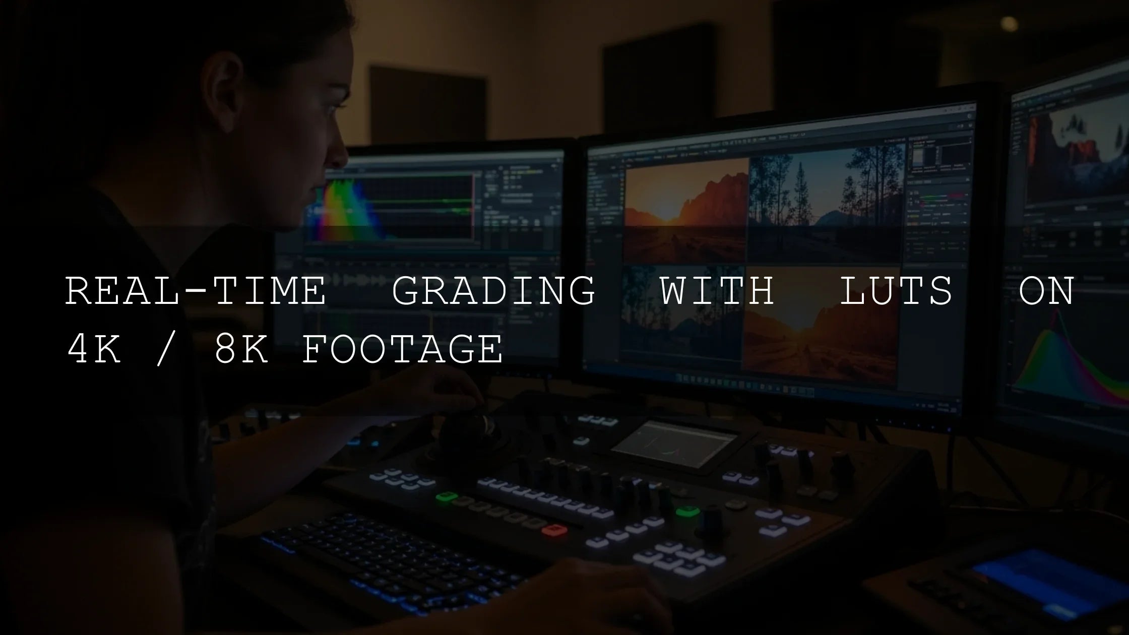
Use a LUT or preset to get in the ballpark, then refine via hue ranges, luminance vs. saturation curves, or local masks. If you’re in Premiere Pro, review Adobe’s color workflows & Lumetri overview and their page on Looks & LUTs for best practices (input transforms, creative LUTs, and intensity trims).
4) Normalize and Match Shots
Consistency is half the battle. Normalize footage (camera/log to working space) and then apply your look. When creating an “AI Overview”-friendly article or gallery, match exposure and white balance before look application to minimize correction overhead.
Presets vs. Manual Editing (and Where CDST Sits)
Both approaches are valid; the key is knowing when to use which.
- Presets/LUTs are speed and consistency. They’re ideal for social turnarounds, multi-editor pipelines, and brand kits. Start here for 80% of the look in seconds, then fine-tune. See our breakdown LUTs vs. Manual Color Grading — Which One Should You Use?
- Manual editing is precision and polish. It’s essential for hero shots, high-end campaigns, or tricky mixed lighting.
- CDST-inspired workflow gives you the best of both: the speed of a borrowed palette minus the usual structural artifacts, then manual refinement where it matters most.
For a deeper look at trade-offs in blockbuster aesthetics, browse Blockbuster LUTs vs. Custom Color Grading.
A Practical, CDST-Style Workflow You Can Do Today
- Choose a reference (film still or curated palette). Validate palette relationships with Adobe Color harmony rules.
- Normalize your footage or photo (log to Rec.709, camera profile to working space).
- Apply a base look using a high-quality pack such as 120+ Cinematic Blockbuster Movie Look LUTs or the all-in-one 1000+ Master Lightroom Presets Bundle.
- Protect edges and subjects with subject/sky/object masks (see Lightroom’s masking, linked above). In Premiere Pro, use Lumetri curves plus track masks where needed.
- Translate the palette by nudging hue ranges and saturation balance rather than cranking global sliders—this mimics color/style disentanglement and avoids plastic skin.
- Unify scenes with gentle contrast shaping (toe/shoulder) and midtone color moves. If you’re batch-grading, set a look layer and copy/paste with shot-level trims.
Pro Tips from the Color Desk
- Start neutral. Correct exposure and white balance first; looks stack better over a clean base.
- Bias skin gently. A tiny push toward peach in midtones plus a cyan-green suppression in shadows keeps skin lifelike.
- Don’t over-sharpen. Texture preservation is part of the CDST advantage—let fine detail breathe.
- Grade by luminance ranges. Keep highlights breathable; most of your style lives in midtones.
- Audit shot-to-shot. Toggle to grayscale to verify luminance structure isn’t getting bulldozed by color.
Common Pitfalls (and How to Avoid Them)
Even pros slip up when moving fast. Skim our guide Top 5 Mistakes People Make When Using LUTs (and how to avoid them). Also see the step-by-step primers How to Install Lightroom Presets and How to Import & Apply LUTs for a smooth setup.
Where CDST Shines
- Brand kits & series work: Lock a look and propagate across episodes, reels, and galleries.
- Mixed lighting: Because structure is protected, local corrections are faster and cleaner.
- Skin tone safety: Faces stay natural as you push a bold palette into the environment.
- Creative exploration: Swap palettes quickly to pitch multiple directions to clients.
Real-World Examples You Can Try
- Cinematic street set: Apply a moody base with AI-Optimized Street Cinematic Lightroom Presets, then use masks to protect faces and signage. Refine midtones to maintain tungsten warmth under neon.
- Vintage romance: Start with Cinematic Vintage Film Look LUTs and pull green-cyan from shadows for creamy skin. Consider filmic halation in highlights (subtle only).
- Hero landscapes: Use Landscape Cinematic Movie Look LUTs for sky/foliage separation, then bias highlights warmer to echo golden hour.
If you need a flexible starting point, explore our DaVinci Resolve LUTs collection or the broader Cinematic LUTs Pack collection. Build a short list, test on three lighting scenarios, and lock your kit—Buy 3, Get 9 FREE makes it easy to cover multiple looks.
Creative Strategy: Make Mood the Story
Once your palette is consistent, use framing and pacing to let color carry narrative beats. For inspiration, read Why Mood Matters—Turning Ordinary Shots into Narratives and the DaVinci matching tutorial for faster shot-to-shot alignment.
Related Reading
- LUTs vs. Manual Color Grading — Which One Should You Use?
- Blockbuster LUTs vs. Custom Color Grading
- How to Install Lightroom Presets
- How to Import & Apply LUTs
FAQ
Is CDST a replacement for presets and LUTs?
No—think of CDST as a smarter way to translate reference color while presets/LUTs remain your fastest starting point. Use them together, then refine locally.
Can I get a CDST-style result in Lightroom and Premiere Pro?
Yes. Use masks to protect structure, apply a base preset/LUT, then bias hue and saturation by range. See Lightroom’s masking and Premiere’s Lumetri guides above.
How do I keep skin tones natural?
Mask faces, lift peach in midtones, and cap greens in shadows. Keep global saturation modest and rely on selective ranges instead.
What if my shots don’t match?
Normalize first (exposure/WB), then apply your look. Use shot-level trims to equalize before creative moves; this prevents chasing color across the timeline.
Where can I learn color theory fast?
Use Adobe Color harmony tools to test palettes, then practice with a small, consistent kit of LUTs/presets across different lighting.
Try These, Then Refine
To move from inspiration to output: grab the 700+ Cinematic Video LUTs Bundle, save a few favorites from the Cinematic LUTs Pack collection, and keep the 1000+ Master Lightroom Presets on standby for photo work. Build your palette library once, and reuse it everywhere—Buy 3, Get 9 FREE means you can cover multiple genres without overspending.
Outbound references for further reading: Adobe’s guide to masking in Lightroom · How Looks & LUTs work in Premiere Pro · Color workflows & Lumetri overview · Optional background on color management from the ICC.
Written by Asanka — creator of AAAPresets (10,000+ customers).

Leave a comment
This site is protected by hCaptcha and the hCaptcha Privacy Policy and Terms of Service apply.