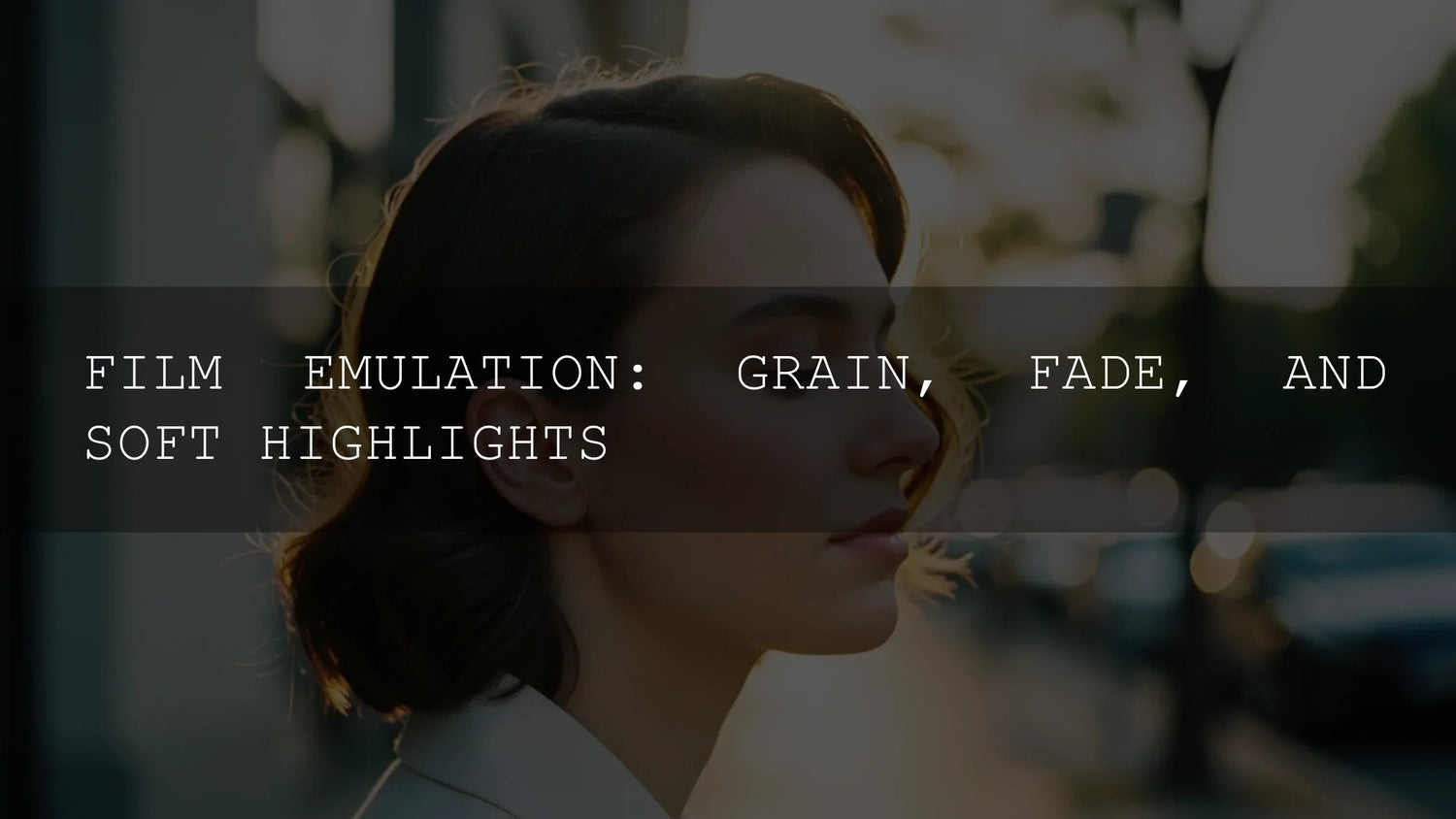
Film Emulation: How Grain, Faded Blacks, and Soft Highlights Create an Authentic Analog Look
If you love the feel of analog but work in digital, film emulation is your bridge. In the next few minutes, we’ll unpack the core building blocks—film grain, faded blacks, and soft highlight roll-off—and show you how to recreate them in Lightroom, Photoshop, and Camera Raw without making your images look artificially “filtered.” Along the way, you’ll get step-by-step guidance, comparisons like Presets vs Manual Editing, and practical pro tips grounded in real-world projects. If you want a polished starting point, try the 1000+ Master Lightroom Presets Bundle and keep exploring the Lightroom Presets collection—try them today and make the most of our offer: Buy 3, Get 9 FREE.
Why Film Emulation Still Matters
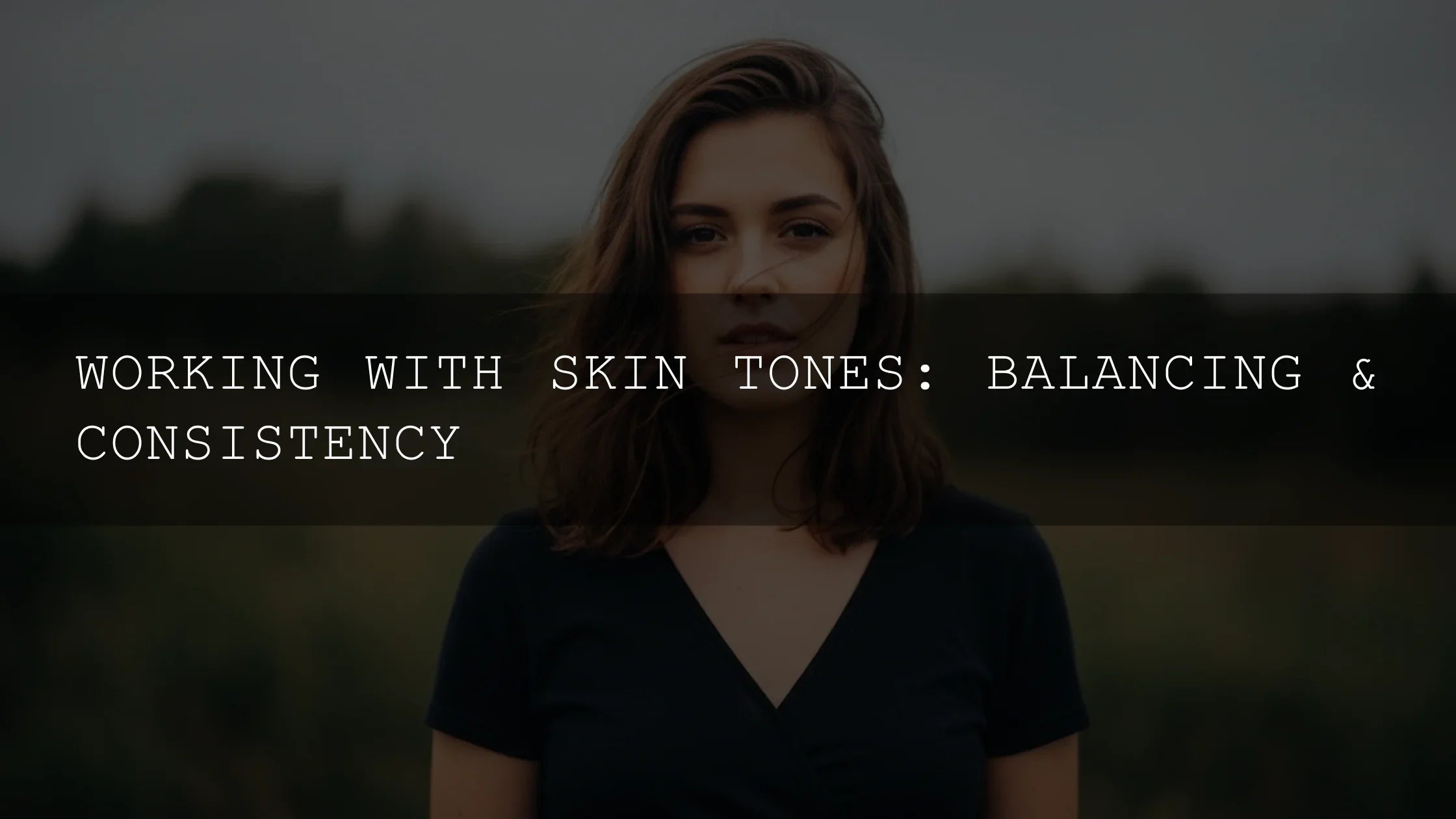
Digital files are clean, sharp, and flexible—but they can feel sterile. Film emulation brings back the tactile cues we associate with memory and story: organic grain, gentle contrast, and highlight behavior that doesn’t snap to white. These traits make portraits more human, landscapes more atmospheric, and street scenes more cinematic. In my own workflow, I’ll often test a film-style preset on a wedding portrait first—skin, fabric, and background bokeh are great “tells.” If grain looks natural on faces and the highlights in the veil roll off smoothly, I know I’m in the right neighborhood.
How film’s “imperfections” shape mood
- Grain adds perceived sharpness and texture that guides the eye (see Adobe’s official explanation of grain controls in Camera Raw). Try the Grain section in Adobe Camera Raw for film-like size/roughness control.
- Faded blacks soften contrast and add a lived-in patina. The easiest way to create it is with a subtle Tone Curve lift in the shadows; Adobe’s resources on tone/curve behavior are helpful starting points: Lightroom Classic: tone & color workflow and Photoshop Curves overview.
- Soft highlights create a gradual transition to white, which feels more “optical” and less clipped. You’ll shape these with a gentle curve in the highlights plus selective warmth in color grading.
Mastering Grain: Texture Without “Noise”
Grain is not random dots—it’s structure. Aim for believable texture that supports the subject rather than distracts.
- Choose your grain character. Fine, tight grain suits portraits and fashion; larger, chunkier grain suits gritty street or documentary. In Camera Raw/Lightroom, adjust Amount, Size, and Roughness to define the look (Adobe’s guide to Grain).
- Match grain to output. Print sizes and viewing distances matter. Zoom to 100% to set texture, then zoom out to preview how it reads at common delivery sizes.
- Color vs mono grain. Monochromatic grain feels classic; a whisper of color grain can “age” modern sensors convincingly—use sparingly.
- Blend with subject & light. Add a touch more grain to flat light (to restore bite), and a touch less to already detailed scenes (to avoid sandpaper skin or crunchy skies).
Want an instant film vibe? Explore Vintage Retro Kodak Film Look Lightroom Presets for ready-made analog character tuned for portraits, lifestyle, and travel.
Faded Blacks: Lift, Don’t Wash Out
Faded shadows read as timeless when you keep micro-contrast intact. The fastest, most controllable method is the Tone Curve.
- Start with a clean baseline. Balance exposure/white balance before curves (Adobe recommends establishing a tonal foundation first—see Lightroom Classic tone & color).
- Lift the shadow anchor. In the Point Curve, nudge the leftmost point slightly upward. Keep the lower-mid “knee” close to the baseline to preserve depth.
- Add hue to shadows (subtle!). Cool lifts (cyan/blue) evoke certain black-and-white papers; warm lifts add cozy nostalgia. In Photoshop, a Curves layer on the Blue channel or Color Grading in Lightroom can do the job (see Photoshop Curves).
- Check skin + blacks together. If black clothing turns muddy, reduce the lift; if skin loses depth, raise lower-mid contrast or add a gentle S-curve.
Soft Highlights: The Secret to “Film” Roll-Off
Film rarely bites into white abruptly. To mimic that elegance, shape the top end of the curve and warm the brightest tones.
- Smooth the top curve. Pull the high-end curve down a hair to slow the transition to white. Keep speculars alive but not spiky.
- Warm the brights. Use Color Grading (Highlights wheel) or a gentle Selective Color/Curves channel move to add a hint of yellow/orange to highlights—think sunset glaze, not orange cast.
- Protect faces. If forehead/hot spots clip, use a Range Mask (Lightroom) or luminosity mask to apply roll-off only where needed.
- Optional bloom. A light diffusion pass can imitate halation—keep it low and mask it to highlights to avoid haze.
Adobe’s curve and tone docs are helpful refreshers while you experiment: Tone Curve how-to in Lightroom Classic and Curves in Photoshop.
Presets vs Manual Editing
Manual editing teaches you cause-and-effect: you’ll understand why a lifted black needs midtone structure, or how highlight warmth influences skin. It’s perfect for signature looks and tricky lighting. Presets give you speed and consistency—great for sets and clients who expect the same vibe across hundreds of photos. The sweet spot? Use a high-quality preset as a base, then fine-tune grain size, shadow lift, and highlight curve per image.
- When to favor presets: high volume shoots, brand consistency, quick client previews.
- When to go manual: mixed light, strong color casts, extreme dynamic range, unusual wardrobes/makeup.
For fast, consistent results (with room to tweak), start with the 1000+ Master Lightroom Presets Bundle and browse Cinematic Film Lightroom Presets tailored to analog moods.
A Practical, Repeatable Workflow
- Baseline exposure & WB. Use the Basic panel to land a neutral foundation.
- Curve shaping. Add a gentle S-curve, lift the shadow point minimally, and smooth the highlight toe.
- Grain last. Dial Amount/Size/Roughness so textures feel natural at typical viewing sizes (see Adobe’s Grain tutorial).
- Targeted color. Warm highlights slightly; keep shadow hue subtle.
- Local polish. Range masks for faces, skies, and hot spots; consider a whisper of diffusion on highlights.
- Consistency check. Compare two or three anchor images from the set—tweak preset or curve to unify.
Real-World Examples
- Street portrait, overcast day: Moderate grain, small Size; slight shadow lift; warm highlights. If the jacket blacks go muddy, reduce lift or deepen lower mids.
- Golden-hour couple session: Fine grain; highlight curve softened; warm highlight tint to enhance flare.
- Cityscape at dusk: Add grain to restore bite in flat areas; cool shadow tint for cinematic mood; protect bright signage via masks.
Recommended Tools & Starting Points
Prefer a head start? These options deliver film flavor fast:
- Vintage Retro Kodak Film Look Lightroom Presets for heritage color and texture.
- 1000+ Master Lightroom Presets Bundle for broad coverage and set-to-set consistency.
- For video editors: Classic Kodak Film Style Video LUTs Pack for authentic stock-inspired grading.
Related Reading
- Crafting authentic vintage film looks in Lightroom
- How vintage film styles elevate your storytelling
- Achieve a film look in DaVinci Resolve using LUTs
- Cinematic presets for street photography
- The ultimate guide to LUTs for creators
FAQs
How much should I lift the blacks for a film look?
Just enough to turn pure black into a dark charcoal while protecting lower-mid contrast. Start with a tiny lift on the Tone Curve and adjust by feel.
What grain settings work best for portraits?
Keep Size and Roughness on the finer side so skin holds detail. View at delivery size—what looks perfect at 100% can be overdone on mobile.
How do I avoid plastic skin when adding diffusion?
Mask your glow to highlights only and keep opacity low. Restore micro-contrast on faces with Clarity/Texture set gently positive if needed.
Can I combine presets for a custom film vibe?
Yes. Apply a film-style preset as a base, then fine-tune Tone Curve, Color Grading, and Grain to your image. Save your tweaks as a new preset for consistency.
Does this approach work for video?
Absolutely—use film-style LUTs for a base and then refine curves/highlights in your NLE or grading app. Try the Classic Kodak Film Style Video LUTs Pack for stock-inspired color.
Where to Go Next
If you want analog character without wrestling sliders from scratch, start with a curated pack and adjust to taste. Explore the Cinematic Film Lightroom Presets and the all-purpose 1000+ Master Lightroom Presets Bundle—apply a look in one click, then refine grain, blacks, and highlight roll-off to match your story.
Helpful Adobe Resources
- Adobe Camera Raw: simulate film grain
- Lightroom Classic: working with tone & color
- Photoshop: adjust tonal range with Curves
Browse More
Written by Asanka — creator of AAAPresets (10,000+ customers).
Leave a comment
This site is protected by hCaptcha and the hCaptcha Privacy Policy and Terms of Service apply.