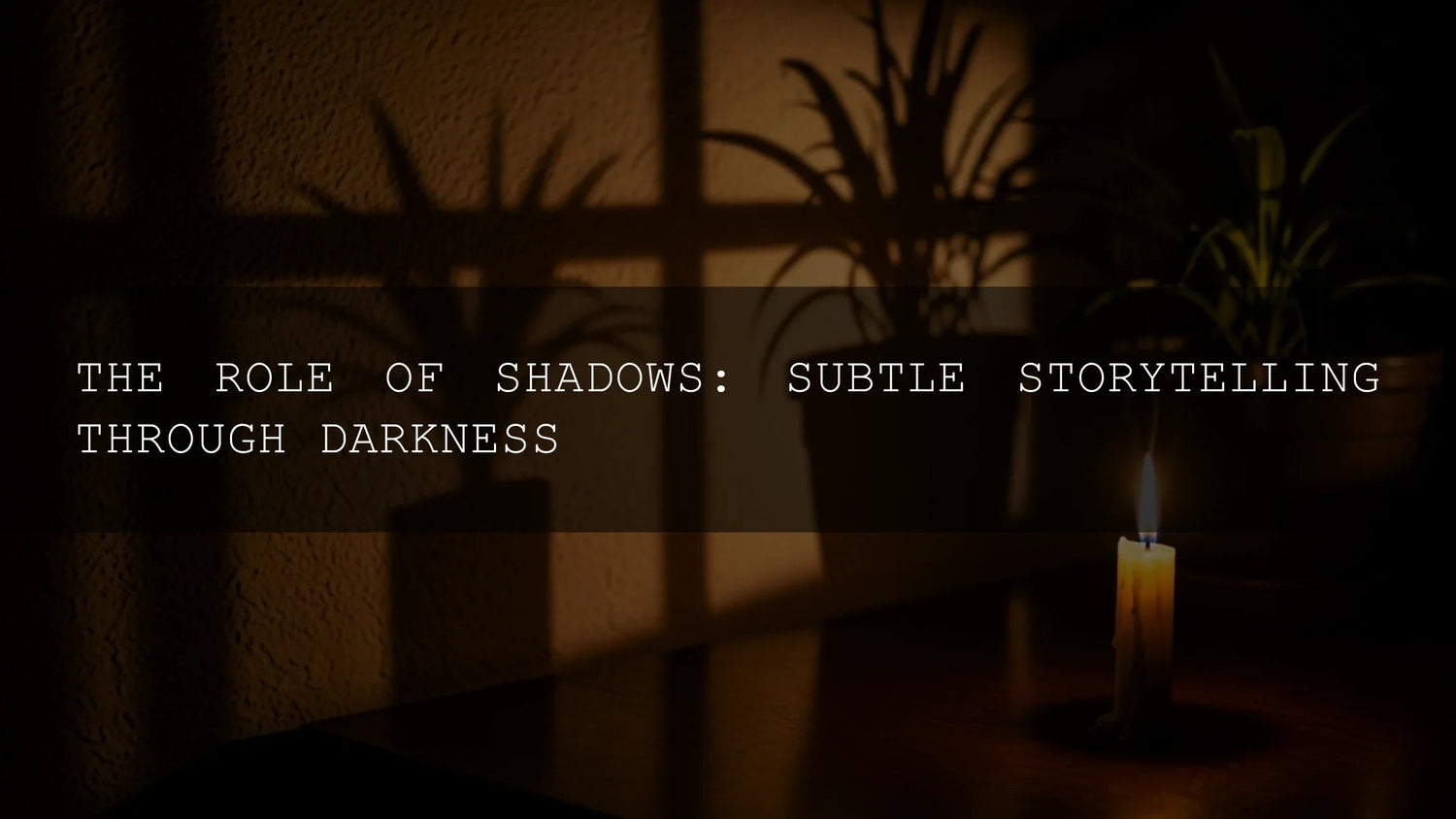
Shadows Are Storytelling: How to Shape Mood, Meaning, and Detail in Lightroom
Shadows aren’t just “the dark parts.” In photography and editing, Lightroom shadows are one of your most expressive tools for shaping mood, guiding the eye, and revealing (or hiding) detail. If you’ve ever chased shadows in photography to build cinematic contrast, experimented with chiaroscuro, or pushed the tone curve to get that moody look, you already know how powerful thoughtful darkness can be. Here’s why this matters and how to master it—step by step inside Lightroom—so your images tell deeper stories.
If you want a fast start, you can pair these techniques with ready-made looks. Our 1000+ Master Lightroom Presets Bundle gives you cinematic, moody, and natural profiles you can tweak in seconds. Browse more options in the Lightroom Presets collection—and yes, it’s currently Buy 3, Get 9 FREE.
What Do “Shadows” Really Mean in Editing?
Photographers talk about shadows in four overlapping ways. Understanding each helps you choose the right Lightroom control—and the right creative choice.
- Literal darkness: The darkest areas in your frame. Think alleyways, backlit portraits, dense foliage, or night streets.
- Symbolic weight: Using darkness to suggest mystery, vulnerability, or conflict—your visual subtext.
- Atmosphere: The overall mood. Hard shadows feel tense and graphic; soft shadows feel intimate and calm.
- Figurative echoes: Darkness that “belongs” to the past—grief, memory, or a place’s history—expressed through tone and contrast.
In Lightroom, these aren’t abstract ideas; they map directly to practical tools: the Shadows, Blacks, Highlights, and Whites sliders; the Tone Curve; and modern masking.
How Shadows Drive Narrative in a Single Frame
1) Suspense and tension
Deep shadows leave space for imagination. By protecting the darkest tones, you suggest what viewers can’t quite see—instantly more cinematic. In Lightroom, keep Blacks rich and pull Contrast with care so you don’t flatten your drama. For fundamentals, see Adobe’s overview of the Light panel and the Shadows slider.
2) Character and psychology
Faces partly in shadow feel complex. Try a subtle Radial or Brush mask to darken one side of a subject’s face and guide attention to the eyes. Need a refresher on selective edits? Review Adobe’s guide to local adjustments in Lightroom Classic.
3) Atmosphere and style
Hard-edged shadows (midday sun, single point light) read as graphic and bold; soft, feathered shadows (window light, overcast) read as gentle and intimate. Use the Tone Curve to fine-tune how abruptly tones roll off into darkness. For step-by-step tone control, see Adobe’s tone control workflow.
From Idea to Edit: A Practical Lightroom Workflow for Shadows
- Expose for intent, not neutrals. If you want mystery, underexpose slightly in-camera; if you want clarity, expose to preserve shadow detail.
- Start with global tone. In the Light panel, adjust Exposure for midtones, then Highlights/Whites for the bright end and Shadows/Blacks for the dark end. Adobe’s help notes that the Shadows slider targets the darker areas while Blacks sets the clipping point—perfect for balancing detail and punch (see Adobe’s walkthrough).
- Use the Tone Curve for character. A subtle S-curve adds bite. Lift the toe (bottom-left) for a faded film look; drop it for deeper blacks.
- Mask with intent. Brush to recover detail only where needed—cheekbone, jacket texture, or foreground cobblestones—and darken elsewhere to keep the mood. Reference Adobe’s local adjustment controls for precise steps.
- Color supports the shadow story. Cooler shadows feel mysterious; warmer shadows feel nostalgic. Build harmonies with Adobe Color’s harmony rules and nudge with Color Mixer or Color Grading.
- Finish with presence, not crunch. Clarity and Texture are powerful—use sparingly. Add just enough to prevent muddy midtones.
Presets vs Manual Editing: What’s Best for Shadow Control?
- Presets (speed & consistency): Great for a reliable starting point across a shoot. You’ll get consistent shadow roll-off, contrast curves, and color harmony in one click. For example, the Aesthetic Moody Lightroom Presets lean into rich blacks while keeping skin tones believable.
- Manual (precision & intent): Perfect when the light is tricky or the story is sensitive—recover detail exactly where it matters, keep other areas intentionally dark.
Best practice: combine them. Apply a preset you love, then refine Shadows/Blacks, tweak the Curve, and add a targeted mask or two. I often test moody looks on wedding prep photos: a preset sets the base, then I brush shadows back on the dress lace and lift a catchlight in the eyes for life.
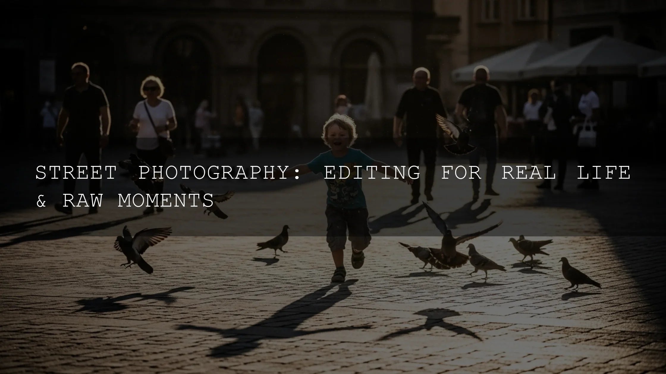
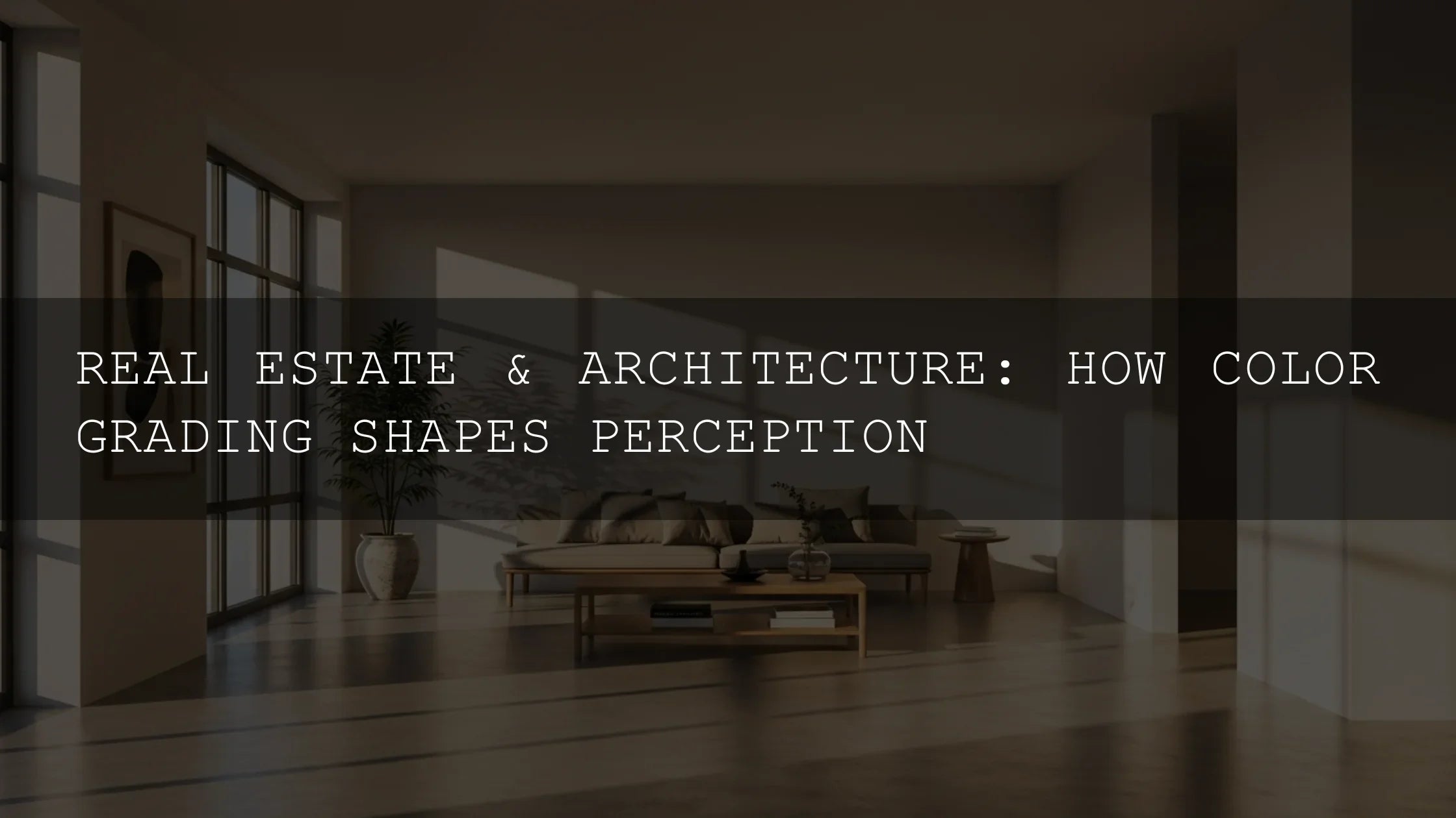
Real-World Use Cases (and What to Adjust)
Street at blue hour
Goal: Preserve neon glow and deep sidewalks. Start with a preset that protects highlights, then lower Blacks a touch for bite, lift Shadows to reveal storefront texture. Curve: gentle S. Mask: linear gradient to deepen sky.
Backlit portraits
Goal: Keep drama without raccoon eyes. Raise Shadows moderately; drop Blacks slightly to avoid a washed look. Use a Radial mask to lift face exposure by ~0.3–0.5 EV and add a hint of Warmth. This aligns with Adobe’s guidance to treat Shadows and Blacks as distinct controls for detail vs depth (basic editing overview).
Product shots for e-commerce
Goal: Clean edges, honest texture. Lift Shadows to reveal material; avoid crushing Blacks. Use a subtle Curve fade for friendliness, or keep true blacks for premium feel. For style ideas, explore our recent guide to e-commerce preset strategies.
Pro Tips for Moody—but Clean—Shadows
- Balance +Shadows and –Highlights. A balanced approach like +Shadows ≈ –Highlights preserves dynamic range while keeping contrast intact (tone control procedure).
- Watch clipping, not just vibes. Toggle clipping warnings or hold Option/Alt when adjusting Whites/Blacks to avoid losing critical texture (Adobe’s tonal scale guide).
- Color-grading the shadows. Subtle cool hues (blue/teal) suggest night; warm (amber) conveys nostalgia. Build palettes with Adobe Color’s wheel, then echo those hues in Shadow tint for cohesion.
- Feather your masks. Hard transitions look artificial. Use generous feathering for believable falloff.
- Presets are starting points. Apply, then refine. The best edits are 70% preset, 30% personal touch.
Try It Today (and Save Time)
If you want a library of shadow-savvy looks—clean, cinematic, vintage, and everything between—grab the 1000+ Master Lightroom Presets Bundle. For pure drama, explore Moody Black Tones or the Moody Dark Green pack. You can always keep browsing in our AI-Optimized Lightroom Presets collection—Buy 3, Get 9 FREE makes testing styles painless.
Further Learning from Adobe
- Adjust photo brightness and control the Shadows slider (Lightroom).
- Tone control workflow: Exposure, Highlights, Shadows, Whites, Blacks (Lightroom Classic).
- Adobe Color: build harmonious palettes that fit your mood.
Related Reading
- Street photography presets that balance deep shadows and neon
- 2025’s trending Lightroom looks and how to apply them
- Five presets that pop on Pinterest without crushing blacks
- Why a master bundle streamlines your shadow workflow
Quick FAQ
What’s the difference between Shadows and Blacks in Lightroom?
Shadows lifts or darkens the dark midtones to recover detail, while Blacks sets the clipping point for the deepest tones—great for adding punch without flattening the image. See Adobe’s tone control notes for context.
How do I avoid muddy results when I raise Shadows?
Counterbalance with a small decrease in Blacks and add a gentle S-curve. Use local masks to lift only the areas that need it.
Should I color-grade the shadows?
Absolutely—subtle cool or warm tints add emotion. Build a cohesive palette with Adobe Color, then echo it in Color Grading.
Are presets enough for complex lighting?
They’re ideal starting points. Apply the look, then refine with masking and curve tweaks to match the scene’s intent.
How do I keep skin tones natural in moody edits?
Use a Radial mask on the face to lift exposure slightly and reduce saturation shifts. Keep Blacks rich, not crushed.
Want an instant head start? Explore the 1000+ Master Lightroom Presets Bundle and the broader Lightroom Presets collection—test multiple looks, then fine-tune shadows to match your story.
Written by Asanka — creator of AAAPresets (10,000+ customers).
Leave a comment
This site is protected by hCaptcha and the hCaptcha Privacy Policy and Terms of Service apply.