
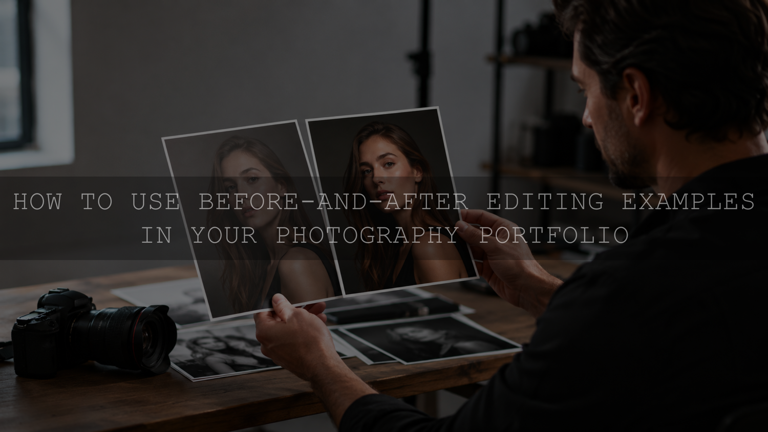
Before-and-after editing examples can make a photography portfolio more useful when they help a potential client understand what changes between capture and delivery. A credible comparison does not make the starting image deliberately look bad. It uses the same photograph, a clearly defined baseline, the finished edit, and a short explanation of the decisions that shaped the result.
This distinction matters because “before” is not always self-explanatory. A camera RAW file typically needs to be rendered or exported to a standard web image format before it can be displayed on a normal webpage. Adobe also notes that Lightroom Classic’s Before view initially shows the photograph as it was originally imported, including any presets applied during import. Adobe’s Lightroom Classic Before and After guidance is useful when preparing a comparison. For a portfolio, define the baseline clearly instead of using “RAW” as a vague label.
What a Before-and-After Should Prove in a Photography Portfolio
A before-and-after belongs in a portfolio when it reveals a skill that matters to the type of work you want to book. The finished photograph should still carry the portfolio. The comparison is supporting evidence that helps a viewer understand your editing choices and problem-solving process.
A useful comparison can show how you handle:
- exposure and highlight or shadow balance;
- white balance and difficult color casts;
- skin-tone refinement without making people look artificial;
- color consistency across a set;
- perspective, lens corrections, or distracting elements when those changes are part of your normal workflow;
- creative color grading that turns a technically sound capture into your recognizable finished style.
Choose examples that match the services you actually want to sell. A dramatic landscape edit may be visually impressive, but it does little for a portrait portfolio if prospective portrait clients need to see how you handle skin, mixed light, and consistent color.
Define the “Before” Honestly
An important portfolio decision is defining what the left side of the comparison represents. There is no single label that fits every workflow.
- Original import: a rendered export showing the photograph as it appeared when imported. If an import preset affected that state, disclose it or define another documented baseline.
- Base correction: a version with technical corrections such as exposure, white balance, lens correction, or basic tonal balancing, but without the final creative grade.
- Final edit: the delivered or portfolio-ready version after the creative grade and any additional retouching or compositing.
If the visible transformation depends on an HDR merge, flash-and-ambient blend, object removal, background replacement, sky replacement, heavy retouching, or compositing, disclose that when it materially changes what the viewer is evaluating. You do not need to list every slider value. You do need to avoid presenting a complex reconstruction as though it were only a simple color adjustment.
For the mechanics of matching crop, scale, labels, and export treatment, use the AAAPresets guide to creating fair before-and-after images.
Choose Images That Make Your Skill Easy to Evaluate
A good starting frame is usually a competent photograph with a real editing challenge, not a failed capture selected to exaggerate the transformation. Look for an image where the composition, timing, focus, or subject is already worth keeping, while the post-production work has a clear purpose.
Before adding a comparison, ask:
- Is it the same source photograph on both sides?
- Is the crop and scale close enough for a fair visual comparison?
- Does the edit solve a problem that matters in this photography niche?
- Does the finished result match the rest of the portfolio?
- Can a viewer understand the main change without a long technical explanation?
- Do I have the permission and usage rights needed to publish both versions?
Portraits and weddings
Choose examples that demonstrate believable skin tones, mixed-light correction, highlight control, or a consistent color direction. Avoid using a deliberately unpleasant skin tone in the baseline simply to make the final version look more impressive. If detailed retouching changes skin texture, body shape, clothing, or background elements, describe that separately from the color grade.
Real estate and interiors
A useful example can show how you balance a bright exterior view with a darker room, correct color contamination from mixed light, refine vertical lines, or combine exposures. If the final image uses exposure blending, flash blending, or compositing, identify the method in plain language so the viewer understands what created the difference.
Product and commercial photography
Use comparisons that show controlled color, clean backgrounds, reflection management, dust or distraction removal, and consistent treatment across a product set. When accurate product color is part of the assignment, a subtle, controlled result can be more useful than an extreme grade.
Landscape and travel photography
Look for examples that show dynamic-range management, local contrast, atmospheric color, or a deliberate creative grade while keeping the scene understandable. If an element was replaced or composited, disclose that rather than letting the comparison imply that every visible change came from tonal editing.
Explain the Edit Without Turning the Portfolio Into a Tutorial
A prospective client usually does not need a complete Lightroom history. A short note under the comparison can explain the value of the edit without exposing every setting.
A useful caption can cover four points:
- Starting challenge: what made the file difficult or unfinished?
- Main corrections: what broad technical problems did you address?
- Creative direction: what mood, color, or visual priority guided the final look?
- Material changes: was there significant retouching, compositing, or element replacement?
For example, a clearly hypothetical portfolio note could read: “Original import: window-lit portrait with a cool ambient cast. Final edit: white balance warmed, face exposure refined, bright highlights reduced, and background color softened. No background replacement.” That tells the viewer what changed without pretending the example proves a business result.
Choose a Presentation Format That Still Works on Mobile
The right format depends on how much explanation the edit needs and how your website behaves on smaller screens.
- Side-by-side comparison: simple and easy to understand when both images remain large enough to inspect.
- Stacked comparison: useful on a narrow screen because each version can use more available width.
- Interactive slider: useful for closely aligned images, but test touch behavior, keyboard access, labels, and loading on the actual published page.
- Project case study: better when the result depends on several stages such as capture, base correction, retouching, and final grade.
- Short video: useful as a supplemental social format, but keep a static final image and enough text on the portfolio page for visitors who do not watch the video.
Do not make the meaning depend only on an animation or slider. Keep “before” and “after” states clearly labeled and place the comparison near the explanation it supports. Google’s current image SEO best practices recommend using standard HTML image elements, placing images in relevant context, providing useful alt text, and balancing image quality with page performance.
Protect Client Work Before You Publish It
Before publishing a client, model, private-property, commercial, or unreleased image as an editing comparison, review the relevant agreement, release, usage terms, confidentiality requirements, and any rules that apply in your jurisdiction. If the existing permission does not clearly cover portfolio use or publication of an unfinished version, obtain appropriate written permission or professional advice before publishing it.
This is especially important with a “before” file because a client may have approved the final delivered image without expecting an intermediate or unretouched version to be made public. Treat the baseline as material that also needs a legitimate basis for publication.
Keep Before-and-Afters Consistent With the Rest of the Portfolio
A comparison should reinforce your visual identity rather than turn the portfolio into a collection of unrelated editing tricks. If one final image is warm and understated, another is heavily teal-and-orange, and another is pastel and airy, the viewer may struggle to understand what they are likely to receive from you.
Build the broader visual system first. The AAAPresets guide to creating a consistent editing style for your portfolio explains how to establish repeatable color, contrast, and finishing decisions while still adapting individual photographs to their lighting and subject.
Where Lightroom Presets Fit Into the Process
A preset can provide a repeatable starting direction, but it should not be used to imply that every image will reach the same result without refinement. Exposure, white balance, camera rendering, subject color, and lighting can change how the same preset looks from one photograph to another.
If you want a broad set of starting looks to test while developing a portfolio direction, the 1000+ Master Lightroom Presets Bundle includes 1000+ Lightroom presets supplied in DNG and XMP formats for mobile and desktop Lightroom workflows. You can also browse the AI-Optimized Lightroom Presets for Mobile and Desktop collection. Treat either option as an editable base, then refine each photograph for its actual light, color, and subject. Products included in AAAPresets’ Buy 3, Get 9 FREE promotion can be combined according to the current offer terms.
A Simple Workflow for Publishing Portfolio Comparisons
- Choose a small representative set. Start with a few examples that demonstrate different skills rather than turning every portfolio image into a comparison.
- Confirm publication rights. Make sure both the baseline and finished version can be shown publicly.
- Define the baseline. Decide whether it is an original import, base-corrected version, or another clearly described stage.
- Match the comparison. Keep the source frame, crop, scale, and output treatment consistent enough that the edit is what the viewer is evaluating.
- Label both states. Use specific wording instead of assuming visitors know what “before” means.
- Add a short decision note. Explain the challenge, the main corrections, the creative direction, and any material retouching or compositing.
- Test the published page. Check desktop and mobile presentation, image sharpness, label readability, and interaction behavior.
- Keep the final work primary. Use comparisons as supporting proof on project pages, case studies, or a dedicated editing-process section rather than replacing the finished portfolio.
Make the Comparison Credible, Not Merely Dramatic
A useful before-and-after photography portfolio does more than show a large visual change. It gives a prospective client enough context to understand what you corrected, what you created, and what your normal finished work looks like. Use an honest baseline, keep the comparison fair, disclose major reconstruction when it matters, and let the final image remain the reason someone wants to hire you.
Written by Asanka Dilshan — founder of AAAPresets, serving 10,000+ customers.



Leave a comment
This site is protected by hCaptcha and the hCaptcha Privacy Policy and Terms of Service apply.