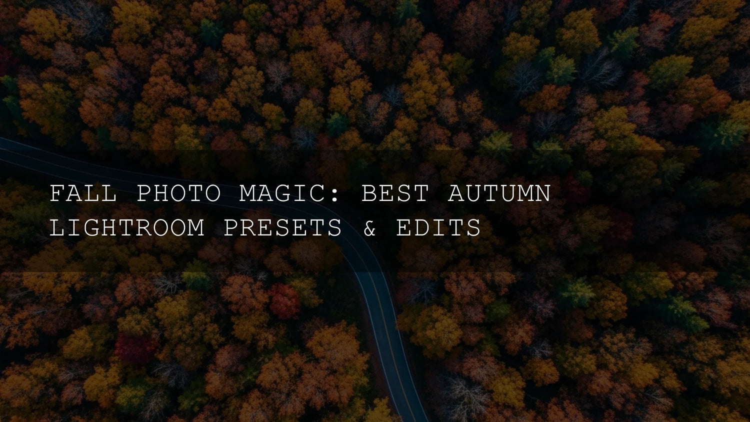
Autumn Lightroom Presets: A Practical Guide to Warm Color, Clean Contrast, and Consistent Skin Tones
Autumn Lightroom presets can do far more than “make it warmer.” Used well, they help you balance golden foliage with cool shadows, protect skin tones, and keep a cohesive look across a whole shoot—on both Lightroom Mobile and Desktop, plus Adobe Camera Raw. In this guide, you’ll learn a fast, reliable workflow, when to choose AI-optimized looks, how presets compare to manual editing, and which fall packs fit different styles (matte film, vibrant color, classic tones). I’ll also share field-tested tips from real edits—what to tweak, what to leave alone, and how to avoid the most common autumn pitfalls.
If you want a head start with a cinematic base look, try AI-Optimized Autumn Gold Tones Lightroom Presets and browse the broader Lightroom Presets collection. You can build a toolkit strategically and Buy 3, Get 9 FREE—a smart way to cover multiple moods with minimal spend.
Why Autumn Color Needs a Balanced Edit
Fall scenes often mix warm subjects (leaves, late-day sun, earth tones) with cooler elements (shade, sky, mist). Push everything warm and you’ll crush depth; cool everything down and the scene feels flat. The goal is a clear, intentional balance: warm highlights and foliage, neutral-to-cool air and shadows, and natural skin tones that don’t drift into carrot orange. A good preset gives you that base harmony, then you fine-tune with a few targeted moves.
Two Lightroom skills carry a ton of weight here: smart masking for local corrections and clean color management in HSL/Color and Tone Curve. If you’re new to these tools, see Adobe’s Masking tool guide for Lightroom Classic and Adobe’s walkthrough on image tone, color, HSL, and Tone Curve. For color decisions, Adobe Color’s harmony rules are a great cheat sheet when you’re nudging hues.
A Simple, Repeatable Autumn Workflow
- Pick a purpose-built preset as your baseline. Start with an autumn-tuned look that matches your intent (golden warmth, matte nostalgia, or bold vibrancy). This saves time and keeps edits consistent across a set.
- Set white balance first. Bias warm for sunlit foliage, then pull Tint slightly magenta to protect skin if reds/oranges are dominant. (Adobe’s WB tips are in the Image tone & color guide above.)
- Use Masking to separate subject and scene. Try Select Subject for portraits or Select Sky/Landscape to keep air and mountains believable. Lower saturation in background reds if they steal attention; lift midtones on the face for clarity.
- Refine color with HSL/Point Color. Tame reds (Hue a touch toward orange; Luminance up a little) to avoid neon leaves and orange skin. Deepen oranges for texture in leaves and knits; keep yellows on the warm side without clipping.
- Shape contrast with Tone Curve. A gentle S-curve adds pop; a lifted toe gives film-like softness in shadowy woods. Avoid crushing blacks—autumn thrives on subtle separation.
- Finish with calibration/Color Grading. A micro push in Blue Primary Saturation or a warm Highlights / cool Shadows split grading gives depth without overcooking.
Which Preset Pack Fits Your Fall Style?
Golden & Cinematic
Choose AI-Optimized Autumn Gold Tones Lightroom Presets if you love sun-kissed portraits, forest walks at golden hour, and travel photos with cozy glow. This set enhances warm highlights, deepens contrast tastefully, and stays friendly to skin tones—even in busy backgrounds of reds and oranges.

Matte, Film-Inspired Nostalgia
Prefer a timeless, editorial vibe? The AI-Optimized Matte Autumn Film Lightroom Presets add soft highlights, gentle contrast, and a sophisticated matte finish. Great for lifestyle shoots, fashion stories, and couple sessions where you want autumn’s warmth without a glossy, high-contrast punch.

Classic, Versatile Fall Color
When you need a reliable all-rounder that “just works,” go with Autumn Fall Tones Lightroom Presets. It’s a polished, versatile starting point for everything from parks and trails to city streets—easy to tweak, steady on skin, and consistent across RAW or JPEG.
Vibrant, Bold, and Share-Ready
For maximum pop—think fiery reds, clean yellows, and punchy oranges—choose Autumn Fall Vibrant Lightroom Presets. It’s perfect for colorful landscapes and bold street scenes, while keeping skies and shadow blues believable.

One Pack to Cover Most Situations
Need a compact but capable toolkit? Fall Lightroom Presets For Autumn Photos includes carefully tuned looks that span subtle warmth to richer color. It’s ideal if you want a consistent aesthetic across portraits, travel, and landscapes without juggling lots of packs.

Presets vs Manual Editing (and When to Combine)
- Speed & consistency (Presets): One-click cohesion across 50–300 images. Ideal for weddings, travel diaries, and seasonal campaigns.
- Precision (Manual): Masking a face, protecting a red jacket, or calming a neon maple—not everything should move together.
- Best of both: Use a fall preset for global harmony, then apply Masking + HSL for targeted refinement. This hybrid approach keeps edits fast and personal.
Real-World Example: From Flat RAW to Autumn Magic
Shot: Backlit portrait on a forest path, midday haze, strong orange leaves behind the subject.
- Apply Autumn Gold Tones as a base. WB +800K, Tint +2 to keep skin healthy.
- Mask the subject (Select Subject). Raise Exposure +0.20, lower Saturation –5 to avoid over-warm skin; add a touch of Clarity.
- Mask the background (Select Background). Pull Saturation –10 on reds, Hue reds +5 toward orange; add Dehaze +5 for leaf detail.
- HSL: Oranges Luminance +6 for leaf texture; Reds Saturation –8 to stop bleeding into skin.
- Tone Curve: Gentle S-curve; lift shadows a hair for film softness.
- Optional Color Grading: Warm Highlights (+20) and cooler Shadows (+10) for depth.
Result: Clean, warm portrait with dimensional foliage and believable air. I tested a similar workflow on an autumn wedding portrait set—delivering 120 images with a consistent, natural look in under two hours.
Pro Tips to Avoid Common Autumn Editing Mistakes
- Watch reds. Oversaturated reds contaminate skin quickly. Ease red saturation; shift Hue slightly toward orange; lift red Luminance to avoid plastic look.
- Don’t crush blacks. Autumn thrives on micro-contrast. Preserve shadow detail so bark, knitwear, and wet streets keep texture.
- Cool the shadows, not the face. Use Masking to add subtle coolness to background shade while keeping subject warmth intact.
- Protect skies. If foliage pops, let the sky stay calm. A quick sky mask with reduced saturation maintains balance.
- Be consistent across a set. Sync only global adjustments first; then add a few targeted local tweaks on hero frames.
Try These Looks on Your Next Shoot
Ready to edit smarter and faster? Start with a preset that matches your mood and refine with a few targeted tweaks. Explore AI-Optimized Autumn Gold Tones for cinematic warmth, AI-Optimized Matte Autumn Film for editorial nostalgia, or the versatile Fall Lightroom Presets For Autumn Photos if you want one pack that covers most scenes. Prefer to browse and compare? See the full Lightroom Presets collection—and remember, you can Buy 3, Get 9 FREE.
Related Reading
- Case Study: How Autumn LUTs Transform Video Edits
- Autumn Wedding Photography: Presets for Romance
- Cinematic Warmth: How Golden Tones Create Intimacy
- Autumn & Fall Photo Editing Tips — Series Index
Helpful Adobe Resources
- Adobe’s guide to masking in Lightroom Classic
- Adobe’s overview of image tone, color, HSL, and Tone Curve
- Adobe Color harmony rules (color wheel)
FAQ
What’s the fastest way to get a cohesive autumn look?
Apply a purpose-built fall preset first, then make 2–3 targeted tweaks (WB, a subject mask, small HSL moves). This hybrid approach is quicker than editing from scratch and more precise than a one-click filter.
How do I keep skin tones natural around very red leaves?
Use Select Subject to isolate the face, reduce Saturation slightly, and shift Reds Hue toward orange in HSL. If needed, raise red Luminance a touch for a softer, more lifelike result.
Are these presets compatible with Lightroom Mobile?
Yes—packs listed here include formats for Lightroom Mobile and Desktop and work with Adobe Camera Raw. Install guides are included on product pages.
Should I use Vibrant or Matte looks for autumn?
Choose Vibrant if you want bold, share-ready color. Choose Matte if you prefer a softer, editorial mood. Many photographers keep both so they can match different scenes and clients.
Where can I learn more about installing or licensing?
See File Licenses and the Contact page if you need help.
Written by Asanka — creator of AAAPresets (10,000+ customers).

Leave a comment
This site is protected by hCaptcha and the hCaptcha Privacy Policy and Terms of Service apply.