
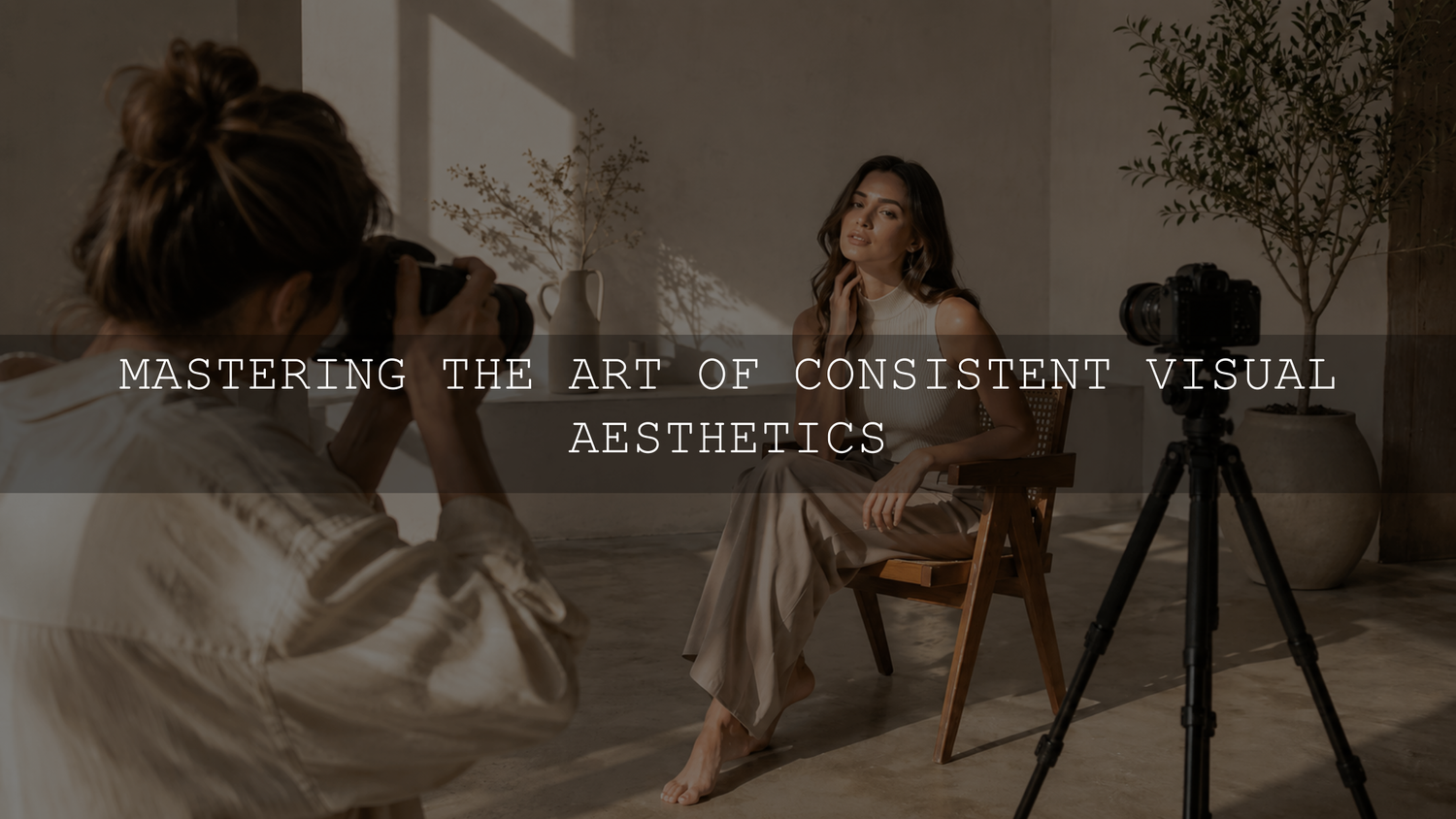
A consistent photo and video aesthetic is created by repeating a controlled set of visual decisions. Define the look, capture content under manageable lighting, correct each file before styling it, apply a small family of related presets and LUTs, and review the finished assets together.
The objective is not to make every photograph and video frame identical. Different cameras, file types, profiles, lenses and lighting conditions will produce different starting points. Your content should instead feel as though it belongs to the same visual system.
What Makes Photos and Videos Feel Consistent?
Visual consistency is easier to manage when you stop thinking of it as one filter and begin treating it as a set of repeatable characteristics.
Compare the following elements across your content:
- Color temperature: Decide whether neutral objects and highlights should appear warm, cool or balanced.
- Tint: Control unwanted green or magenta shifts, especially in indoor and mixed lighting.
- Contrast: Choose whether the style uses deep blacks, lifted shadows, gentle contrast or a brighter commercial finish.
- Saturation: Establish whether colors should appear vivid, natural, pastel or muted.
- Shadow and highlight color: Decide whether darker and brighter areas remain neutral or carry a subtle creative color.
- Skin-tone treatment: Keep faces believable and reasonably consistent across photographs and video.
- Texture: Use grain, sharpening, clarity and softness deliberately rather than changing them from one post to the next.
- Lighting: Capture related content with a similar direction, softness and color of light whenever practical.
- Composition: Repeat recognizable framing, subject scale, negative space and crop choices.
These characteristics form your visual language. Individual posts can still vary in subject, location and emotion without making the complete feed feel disconnected.
Define Your Visual Direction Before Editing
Begin by choosing three words that describe how the finished content should feel. Examples might include “warm, natural, cinematic,” “bright, minimal, polished,” or “muted, earthy, nostalgic.”
Avoid choosing words that describe only one photograph. The direction should work across the portraits, products, locations and videos you normally create.
Turn those words into a simple style card containing:
- One approved hero photograph
- One representative video frame
- Your normal contrast and black-point direction
- The intended warmth or coolness
- Your normal saturation range
- Examples of acceptable skin tones
- Important brand, clothing or product colors that must be protected
- The names of the approved Lightroom presets and video LUTs
- Examples of content that does not fit the style
This reference is more useful than relying on memory. It also gives another photographer, editor or social-media manager a clear target when several people contribute to the same account.
For a deeper personal-brand workflow, see the guide to developing a signature editing style.
Create a Small Preset Toolkit
A large preset library can be useful for experimentation, but daily consistency normally comes from a much smaller group of approved looks. Create one core preset and a few controlled variations instead of choosing a completely different style for every post.
A practical toolkit might contain:
- A balanced daylight preset
- A softer indoor or window-light variation
- A low-light or evening variation
- A clean product or neutral-color variation
- A stronger campaign look reserved for selected content
The variations should share recognizable color and tonal characteristics. They do not need to contain identical slider values.
Decide Which Settings Belong in the Preset
A reusable creative preset may include the tone curve, Color Mixer adjustments, color grading, calibration, grain and selected detail settings. Exposure and white balance often work better as image-specific corrections unless most content is captured in a controlled setup.
Including a fixed exposure adjustment in every preset can make an already bright photograph too bright or deepen an underexposed image further. A fixed white balance can also create inconsistent results when one photo was captured outdoors and another was captured under warm artificial light.
Adobe’s current Lightroom documentation confirms that presets can include adjustments such as exposure, contrast, saturation and color grading, while still allowing the applied result to be refined afterward.
Capture Content That Can Be Matched
Editing cannot completely remove major differences in lighting direction, color temperature, perspective or exposure. Consistency therefore begins during capture.
Whenever possible:
- Photograph and film related content during the same session.
- Use the same light source or a similar time of day.
- Avoid mixing daylight, fluorescent light and warm household bulbs in one scene.
- Keep automatic white balance from changing dramatically between related video clips.
- Use a consistent lens or comparable focal length for recurring content.
- Record a neutral gray or white reference when color accuracy matters.
- Check important highlights before they become permanently clipped.
- Keep the camera position and subject scale consistent for repeated product or talking-head content.
You do not need to eliminate all natural variation. Golden-hour content can look different from indoor studio content while still sharing a recognizable contrast, color palette and skin-tone treatment.
Correct the Technical Base Before Applying the Look
A preset or creative LUT should normally shape a reasonably balanced file. Applying a strong look before correcting an obvious color cast or profile problem can exaggerate the original issue.
Prepare the Photograph
- Select an appropriate camera or Adobe profile.
- Correct the overall exposure.
- Adjust white balance and tint.
- Recover available highlight and shadow detail without flattening the image.
- Correct obvious lens, perspective or mixed-light problems.
- Apply the selected creative preset.
- Refine exposure, white balance, color and skin tones after seeing how the preset affects the photograph.
The starting profile matters because it influences the original color and tonal rendering. The same preset can produce visibly different results when two photographs begin with different profiles, white-balance values or file types.
RAW files normally provide more flexibility for substantial white-balance, highlight and color corrections than processed JPEG files. The RAW versus JPEG editing guide explains how those starting files can affect preset results.
Match Video to the Photo Style With LUTs
A Lightroom preset and a video LUT can share a creative direction, but they do not store the same kinds of adjustments.
A Lightroom preset may contain controls for exposure, white balance, tone curves, individual colors, texture, sharpening, noise reduction, lens corrections and masks. A standard LUT remaps color and tonal values. It cannot reproduce every Lightroom adjustment, local mask or image-specific correction.
Do not expect a photo preset to transfer directly into a video editor as a complete matching look. Instead, reproduce the visible characteristics:
- Highlight warmth
- Shadow color
- Black-point depth
- Midtone brightness
- Contrast strength
- Overall saturation
- Skin-tone direction
- Rendering of important greens, blues, reds or brand colors
Prepare the Video Before the Creative LUT
- Identify the camera profile, color space or gamma used during recording.
- Interpret or transform RAW and Log footage correctly when required.
- Balance exposure and white balance.
- Match the brightness of clips captured within the same scene.
- Apply the creative LUT.
- Reduce the LUT intensity when the effect is too strong.
- Use secondary corrections for skin, products and important colors.
Adobe’s current Premiere color-management guidance explains how properly tagged RAW and Log media can be transformed into the selected working and output color spaces. Confirm the color pipeline before deciding that the creative LUT is causing a mismatch.
Compare the Photo and Video Side by Side
Choose one approved photograph and one representative frame from a related video. Display them at a similar size and compare them in a fixed order.
- Neutral objects: Check whether whites, grays and blacks lean yellow, blue, green or magenta.
- Exposure: Compare faces, products, midtones, highlights and shadow detail.
- Skin tones: Look for orange, yellow, magenta, gray or unnaturally desaturated skin.
- Important colors: Confirm that clothing, products and branded objects remain believable.
- Contrast: Check whether one format has much deeper blacks or harsher highlights.
- Saturation: Identify colors that have become fluorescent, muddy or weak.
- Overall mood: Confirm that both assets communicate the intended warm, clean, cinematic, pastel, dark or natural direction.
The goal is a recognizable relationship, not a mathematically identical result. Photographs and videos are viewed differently, and small differences are normal.
Batch Edit by Lighting Group
Batch editing is one of the most dependable ways to maintain a consistent aesthetic, but the complete shoot should not automatically receive one identical edit.
Divide the content into groups such as:
- Direct sunlight
- Open shade
- Golden hour
- Window light
- Warm indoor light
- Mixed lighting
- Flash photography
- High-ISO or low-light content
Select one representative image from each group, create a balanced master edit and then copy only the settings that genuinely belong to the group.
Settings that may be suitable for synchronization across similar files include:
- The selected profile
- Tone curves
- Color Mixer adjustments
- Color grading
- Calibration
- Grain
- Sharpening and noise-reduction settings when the files are technically similar
- Lens corrections when the same lens was used
Settings that often require individual review include:
- Exposure
- White balance and tint
- Crop and straightening
- Healing corrections
- Subject-specific masks
- Perspective transforms
- Noise reduction when ISO changes significantly
Adobe allows users to choose which edit settings are copied and pasted, rather than requiring every adjustment to be transferred. For a complete gallery workflow, follow the guide to batch editing without making every photograph look identical.
Use Color Relationships Intentionally
A consistent aesthetic does not require every object to use the same color. It requires a controlled relationship between the dominant colors.
Begin with a limited group of recurring neutrals and supporting colors. For example, a warm minimalist brand might use cream, beige, muted brown and soft green, while a higher-energy style might combine neutral backgrounds with controlled red or orange accents.
Complementary colors can create useful visual separation when used carefully. A warm subject against a cooler background can feel intentional, but strong complementary colors in every part of the frame may become distracting.
Protect colors that carry real meaning. Skin tones, product finishes, packaging and branded elements should not be shifted merely to make the complete feed look more dramatic.
Review the Grid as a Quality-Control Step
A content-planning grid can reveal inconsistencies that are difficult to notice while editing one file at a time. Use it as a final quality-control view rather than allowing it to control every creative decision.
Look for:
- One image that is significantly warmer or cooler than its neighbors
- Sudden changes in brightness or black-point depth
- Several highly saturated images grouped together unintentionally
- Repeated crops that make the feed feel static
- Video thumbnails that do not resemble the graded video
- Skin tones that change noticeably between adjacent portraits
- Product or brand colors that vary across posts
Review the exported files and video thumbnails rather than relying only on editing previews. The platform, export settings, display brightness and device settings can affect how the final content appears.
Common Consistency Problems
The Same Preset Looks Different on Every Photo
Compare the original exposure, white balance, camera profile, file type, lighting and dominant colors. The preset applies the same instructions, but those instructions interact differently with each starting image.
The Video Looks More Saturated Than the Photos
Confirm that the video profile was interpreted correctly, reduce the LUT strength and compare individual color channels. Correct the technical base before replacing the LUT.
Everything Matches Except the Skin Tones
Use targeted corrections instead of changing the entire image. Adjust the relevant red, orange and yellow ranges carefully, and use local masks or secondary corrections where necessary.
Mixed Lighting Creates Green and Orange Areas
One global white-balance setting cannot always neutralize several different light sources. Use local corrections, reduce the conflicting light during capture or accept a controlled amount of natural variation.
The Feed Looks Consistent but Repetitive
Keep the color and tonal system stable while varying composition, subject distance, camera movement, location, perspective and content format. Consistency should create recognition without removing visual rhythm.
A Repeatable Weekly Workflow
- Review the approved style card and current campaign direction.
- Plan related photographs, vertical videos and thumbnails together.
- Capture the assets under controlled or documented lighting.
- Separate the files by camera, profile and lighting condition.
- Correct one representative photograph and video clip from each group.
- Apply the selected preset and LUT, then refine each master edit.
- Batch-apply only suitable shared settings.
- Complete an individual exposure, white-balance, skin-tone and crop review.
- Export a small validation set.
- Review the photographs, video frames and thumbnails together before publishing.
Creators who want a broader starting library can use the 1000+ Master Lightroom Presets Bundle, supplied in DNG and XMP formats for Lightroom photo workflows, alongside the 700+ Cinematic Video LUTs Bundle, supplied in CUBE format for supported video-editing applications. Select a small group of related looks and refine them for your actual lighting rather than changing styles for every post.
Frequently Asked Questions
Should I Use the Same Preset on Every Photograph?
You can use one preset as the creative foundation, but every photograph should still be reviewed. Exposure, white balance, profile, subject color and lighting may require individual refinement.
Can a Lightroom Preset Be Converted Directly Into a Video LUT?
Some color and tonal characteristics can be translated into a LUT, but Lightroom masks, sharpening, texture, lens corrections and image-specific recovery adjustments do not transfer in the same way.
Should Exposure and White Balance Be Saved Inside My Presets?
Include them only when most content is captured under controlled and repeatable conditions. For mixed shoots, keeping exposure and white balance image-specific usually produces more dependable results.
How Many Presets and LUTs Should a Brand Use?
There is no fixed number. A small family of related daylight, indoor, low-light and campaign looks is often easier to manage than a large selection of unrelated styles.
Build Recognition Without Removing Creativity
A consistent aesthetic should make your work recognizable, not make every post look interchangeable. Define the visual characteristics that matter, capture content that can be matched, correct technical problems first, use presets and LUTs as adjustable foundations, and compare the finished assets together.
Your visual direction can evolve over time. When it changes, document the new contrast, color, lighting and texture decisions as another chapter in the same creative system rather than trying to disguise every previous style.
Browse the Lightroom presets for mobile and desktop and the cinematic video LUT collection to build a coordinated editing toolkit. Eligible products are included in the current Buy 3, Get 9 FREE offer.
Written by Asanka — creator of AAAPresets, serving more than 10,000 customers.


Leave a comment
This site is protected by hCaptcha and the hCaptcha Privacy Policy and Terms of Service apply.