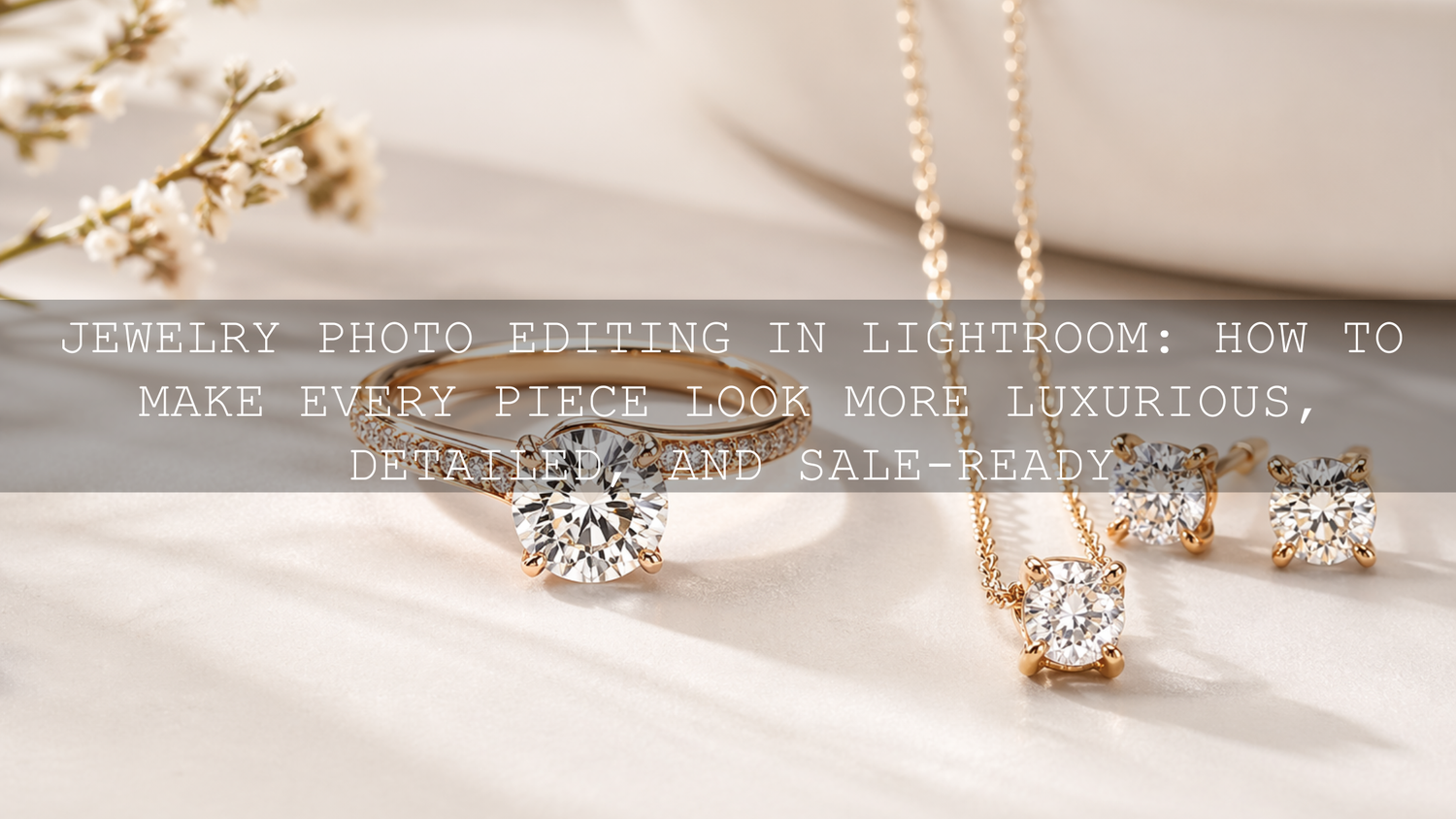
Jewelry Photo Editing in Lightroom: How to Make Every Piece Look More Luxurious, Detailed, and Sale-Ready
Jewelry photo editing is one of the most important parts of selling handmade pieces, engagement rings, necklaces, earrings, and gift jewelry online. In 2026, strong jewelry photography Lightroom presets are not about making metals look fake or pushing sparkle until it looks unrealistic. They are about keeping detail, controlling reflections, protecting gemstone color, and creating a polished finish that helps the product feel premium. If you want a faster editing workflow for close-up product shots, try the Jewelry Product Photography Lightroom Presets and browse the Lightroom Presets for Lightroom Mobile & Desktop collection. It is an easy way to build a cleaner, more consistent store look, and you can use the Buy 3, Get 9 FREE offer as you build your editing toolkit.
Here is why this matters. Jewelry is small, reflective, and full of fine detail. Customers cannot feel the weight of a pendant, inspect a clasp, or tilt a stone under real light when they shop online. They judge quality from your photos. That means your edits need to do two things at once: make the piece look beautiful and make it look believable.
A good jewelry image should feel crisp, bright, elegant, and trustworthy. A bad one usually feels flat, overly yellow, too gray, too sharp, too soft, or full of distracting reflections. The difference often comes down to a few Lightroom decisions done in the right order.
Why Jewelry Photography Is Harder Than It Looks
Jewelry photography pushes your editing workflow harder than many other product categories. A shirt can survive a little softness. A candle can still look appealing with gentle shadow loss. Jewelry usually cannot. When a customer is paying attention to metal finish, stone color, engraving, or tiny craftsmanship details, every editing mistake becomes more obvious.
- Reflections can overwhelm the product. Polished gold, silver, and gemstones catch light from every direction.
- Tiny details matter. Chain texture, stone settings, prongs, edges, and engraved surfaces help communicate value.
- Color accuracy matters. Warm gold should look rich, not orange. Silver should look clean, not muddy blue. Gemstones should look vivid but real.
- Sparkle is easy to ruin. Too little highlight control makes jewelry look dull. Too much makes it look blown out and cheap.
- Consistency builds trust. A collection page feels more premium when every image has the same editing logic.
If you also shoot other products for your store, the ideas in this guide to e-commerce and product photography presets are worth reading because the same consistency principles apply across your catalog.
What Lightroom Does Best for Jewelry Images
Lightroom is a strong match for jewelry photo editing because it gives you speed, repeatability, and non-destructive control. That combination matters when you are editing a full collection and need every image to feel like it belongs to the same brand.
For jewelry, Lightroom is especially useful for:
- correcting white balance so metals and stones look natural
- recovering highlight detail on reflective surfaces
- opening shadows without making the image look gray
- adding selective clarity and texture where detail matters
- using masks to brighten or refine only the product, not the whole frame
- copying a clean look across multiple photos for a consistent storefront
Adobe’s own resources are useful here too. If you want to understand selective adjustments better, Adobe’s guide to masking in Lightroom Classic is one of the best references. For better color correction, Adobe also explains white balance and tone controls in Lightroom. And if you want a cleaner sense of warm and cool balance when styling gemstones or metals, the Adobe Color wheel and harmony tools are helpful for training your eye.
The Best Preset Types for Jewelry Photo Editing
Not every preset should be used the same way. Jewelry photos usually fall into three editing situations: clean product shots, macro detail shots, and context shots such as bridal, lifestyle, or wedding images. Each one benefits from a slightly different starting point.
1. Clean product presets for polished storefront images
If your goal is a professional catalog look with balanced metal tones and controlled sparkle, the Jewelry Product Photography Lightroom Presets are the most direct match. They are built for product presentation, which makes them useful when you want a clean, sales-ready result without rebuilding every image manually.

This kind of preset works best when your base photo is already exposed carefully and the background is reasonably controlled. It gives you a polished starting point, but you still want to fine-tune exposure and white balance after applying it.
2. Macro photography presets for close-up detail
For rings, gemstone cuts, chain texture, engraving, and other close-up views, macro-focused presets are often the smarter starting point. The AI-Optimized Macro Photography Lightroom Presets and Lightroom Presets For Macro Photos are especially useful when the selling point is the fine detail itself.

I have tested macro-style presets on close-up product shots where the original file looked technically sharp but still felt lifeless. In most cases, the biggest improvement came from using a detail-friendly preset first, then reducing highlights and correcting white balance before touching saturation. That order usually gives a more expensive-looking result.
3. Wedding and lifestyle presets for jewelry in real moments
If your jewelry is photographed on people, during gifting, or in wedding settings, the AI-Optimized Indian Wedding Lightroom Presets and the 150 + Gorgeous Lightroom Presets for Wedding Photography can be strong choices. They help when you need the jewelry to shine without destroying skin tone, fabric detail, or the overall mood of the image.
That is especially important in bridal content, where you may be balancing gold, gemstones, skin tones, embroidery, and venue lighting all at once. If your work includes more ceremony or bridal content, the Wedding Lightroom Presets for Wedding Photography collection is a useful place to continue browsing.
A Simple Lightroom Workflow for Better Jewelry Photos
Let’s break it down into a workflow that actually works. This is the part that turns presets from a quick effect into a professional tool.
Step 1: Start with the cleanest file possible
Jewelry edits are always easier when the original exposure protects highlight detail. If metal reflections or gemstones are already blown out, Lightroom cannot bring back real texture that is no longer there. Slightly protecting highlights in-camera is usually safer than shooting too bright.
Step 2: Apply the right preset for the shot type
Use a jewelry preset for clean product shots, a macro preset for detail shots, and a wedding-oriented preset for real-life scenes. The preset should match the image goal, not just the product category.
Step 3: Fix white balance before chasing style
This is where many edits go wrong. If your white balance is off, everything after it becomes harder to judge. Warm gold can turn orange. Silver can drift blue. Pearls can lose their creamy tone. Gemstones can look dead.
In my own testing, jewelry images usually improve faster from a white balance correction than from adding more contrast. Get the foundation right first. Then shape the mood.
Step 4: Pull back highlights and refine whites
Jewelry should feel luminous, not clipped. Lower the highlights enough to recover texture on bright reflections, then refine whites carefully so the image still has shine. This is often where the luxury look comes from: controlled brightness instead of harsh brightness.
Step 5: Add detail selectively
Texture and clarity can help reveal stone cuts, prongs, and chain patterns, but too much creates a rough, over-edited look. Apply just enough to make the craftsmanship feel crisp. For even better control, mask the piece and adjust detail only on the jewelry, not the full frame.
Step 6: Clean up background distraction
Backgrounds should support the piece, not compete with it. A softer background, slightly reduced saturation, or a subtle exposure adjustment can help the jewelry stand out more clearly. This is where Lightroom masking becomes extremely helpful for product work.
Step 7: Sharpen last
Sharpening is important, but it should come after tone and color work. Evaluate it carefully, ideally at 1:1 view. Too much sharpening makes polished surfaces look gritty. Adobe’s Lightroom sharpening guide is useful if you want a quick refresher on how much is enough.
Presets vs Manual Editing for Jewelry Photography
This comparison matters because many people think presets are either magic or pointless. The truth is somewhere in the middle.
- Presets are best for speed, consistency, and direction. They help you get to a polished base look quickly.
- Manual editing is best for correction. It solves the unique issues in each file, especially reflections, mixed lighting, or unusual gemstone color.
- The best workflow is hybrid. Start with a strong preset, then fine-tune manually.
That is why the smartest question is not “preset or manual?” It is “which preset gives me the best starting point?” If you want a broader comparison of workflow speed and flexibility, read Lightroom Presets vs Photoshop Actions. And if you want more creative control after your base edit, this guide to stacking presets can help you experiment without losing consistency.
Common Jewelry Editing Mistakes That Make Photos Look Cheap
- Too much saturation. Gemstones should look rich, not radioactive.
- Too much clarity. Fine detail should feel refined, not crunchy.
- Ignoring white balance. Metal color shifts instantly reduce trust.
- Letting highlights blow out. Sparkle is good. Missing detail is not.
- Using the same preset without adjustment. Even a great preset needs image-specific refinement.
- Inconsistent edits across a collection. Customers notice when one ring is warm, the next is cold, and the next is flat.
If you regularly struggle with warm indoor product setups, window light, or mixed lighting, this mixed-lighting guide is especially useful because jewelry often reacts badly to those conditions.
How to Build a More Premium Jewelry Brand Look
The strongest jewelry photography does more than show the item. It builds a visual identity. That means deciding how your store should feel. Clean and minimal. Romantic and warm. Editorial and luxurious. Bright and modern. Once you know that, presets become far more useful because you are using them to repeat a brand look instead of chasing a different style every time.
For many jewelry brands, the winning combination is simple: controlled highlights, elegant contrast, accurate color, and just enough depth to make the piece feel dimensional. That is more powerful than heavy effects.
If you are building a larger preset library for product shots, gifting campaigns, bridal imagery, and social content, the 1000+ Master Lightroom Presets Bundle gives you more range, while the AI-Optimized Lightroom Presets For Mobile and Desktop collection is useful when you want more one-click options across different scenes. And if you need help choosing the right set for your workflow, the contact page is there for support.
Related Reading
- The Best Lightroom Presets for E-commerce & Product Photography
- Mastering Lightroom: How to Stack Presets for Unique and Stunning Results
- Lightroom Presets vs Photoshop Actions: Which Is Better for Editing?
- How to Install Lightroom Presets in a Quick and Easy Way
If you want your jewelry photos to feel sharper, cleaner, and more expensive without spending forever on each file, start with the Jewelry Product Photography Lightroom Presets, add the AI-Optimized Macro Photography Lightroom Presets for close-up detail work, and browse the Lightroom Presets for Lightroom Mobile & Desktop collection for more flexible looks. For bridal and gifting content, the 150 + Gorgeous Lightroom Presets for Wedding Photography is a strong follow-up. Build the toolkit that fits your style, keep your edits consistent, and use the Buy 3, Get 9 FREE offer to expand faster without overcomplicating your workflow.
What is the best Lightroom preset type for jewelry photography?
A jewelry-specific product preset is usually the best starting point for clean storefront images, while macro presets are better for rings, stones, engraving, and other close-up detail shots.
Should jewelry photos look bright or moody?
Most jewelry product photos work best when they look bright, clean, and controlled rather than heavily moody. A little depth is good, but customers still need to clearly see color, texture, and craftsmanship.
Can presets fix reflections in jewelry photos?
Presets can improve the starting look, but reflections usually need manual refinement too. Highlight control, white balance, masking, and small exposure adjustments are what truly help manage reflective surfaces.
Is Lightroom enough for jewelry photo editing?
For many store images, yes. Lightroom handles white balance, tone, detail, masking, and consistency very well. For more advanced retouching or object cleanup, some photographers also use Photoshop, but Lightroom is often enough for the main edit.
How do I keep all my jewelry product photos consistent?
Use one core preset family, correct white balance first, then apply the same editing logic across the full set. Matching exposure, highlight behavior, and background tone does more for consistency than using dramatic effects.
Written by Asanka — creator of AAAPresets (10,000+ customers).
Leave a comment
This site is protected by hCaptcha and the hCaptcha Privacy Policy and Terms of Service apply.