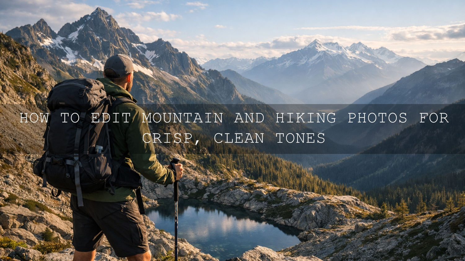
How to Edit Mountain and Hiking Photos for Crisp, Clean Tones
Mountain and hiking photo editing works best when the final image still feels like the place you stood: cold air, textured rock, clean light, natural greens, and distance that feels real instead of overly processed. Good mountain photo editing is not about forcing drama into every frame. It is about shaping tone, controlling highlights, keeping colors believable, and guiding the eye so the scene feels open, crisp, and alive. When that balance is right, your hiking photo editing stops looking flat and starts feeling like the adventure itself.
If you want a faster starting point, try the Cinematic Camping Adventure Lightroom Presets and browse the Professional Lightroom Presets for Landscape Photography collection. That gives you a strong base for cleaner greens, better sky separation, and richer mountain detail across a full set of trail images. It also fits naturally with Buy 3, Get 9 FREE.

The biggest mistake I see in outdoor edits is simple: people chase color before they fix tone. If your highlights are harsh, your shadows are muddy, and your white balance is drifting too blue or too yellow, extra saturation will only make the file feel less natural. Here’s why this matters: mountain photos already have a lot going on. Bright skies, dark forests, reflective water, haze, and layered distance all compete for attention. Your job in editing is to make those elements work together, not fight each other.
On outdoor sets, I usually start by cleaning up exposure and white balance before I touch any creative look. I have found that mountain files often need less “effect” and more control. A small shift in highlights, whites, and local masking can do more for a summit photo than a heavy preset ever will. That is also why learning tools like Adobe’s tone control workflow in Lightroom Classic and Adobe’s guide to masking in Lightroom makes such a big difference when you want clean outdoor results.
What Crisp, Clean Tones Actually Mean in Mountain Photography
Crisp and clean does not mean sterile. It means the photo feels polished without losing the atmosphere that made you raise the camera in the first place. In mountain and hiking images, that usually comes down to five things.
- Clear detail: Rock texture, trail lines, tree edges, snow, and clothing details should feel defined without crunchy oversharpening.
- Balanced contrast: The image needs depth, but not at the cost of crushed shadows or blown skies.
- Natural color: Greens, blues, browns, and skin tones should feel believable, not neon.
- Air and separation: Distant ridges should feel layered rather than muddy, especially in hazy conditions.
- Controlled mood: You can make the scene cinematic or earthy, but it should still feel grounded in the real landscape.
If you enjoy moodier outdoor work, the Dark & Moody Travel Lightroom Presets can be a strong option for cloudy trails, forest paths, or deep valley light where you want more drama without losing the story in the shadows.

A Simple Step-by-Step Workflow for Mountain and Hiking Photo Editing
Let’s break it down into a workflow you can repeat after every hike, travel day, or mountain shoot.
- Pick the strongest frame first. Before editing, choose the image with the best gesture, strongest light, or clearest trail story. Editing cannot rescue a weak composition as easily as many people think.
- Set white balance before mood. Mountain scenes often lean too blue because of shade, altitude, snow, or overcast light. Warm it slightly until rock, skin, and trail dirt feel believable again.
- Pull back harsh highlights. Bright clouds and reflective stone lose detail quickly. Lower highlights first, then tune whites carefully so the sky still feels bright.
- Open shadows with restraint. Lift dark areas enough to reveal texture in trees, jackets, backpacks, and rock faces, but keep some depth. Flat shadows kill mountain atmosphere.
- Add midtone definition. A small clarity or texture adjustment can make trails, ridges, and foliage feel sharper. Use restraint so the file still looks premium, not gritty.
- Use masking for separation. Darken the sky a touch, brighten the subject slightly, or add selective contrast to the mountains. This is where the image starts to feel intentional instead of global and generic.
- Finish with color control. Reduce overbearing greens, tame cyan skies if needed, and make sure earth tones still look earthy. For harmony, I often use Adobe Color’s color wheel and harmony tools as a quick reminder of how warm and cool tones can balance each other naturally.
Pro tip: If your mountain image feels messy, do not add more saturation. Lower highlights, refine white balance, and use one local mask on the main subject area first. That usually fixes more than people expect.
Where Presets Help and Where Manual Editing Still Wins
Presets vs manual editing is not really an either-or decision. The best results usually come from both.
- Presets are best for speed and consistency. They help you establish a repeatable look across sunrise hikes, forest trails, and mountain portraits without rebuilding every edit from zero.
- Manual adjustments are best for accuracy. Every outdoor file has different light, altitude haze, cloud cover, and color temperature. Even a great preset needs small corrections.
- The smartest workflow is preset first, refinement second. Apply a strong base look, then tune exposure, white balance, masking, and color by hand.
I tested this approach on mixed outdoor sets where one gallery included open ridgelines, shaded pine forests, and rocky summit portraits. The preset gave me speed. Manual tweaks gave me realism. That combination is what made the gallery feel cohesive instead of copy-pasted.
Best Preset Directions for Different Mountain and Trail Scenes
For bright alpine views and open landscapes
Choose a look that keeps the air feeling clean and the distance readable. The Landscape Cinematic Lightroom Presets Pack is a strong fit when you want more depth, cleaner skies, and a polished landscape finish without losing the natural feel of the terrain.
For earthy trails, forests, and camping stories
When the scene is about texture, warmth, and the feeling of being in the outdoors, the Earth Tone Outdoor Lightroom Presets are especially useful. They work well for hiking boots on dirt trails, tents, wood textures, campfire moments, and late-afternoon forest light.
For lush green nature and mountain forests
If your photos lean heavily into trees, moss, or deep green valleys, the AI-Optimized Nature Forest Lightroom Presets can help keep greens rich while still feeling believable. This matters more than most people realize because green is one of the easiest colors to over-edit.
For moody weather and cinematic travel frames
Fog, cloud cover, and dramatic weather can look incredible in the mountains, but only if you preserve shape and separation. If that is your style, you may also like reading this guide to editing fog and mist in landscapes and this breakdown of warm vs cool tones to decide whether your scene needs clarity, warmth, or atmosphere.
How to Keep Hiking Photos Natural While Still Looking Professional
The most professional outdoor edits usually feel effortless. That comes from restraint. Here are the habits that make the biggest difference.
- Do not oversharpen the whole frame. Skies and haze should stay soft. Save the crispness for edges, texture, and subject detail.
- Let the weather stay in the image. Fog, mist, and low cloud are not problems to erase. They are often the reason the frame works.
- Protect skin tones in hiking portraits. Outdoor color shifts can make faces too magenta, too orange, or too cold. Always check skin separately from the landscape.
- Keep blues and greens under control. In mountain scenes, these channels can dominate fast. Lowering saturation a little often looks more premium than increasing it.
- Use contrast to guide attention, not just add punch. The viewer should know where to look first, whether that is the trail, the person, or the mountain peak.
If you are editing on the go after a hike or trip, browsing the Lightroom Mobile Presets collection can make the workflow much easier, especially when you want quick consistency from your phone before doing a final pass later.
Common Editing Mistakes That Make Mountain Photos Look Cheap
- Too much dehaze: This often makes distance look dirty and unnatural instead of crisp.
- Overdone HDR-style shadows: Lifting every dark area removes depth and makes the file feel flat.
- Electric greens and teal skies: These can make beautiful locations look artificial fast.
- Global edits only: Outdoor images almost always improve with at least one or two local masks.
- Ignoring composition in post: Crop, level, and edge cleanup matter just as much as color.
For a broader preset workflow, you can also explore top Lightroom presets for travel photography and, if you also shoot motion on the trail, this adventure LUTs guide for action footage.
Related Reading
- Warm vs cool tones for storytelling and color direction
- How to edit fog and mist in landscapes without losing depth
- Best Lightroom presets for travel photography workflows
- Five preset styles that speed up travel and outdoor editing
Bring Your Mountain Photos Closer to What the Adventure Felt Like
The best mountain and hiking photo editing does not try to impress with heavy effects. It makes the image feel more true, more dimensional, and more alive. Start with tone. Refine white balance. Use masking with purpose. Then add style in a way that supports the landscape instead of overpowering it.
If you want a faster editing base, start with the Cinematic Camping Adventure Lightroom Presets, explore the Landscape Cinematic Lightroom Presets Pack, and browse the landscape presets collection for more trail-ready looks. And if you need setup help before you begin, the FAQ and help page is a useful place to start. Buy 3, Get 9 FREE makes it easier to build a full outdoor editing toolkit without overthinking every scene from scratch.
FAQ
What is the best way to edit mountain photos without making them look fake?
Start with exposure, white balance, highlights, and shadows before you add any strong creative look. Natural contrast and controlled color usually matter more than extra saturation.
Are presets good for hiking photos?
Yes. Presets are great for speed and consistency, especially across a full hiking gallery. The best results usually come from applying a preset first and then refining the image manually.
Why do my mountain photos look flat after editing?
Flat outdoor edits often come from lifting shadows too much, leaving white balance unresolved, or avoiding local masking. A small amount of selective contrast usually helps more than global saturation.
Should I use warm or cool tones for mountain photography?
It depends on the scene. Warm tones work well for sunrise, sunset, and earthy trail stories. Cool tones often suit alpine air, snow, lakes, and misty distance. The key is keeping the color choice believable.
Can I edit hiking photos on Lightroom Mobile?
Yes. Lightroom Mobile works well for hiking and travel editing, especially if you want quick consistency in the field. A final desktop pass can still help for masking and detailed refinements.
Written by Asanka — creator of AAAPresets (10,000+ customers).
Leave a comment
This site is protected by hCaptcha and the hCaptcha Privacy Policy and Terms of Service apply.