
How to Edit Real Estate Photos for Bright and Airy Interiors
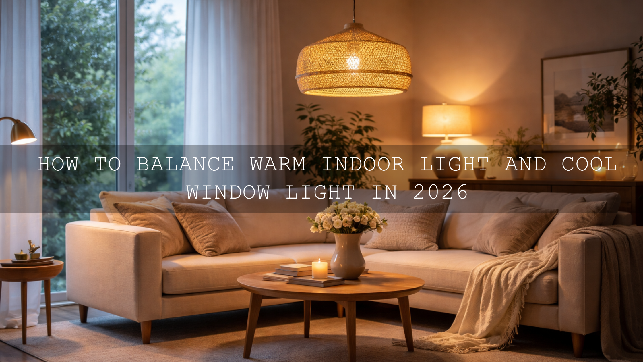
Real estate photo editing is not about making every room look unreal. It is about helping a space feel open, clean, and easy to imagine living in. When you edit for bright and airy interiors, the goal is simple: keep whites clean, protect window detail, fix mixed lighting, and create a natural sense of space. In interior real estate photography, that balance matters more than heavy effects. Buyers notice when a room feels fresh and believable, and they also notice when an edit feels too cold, too orange, or overexposed.
If you want a faster starting point, try the AI-Optimized Interior Design & Real Estate Lightroom Presets and browse the AI-Optimized Lightroom Presets For Mobile and Desktop collection. They give you a strong base for bright interior edits, and they fit naturally with the offer: Buy 3, Get 9 FREE.
Why the Bright and Airy Look Works So Well in Real Estate
A bright interior feels bigger. It feels cleaner. It feels calmer. That is why this editing style continues to work so well for listings, rentals, and interior portfolios. When a buyer scrolls through dozens of properties, darker or muddy photos make a room feel smaller than it really is. Clean light, balanced color, and soft contrast help viewers focus on layout, finishes, and atmosphere instead of editing mistakes.
This does not mean every room should be pushed toward pure white. A warm wood kitchen, a moody lounge, or a luxury apartment with deeper tones still needs its own personality. The trick is to preserve character while removing the problems that make interiors look dull: yellow casts, gray shadows, blown windows, leaning walls, and color contamination from floors or paint.
I have tested this kind of workflow on small apartments, brighter staged homes, and rooms with difficult tungsten lighting, and the same pattern keeps coming up: the best results happen when I correct light and color first, then add style carefully. That is what keeps a listing polished without making it fake.
The Most Common Problems in Interior Real Estate Photography
- Mixed color temperatures: Window light can look blue while lamps push orange or yellow into walls and ceilings.
- Window highlights that clip too fast: Bright exteriors often lose detail long before the room itself looks properly exposed.
- Heavy shadows in corners: Dark furniture, hallways, and ceiling edges can make a room feel cramped.
- Perspective distortion: Wide-angle interiors often show leaning verticals and stretched furniture.
- Color casts from materials: Wood floors, green gardens outside, and painted walls can reflect color into neutral surfaces.
- Flat contrast: Lifting exposure alone can make an image brighter but lifeless.
Once you know which problem you are solving, editing becomes much faster. You stop dragging sliders randomly and start building a repeatable system.
A Step-by-Step Workflow for Bright, Clean Interior Edits
- Start with profile and lens corrections. Before styling the image, clean up the file. If the lens profile is available, enable it. Adobe also explains perspective and lens cleanup in its guide to correcting lens distortions in Camera Raw. This gives you a cleaner foundation before you shape tone and color.
- Fix perspective early. Interiors usually need straight verticals. Use Upright or Guided Upright before you judge the final composition. Adobe’s Upright perspective correction guide for Lightroom Classic is especially useful for architecture and rooms with strong lines.
- Set white balance before chasing brightness. If the room is too yellow, many people raise exposure and make the problem look worse. Neutralize the file first. Focus on walls, ceilings, and cabinetry. If they look right, the rest of the room usually gets much closer.
- Open the room without killing depth. Raise exposure carefully, then use highlights and whites to protect windows and bright trim. Lift shadows only enough to reveal detail. If shadows go too high, the room loses shape.
- Use local masking instead of global fixes. This is where professional-looking interior edits usually separate from average ones. Adobe’s Lightroom Classic masking tool guide and Lightroom masking guide show how to target specific areas. In practice, that means you can darken a blown window slightly, lift a dark corner, or refine only the ceiling without affecting the whole image.
- Clean up individual colors. If wood is pushing too orange or greenery outside is tinting the room, use the HSL or Color Mixer panel. Subtle adjustments usually work better than dramatic ones. The best interior edits feel controlled, not obvious.
- Add clarity selectively. Architecture benefits from definition, but too much global clarity can make interiors harsh. I usually keep overall texture moderate and let important lines like cabinetry, tile, and trim carry the detail.
Pro tip: If a room still feels flat after exposure and shadow work, do not rush to raise contrast globally. First check perspective, then local masks, then color balance. Many “flat” interiors are really just crooked, color-shifted, or unevenly lit.
How to Keep Bright Interiors Natural Instead of Washed Out
This is where many edits go wrong. A bright edit is not the same thing as a pale edit. You still need believable wood tones, texture in sofas and curtains, separation between white walls and white trim, and enough tonal depth to guide the eye around the room.
A practical way to think about it is this:
- Brightness makes the room feel open.
- Neutral color makes the room feel clean.
- Controlled contrast makes the room feel dimensional.
I often test an interior edit by asking one simple question: does this still feel like a real home under good light, or does it feel like a preset sitting on top of a file? If it feels too polished too early, I pull back. Real estate buyers respond better to believable clarity than to aggressive style.
When I want help refining the palette, I also like checking broad harmony ideas with the Adobe Color wheel. You do not need a dramatic palette for interiors, but understanding how warm woods, cool daylight, and neutral finishes interact makes it easier to keep the final image cohesive.
Presets vs Manual Editing for Real Estate Interiors
Presets vs manual editing is not really an either-or decision in real estate work. The smartest workflow uses both.
Presets are best for speed, consistency, and getting close to your preferred look fast. They help you move through large galleries, keep different rooms feeling related, and avoid repeating the same technical setup from scratch on every file.
manual editing is what makes the preset fit the actual room. Every property has different light sources, wall colors, window intensity, and lens distortion. That is why a one-click result is rarely the final result.
For most photographers, the fastest system is this: apply a strong preset base, correct perspective, fix white balance, then use masks for room-specific problems. That gives you the speed of presets and the accuracy of manual work.
Best Presets for Bright and Airy Interior Photography
If your main goal is bright, clean, professional listing photos, the best starting point here is the AI-Optimized Interior Design & Real Estate Lightroom Presets. They are built for indoor lighting, cleaner whites, better architectural clarity, and more balanced tonal control in rooms that would otherwise feel dim or uneven.

If the room already has strong daylight and you want a softer, cleaner finish, the Bright and Airy Lightroom Presets work especially well. They are useful when you want the space to feel polished but still gentle, with soft highlights and an elegant overall look.
For more minimal interiors, clean rentals, modern kitchens, or styled spaces with lots of neutral surfaces, the Bright and Airy minimalist Lightroom Presets are a strong fit. They keep the frame light and uncluttered, which is ideal when the architecture itself needs to stay the focus.

If you want a warmer, more welcoming atmosphere without going muddy, the Bright & Airy Brown Lightroom Presets can work beautifully in homes with wood, stone, and softer earth-toned decor. They are especially helpful when a room needs warmth but not the heavy orange cast that often comes from artificial lighting.
And if you want a flexible backup for other spaces, workflows, and mixed shoots, the Lightroom Presets for Lightroom Mobile & Desktop collection gives you more room to experiment across different property styles.
Real Estate Videos Need the Same Consistency
Photos usually get the first click, but video often closes the gap between interest and emotion. A walkthrough that feels bright, steady, and clean helps buyers imagine movement through the home. If your stills are polished but your video feels flat, the overall presentation loses consistency.
That is where the Real Estate LUTs Pack becomes useful. It helps keep interior and exterior footage cleaner, brighter, and more unified across clips. For broader browsing, you can also explore the Cinematic LUTs Pack For Premiere Pro, DaVinci & Final Cut Pro and More collection.
I have seen this make a big difference on simple property walkthroughs. Even when the camera movement is basic, consistent color and cleaner interior brightness instantly make the tour feel more premium. That matters because buyers do not separate “shooting” from “editing” in their minds. They only register whether the property feels desirable.
A Simple Before-and-After Editing Mindset
Imagine a living room shot with one bright window, warm lamps, and slightly dark corners. Straight out of camera, it may feel yellow, uneven, and smaller than the real room. Instead of trying to fix everything globally, break it into layers:
- Straighten the verticals.
- Neutralize the wall color.
- Recover the window slightly.
- Lift the corner shadows carefully.
- Restore clean contrast so the room still has shape.
That is the whole game. Real estate photo editing gets easier when you stop asking, “Which preset makes this look expensive?” and start asking, “Which corrections make this feel true, open, and inviting?” The best bright and airy interiors usually come from restraint, not excess.
If you want to build that workflow faster, start with the AI-Optimized Interior Design & Real Estate Lightroom Presets, add the Real Estate LUTs Pack for walkthroughs, and keep the AI-Optimized Lightroom Presets For Mobile and Desktop collection nearby for more room styles. Buy 3, Get 9 FREE makes it easier to build a practical toolkit without overcomplicating your editing setup.
Related Reading
- Presets for Real Estate Photography: Bright, Clean & Professional
- Real Estate & Architecture: How Color Grading Shapes Perception
- Mastering Lightroom: How to Stack Presets for Unique and Stunning Results
- The Best Lightroom Presets for E-commerce & Product Photography
- Mastering the Art of Brand Identity: How to Match LUTs for Unwavering Consistency in Your Edits
Helpful Setup and Support
If you need help getting started after download, you can check the FAQ page or reach out through the contact page.
FAQ
What is the best way to brighten interior real estate photos without blowing out windows?
Start by correcting white balance and perspective first, then raise exposure moderately and recover highlights. After that, use local masks on windows and dark corners instead of relying only on global sliders.
Are Lightroom presets enough for professional real estate photo editing?
Presets are an excellent starting point for consistency and speed, but the final professional result usually comes from manual adjustments like masking, white balance cleanup, and perspective correction.
Which preset style works best for modern interiors?
For modern interiors, bright and airy or minimalist preset styles usually work best because they keep whites clean, preserve negative space, and let architectural lines stay clear.
Should real estate videos be color graded too?
Yes. A clean grade helps video walkthroughs feel more polished and consistent with your listing photos. Even a subtle LUT can improve brightness, color balance, and overall presentation.
Can I use these presets in Lightroom Mobile and Desktop?
Yes. Many AAAPresets packs are designed for Lightroom Mobile and Desktop, which makes it easier to keep your editing style consistent across devices and workflows.
Written by Asanka — creator of AAAPresets (10,000+ customers).
Leave a comment
This site is protected by hCaptcha and the hCaptcha Privacy Policy and Terms of Service apply.