
How to Edit Hotel and Airbnb Photos for a Luxury Look
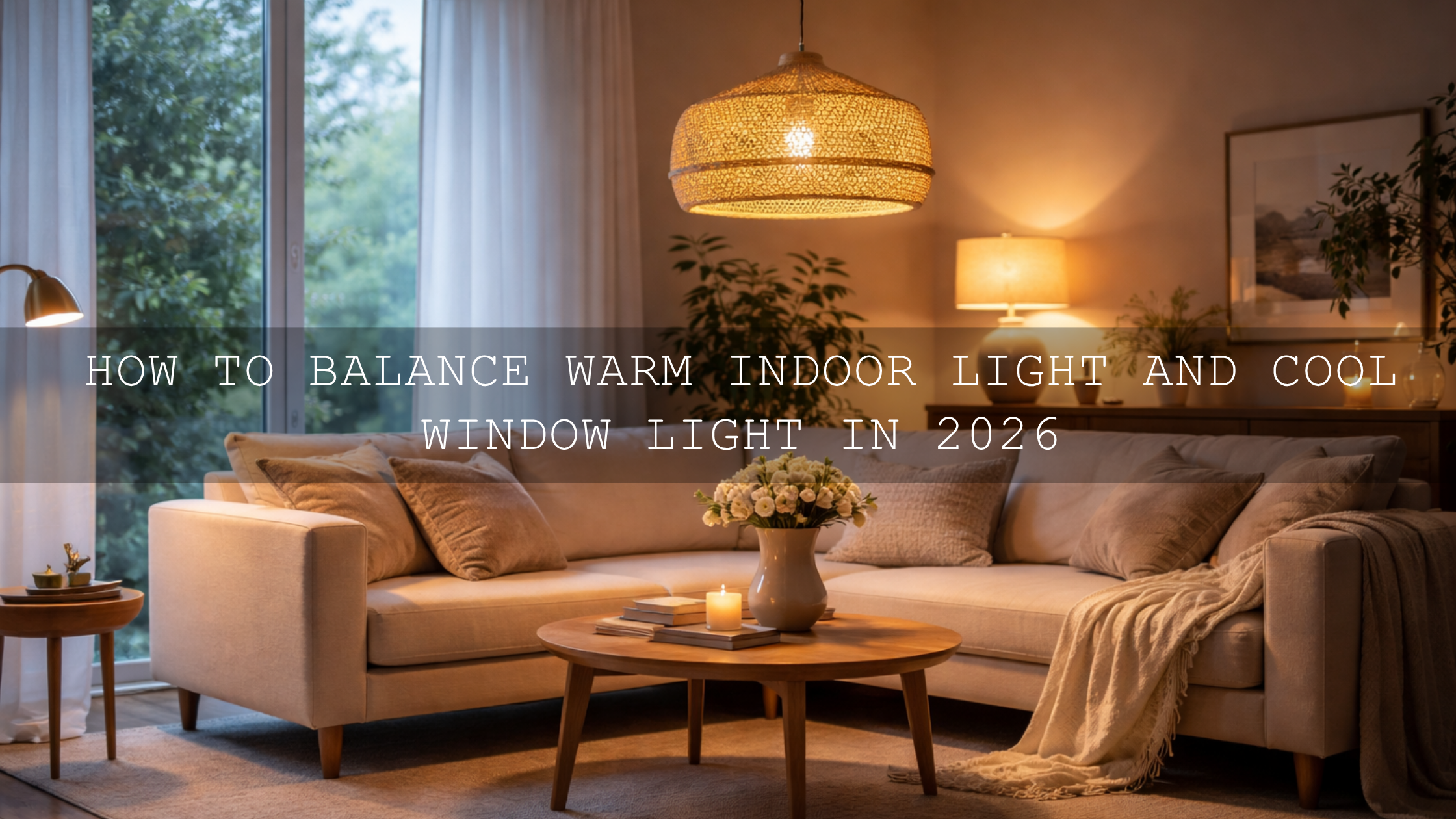
If you want to edit hotel and Airbnb photos for a luxury look, the goal is not to make every room dark, orange, or overly dramatic. The goal is to make the space feel premium, calm, clean, and worth booking. Luxury property photo editing usually comes down to five things: controlled highlights, believable white balance, rich contrast, clean color separation, and consistency from one image to the next. When those elements work together, even a simple room can feel high-end.
If you want a faster starting point, try the AI-Optimized Interior Design & Real Estate Lightroom Presets and browse the Lightroom Presets for Lightroom Mobile & Desktop collection so you can keep a polished look across bedrooms, bathrooms, lobbies, balconies, and lifestyle detail shots. That is one of the easiest ways to speed up your workflow while staying consistent, and it fits naturally with the offer: Buy 3, Get 9 FREE.
What Makes a Property Photo Feel Luxurious
Here’s why this matters: guests do not just book a room. They book a feeling. A luxury image suggests comfort, taste, quiet, softness, and confidence. That usually means you want to avoid edits that feel cheap, harsh, or messy.
- Clean whites: Bedsheets, curtains, towels, and walls should look fresh, not blue, yellow, or gray.
- Controlled windows: A bright window can still look natural without turning into a blank white block.
- Rich but believable contrast: Luxury images often have depth, but they do not crush every shadow.
- Intentional color: Warm wood, brass, marble, linen, and ambient lighting should feel coordinated.
- Consistency across the gallery: The full listing should look like one brand experience, not a random set of edits.
I have tested this type of workflow on boutique-style interiors and hospitality-inspired room edits, and the strongest results always came from restraint. The images that felt most expensive were not the ones with the heaviest preset. They were the ones where the whites stayed clean, the shadows stayed controlled, and the mood felt intentional.
Start with a Clean Base, Then Add the Luxury Mood
One of the biggest mistakes in hospitality editing is starting with a heavy creative preset before the file is balanced. For hotel and Airbnb photography, a cleaner real-estate-friendly base usually works better first. The AI-Optimized Interior Design & Real Estate Lightroom Presets are a smart match when you need bright, polished interiors with believable color and stronger architectural clarity. For walkthrough clips and property reels, the Real Estate LUTs Pack gives you a matching video direction so your stills and motion content feel part of the same brand.
Once your exposure and color are under control, you can decide which kind of luxury mood fits the property best. A city penthouse, cocktail lounge, or boutique suite may benefit from deeper blacks and moodier contrast. A beachfront villa, resort balcony, or golden-hour bedroom scene may look better with warmth, glow, and softer highlight roll-off.
Dark and Moody vs Warm and Inviting
Luxury does not always mean the same color treatment. In practice, most hotel and Airbnb edits fall into one of two directions.
Dark and moody luxury
If the space has black finishes, modern furniture, dramatic architecture, premium textures, or nightlife energy, a darker treatment can work beautifully. The Luxury Black Lightroom Presets are a strong fit for this style because they are built around deep tones, premium contrast, and a modern high-end mood. For creators who want something even broader, the Lightroom Presets for Moody Photography collection is useful for browsing related looks.

This direction works best when you still protect texture. Black leather seating, dark wood, stone, velvet, brushed metal, and architectural lines should stay visible. If the preset makes a corner go dead or wipes out detail in fabric, lift shadows a little and ease off the blacks.
Warm and inviting luxury
If the property sells comfort, sunlight, romance, or a premium lifestyle experience, warmer edits usually convert better. The AI-Optimized Luxury Golden Tones Lightroom Presets are ideal for golden-hour suites, hospitality lifestyle shots, breakfast setups, spa interiors, and warm wooden spaces. They push the image toward glow and softness without making it feel cheap.

Warm luxury edits work especially well when you let the room breathe. Keep whites slightly warm, not yellow. Let skin tones stay natural in any guest or lifestyle shots. Let the sunlight feel soft, not orange. That balance is what separates premium warmth from a basic social-media filter.
Presets vs Manual Editing for Hospitality Photos
Let’s break it down. This is not really a battle of presets vs manual editing. The best results usually come from both.
- Presets are best for: speed, consistency, and getting a strong visual direction quickly.
- Manual editing is best for: fixing room-specific problems like mixed lighting, blown windows, bad wall color, or uneven corners.
- The best workflow: correct the file, apply the preset, then refine locally.
That is why a property editor who understands both will almost always outperform someone who only drops a preset and exports. Presets save time. Manual adjustments make the result believable.
A Step-by-Step Luxury Editing Workflow in Lightroom
1. Start with RAW whenever possible
RAW files give you far more flexibility for recovering window detail, adjusting white balance, and shaping contrast than JPEGs. That extra latitude matters a lot in hospitality photography because interiors often contain bright windows, white bedding, dark furniture, and mixed light in the same frame. Adobe’s RAW vs JPEG guide is a solid reference here.
2. Fix white balance before you chase style
Luxury edits fall apart fast when walls turn green, sheets go blue, or warm bulbs make the whole room orange. Start by correcting the color cast first. Adobe recommends using the Temp slider to cool or warm the photo and the Tint slider to offset green or magenta shifts, which is exactly what you need in mixed indoor light.
If you often struggle with warm lamp light and cool window light in the same frame, these reads can help: mixed indoor and window-light preset fixes, simple indoor lighting fixes, and how to adapt presets to changing lighting.
3. Balance the overall exposure
Before adding mood, get the exposure into a clean working range. Bring highlights down until window frames, curtains, or exterior shapes start returning. Raise shadows only enough to reveal texture in dark furniture and corners. Then adjust whites and blacks so the image keeps depth without feeling muddy.
4. Apply your preset and lower the strength if needed
Now apply the look that matches the property. Use a clean interior preset first if the room needs polish, then move into a darker or warmer luxury direction depending on the space. If the preset pushes too hard, back it off with gentler exposure, contrast, or color adjustments. A luxury edit should feel tailored, not stamped.
5. Use masking to refine windows, beds, and feature areas
This is where most “good” edits become premium. Adobe’s masking tools let you make local tonal and color corrections instead of forcing one global adjustment across the whole frame. In property photos, that means you can hold back the window, brighten the bed slightly, refine the floor, or guide the eye toward the hero area of the room.
My favorite practical masks for hotel and Airbnb photos are simple:
- Window mask: reduce highlights and whites slightly so the window feels controlled.
- Bed or seating mask: add a touch of exposure and texture so fabrics look premium.
- Ambient lamp area: protect warmth locally without making the whole room yellow.
- Architecture mask: lightly refine contrast on walls, trims, and furniture edges.
6. Keep the color palette tight
Luxury images usually feel more expensive when the palette is disciplined. Adobe Color’s harmony tools are helpful if you want to think in terms of palette direction before grading. In practice, this means letting warm woods, cream linens, muted greens, brass fixtures, and neutral walls support one another instead of fighting for attention.
7. Sync carefully across the full listing
Once one hero image looks right, sync that direction across the rest of the gallery. Then check each frame one by one. A bathroom may need cooler whites. A bedroom may need softer highlights. A balcony scene may need less warmth. Consistency matters, but copy-paste editing without review is where luxury listings start to look careless.
Common Mistakes That Kill the Luxury Look
- Overexposed windows: They instantly make the edit feel cheap and rushed.
- Too much orange: Warmth should feel elegant, not heavy.
- Crushed blacks: Deep contrast is good, but dead corners hide detail and reduce trust.
- Cold whites everywhere: Pure blue-white rooms often feel sterile instead of premium.
- Different moods in every room: The listing should feel like one experience.
- Over-sharpening: Luxury needs crisp detail, not crunchy edges.
When Black and White Can Add a Premium Editorial Feel
Black and white is not the best choice for every property gallery, but it can be powerful for selective storytelling. Use it for a staircase detail, a moody lobby, a textured bathroom, a hallway symmetry shot, or a close crop of stone, linen, wood, or glass. In those cases, removing color can increase focus on shape, material, and light.

Just be selective. For most listings, color still sells the experience better. Black and white works best as a supporting editorial image, not the main selling frame.
Build a Stronger Hospitality Editing System
If you want your hotel and Airbnb photos to feel brighter, more polished, and more premium without rebuilding every edit from scratch, start with the AI-Optimized Interior Design & Real Estate Lightroom Presets, then use the Luxury Black Lightroom Presets or AI-Optimized Luxury Golden Tones Lightroom Presets when the property needs a stronger boutique or warm-luxury identity. For video tours, walkthroughs, and reels, the Real Estate LUTs Pack helps keep your motion content aligned with the same visual language. You can keep exploring styles in Lightroom Presets for Moody Photography and Lightroom Presets for Lightroom Mobile & Desktop. If you need help choosing the right pack for your workflow, you can also reach out through the AAAPresets contact page.
Related Reading
- Presets for real estate photography with a bright, clean, professional finish
- How to handle tricky mixed indoor and window lighting
- Simple indoor lighting fixes when presets look wrong
- How to adapt Lightroom Mobile presets to changing light
- How color grading shapes the perception of real estate and architecture
What is the best editing style for hotel and Airbnb photos?
The best style depends on the property, but most high-performing hospitality edits combine clean whites, controlled highlights, rich contrast, and believable color. The look should feel polished and premium without appearing fake.
Should hotel and Airbnb photos be bright or moody?
Both can work. Bright edits usually suit airy rentals, villas, and family-friendly spaces. Moody edits work better for boutique hotels, luxury apartments, bars, lounges, and modern interiors with darker finishes.
Are presets enough for luxury property editing?
Presets are a strong starting point, but the best luxury results usually come from combining presets with manual corrections for exposure, white balance, and masking.
How do I keep window detail in interior photos?
Start with a balanced exposure, lower highlights and whites, and use a local mask on the window area. Shooting RAW gives you more flexibility when recovering bright areas.
Can I match my hotel photos and video tours?
Yes. The easiest way is to use a consistent color direction for both stills and motion, such as pairing Lightroom presets for photos with LUTs for walkthrough videos and reels.
Written by Asanka — creator of AAAPresets (10,000+ customers).
Leave a comment
This site is protected by hCaptcha and the hCaptcha Privacy Policy and Terms of Service apply.