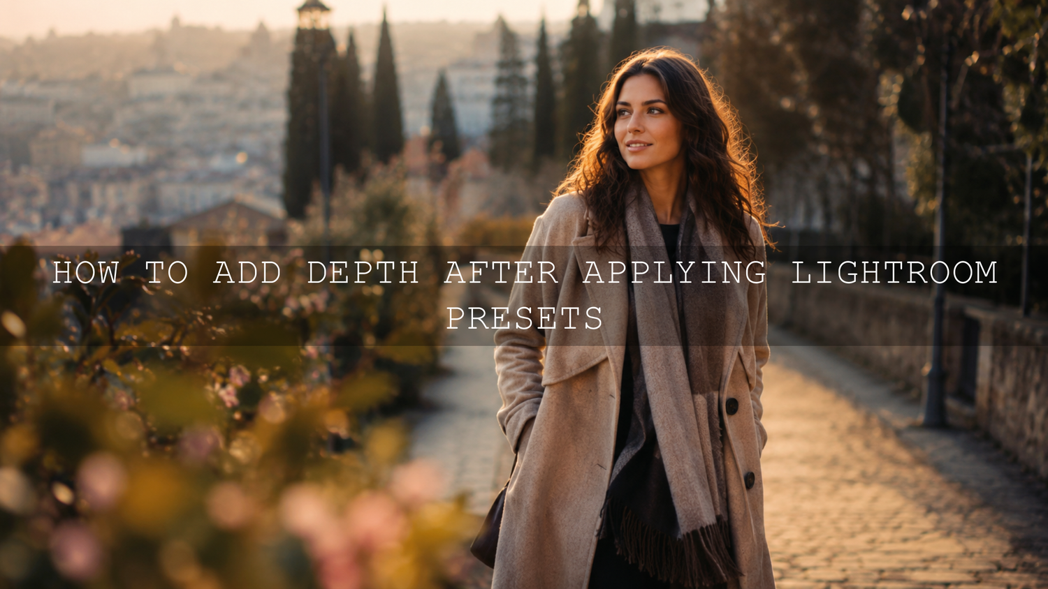
How to Add Depth After Applying Lightroom Presets
Learning how to add depth after applying Lightroom presets is one of the easiest ways to turn a good edit into a stronger, more professional-looking photo. A preset gives you the color style, contrast direction, and mood, but depth comes from the careful final adjustments: light, shadow, tone curve, masking, color balance, sharpening, and small local refinements.
Here’s why this matters. A preset can make a photo look better in one click, but every image starts with different light, exposure, subject distance, background detail, and color. If you stop right after applying the preset, the edit can sometimes feel flat. When you refine the image after the preset, you create separation between the subject, foreground, midground, and background. That is what makes the photo feel more alive.
For a faster starting point, explore the 1000+ Master Lightroom Presets Bundle and browse more flexible looks in the Lightroom Presets for Mobile and Desktop collection. Try these presets today, Buy 3, Get 9 FREE, then use the workflow below to shape the final depth and dimension.
Why Presets Can Look Flat After One Click
Lightroom presets are saved editing settings. They can adjust exposure, contrast, shadows, highlights, tone curve, HSL, color grading, sharpening, grain, vignetting, and more. Adobe also explains that presets apply predefined adjustments to a photo, which makes them useful for speed and consistency. You can learn more from Adobe’s guide to editing with presets in Lightroom.
The limitation is simple: a preset does not know the full story of your image. A wedding portrait taken in soft window light, a drone landscape shot at noon, and a street photo taken at night all need different final corrections. The same preset may look beautiful on one image and too dark, too bright, too warm, or too low-contrast on another.
I usually treat a preset as the first creative layer, not the final edit. When I test AAAPresets styles on portraits, landscapes, wedding scenes, travel photos, and low-light street shots, the strongest results almost always come after small manual refinements.
For more help with this problem, read why Lightroom presets look different on every photo and how to fix flat presets with depth and pop.
What Visual Depth Means in Lightroom Editing
Visual depth is the feeling that a flat photo has space inside it. The viewer can sense what is close, what is in the middle, and what is far away. Strong depth makes the subject stand out without making the whole image look over-edited.
Depth usually comes from a mix of these elements:
- Light and shadow: brighter areas move forward, while deeper shadows can create shape and separation.
- Contrast: controlled contrast helps define edges, textures, and subject form.
- Color temperature: warm tones often feel closer, while cooler tones can feel farther away.
- Sharpness: a sharper subject and softer background can create a natural layered look.
- Local adjustments: masks, gradients, and brushes help you edit one area without damaging the entire photo.
Presets vs Manual Editing: Which Creates Better Depth?
Presets and manual editing should not compete with each other. They work best together.
- Presets are best for speed and style: They help you create a consistent color direction quickly.
- Manual editing is best for accuracy: It helps you correct exposure, subject brightness, skin tones, background distractions, and final depth.
- The best workflow uses both: Apply the preset first, then use manual adjustments to make the image fit the actual scene.
Think of the preset as the creative foundation. The manual adjustments are the tailoring. A preset gives the photo a mood, but your final edits make it feel custom, balanced, and professional.
Step-by-Step Workflow to Add Depth After Applying Lightroom Presets
1. Start With Exposure Before Pushing Contrast
After applying a preset, look at the exposure before touching any dramatic sliders. If the photo is slightly too dark, the depth may feel heavy and muddy. If it is too bright, the image may lose shape and look washed out.
Start with small changes:
- Raise or lower Exposure until the subject feels naturally visible.
- Pull Highlights down if bright areas are distracting.
- Open Shadows carefully if important details are crushed.
- Adjust Whites and Blacks to create a clean tonal range.
Here’s why this matters. If your base exposure is wrong, every other depth adjustment becomes harder. Before adding drama, make sure the photo has a clean foundation. If your preset makes the image too dark, this guide on recovering detail from dark Lightroom presets will help.
2. Use the Tone Curve for Shape, Not Just Contrast
The tone curve is one of the most powerful tools for adding depth after applying Lightroom presets. It lets you control shadows, midtones, highlights, and overall contrast with more precision than the basic Contrast slider. Adobe’s official Camera Raw guide explains how color and tonal adjustments help refine the look of an image, including curve-based tonal control in raw editing workflows through Adobe’s Camera Raw color and tonal adjustment guide.
A simple depth-focused curve often looks like this:
- Lift the midtones slightly if the subject looks dull.
- Deepen the lower shadows a little to create shape.
- Keep highlights controlled so the image does not feel harsh.
- Avoid extreme curves that crush skin, skies, or background detail.
For portraits, I often keep skin tones soft while adding contrast around clothing, hair, or background edges. For landscapes, I may deepen the foreground shadows slightly and brighten the midground to guide the viewer’s eye into the scene.
3. Add Local Contrast With Texture and Clarity
Texture and Clarity can make an image feel more three-dimensional, but they should be used carefully. Too much Clarity can make skin rough, clouds harsh, and shadows crunchy. Too much Texture can make the image feel over-processed.
Use these sliders with intention:
- Texture: Best for small detail like fabric, rocks, leaves, hair, and product surfaces.
- Clarity: Best for midtone contrast and stronger shape.
- Dehaze: Useful for landscapes and foggy scenes, but easy to overuse.
Pro tip: add Texture or Clarity to the subject, not always the entire image. This helps the subject move forward while the background stays softer and less distracting.
4. Use Lightroom Masking to Separate Subject and Background
Masking is where a flat preset edit can become a professional-looking image. Instead of changing the whole photo, masks let you brighten the subject, darken the background, soften distractions, or add depth to only one part of the frame. Adobe’s official guide to masking for local adjustments in Lightroom explains how tools like Select Subject, Select Sky, Select Background, and object masks can help with targeted edits.
Try this simple subject-depth mask:
- Create a subject mask.
- Increase Exposure slightly if the subject is too dull.
- Add a small amount of Texture or Clarity.
- Warm the subject slightly if the background is cooler.
- Keep the changes subtle so the edit still feels natural.
Then create a background mask and do the opposite:
- Lower Exposure slightly if the background competes with the subject.
- Reduce Clarity a little for a softer distance effect.
- Cool the background slightly when it fits the scene.
- Reduce saturation in distracting colors.
This is one of the fastest ways to create foreground-background separation without making the image look fake.
5. Use Color Temperature to Create Space
Color can create depth even before the viewer notices it. Warmer tones often feel closer. Cooler tones often feel farther away. This is useful after applying cinematic, moody, travel, wedding, street, or landscape Lightroom presets.
Try this approach:
- Warm the subject slightly if it needs more attention.
- Cool the background slightly if it feels too close or distracting.
- Keep skin tones natural and avoid making faces too orange.
- Use local color changes instead of changing the whole image.
For example, in a wedding image, you may warm the couple slightly and cool the background shadows. In a mountain landscape, you may keep the foreground warmer and make distant hills cooler and softer. For more landscape-focused depth ideas, read how to add depth and drama to mountain landscapes.
6. Refine HSL for Natural Color Separation
HSL stands for Hue, Saturation, and Luminance. This section is excellent for adding depth because it lets you control specific colors without changing the entire image.
Use HSL like this:
- Greens: Reduce neon greens and darken them slightly for a richer landscape look.
- Blues: Lower blue luminance for deeper skies, or reduce saturation for a softer background.
- Oranges: Protect skin tones by making small changes only.
- Yellows: Shift harsh yellow tones toward warmer or cleaner greens depending on the image.
When I test presets on outdoor portraits, HSL is often the final step that separates a polished edit from an overdone one. The preset creates the mood, but HSL keeps the color believable.
7. Add a Soft Vignette Without Making It Obvious
A vignette can help guide attention toward the subject, but it should not look like a dark circle around the image. The best vignette feels like natural light falloff.
Use a vignette when:
- The subject is near the center or slightly off-center.
- The edges are too bright and distracting.
- The image needs a stronger mood.
- You want to keep the viewer’s eye inside the frame.
For more control, use a radial mask instead of only the Vignette slider. A radial mask lets you place the effect exactly where the photo needs it.
8. Sharpen the Subject, Not the Whole Photo
Sharpness creates attention. If everything is equally sharp, the viewer may not know where to look. After applying a preset, sharpen the most important subject areas and avoid over-sharpening the background.
For portraits, focus sharpening on the eyes, hair, and key facial details. For landscapes, sharpen the foreground subject, rocks, trees, architecture, or important textures. For product photography, sharpen the product edge and main surface details.
Pro tip: if the background has noise or rough texture, avoid global sharpening. It can make the background feel closer and reduce depth.
9. Use Noise Reduction Carefully
Noise reduction can clean up a photo, but too much can remove texture and make the image look plastic. This is especially important in low-light, wedding, indoor, and night street photography.
Use noise reduction mainly in:
- Dark shadow areas.
- Smooth skies.
- Background blur.
- High ISO images.
Keep important subject details natural. A little texture often makes a photo feel more real.
A Simple Before-and-After Editing Example
Imagine a portrait taken during golden hour. You apply a warm cinematic preset and the colors look beautiful, but the image still feels flat. The background is bright, the face is slightly underexposed, and the warm tones are everywhere.
Here is how I would refine it:
- Raise Exposure slightly so the face feels clean.
- Pull Highlights down to protect the bright background.
- Create a subject mask and add a small amount of brightness and Texture.
- Create a background mask and lower Exposure slightly.
- Warm the skin carefully, but reduce orange saturation if needed.
- Add a soft vignette or radial mask to guide attention.
- Sharpen the eyes and leave the background softer.
The result is not a completely different edit. It is the same preset style, but with more shape, direction, and emotional focus.
Best AAAPresets Products for Depth-Focused Lightroom Edits
If you want a wide preset library for portraits, landscapes, travel, street photography, weddings, and creative edits, the 1000+ Master Lightroom Presets Bundle is the best all-around starting point. It gives you many creative directions, so you can choose the right base look before adding depth manually.
For wedding and couple edits, the AI-Optimized 100+ Cinematic Wedding Lightroom Presets Bundle is useful when you want soft skin tones, emotional color, and a polished romantic style. For vintage and classic edits, the Vintage Retro Kodak Film Look Lightroom Presets can give your photo a strong film-inspired base before you refine tone curve, masking, and color separation.
You can also browse the AI-Optimized Lightroom Presets for Mobile and Desktop collection to find styles that match different lighting conditions, subjects, and creative moods.
Common Mistakes That Remove Depth
- Using too much Saturation: This can make the image loud but not deeper.
- Increasing global Clarity too much: This can make every area compete for attention.
- Crushing the blacks: Deep shadows are useful, but blocked-up shadows can remove detail.
- Ignoring skin tones: A strong preset still needs careful color correction on people.
- Overusing blur: Artificial blur can look fake if the edges are not natural.
- Skipping masks: Global edits alone often cannot create strong subject separation.
If a preset feels too strong, reduce the intensity of the final look and rebuild the depth step by step. This article on taming overly powerful presets for subtle edits is a helpful next read.
Related Reading
- Fix flat Lightroom presets with depth and pop
- Why Lightroom presets look different on every photo
- How to recover detail when presets make photos too dark
- Add depth and drama to mountain landscape edits
Final Lightroom Depth Workflow Checklist
- Apply your preset as the creative base.
- Correct Exposure, Highlights, Shadows, Whites, and Blacks.
- Use the tone curve to shape contrast and dimension.
- Create a subject mask and add controlled brightness or texture.
- Create a background mask and reduce distractions.
- Use HSL to refine greens, blues, oranges, and yellows.
- Add a soft vignette or radial mask if the frame needs direction.
- Sharpen the subject and avoid over-sharpening the background.
- Apply noise reduction only where needed.
- Step away, return with fresh eyes, and make small final corrections.
Presets are powerful because they save time and give your photos a consistent style. But the final depth comes from your decisions after the preset is applied. Start with the 1000+ Master Lightroom Presets Bundle, explore more styles in the Lightroom Presets for Mobile and Desktop collection, and refine each image with masking, tone curve, HSL, and local contrast. Try these presets today, Buy 3, Get 9 FREE, and build a faster workflow that still feels custom and professional.
FAQ
How do I add depth after applying Lightroom presets?
Start by correcting exposure, highlights, shadows, whites, and blacks. Then use the tone curve, subject masking, background masking, HSL, local contrast, and selective sharpening to create separation between the subject and background.
Why does my preset make my photo look flat?
A preset applies the same saved settings to different photos. If the original light, exposure, contrast, or color is different, the preset may not create enough separation. Manual adjustments after the preset help fix this.
Should I use Clarity or Texture to add depth?
Use both carefully. Texture is better for fine detail, while Clarity adds midtone contrast. For a natural result, apply them locally to the subject instead of pushing them across the whole image.
Can masking make Lightroom presets look more professional?
Yes. Masking lets you brighten the subject, soften the background, control color in specific areas, and guide attention. This is one of the best ways to make preset edits look more custom and polished.
Is the tone curve better than the Contrast slider?
The tone curve gives more control because you can adjust shadows, midtones, and highlights separately. The Contrast slider is faster, but the tone curve is usually better for careful depth and dimension.
Written by Asanka — creator of AAAPresets (10,000+ customers).

Leave a comment
This site is protected by hCaptcha and the hCaptcha Privacy Policy and Terms of Service apply.